Revamping a 60-Year-Old Bath
Interior designer John Kelsey describes the decision-making process behind a six-week gut remodel of an old bathroom in a Dutch colonial home.
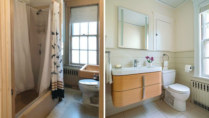
Synopsis: Interior designer John Kelsey describes the remodel of his 1960s bath, a $56,000 project that was years in the making. The article includes a list of the original bathroom’s shortcomings and how each of these design flaws was solved in the remodel, an explanation of how the decision-making process evolved over the course of the project, and a rundown of products used in the updated bath.
Our 1917 Dutch Gambrel house might be likened to the cobbler’s barefoot kids. Though we are interior designers, home projects often take a back seat. Renovating our second-floor family bath was on the list of deferred projects for far too long. That changed about a year ago, when our firm, Wilson Kelsey Design, was selected to be a member of the DXV (an American Standard brand) 2018 Design Panel. As a thank you, we were offered our choice of bathroom fixtures. It was the motivation we needed. My wife and business partner, Sally Wilson, and I finally redesigned the old bath, which hadn’t seen an update since 1960.
Whenever we take on a renovation project, we assume there will be surprises when the walls, floors, and ceilings are opened up. Here, we were most concerned about the possibility of structural rot around the bathtub, but we were lucky not to find any. Another pleasant discovery was that the space required almost no squaring up before hanging the blue board and cement board. The electrical work was another matter. With the exception of an addition to the house and in the kitchen, where we had done an extensive remodel, the original knob-and-tube wiring ran throughout. We knew we’d have to replace it in the bathroom to meet code. When the walls were opened, we learned the wiring and switching for the adjacent dressing room and the entire stairwell and foyer also ran through the bathroom’s walls and ceiling— this is a classic example of why a contingency budget is a must. Ultimately, we bit the bullet and had all of the knob-and-tube removed.
Other surprises were minor: The framing around the chimney running through one corner of the bath was too close to meet the 2-in. clearance code. And, for some unknown reason, the jack studs on one side of the window had been cut.
The initial bathroom construction estimate was just over $50,000. We carried a contingency of 20% ($10,000). The final cost was just over $56,000, including the change orders for repairing the jack studs, fixing the framing around the chimney, removing asbestos in the attic, painting (which was not part of the original plan), and installing the Porcelanosa tub surround—the panels for which needed to be custom-cut on-site. The installation took two people two days to finish, making it three times the cost of a conventional ceramic tile install. From concept to drawings, specs, schedules, and construction, the project took six weeks to complete.
Solving for Function
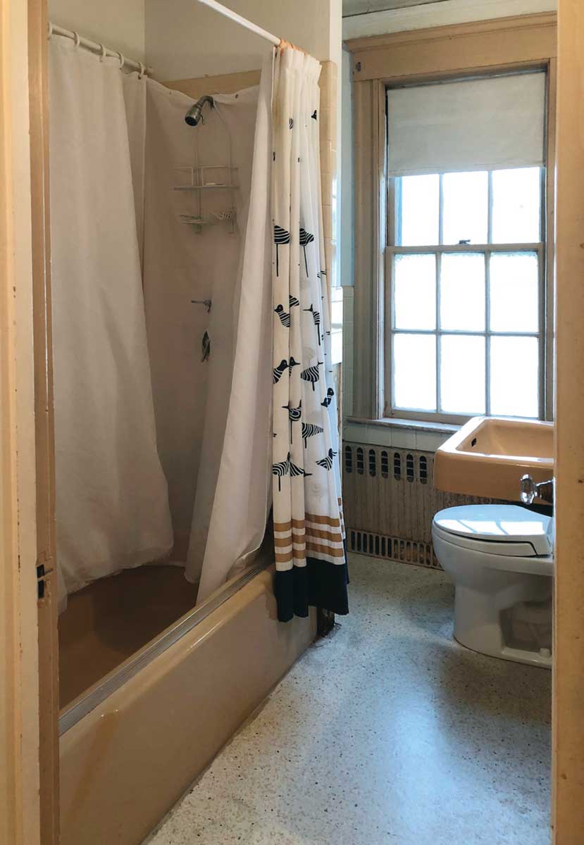
As is the case with many old bathrooms, we faced a common set of problems: a cramped layout, wasted space, poor lighting, no ventilation, and limited storage. We prioritized what needed to be addressed and targeted our changes to solve those issues.
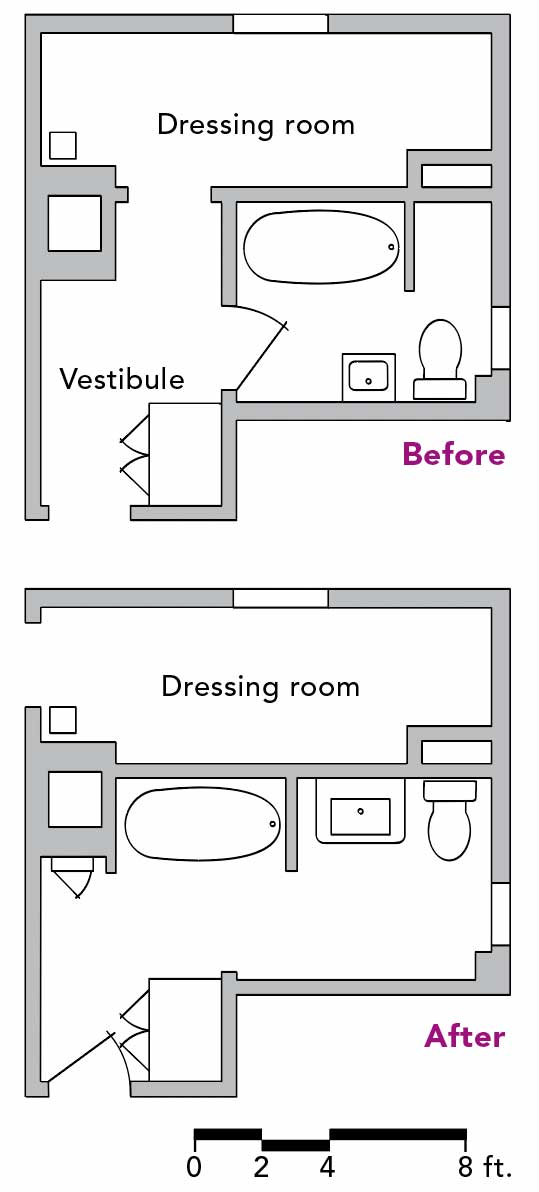
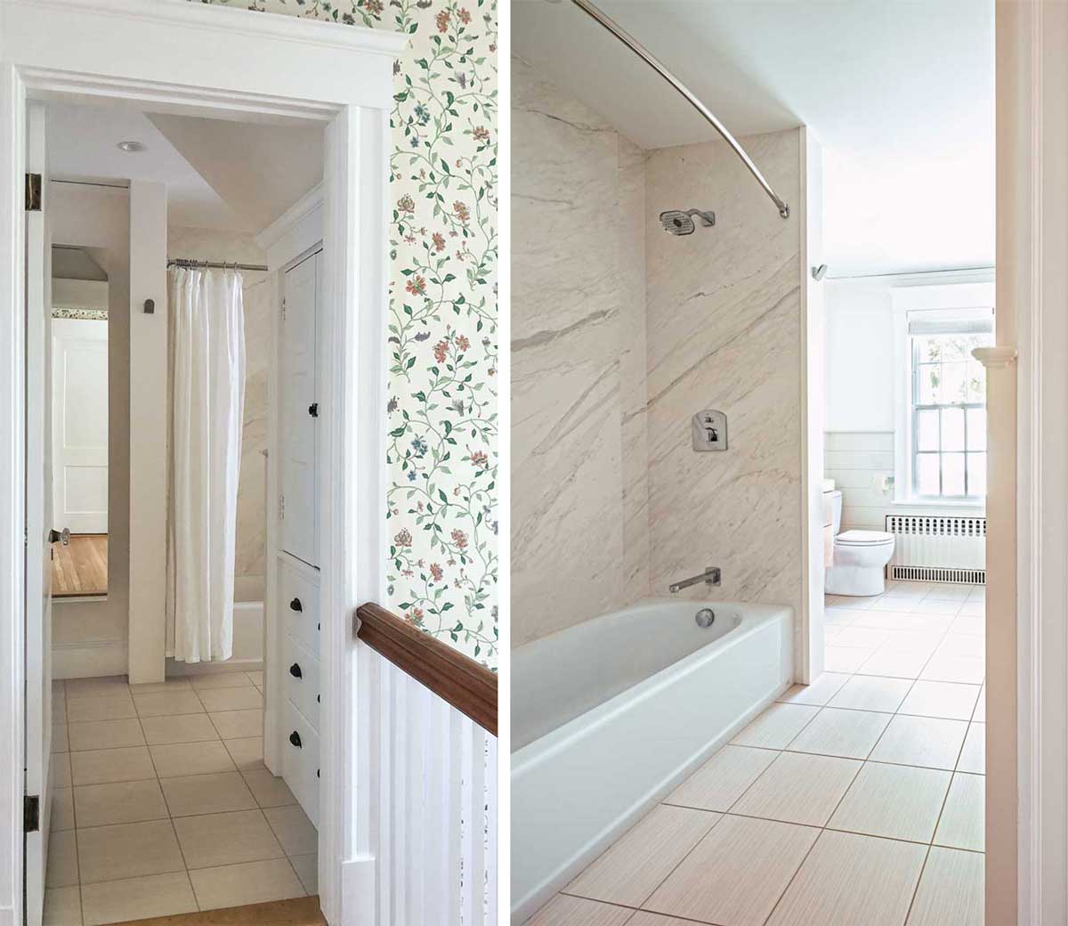
Solution We made the bathroom larger and more efficient by relocating the door between the vestibule and bedroom. With that door eliminated and the vestibule better integrated into the bathroom, the tub/shower, vanity, and toilet could be located on one wall, providing 40 in. of circulation in front of all plumbing fixtures.
Problem There was no exhaust fan. We had to determine the best location for a fan and its ductwork, keeping in mind that there’s stucco on the back of the house and a slate roof. Penetrating 100-year-old stucco would most likely cause cracking, which would require patching—finding a color and texture match would have been challenging. And puncturing a century-old slate roof posed a risk of leaks.
Solution The contractor found a path for the ductwork through the attic crawlspace to the shingled portion of the house.
Problem The lighting was terrible; there was one fixture in the vestibule and a single light bar over the sink.
Solution Four recessed LED downlights in the ceiling solved our general problem. We also added a medicine cabinet with integrated LED lighting.
Problem There were no GFCI outlets at the sink, which code requires.
Solution The medicine cabinet we selected also features integrated GFCIs.
Problem Storage was woefully limited and all existing cabinet doors and drawers constantly jammed.
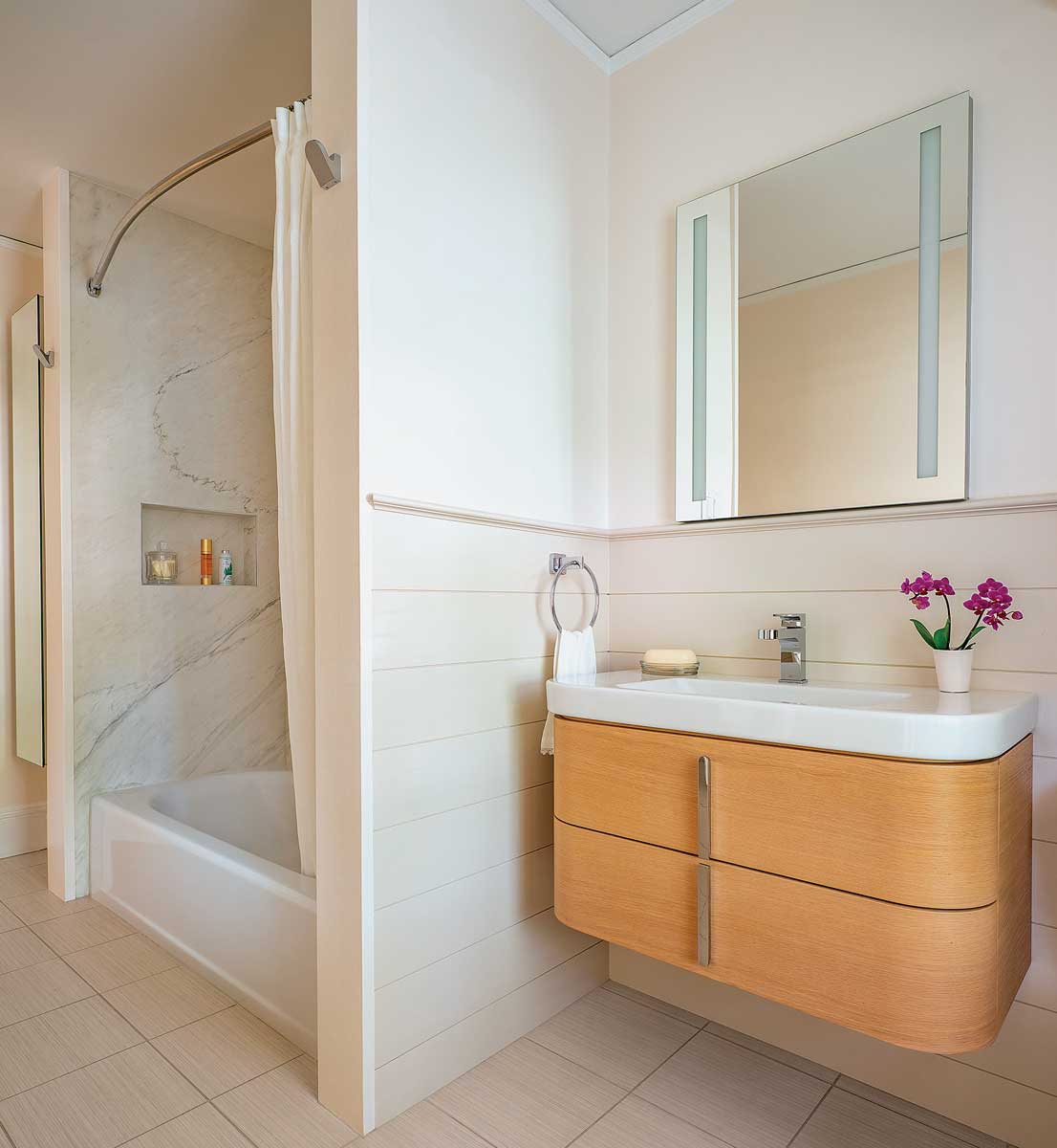
Solution We expanded the existing built-in over the toilet and had all the sticky doors and drawers realigned and adjusted, making them as good as new. We selected a DXV wall-hung vanity with two drawers—one for each of us—and a Porcelanosa mirrored storage cabinet doubles as a full-length mirror in the former vestibule. (We always look for opportunities to incorporate elements that serve dual functions like this.)
Problem The style was dated. We needed to target our budget to cover materials and finishes that would bring the room into the 21st century.
Solution The DXV products and our selections were orchestrated to give the room a modern yet classic look—one that works with a century-old house and will continue to do so for at least another two decades.
From Start to Finishes
For any renovation, we look to the house for cues and ideas. Our old house did not disappoint. We reused existing trim profiles and put a modern spin on the original beadboard in the kitchen. Selecting the DXV products and tub tiles was a more complicated process.
Getting started Initially, we thought about really pushing the modern look with classic black-and-white subway tiles and dark grout. We had in mind DXV’s 33-in. Equility wall-hung vanity in black paired with their Randall single-handle faucet. Hudson Valley’s Islip sconces were considered for either side of the vanity mirror/cabinet. But after sitting with our selections, we concluded the combination didn’t work. The subway tile felt fussy and there was no synergy between the modern and traditional elements. In the end, we realized the black-and-white scheme was all wrong for this house. We did like the 12-in. by 12-in. Daltile porcelain floor tile, which we kept.
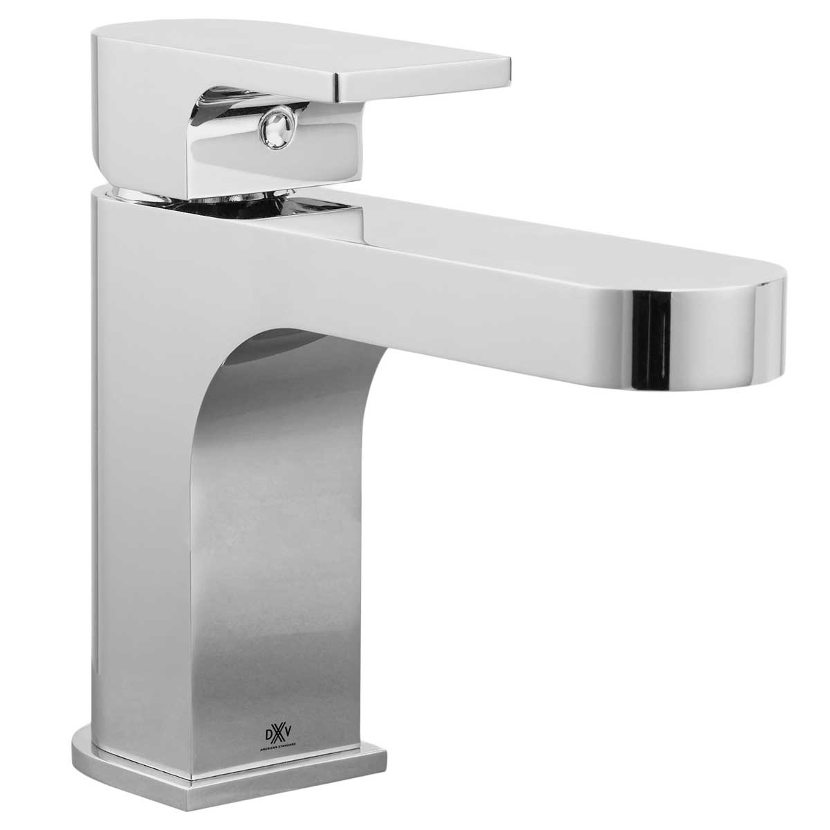
Phase two On our next pass, we changed the vanity finish to Natural Oak, which we liked better because it was lighter and brighter. We swapped out the Randall faucet for DXV’s Equility single-handle faucet, which paired well with the vanity. We also increased the size of the tile in the tub surround. At that point, we were still considering wainscot throughout, but we started thinking about the budget and whether it would be the smartest use of our money.
Making adjustments From there, we increased the tile size for the tub surround again—now 12 in. by 24 in.—and we made the shower niche smaller because centering it on the long tub wall felt odd. It was an improvement, but we weren’t sold on the “hole in the wall,” as we came to call it. Then there was the issue of accent tiles in the niche. Unless we could find some loose samples or leftovers, we would have had to purchase an entire box just to get two tiles.
Surface treatments We decided to finish the built-in cabinet with trim painted to match the adjacent wall. This was an effective move for tying things together. Still toying with the idea of wainscot, we visualized it in a slightly darker tint or a soft gray; we imagined, as a horizontal element, it would help break up the small space. (We believe occupants see surfaces before experiencing volume, which influences their sense of a space—surface treatments really matter when it comes to initial impressions.)
Figuring fixtures To complement the vanity, we chose sconces with Hudson Valley’s Tate fixture in a nickel finish. Having received rave reviews from our clients on the medicine cabinets with integrated LED lighting that we had spec’d on prior projects, we selected a 24-in.-wide lighted Kohler Verdere.
Final decisions We were close but still missing extra storage and a full-length mirror, which were ultimately combined in the Porcelanosa mirrored storage cabinet. We began toying with the idea of using stone slabs rather than large-format tiles for the tub surround. It was at this stage that we decided to crunch the numbers. We had a pretty good idea of where this was going, and it was more than we wanted to spend. Compromises needed to be made. After some digging, we discovered Porcelanosa makes 1⁄4-in. by 48-in. by 96-in. faux-marble slabs at a very reasonable cost—we could use them for the tub. (We used the same material in the niche since we had scraps cut to size). We finally decided against wainscot in the vestibule and did away with the sconces at the vanity—our clients who have them in addition to lighted cabinets have reported that they are redundant.
John Kelsey is principal of Wilson Kelsey Design. Photos by Eric Roth, except where noted.
Floor-plan drawings: Patrick Welsh. “Before” photo: courtesy of the author.
Product photos: courtesy of DXV
From Fine Homebuilding #287
More bathroom remodels:
One Bathroom, Three Ways – Three architects reimagine the same space to suit different needs.
Bathroom Remodel Reality Check – A no-nonsense look at the complications of common bathroom upgrades.
Bathroom Remodeling on Any Budget – Keeping your budget in check is a balance of good design and thoughtful material selection.
