Net-Positive in New England
This new home blends the nostalgia of a traditional Massachusetts farmhouse with the needs of a 21st-century family.
Synopsis: Fine Homebuilding’s Best Energy-Smart Home Award for 2017 goes to Mark Doughty of Thoughtforms and Stephanie Horowitz and the team at ZeroEnergy Designs for an update on the farmhouse style that meets the needs of a modern family and produces enough energy to warrant a monthly check from the electric company or to power an electric car.
When their family outgrew the cozy 1850s home they had meticulously renovated, Mark and Pilar Doughty were faced with the choice of buying and renovating a roomier historic house or building a new home. They felt that energy efficiency, comfort, and environmental responsibility were essential requirements, and after a few years of house hunting and number crunching it became clear that building a new custom home would be the smartest way to get everything their family needed and wanted.
Renovating and living in an old New England farmhouse prepared the Doughtys for planning their ideal home, but it was still a daunting task. Fortunately, as president of Thoughtforms, a cutting-edge custom home builder in the Boston area, Mark had experience managing the construction of many energy-efficient homes—but he had never been involved with a build this modest, nor one this personal. To make their dream home a reality, the Doughtys enlisted the help of like-minded architecture firm ZeroEnergy Design (ZED). Mark had met the design team at ZED years ago, but hadn’t found an opportunity to work with them until now. “We were impressed with their passion, their integrated architecture and engineering, and their commitment to sustainable design,” Mark remembers. ZED managing director Stephanie Horowitz felt that Mark and Pilar were ideal clients because they brought with them an extensive knowledge of houses, but were honest about the limits of their own expertise.
SPECS at a glancePerformance
Systems
|
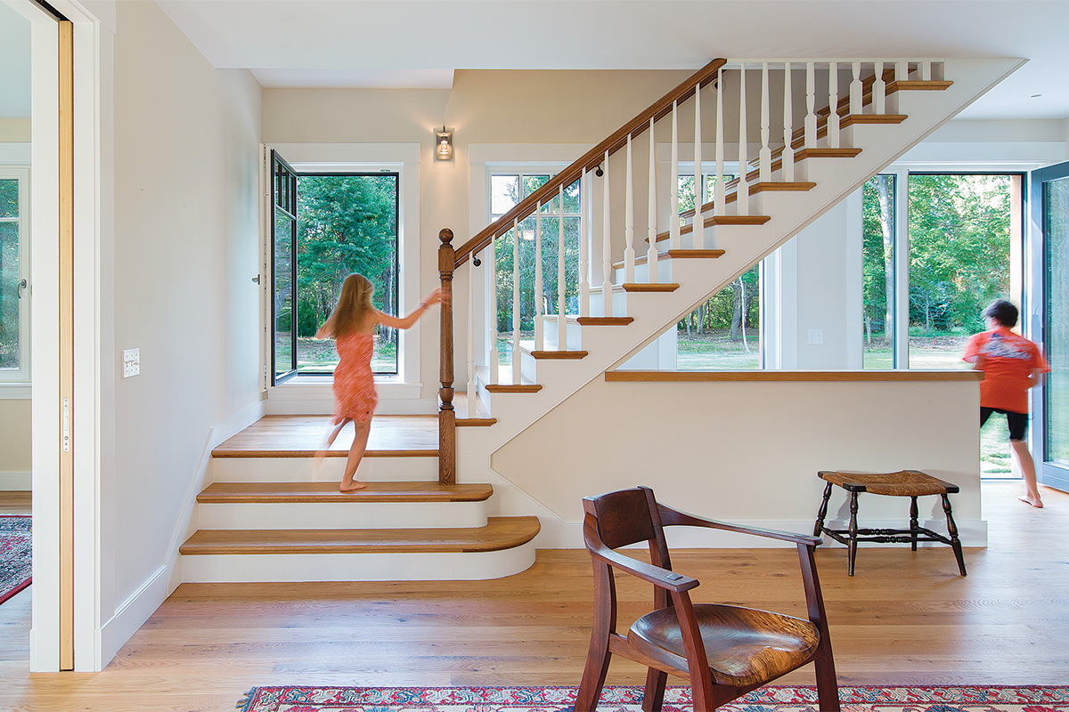
The design team used an iterative approach to create a plan that matched the way the Doughtys wanted to live in their home. Stephanie noted that it’s common for ZED to alternate between trying to tease out what a client is looking for and offering concepts they’ve had success with in past projects. Everyone spent a great deal of time discussing details such as how the family expected to move through the house and how they and their guests would interact within the various spaces. The resulting plan is a hybrid, reminiscent of the antique homes Mark and Pilar are so fond of, but with features added or omitted to better match their contemporary way of life.
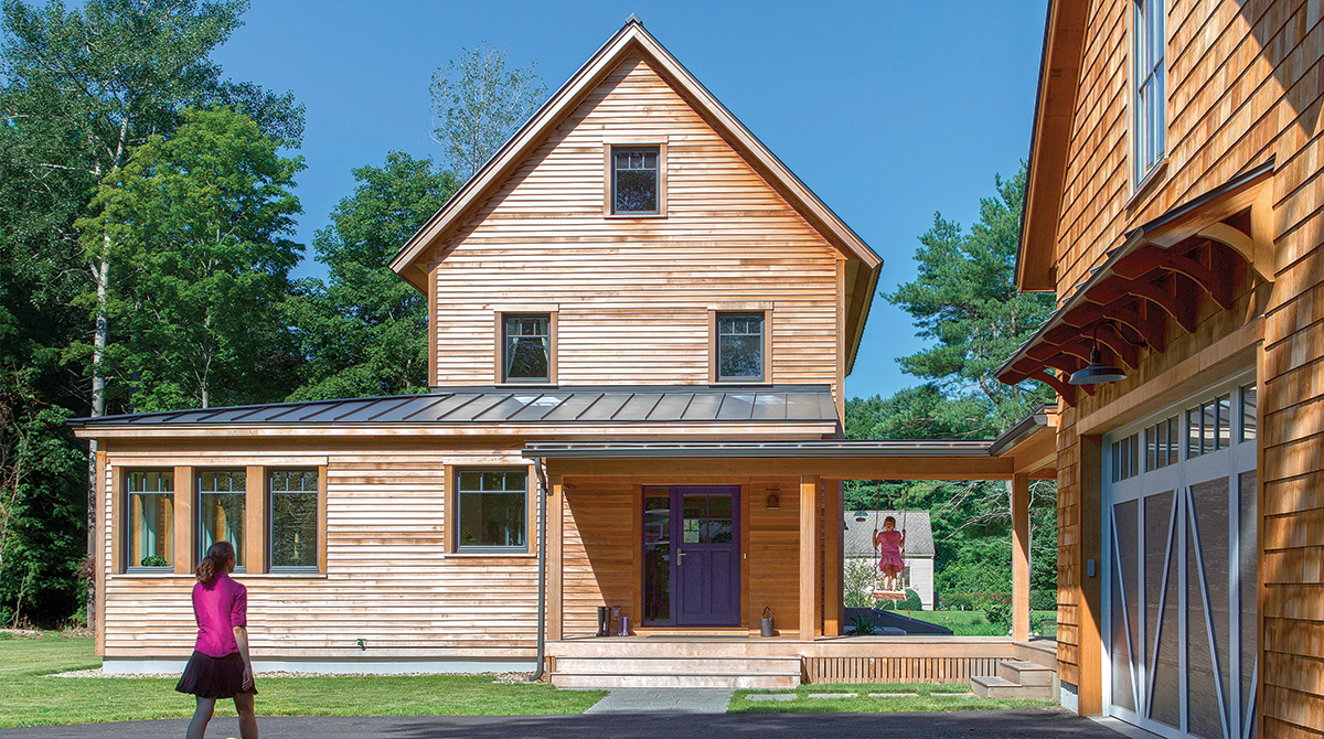
The Doughtys opted to make the mudroom their main entry, forgoing the formal front door common to nearly every old New England home. Without the expense of the additional porch and door, Mark and Pilar felt comfortable splurging for a Belgian bluestone mudroom floor, which appealed to them for its durability, its rugged good looks, and its ability to hide dirt tracked in on the kids’ sneakers. The rest of the main floors are rustic white oak, complete with knots and country charm.
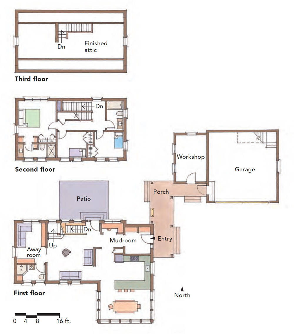
The mudroom opens into the bright main floor, leading to a compact office alcove on the right, the kitchen and dining area on the left, and straight into the living room through the center of the house. Activities in the living room can overflow into a multipurpose away room on the far side of the house—but slide a pair of pocket doors closed and the away room, along with its adjacent full bathroom, becomes a private guest suite.
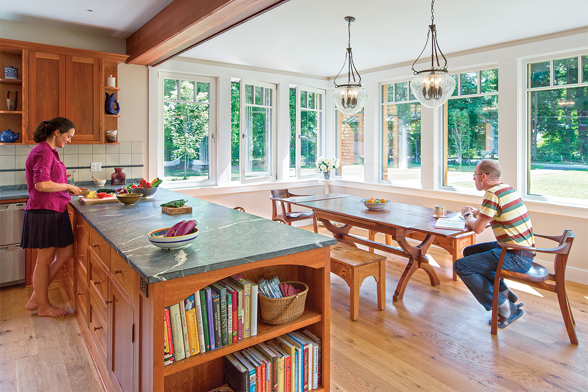
Even though it’s nestled into one corner of the first floor, the kitchen and its accompanying dining area is the heart of the home. It’s also one of the brightest and cheeriest rooms, with a row of extra-large corner windows making it feel almost as though you’re sitting outside. Shaker-style cherry cabinets add warmth to the room and are a nod to the nearly identical cabinets the Doughtys loved in their previous home. The compact, interconnected first-floor plan allows the Doughtys and their children to be together and interact even when engaging in different activities. “The design has fully supported our daily routines and the values that we have around family, togetherness, and space,” Pilar asserts. The second-floor plan is much more traditional. The two kids’ rooms share a bathroom and all of the rooms—including the master suite—are modest in size by today’s standards.
Head up one more flight of stairs and you’ll find one of the family’s favorite living spaces. Because of its openness and simplicity, the Doughtys find that they use the finished attic for any number of activities that don’t have dedicated places elsewhere in the house. Pilar acknowledges the obvious use of the attic as a playroom, as a craft room, and as an extra sleeping space for guests, but she also says the attic hosts uncommon activities such as breakdancing and practicing Reiki.
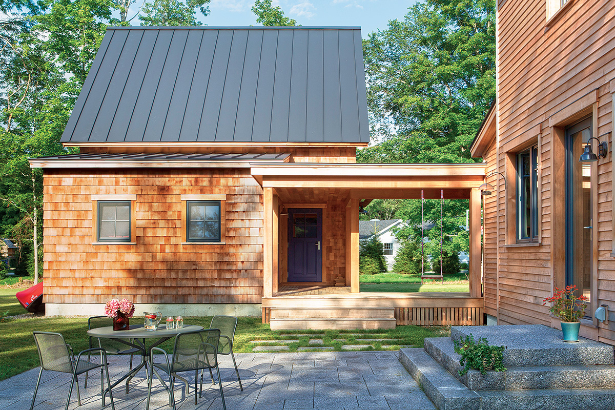
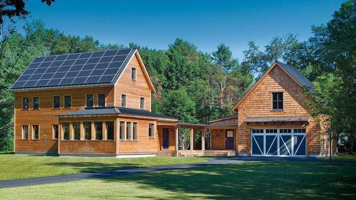
Outside, there’s a mix of traditional and uncommon ideas as well. The house and garage are both simple two-story structures with steep gable roofs and unfinished wood siding—details that are common to the New England vernacular. The barnlike detached garage, with its open breezeway leading to the house, evokes regional country homes from a time before automobiles and heated garages. But the Doughtys’ primary reason for keeping the garage separate from the house is to encourage themselves to appreciate their natural surroundings every day.
There are two prominent exterior features that clearly diverge from the traditional aesthetic so prevalent throughout the house. The most apparent is the tidy array of solar panels that almost completely covers the front half of the roof. The second unusual feature is the bump-out, which flanks the right corner of the house. Though it does look similar to an enclosed porch, its large windows, its front-and-center location, and the bold asymmetry it adds to the façade are distinctly modern elements that ZED introduced to bring the entrance down in scale and to allow for more generous windows in the dining area.
Because of ZED’s commitment to energy efficiency, their team always comes to the table with a list of performance specifications as non-negotiable items. Details like size, layout, and finish materials can be adjusted, but not envelope details or HVAC systems.
Jordan Goldman, ZED engineering principal, pointed out that Thoughtforms typically builds much larger homes, so Mark and Pilar had purchasing connections not usually available for such a modest project. This, paired with ZED’s capabilities for cost analysis and performance modeling, led to impressive energy efficiency.
ZED penned a time-tested building envelope that Jordan is comfortable calling a ZED standard assembly. It starts with conventional 2×6 framing. Dense-pack cellulose on the inside and two layers of 2-in. rigid foam on the outside make it superinsulated. The roof is similarly insulated, but with three layers of 2-in. foam and enough cellulose to fill the rafter bays. A meticulously sealed weather barrier helped the house become among the most airtight in the country, with a final air-leakage level of 0.27 ACH50.
Overall, the house performs better than anticipated, largely due to the Doughtys’ conscientious efforts to conserve energy. The 13.8kw photovoltaic array produces 50% more power than the family currently uses, which will allow enough capacity to charge an electric car in the future. In the meantime, Mark and Pilar are happy to collect a check from their utility company for the
surplus energy.
The benefits are equally about comfort. “In our old 1850s house,” Pilar recalls, “we were constantly pulling shades up and down to regulate cooling in the summer and wearing knit caps in the winter to stay warm without breaking the bank.” The new house is always the right temperature.
And Mark pointed out one more pleasant surprise that’s made him proud: During New England’s historic Snowmageddon of 2015, there wasn’t a single icicle hanging from the eaves.
SPEC
|
|
A Go-To Assembly
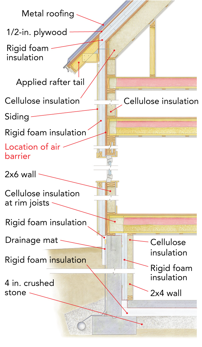
For the team at ZeroEnergy Designs, this building assembly is a proven performer.
R-69 roof construction
To achieve the high R-value of this roof, the assembly includes polyiso insulation above the roof deck and cellulose insulation in the rafter cavities. The metal standing-seam roofing is fastened to an additional 1/2-in. layer of plywood sheathing installed above the exterior rigid foam. Inside, the ceiling plasterboard is installed over 1×3 strapping and finished with no-VOC primer and paint.
R-44 wall construction
This wall assembly has 4 in. of foil-faced polyiso rigid insulation with staggered and taped seams outside. The exterior foam adds R-value and is used to minimize thermal bridging. The siding is fastened to 3/4-in. furring strips, creating a space for drainage and airflow. The interior walls are also finished with no-VOC primer and paint.
R-36 foundation wall construction
To keep the basement dry, the concrete wall has liquid-applied waterproofing and a drainage mat. The basement is insulated inside with 4 in. of foil-faced polyiso rigid insulation sealed to concrete and unfaced batt insulation in the wall cavities. The 5/8-in. moisture-resistant plasterboard is finished with no-VOC primer and paint.
R-26 slab construction
Air movement and vapor are controlled under the slab with 10-mil poly that wraps up at the slab edge and is tapped to the foundation wall. The slab is insulated with 6-in. EPS rigid insulation that wraps up the slab edge to break the thermal bridge.
Rob Wotzak is a carpenter, blacksmith, artist, and freelance writer in New Milford, Conn. Photos by Chuck Choi.
