Passive House Perfection
This compact farmhouse achieves home building’s highest performance standard without a shred of aesthetic compromise.
Synopsis: When architect Justin Pauly first sent plans for a new Passive House he had designed to the planning commission in Carmel, Calif., he and Rob Nicely, the builder, were so excited that they sent along a brochure on Passive House construction. Although the commissioners initially balked at the proposal, they eventually came around and approved the plan for the small site, which is hemmed in on three sides by other houses and on the fourth by a cluster of redwood trees. Pauly’s 1600-sq.-ft. house has an open floor plan with intimate spaces branching off from a central dining area. A small second floor contains a guest suite, and attached to the house by a breezeway is a single-car garage. A patio off the dining area faces the redwoods. With the exception of certain duct runs, the mechanical system–a heat-recovery ventilator with a hydronic coil added as a backup heating element–is housed in a crawlspace under the house. This design meant forgoing a concrete slab, which is often used in Passive Houses to store solar energy. As an alternative, phase-change materials (PCMs) were used in the wall assemblies on the south side of the house. PCMs serve as thermal heat sinks and are installed as sheets behind the drywall of interior walls. For its marriage of style and Passive House performance, this house is FHB’s best new home for 2013. View the video here.
After both growing up in California, Mica and Laureen lived together in many other places throughout their busy careers. Their hearts have always been on the West Coast, though, and they longed to return one day. They eventually found a small piece of property in the coastal enclave of Carmel-by-the Sea on the Monterey Peninsula, and they hired me as architect and Rob Nicely of Carmel Building & Design as builder for a new house that will one day be their permanent home. The collaboration yielded a new type of house for this area, one that appropriately breaks free of the local vernacular while also meeting the country’s most aggressive performance benchmarks.
This Passive House is a first for Rob, for me, and for the city of Carmel. Working on this project has confirmed for Rob and me the importance of sustainable, high-performance design and building. For the city and for those who now get to experience this home, I hope the house evokes a realization that design and performance can be held to the same very high standard and that beautiful, exceptionally low-energy homes are within our collective reach.
A fear of Passive House
One of the initial challenges with our project was providing Mica and Laureen with the house that they wanted while also convincing Carmel’s strict planning commission that the project would complement the existing city fabric. When we first sent the project to the commission, we were so excited about the idea of building Carmel’s first Passive House that we included a Passive House brochure. Unfortunately, that decision had the opposite effect of what we hoped. Instead of getting people excited about our project, it scared them into thinking that we were going to build a box with a wall of south-facing glass and few other openings. While this design might be true of some Passive Houses, our plans called for a different home. Mica and Laureen wanted a contemporary farmhouse with a clean, crisp, and inviting exterior, and an interior with an open floor plan that would use a series of outdoor spaces to create a strong relationship with the small yet dramatic site. Fortunately, the commission was able to see that vision, and our plans were approved.
Working around the redwoods
The lot is a 4000-sq.-ft. flag-shaped parcel hemmed in on three sides by existing homes and on the fourth side by a cluster
of massive redwood trees. These redwoods are the dominant feature on the property and became the inspiration for many of the house’s design decisions.
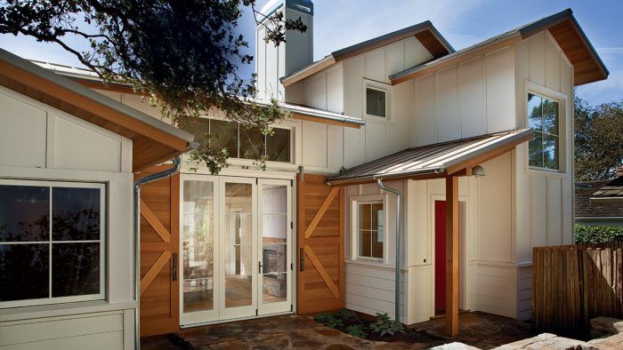
The lot’s physical and regulatory constraints led us to position most of the house at the rear of the property, with a small singlecar garage placed at the street. The garage is linked to the house via a narrow, covered breezeway that steps down slightly to accommodate a subtle change in topography across the site. We placed a small courtyard directly behind the redwood trees and in front of the main living space, and a more private outdoor area directly to the south of the main living space at the rear of the property. The garage and breezeway give the property a “compound” feel, while the outdoor areas tie the interior spaces to the exterior site and help to give the compact house a needed sense of openness.
Evoking comfort in an open plan
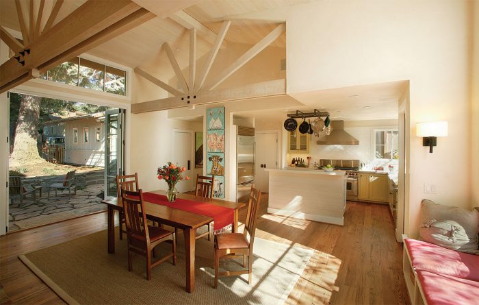
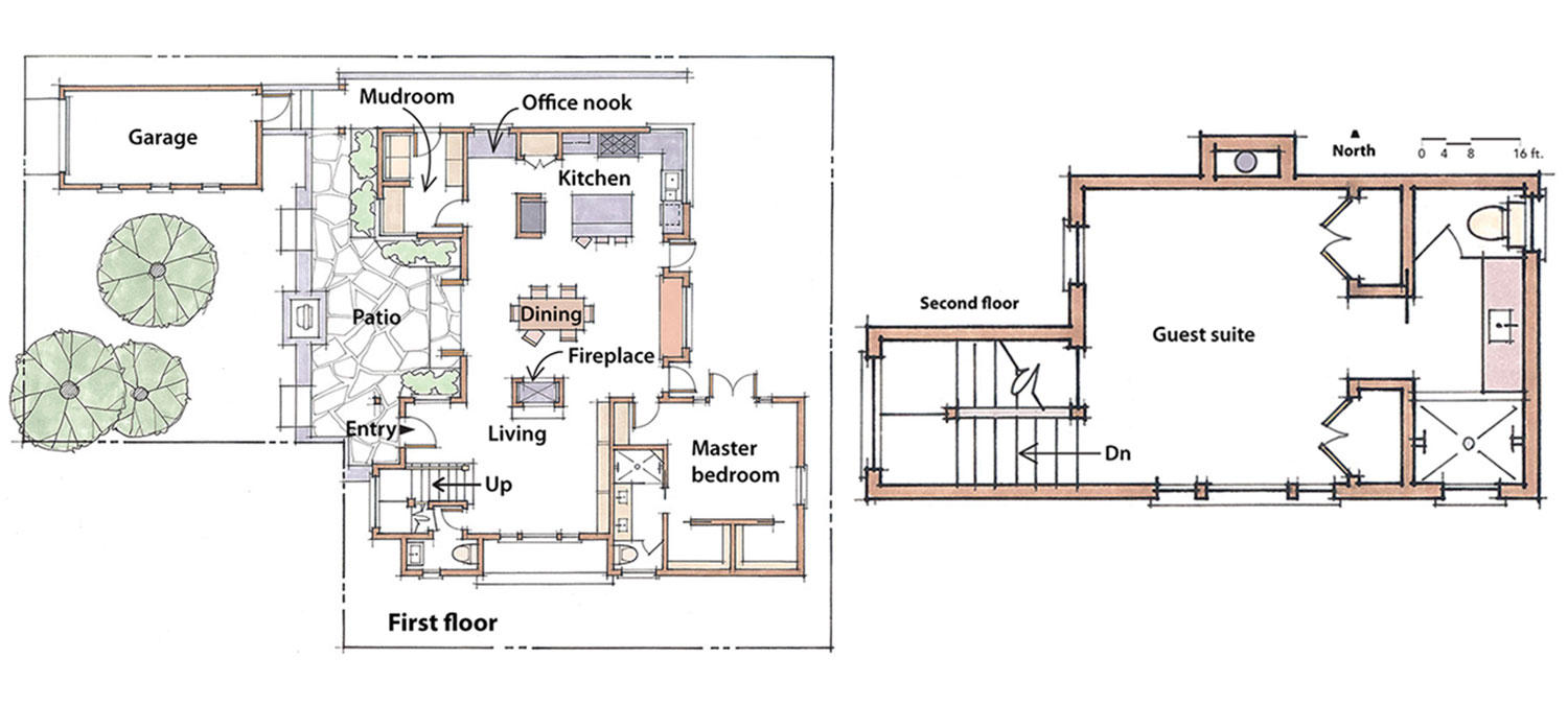
The floor plan has carefully designed spaces for gathering and retreat. the core of the plan is the vaulted dining room, which brings people together in the heart of the home. More intimate spaces branch off this central space, and are enriched with elements that make them inviting and comfortable.
SPECS
Bedrooms: 2
Bathrooms: 2 1 ⁄ 2
Size: 1600 sq. ft.
Cost: $425 per sq. ft.
Completed: 2012
Location: Carmel, Calif.
Architect: Justin Pauly, paulydesigns.com
Builder: Rob Nicely, carmelbuilding.com
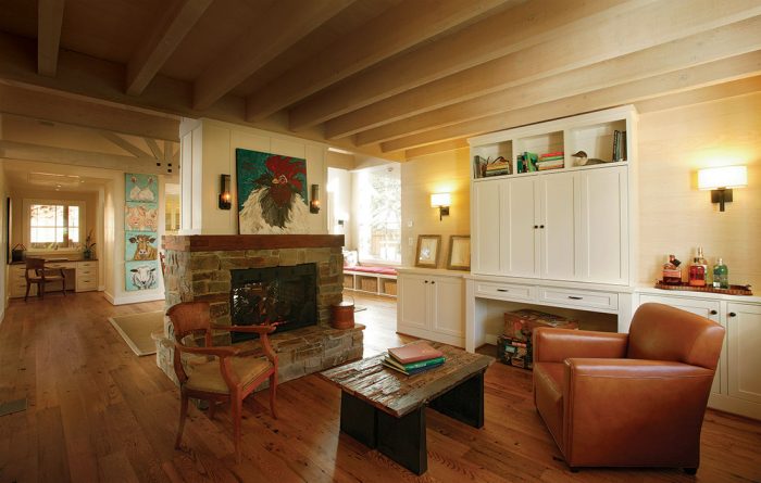
Living room
The living room sits beneath a whitewashed Douglas-fir ceiling and before whitewashed Douglas-fir plank walls and custom built-ins. Separated from the grand dining space by only a double-sided fireplace, the living room is very much connected to the hub of the house, while affording respite from the activity within it.
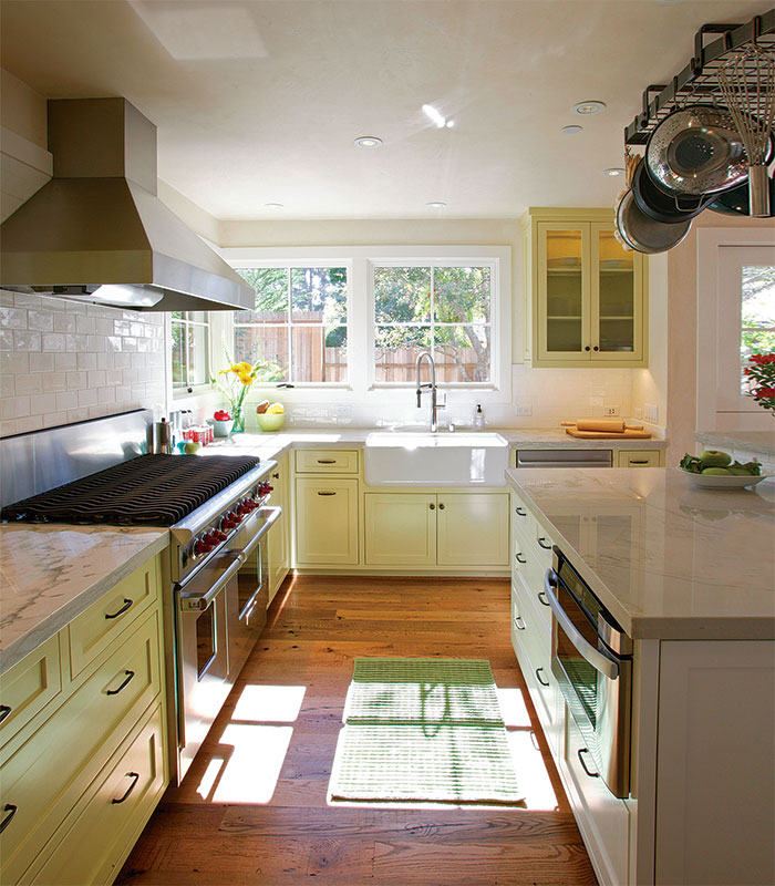
Kitchen
Light green cabinets topped with polished white macaubas quartzite, not marble, sit in front of a subway-tile backsplash to create a bright, durable space for cooking and entertaining.
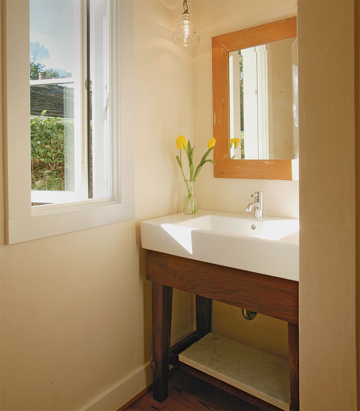
Half-bath
With a Duravit sink atop a custom walnut stand set under a Troy pendant, even the bright, airy half-bath off the living room reinforces elegant farmhouse simplicity.
Guest suite
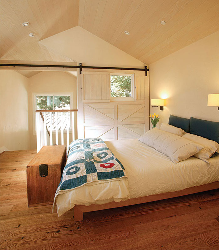
In the small bedroom, a sliding barn door with an operable window helps to define the home’s farmhouse style and creates privacy at the top of the stairs.
Open spaces and intimate places
In addition to well-connected indoor and outdoor spaces, Mica and Laureen also requested a well designed kitchen with a large open space nearby for entertaining and smaller, more intimate spaces for relaxing and reading. The compact kitchen and mudroom lie to the north of the dining room; to the south are a small sitting room, a powder room, a master bedroom, and stairs to the secondfloor suite. While the vaulted dining room, with large openings to the north and south, lends the house a sense of grandeur, all of the other rooms have a more intimate feel because of their smaller footprint and warm, natural finishes.
A twist on a traditional style
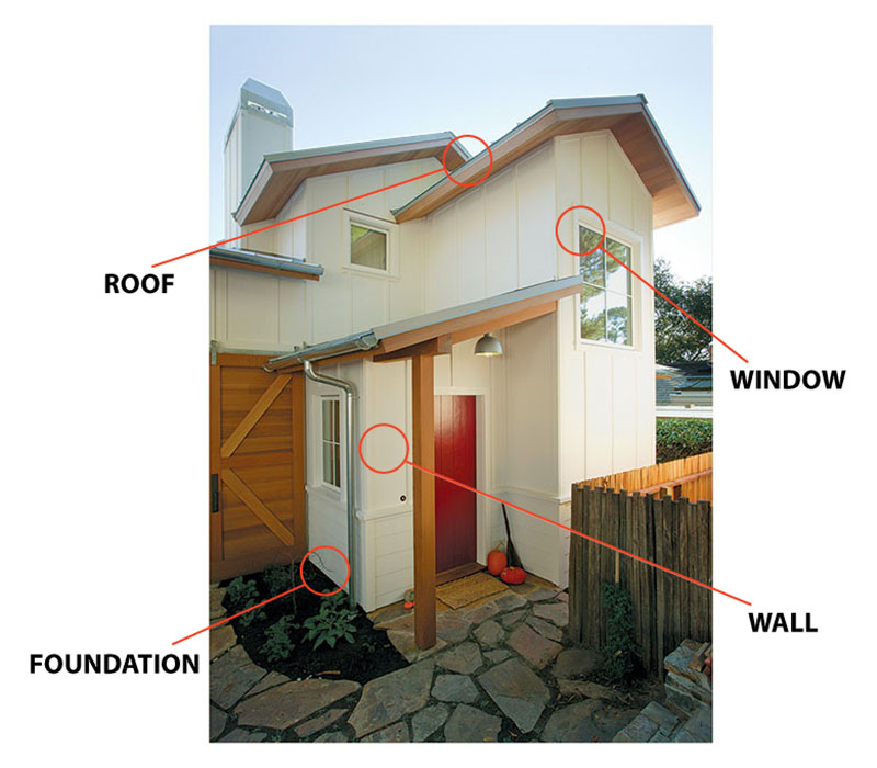
Many of the interior and exterior spaces include traditional elements rendered in more modern detail. Inside, a palette of exposed whitewashed rough-sawn Douglasfir framing, integral colored plaster, and floorboards made of reclaimed barn wood adds to the warmth of the spaces. Boardand- batten detailing on the upper portion of the fireplace and a large sliding barn door in the upstairs bedroom continue to reinforce the farmhouse aesthetic.
We covered the exterior in white boardand- batten siding that sits atop a continuous water table, with lap siding below to offer a sense of grounding to the home’s base. We chose standing-seam zinc-coated metal for the roof, with clear cedar trim for the fascia and underside of the eaves. This boxed-in eave detail gives the whole lid the clean feel of a separate element that has been dropped neatly onto the home below. Additionally, the large cedar sliding barn doors and the exaggerated scale of the foursquare window at the stairwell on the north elevation are prominent elements that push the house’s style toward the contemporary.
Components for conservation
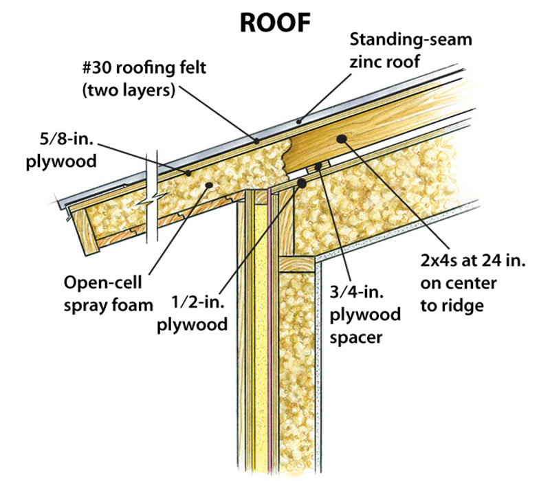
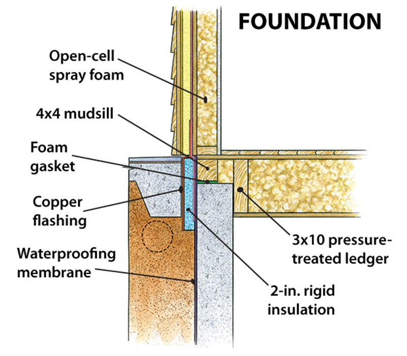
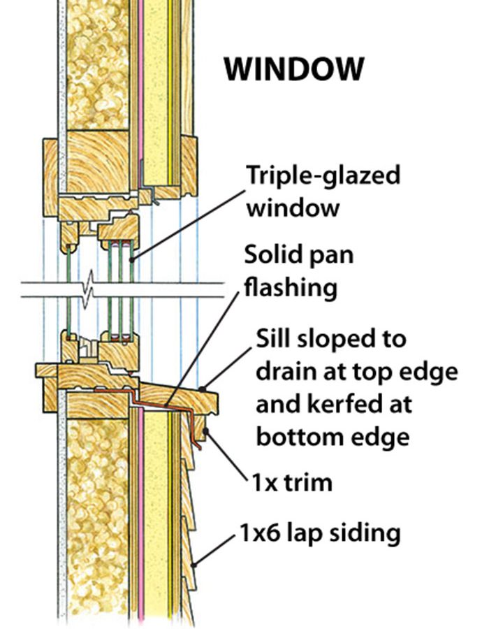
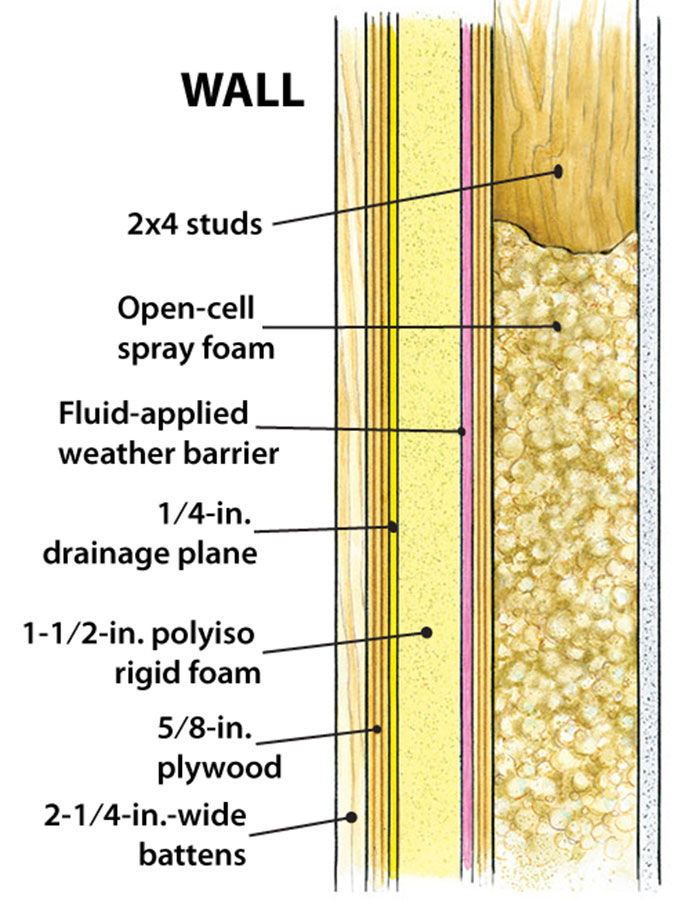
This home consumes as little energy as possible and holds onto that energy for as long as possible through a well-designed envelope. All of the major components have been detailed to ensure optimum performance, while being practical to build.
 |
 |
 |
 |
Slashing energy use
The Passive House approach to building hinges on minimizing the amount of energy consumed in a home by providing extremely high levels of insulation and minimizing air leakage. Unlike other rating systems and certification programs, Passive House tends to focus wholly on energy consumption, which has long been a concern for Rob and me.
Several design strategies helped the house to achieve its performance goals. The compact footprint is a key attribute of a super-lowenergy building. Furthermore, we maximized the amount of solar gain in the main living areas of the house through generous amounts of southern glazing. Passive Houses tend to minimize the amount of glazing on their north sides, which typically bleed energy without providing any positive solar gain. In the case of this house, however, eliminating windows and doors on the north side would have changed the entire look and feel of the house.
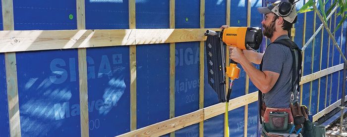
Fortunately, we were able to compensate for the large glazed openings to the north by using more insulation in the walls and roof. A combination of advanced-framing techniques and what we consider a “dualskinned” construction approach to the roof and walls gave us a well-insulated envelope and enabled us to hit our blower-door targets. If the house performs as modeled, it will use approximately 15% to 20% of the energy consumed by a code-built house.
Our mechanical system is comprised of a Zehnder heat-recovery ventilator (HRV) that serves two purposes. First, it provides a continuous flow of fresh air into the house. Second, it uses warm indoor air to preheat fresh makeup air through a heat-exchange core to minimize overall heat losses. A hydronic coil added to the HRV serves as a backup heating element. With the obvious exception of certain duct runs, the entire mechanical system lives in a fairly conventional crawlspace under the house. This design detail meant that we had to forgo a concrete slab, which is often used in Passive Houses to store solar energy. As an alternative, we incorporated phase-change materials (PCMs) into the wall assemblies on the south side of the house to serve as a thermal heat sink. PCMs help to regulate indoor temperatures by absorbing excess heat during the day and slowly releasing the heat in the evenings, when the interior temperature dips below the 73°F set point. PCMs simply install as sheets behind the drywall of the interior walls.
Other than the use of PCMs, the construction of this house was intentionally straightforward. I hope that many of the design and construction techniques we used will become mainstream in the years ahead and that highperformance houses such as this will become synonymous with high-end construction.
—Justin Pauly is an architect in Monterey, Calif. 
Photos by Rob Yagid, except where noted.
Drawings: Don Mannes.
To read the entire article, click the View PDF button below.
From Fine Homebuilding #235
See more award-winning homes from the 2013 HOUSES Awards.
