Make a Prefab Fireplace Look Like It Belongs
Factory-made fireplaces are popular because they are energy efficient and easy to install. Architect Paul DeGroot explains how to make a prefab fireplace look custom.
Factory-made fireplaces are popular because they are energy efficient and easy to install. Unlike site-built masonry fireplaces, they don’t need stout foundations under them, and they are less expensive. However, I often see them finished with scant attention given to creating a style that matches the homes they’re in. It’s not unusual to see the same “throw down” decorating answer in an urban town house as in a suburban builder-traditional: cheap tile and stock wood moldings pasted onto the wall, with little regard for pleasing proportions and handsome design. That’s not necessary, though. An affordable fireplace doesn’t have to look cheap.
Basic pointers for any style
I’ve chosen four popular interior styles to illustrate how to dress a prefab fireplace appropriately for a particular room. First, I’ll discuss a few basic ideas that are independent of room style.
The best-looking prefabs fall into two categories. They either have attractive doors and facades (made of heavy-gauge steel or cast iron with long-lasting finishes) that are meant to be exposed to the room, or they have metal surrounds that are intended to be hidden by noncombustible finish materials.
When done well, those in the latter group can appear nearly indistinguishable from masonry fireplaces.
On the whole, hiding as much of the factory sheet-metal front as possible is a good start for a prefab fireplace. Read the installation manual for your particular model first to find out exactly what you can and can’t do. For factory-made units, manufacturers specify safe clearances to combustible finish materials in their product literature. These clearances are often less stringent than those listed in the building codes for masonry fireplaces.
Consider proportions and finishes
Regardless of a room’s style, the size of a firebox opening (the “viewing area” in industry lingo) should be proportionate to the room’s size. Generally, the larger the room, the wider and taller the fireplace you’ll want, especially if it will be the focal point. A small fireplace centered in a big room will look insignificant, especially if the firebox opening is low and the ceiling is high. Some prefabs have low viewing areas, with heights ranging from 20 in. to 24 in. If you put one of these units level with the floor in a room with a tall ceiling, it will seem dwarfed, particularly if its width is double the firebox height or thereabouts. Place such a fireplace on a raised hearth, or elevate it up the wall to get the flames closer to eye level. Alternatively, pick a model with a taller opening, perhaps 28 in. or higher.
When I first noticed prefab zero-clearance fireplaces back in the 1980s, I saw a lot of shiny brass plating on metal doors, vents, and facades. I doubt that this thin-plated finish ever fooled anyone into thinking luxury. I find the polished metal distracting; the flames are what should shine. Although shiny brass and gold finishes are still available today, matte black and other dark tones work well with most decors. Lighter metal finishes such as brushed nickel and pewter softly pick up other colors in the room without being superreflective.
Regardless of the finish, a flimsy, ill-fitting set of fireplace doors will exude an “I don’t really care” vibe. Let door quality be a measuring stick when you’re shopping for a quality fireplace.
Traditional
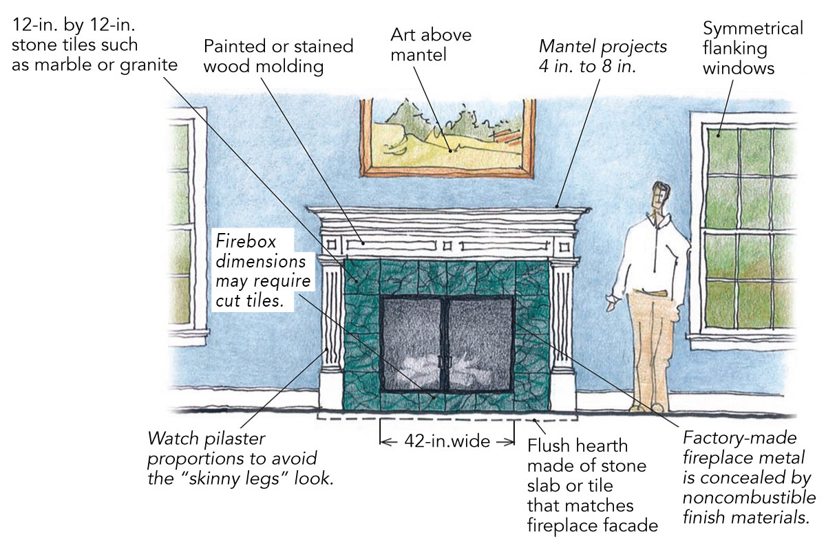
There are big variations in the styles of homes that we label traditional, including everything from authentic Victorians and colonials to the Old World-style homes popping up everywhere. Likewise, a traditional fireplace can have many expressions, from understatedly elegant to highly decorated. It still needs to have the classic elements, though: a prominent mantel and a surround with pilasters flanking the firebox opening.
A raised hearth of brick or stone anywhere from 2 -in. to 12-in. tall is an option. A flush hearth in a slab of polished marble set into a hardwood floor always looks elegant. Use the same marble on the fireplace facade for consistency, but switch to thinner marble tiles to save money. Other natural stones are equally good, of course. In fact, there are numerous prefabricated mantels, surrounds, and hearths—some very ornate—in natural stone and man-made “cast stone” that you can order as a unit. They can be expensive, however.
Painted or stained woodwork will cost a lot less, whether it’s handcrafted or ordered factory-assembled. Here’s where symmetry and decorative moldings rule. Create a spacious top shelf at the mantel by setting a crown above other moldings to get a big projection off the wall. The combination of moldings is limited to one’s imagination. Avoid the “skinny legs” look, where the pilasters are very narrow compared to the horizontal header portion of the mantel. Four-in.-wide pilasters look spindly below a 14-in.-tall header. The pilaster base should be taller than the room’s baseboard. Also, let the pilasters project from the wall 2-in. or more. The overall effect is more substantial and automatically makes the top of the mantel deeper.
Rustic
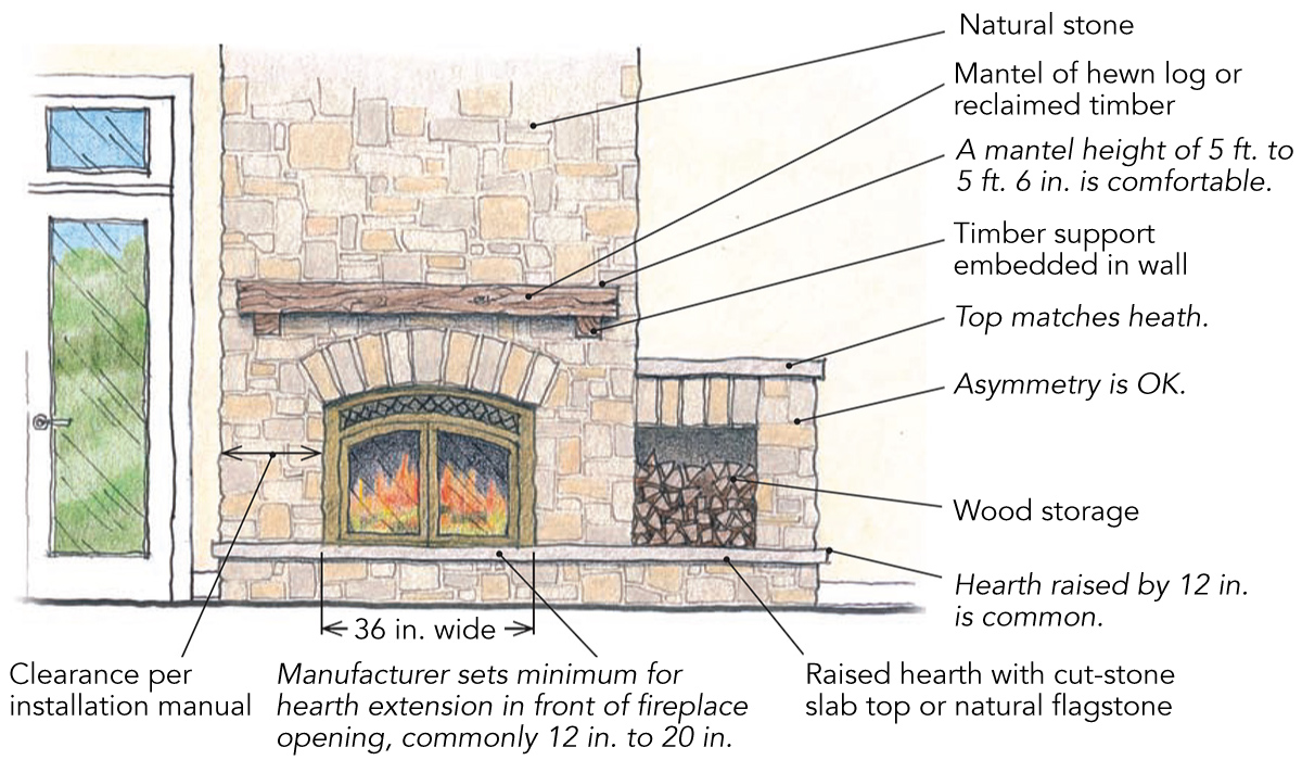
Picture a split-level ranch, a wooded cottage, or even an adobe farmhouse. Rustic is a catch-all category where the style is neither overly traditional nor cutting-edge contemporary, but somewhere in between. A fireplace in one of these homes likely has a mantel, but it might not have a surround with pilasters. If rustic is the design goal, then you can expect decorative moldings to play a minor role—or no role at all. In this case, all shapes and sizes of factory-made fireplaces will work. It is typical to set these prefab units behind facades of stone, brick, stucco, or tile. If your home has brick or stone on the outside, then you should consider using that same masonry for the fireplace wall. Showing off a full-height wall of brick or stone is common, with stone imparting a rugged, outdoorsy feel in its rough state and a more refined look when smoother blocks or slabs are used. (Here in Texas, native limestone is affordable in random pieces with rough faces and is only a bit more pricey when sawn into slabs.) A raised hearth provides extra seating. Use smooth stone or stained concrete on the hearth top for comfort and easy cleanup.
The mantel for a masonry wall can be just about anything—from a stone slab to a reclaimed timber—and can be supported by wood or masonry blocks embedded in the wall. For a less rustic look, craft a simple wooden mantel, and anchor it to the studs behind the masonry so that the supports are hidden. Other wall materials besides heavy rock and brick fit the casual style. Certain tiles, such as slate or granite with honed or flamed surfaces, have enough texture to feel casual while having a touch of refinement. Also, look for ceramic tiles that mimic stone, or make more of a “wow” statement with a fireplace surround of glass mosaic tiles.
Contemporary
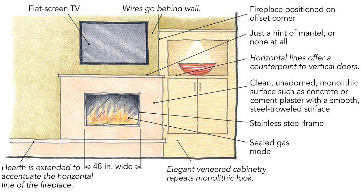
This is another example where ornate moldings are not appropriate. Easy choices here are relatively smooth, unadorned surfaces, such as slabs of stone, expanses of stained concrete, and even sheet metal. Limiting the material palette to just two or three choices evokes a modern feel, as does running the fireplace-surround material all the way up to the ceiling. If a mantel is desired, it needs to be simple—maybe a thick plate of steel, a linear slab of limestone, or a smooth plank of walnut. Think geometry: Use your materials in a planar fashion.
Style-wise, I don’t think many would object to hanging a flatscreen TV above the fireplace in a contemporary living room (and this may be a good case for having just a hint of a mantel or even no mantel at all). There are a number of clean-lined prefab fireplaces today with a minimalistic aesthetic that will fit well. Some have horizontal viewing areas, and many are gas units. The horizontal aspect of the firebox meshes nicely with the similar proportions of a flat-screen TV. I think symmetry is far less important in the contemporary/modern vein than it is in other styles, so don’t be afraid to use an off-center element in the composition. For example, a raised hearth might stretch across the wall in one direction while the mantel extends the opposite way. Or you might build a cabinet with similar modern lines on one side of the fireplace and leave the other side for windows.
Craftsman
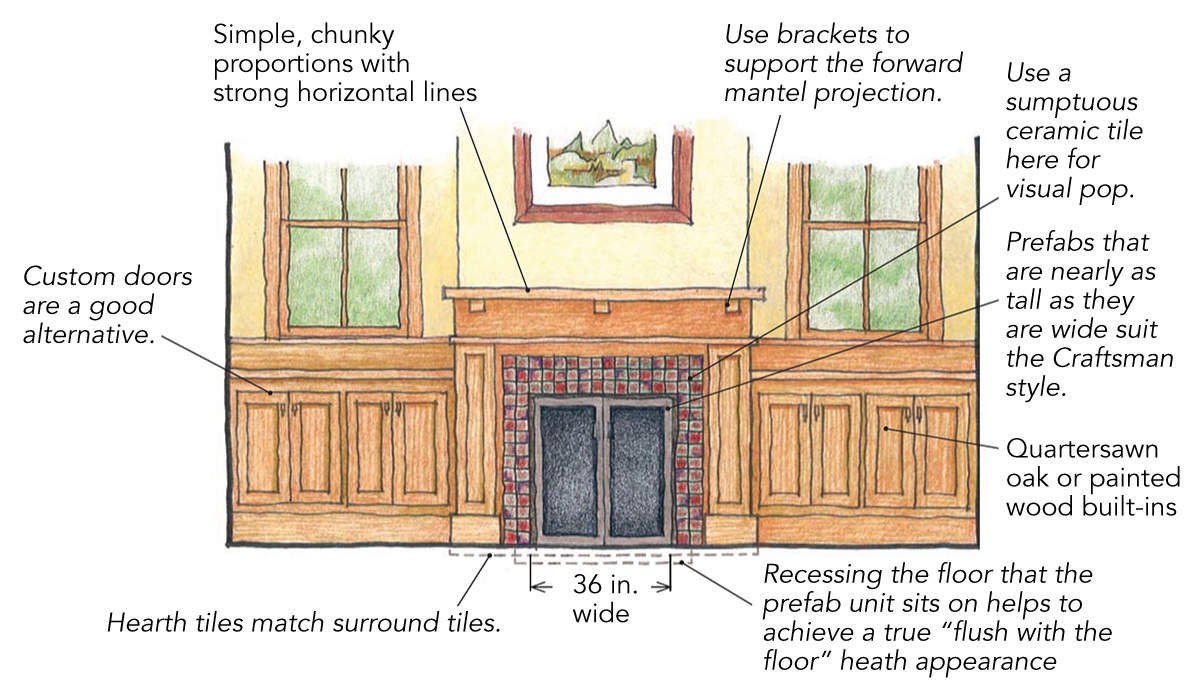
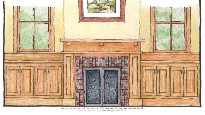
It would be a shame not to show off some woodworking skills around a fireplace in a Craftsman-style home. Either painted or stained wood is fine; it all depends on what’s used for baseboards and other trim nearby. Quartersawn oak would make Frank Lloyd Wright and the Stickley brothers proud, but other American woods such as maple, ash, birch, and cherry can look equally handsome.
Whether it’s custom-built or ordered from a catalog, the mantel/surround should adhere to the notion of restrained ornamentation. Plain is not a bad thing here. Lean toward simple molding profiles, squared edges, and somewhat chunky proportions. A fireplace flanked with matching cabinets looks terrific. A raised hearth, however, can complicate things for these cabinets; a flush hearth looks best in this situation. Natural stone, brick, and stucco are appropriate noncombustible facings to use between the fireplace and the mantel and pilasters. Another option is to find a ceramic tile with rich, earthy tones to add color, texture, and visual interest. If the room is narrow, pick a fireplace that is less horizontal and has a more upright stance. Exposed metal with a cast-iron or wrought-iron appearance will complement the room.
Drawings by the author
