A Kitchen Takes a New Direction
A sunroom addition sets the stage for a more functional kitchen.

Synopsis: Architect Cate Comerford wanted to update the kitchen in her 1939 bungalow in Port Townsend, Wash., which was suffering not only from decades-old cabinetry but from a dysfunctional layout in which traffic moved straight through the action. Rather than add to the kitchen, she appended a 100-sq.-ft. sunroom to one side, which allowed her to relocate the doorway and turn the disorganized space into an efficient, U-shaped kitchen.
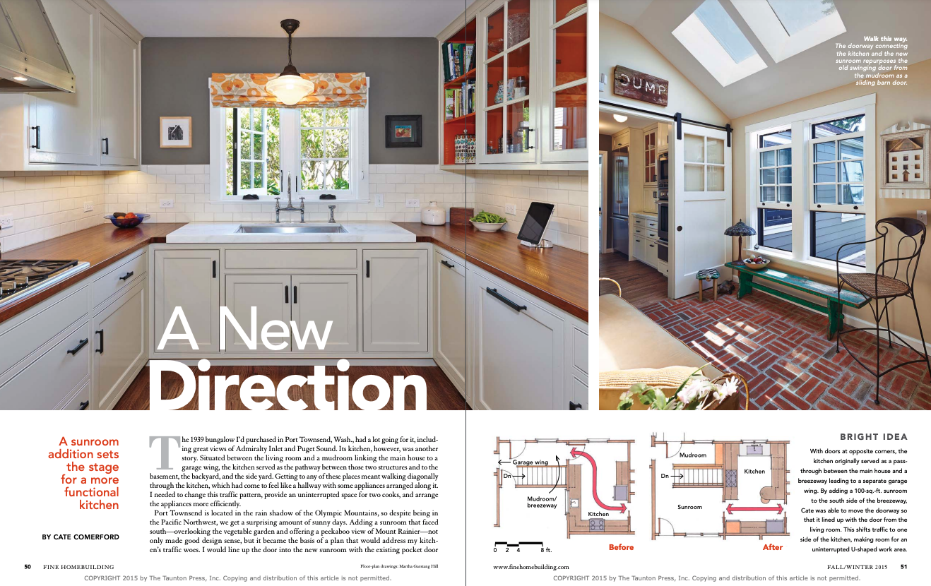
The 1939 bungalow I’d purchased in Port Townsend, Wash., had a lot going for it, including great views of Admiralty Inlet and Puget Sound. Its kitchen, however, was another story. Situated between the living room and a mudroom linking the main house to a garage wing, the kitchen served as the pathway between those two structures and to the basement, the backyard, and the side yard. Getting to any of these places meant walking diagonally through the kitchen, which had come to feel like a hallway with some appliances arranged along it. I needed to change this traffic pattern, provide an uninterrupted space for two cooks, and arrange the appliances more efficiently.
Port Townsend is located in the rain shadow of the Olympic Mountains, so despite being in the Pacific Northwest, we get a surprising amount of sunny days. Adding a sunroom that faced south — overlooking the vegetable garden and offering a peekaboo view of Mount Rainier — not only made good design sense, but it became the basis of a plan that would address my kitchen’s traffic woes. I would line up the door into the new sunroom with the existing pocket door leading from the kitchen to the living room. Traffic between the house and the garage wing could now move straight across one end of the 10-ft.-wide kitchen without interfering with the work taking place there.
Out of chaos, a unified workspace
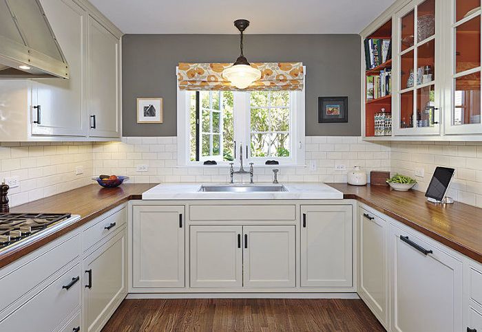
Relocating the mudroom/breezeway door to the new sunroom allowed the creation of an efficient, U-shaped work area that local cabinetmaker Fred Kimball was able to outfit with cabinets following my design. The kitchen’s original cabinets were plywood, built in place, and offered little to salvage beyond a wonderful old pull-out cutting board that I had reinstalled in the new work area. There was one additional takeaway: The old cabinets had bright orange interiors, which made me smile every time I opened a door or drawer. When I got the new cabinets, I painted the interiors with the same cheerful color.
My new “U” space includes plenty of countertop work surfaces as well as the sink, dishwasher, and gas cooktop. Upper cabinets hold dishes and pantry items; lower cabinets and drawers hold pots, pans, and cutting boards.
Traffic now flows past the far wall, where a built-in refrigerator/freezer and a combination oven, microwave, and warming drawer flanks a hutch that contains a generous appliance garage. It may not be a traditional work triangle, but I’ve found that this layout works great for my partner and me, who often cook at the same time. In particular, the refrigerator’s position allows items to be taken out and staged on the nearby peninsula. When we’re done cooking, those items are easily loaded back into the refrigerator.
For more photos, drawings, and details, click the View PDF button below:


