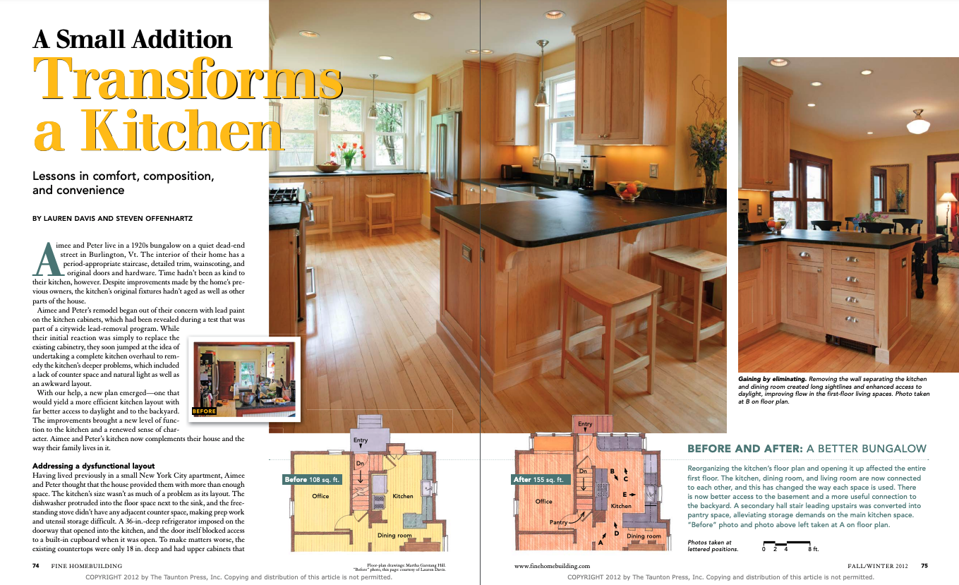
A Small Addition Transforms a Kitchen
This kitchen remodel provides lessons in comfort, composition, and convenience.
Aimee and Peter live in a 1920s bungalow on a quiet dead-end street in Burlington, Vt. The interior of their home has a period-appropriate staircase, detailed trim, wainscoting, and original doors and hardware. Time hadn’t been as kind to their kitchen, however. Despite improvements made by the home’s previous owners, the kitchen’s original fixtures hadn’t aged as well as other parts of the house.
Aimee and Peter’s remodel began out of their concern with lead paint on the kitchen cabinets, which had been revealed during a test that was part of a citywide lead-removal program. While their initial reaction was simply to replace the existing cabinetry, they soon jumped at the idea of undertaking a complete kitchen overhaul to remedy the kitchen’s deeper problems, which included a lack of counter space and natural light as well as an awkward layout.
With our help, a new plan emerged—one that would yield a more efficient kitchen layout with far better access to daylight and to the backyard. The improvements brought a new level of function to the kitchen and a renewed sense of character. Aimee and Peter’s kitchen now complements their house and the way their family lives in it.
Addressing a dysfunctional layout
Having lived previously in a small New York City apartment, Aimee and Peter thought that the house provided them with more than enough space. The kitchen’s size wasn’t as much of a problem as its layout. The dishwasher protruded into the floor space next to the sink, and the freestanding stove didn’t have any adjacent counter space, making prep work and utensil storage difficult. A 36-in.-deep refrigerator imposed on the doorway that opened into the kitchen, and the door itself blocked access to a built-in cupboard when it was open. To make matters worse, the existing countertops were only 18 in. deep and had upper cabinets that were placed a mere foot above them. The usable space that existed on the shallow counters was overcrowded with appliances and dry goods that couldn’t find a home elsewhere.
 |
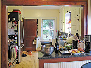 |
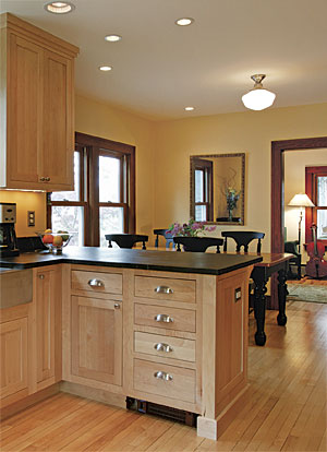
Gaining by eliminating. Removing the wall separating the kitchen and dining room created long sightlines and enhanced access to daylight, improving flow in the first-floor living spaces. Photo, left, taken at B on floor plan.
Lauren Davis
BEFORE AND AFTER: A BETTER BUNGALOW
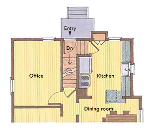
Reorganizing the kitchen’s floor plan and opening it up affected the entire first floor. The kitchen, dining room, and living room are now connected to each other, and this has changed the way each space is used. There is now better access to the basement and a more useful connection to the backyard. A secondary hall stair leading upstairs was converted into pantry space, alleviating storage demands on the main kitchen space. “Before” photo and photo above left taken at A on floor plan.
 |
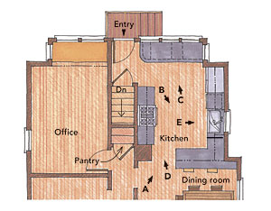 |
Photos taken at lettered positions.
Changing the basement stairs changed everything
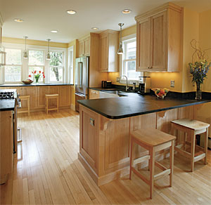
Movement from the kitchen to the backyard and basement was significantly hampered by a protruding doorway that led to winding basement stairs. The design solution that unlocked the space’s potential relied on adding a 3-ft.-deep bump-out across the back of the house and reconfiguring the problematic staircase. We straightened the run of stairs and aligned the basement entrance with the new back door. Not only do the straight run of stairs and the aligned doorways make it easier to shuttle bikes in and out of the basement, but the setup also relieves congestion in the primary floor area of the kitchen. The bump-out also allowed for the addition of a large countertop, more storage, and several new windows.
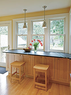
Now, visitors entering through the back door are greeted by a lightfilled, clutter-free kitchen. Just inside the door is an open counter for resting grocery bags, with shelves below for keys, phones, and shoes. The 30-in.-deep soapstone counter provides plenty of room to spread out a laptop, paperwork, and a morning cup of coffee while looking over the garden. We set the counter on standard 24-in.-deep base cabinets that provide much-needed storage while still allowing plenty of legroom for those seated at the barstools.
A bigger opening and a better peninsula
Initially, Aimee and Peter were skeptical about opening the kitchen to the rest of the house to increase the perception of space. A wall with a cased opening had originally separated the kitchen and the dining room. While a small peninsula in the opening offered a connection between the two spaces, sightlines and daylight were blocked by the surrounding wall. After we opened the walls during demolition of the kitchen, Aimee and Peter quickly embraced the feeling of the open design. In response, we eliminated the wall between the kitchen and the dining room and significantly increased the size of the peninsula, which now serves as a seating area for the dining room and a workspace for the kitchen.
Finally, we took great care to weave the newly milled maple flooring into the existing floors of the kitchen and dining room, helping to enhance the sense of continuity throughout the house.
THE THREE Cs OF A GREAT DESIGN
The old kitchen in this house was difficult to work in, but it also lacked the comfortable, functional, and appealing spaces that can make a kitchen a pleasant place for relaxing or socializing. The old kitchen was a place to prepare food and a place to avoid at all other times. Now, the kitchen is a fitting social center and a place the homeowners seek out, even when they’re not cooking. Here are three areas focused on in the redesign of Aimee and Peter’s kitchen.
COMFORT:
Like many older kitchens, the one in this home had room for standing only and had no truly inviting areas. The new kitchen has seating on the dining-room side of the peninsula and at the counter within the new bump-out. Three windows above the large countertop, which acts as the windowsill to create a more seamless view outside, provide much-needed daylight and make it the most obvious and appealing place to sit. The homeowners have found this new space so enjoyable that it doubles as another home office on most days and as a place to engage socially most evenings. Photo taken at C on floor plan.
CONVENIENCE:
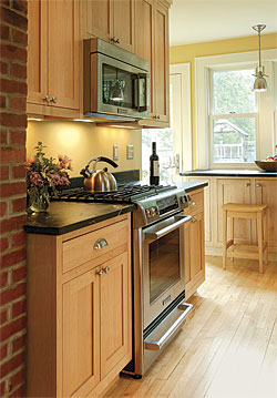
Cooking meals in the old kitchen was difficult because of the awkward arrangement of appliances and prep surfaces. Expanding the kitchen and rearranging the stairs allowed the owners to move the fridge to the opposite wall and add valuable storage around the new stove. Most everything they need to prepare a meal—spices, utensils, pots, and pans—is now stowed within arm’s reach of the stove, and there is plenty of counter space for meal prep. The homeowners have likened the new kitchen to a ship’s galley, where every item has its proper place and every space has its proper use. Photo taken at D on floor plan.
COMPOSITION:
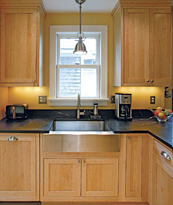
In the renovation, the window on the east wall shifted 6 in. to the right. This created enough room for a refrigerator and a dishwasher to the left of the stainless-steel, farm-style sink, and it centered the window above the sink. The window provides a balance of daylight in the kitchen, which is complemented by recessed lighting (ambient), a pendant light (task/accent), and undercabinet lights (task/accent). Such symmetrical scenes, with layers of light, help to create clean, crisp, inviting spaces where the homeowners want to spend their time. Photo taken at E on floor plan.
Notable elements: Cabinets Omega Cabinetry, Omegacab.com • Stove Kitchen Aid 30 in., KitchenAid.com • Pendant lights Benson Pendant, RestorationHardware.com • Faucet Blanco Kantrol, BlancoAmerica.com • Refrigerator Kitchen Aid • French Door, KitchenAid.com
Lauren Davis is a partner of Brown + Davis Design (BrownandDavis.com). Steven Offenhartz is owner of Offenhartz Management Co. in Burlington, Vt. Photos by Rob Yagid. Floor-plan drawings: Martha Garstang Hill.
To view the entire article, please click the View PDF button below.
