Historic Kitchen Reimagined
Urbanology Designs restores the integrity of a century-old kitchen.
“It’s fun when a client sees these old houses as a giant opportunity.”—Ginger Curtis
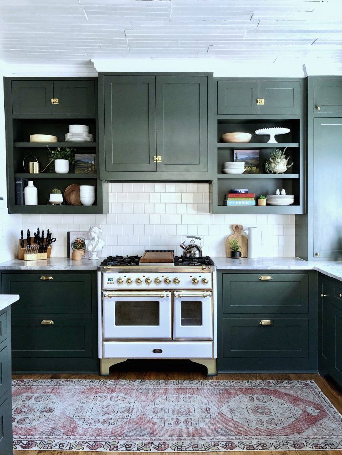
Located in the Fairmont National Historic District of Fort Worth, Texas, this renovated 1905 kitchen epitomizes old-world charm, which is exactly what Urbanology Designs principal Ginger Curtis was going for. Measuring less than 300 sq. ft., the room was being eaten up by an island when Curtis was introduced to the project. In addition to being cramped and dysfunctional, there wasn’t any seating. What the room did have was colossal character.
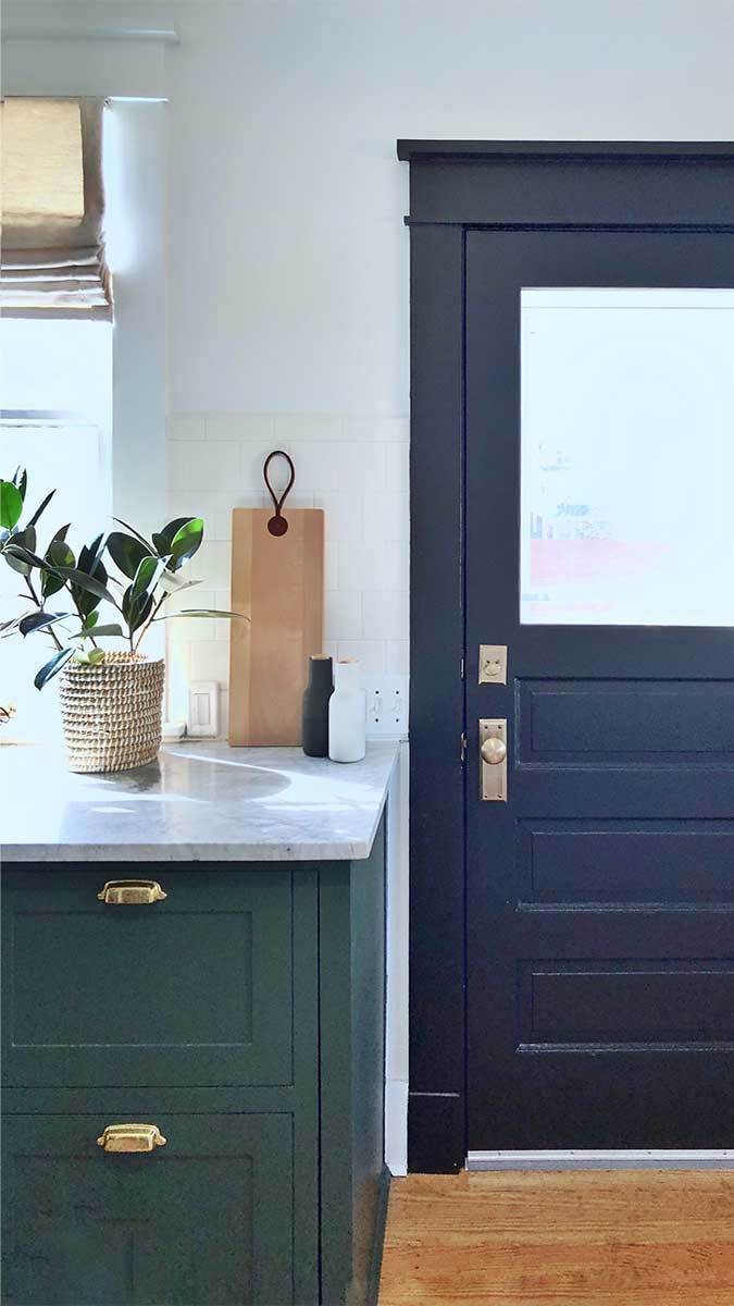
Curtis’s first move was to get rid of the island—an unusual decision, given today’s trends in kitchen design, which seem to center around the island. Though rich in historic architectural details, such as the framing and molding around the door and the slatted wood ceilings, they were in need of repair. What could be salvaged was, though the floors were so damaged they needed to be replaced. Staying true to the history of the house, Curtis spec’d a narrow plank.
The refresh includes all-new Shaker-style cabinetry painted a noteworthy shade of green. Of her choice, Curtis says: “The cabinets have that traditional transitional element but with a unique color, which most clients would be afraid to do. We didn’t want Kermit-the-Frog green. It needed to have depth. It couldn’t be a green you would get tired of.” She aptly describes her selection—Sherwin Williams’s Foxhall Green—as “dusty.” Vintage cup pulls and latches on the cabinetry push the old-world vibe.
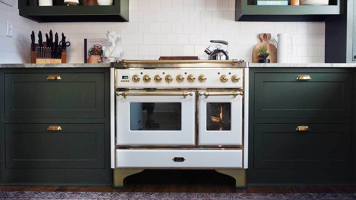
“We didn’t want people to get whiplash going into a brand-new, shiny kitchen in this old house,” Curtis jokes. “We wanted the element of nostalgia and history.” She points to the Italian Ilve oven range—a find from Facebook Marketplace—as the embodiment of that design intent. It is easily the room’s pièce de résistance.
Simple quartz countertops together with the square-tile backsplash create a clean, classic look. Of the square tile, Curtis says: “It’s an old style that’s resurfacing. It has the same look you get with subway tile but it’s a little different and subtle.” It could be said that the shape helps keep the wall treatment in scale with the small space and limited number of cabinets. Another nuanced detail is the open cabinet, chosen in lieu of floating shelves, which are arguably all too common these days.
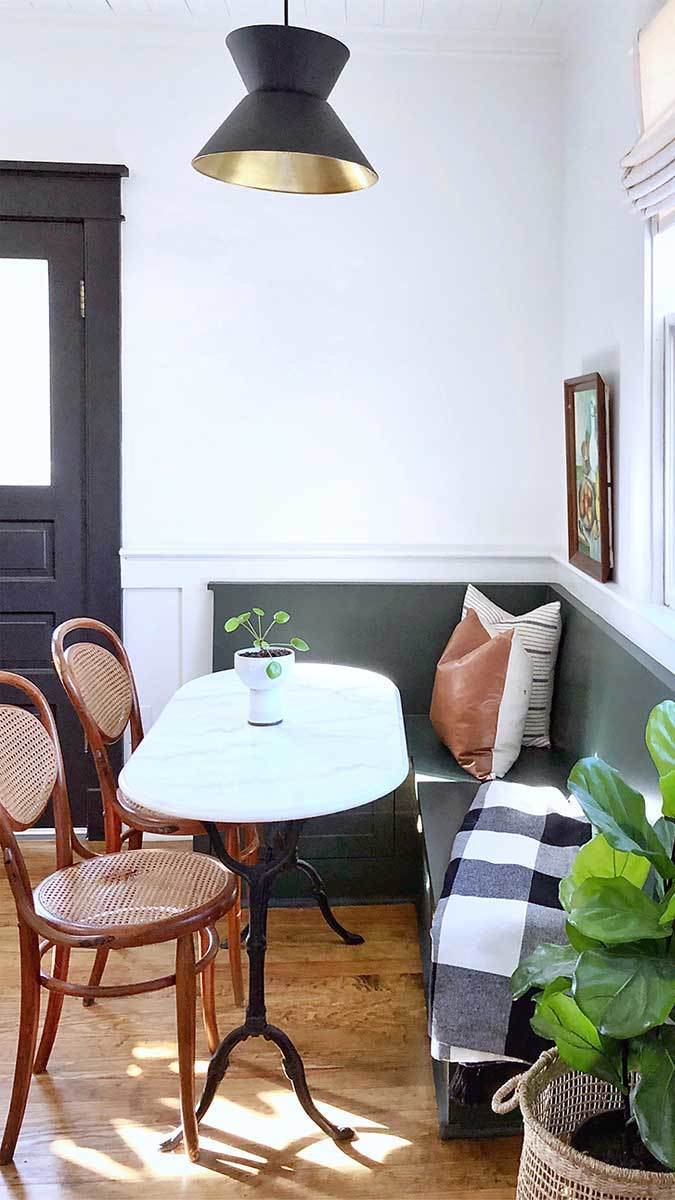
Seating is supplied by an antique table with oval marble top and metal base from Chairish. “I love incorporating a shape that’s unexpected, something not average,” Curtis explains in reference to the oval tabletop. “It’s a very functional setting that was a perfect fit for that space, and it gave the clients something they didn’t have before.”
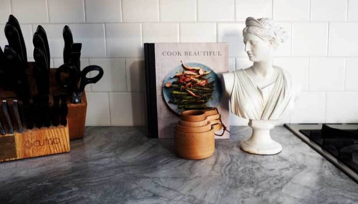
Of special note is the way in which Curtis incorporates fine art. A marble bust sits beside the range and two oil paintings are on shelf display. “I’m seeing art in the kitchen as a bespoke trend,” she says. “I like to call it ‘relaxed modern’—that pulling in of untraditional elements; art is a good example of that.”
Photos courtesy of Urbanology Designs
If you have a kitchen project that might be of interest to our readers, please send a short description and images to kjacques@taunton.com.
For more kitchen renovations in historic homes:
Fine Homebuilding Recommended Products
Fine Homebuilding receives a commission for items purchased through links on this site, including Amazon Associates and other affiliate advertising programs.

Get Your House Right: Architectural Elements to Use & Avoid

Graphic Guide to Frame Construction

Musings of an Energy Nerd: Toward an Energy-Efficient Home
