Hyde Park Kitchen Remodel
Austin-based CG&S Design-Build gives this historic home a period-appropriate kitchen upgrade.
The existing kitchen in this 1890s Victorian was a poorly designed 1970s remodel with questionable DIY-style plumbing and compromised balloon framing. Interestingly, the clients didn’t want to open the kitchen to adjacent rooms—as is so often the case with kitchen remodels—but rather wanted it to remain a distinct room. They were looking to remedy an inadequate storage situation and improve the overall flow. They also called for an eat-in table. And since the kitchen’s exterior door is the day-to-day entrance, the design needed to incorporate mudroom-like features.
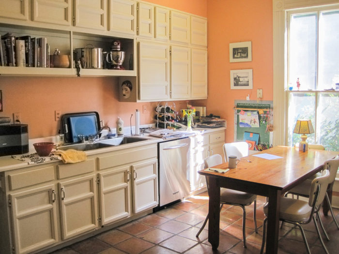
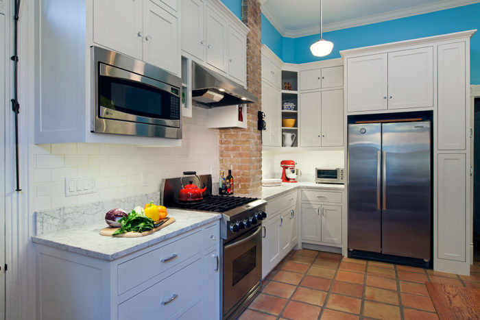
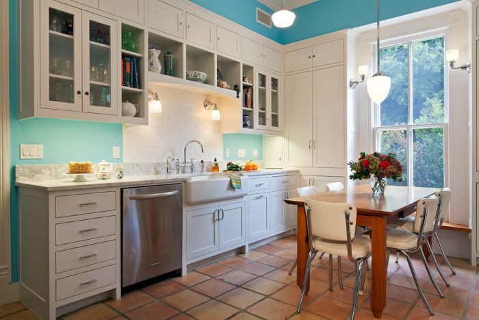
Historically, families were not likely to have spent much time in the original kitchen, as it would have been the servants’ domain. At some point in the 20th century, perhaps in the 1930s, homeowners would have begun to take over the space. That idea became a design driver. Stylistically, a brand-new 21st-century-style kitchen would be out of sync with the rest of the Queen Anne home, which is listed on the National Register of Historic Places. Instead, CG&S Design-Build aimed to make the kitchen look like a fresh 1930s remodel of the 1890s servants’ kitchen—albeit with 21st-century stainless steel appliances and a 1970s Saltillo tile floor.
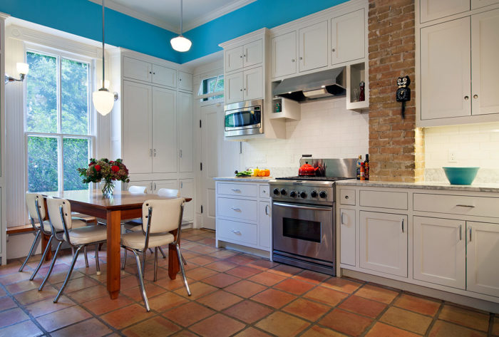
The scope of the work included: gutting the entire room, adding blocking to the original framing, contending with sealed spaces where rodents and insects gained entry, improving the insulation, and revamping the plumbing and electrical systems. CG&S reorganized awkward furr-downs that concealed the air-conditioning ducts; replaced outdated cabinetry with face-framed cabinets with crown molding; and added open storage surrounds by the range and sink, as well as shallow tower cabinets on either side of the original double-hung window, which itself was rebuilt.
Schoolhouse lighting fixtures, sconces above the sink and at the window, and the pendant over the table are all period fixtures of different vintages, which seemed appropriate for a home that had changed so much over time. The painted flush inset cabinets are historically accurate, as is the cabinet arch above the sink. The Carrera marble countertops are a contemporary material, but gives the right overall feel regardless of veracity. Likewise, the tile backsplash felt appropriate for the era. CG&S kept the extant brick flue—a vestige of a former heating system—to add color, texture, and historical flavor. The countertop had to be cut into the flue and the upper cabinets had to be scribed to it.
Other than the space occupied by the window and antique long leaf pine bench, the exterior wall is all cabinets. Those by the door function as the mudroom—there are coat hooks and space for backpacks and the like. At the window, custom-designed flared cabinet sides and the wood bench abut the existing fluted trim—an installation that took some finesse.
Photos by Tommy Kile
