Midcentury-Modern Kitchen
Great storage and sharp details pull this kitchen remodel into the present.

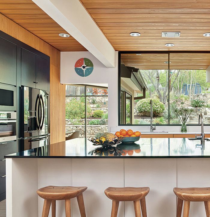
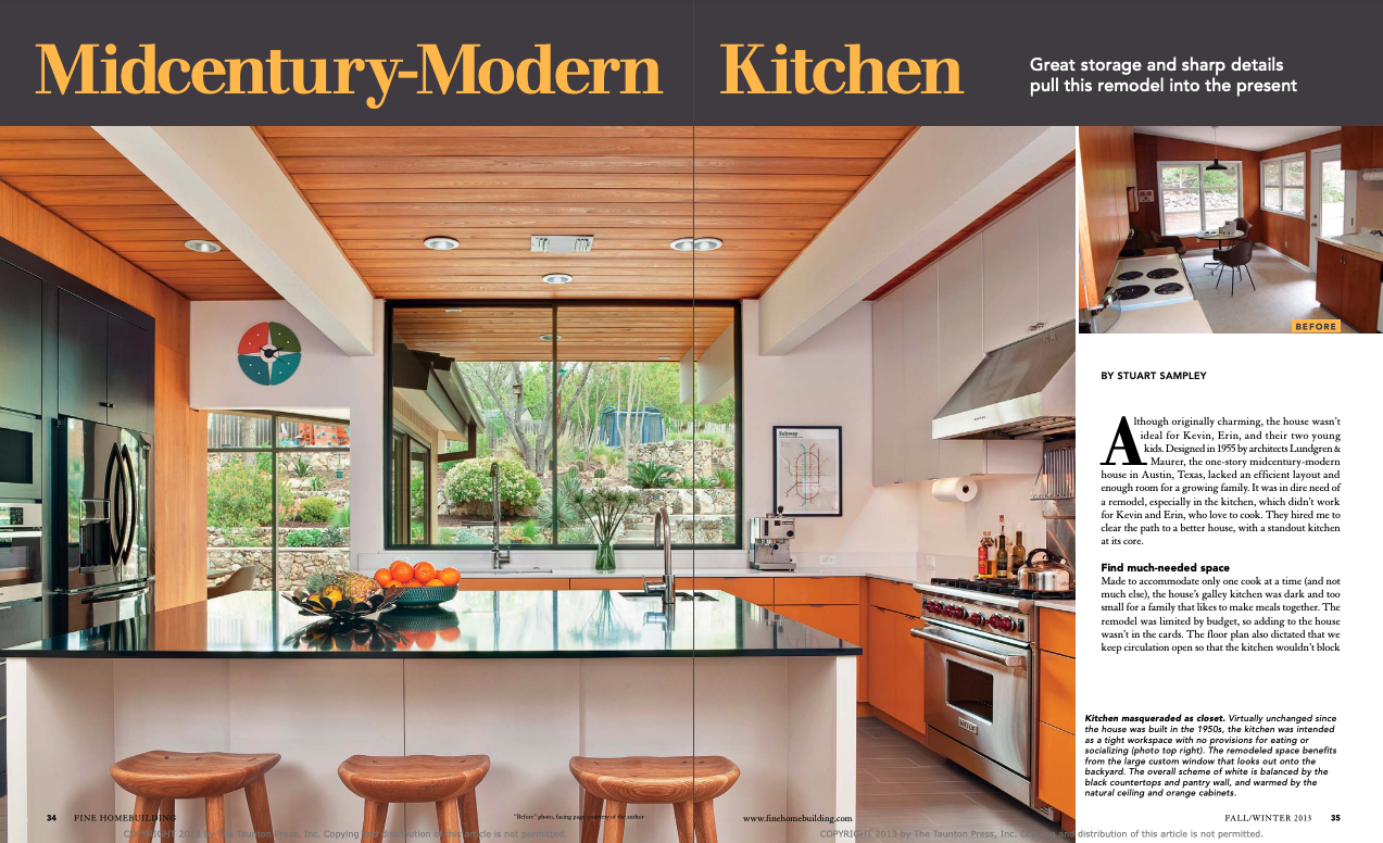
Synopsis: The original kitchen in Kevin and Erin’s 1955 one-story house in Austin, Texas, was dark and small. When the couple hired architect Stuart Sampley to remodel their house, they decided to place the new kitchen at its core. Sampley explains in this article how he reconfigured the floor plan to make this possible. He began by moving the kitchen into the larger space previously occupied by a bedroom and then aligning the kitchen with the exterior wall, giving it a large view of the backyard. This created enough room for a better workflow centered on a large island, which was Kevin and Erin’s most important request. One side of the island serves as a prep area, complete with a sink for washing food, while the other side offers seating for guests. A new wall opposite the range houses the refrigerator, a convection microwave oven, audiovisual equipment, storage cabinets, and a small walk-in pantry.
Although originally charming, the house wasn’t ideal for Kevin, Erin, and their two young kids. Designed in 1955 by architects Lundgren & Maurer, the one-story midcentury-modern house in Austin, Texas, lacked an efficient layout and enough room for a growing family. It was in dire need of a remodel, especially in the kitchen, which didn’t work for Kevin and Erin, who love to cook. They hired me to clear the path to a better house, with a standout kitchen at its core.
Find much-needed space
Made to accommodate only one cook at a time (and not much else), the house’s galley kitchen was dark and too small for a family that likes to make meals together. The remodel was limited by budget, so adding to the house wasn’t in the cards. The floor plan also dictated that we keep circulation open so that the kitchen wouldn’t block access to the master-bedroom suite. My solution was to move the kitchen into the space previously occupied by an adjacent bedroom and then to align this new kitchen with the exterior wall so that it would look out onto the backyard. The new layout extended the size of the kitchen to an ample 16 ft. by 16 ft.
Where the original kitchen once stood, we added a pantry wall to centralize kitchen storage; the pantry wall also houses a bar in the dining room and a media alcove in the living room. With the kitchen considerably larger, there was now enough room for Kevin and Erin’s first and most important request: a kitchen island.
Modeling helps to plan the space
No matter the size of the kitchen, every inch counts. I like to begin the design process by talking to clients about how they’re going to use their kitchen. At Kevin and Erin’s place, we talked about the need for an island for meal prep, and for space so that family and friends could visit with the cooks but not be in the way.
Kevin and Erin move around each other frequently while they are cooking, so we couldn’t leave the space between the island and the lower cabinets to standard measurements. I set the island dimensions at 82 in. by 72 in. but wanted to be sure that this size would work. When the kitchen framing was up, the builder mocked up the planned size and height of the island with a piece of plywood. We then had Kevin and Erin practice walking by each other between the island and the facing counter to confirm that the island dimensions were just right.
For more photos and details on this midcentury-modern kitchen, click the View PDF button below.


