Old-School Kitchen Design Delights with Classic Style
A new kitchen breaks with the trend of open living space.

Many homeowners today share the desire to connect their kitchen to their living spaces. In new homes, this often manifests as a great room. (In remodels, this usually means walls are knocked down.) Jean and Ellen’s colonial New England home had a great room, but they didn’t like it at all.
The kitchen was too small. Jean bakes and Ellen is into healthy cooking; they often work in the kitchen at the same time and were always bumping into each other. Guests made the kitchen feel even smaller. And whether the sisters were having a normal day at home or a dinner party with a handful of friends, when the open space was used for multiple activities or by too many people, it was loud.
Jean and Ellen needed a kitchen with a plan that would work for two cooks, and they wanted it to be separate from the living space in a traditional layout aligned with the original style of the house. Not only did the addition I designed provide the necessary functional space for the kitchen, it greatly improved the look of the backyard.
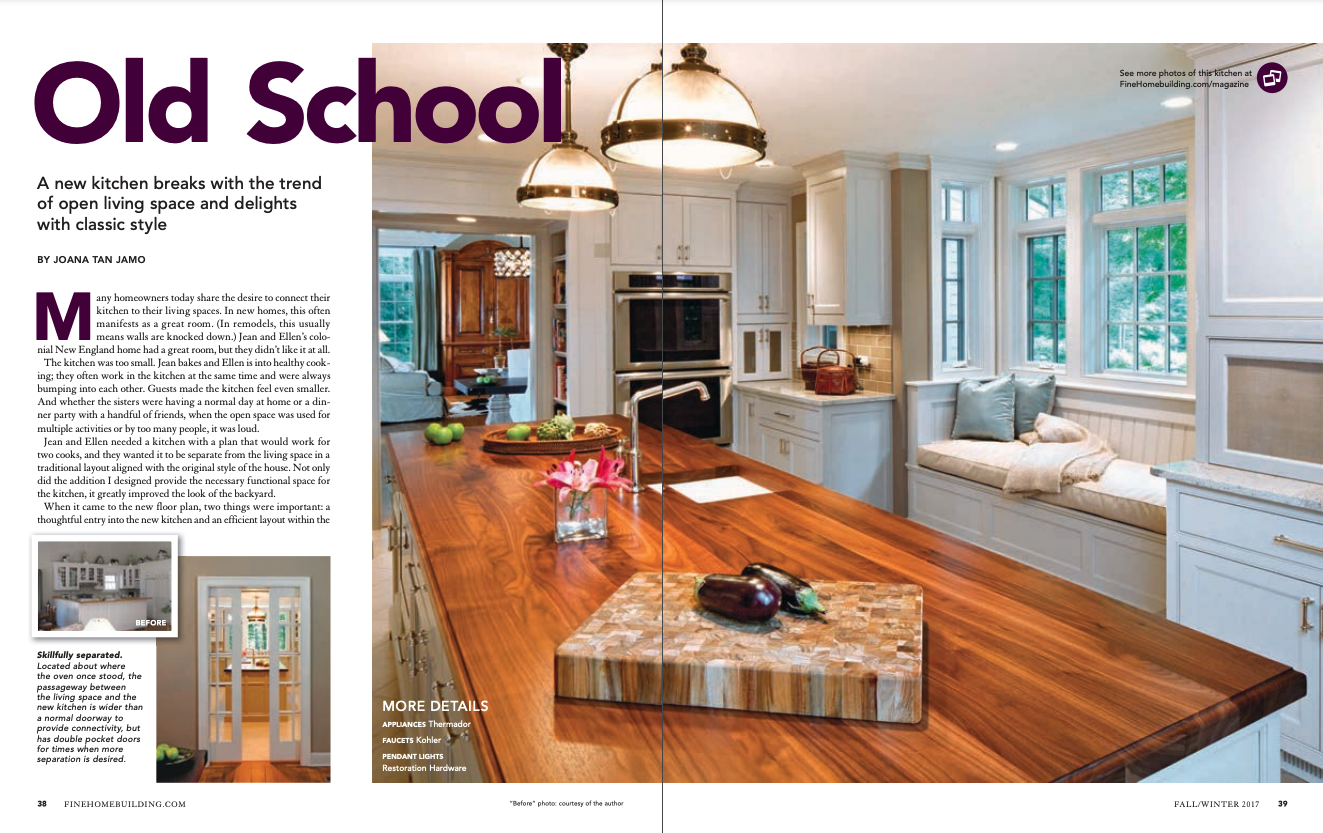
When it came to the new floor plan, two things were important: a thoughtful entry into the new kitchen and an efficient layout within the kitchen based on how it would be used. The new entry does two things. First, it determines how the kitchen is seen from the living space. We made the opening wide enough to provide a decent view into the kitchen and positioned the island, sink, and three windows along the central axis of the view. In this way, the opening frames interesting architectural features and the view extends outside.
The entry also creates an architectural pinch point between the living space and the kitchen. So, while we made the passageway wide enough to offer a decent view, we also lined the vestibule with bookcases and a paneled soffit. The transition between the two spaces is smooth, and yet there is a marked sense of entry as you walk through the tight vestibule into the spacious kitchen. When it came to organizing the kitchen itself, we chose to orbit the island with zones for cooking and baking and specific types of storage for things like dry goods and compost.
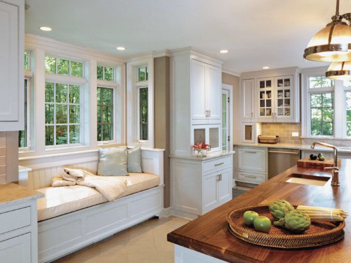
Ellen and Jean had no doubt that the style should be classic New England. We chose to work with muted colors, starting with white cabinets and grey backsplash tile. Ellen picked River White granite countertops with speckled mauve accents. The island was painted a bluish grey and the black-walnut countertop was made by Parkerville Wood Products. This was one of the bigger spends, but we wanted the island to stand out with furniture-like appeal. We also splurged on nickel hardware, which provides a gleaming accent against the muted background.
The cabinets have mostly flat-panel doors and drawers with beaded openings. We used glass doors for the upper cabinets that flank the sink with muntin divisions mimicking those of the central windows and stainless-steel mesh panels from McNichols in a few locations. The mesh panels, like old-school bread cupboards, vent the coffee and compost stations and allow the TV’s remote to work with the cable box concealed behind a small door. Jim Licari Junior and Senior of Licari Woodworking were remarkably helpful with the cabinet design. They turned my elevations into shop drawings and were able to fine-tune the storage with solutions like custom inserts that store the exact pots and pans, glassware, and flatware that Ellen and Jean own and an appliance garage that hides the mixer and food processor right on the countertop.
Regardless of layout and style, all kitchens need good lighting. With two exterior walls in this kitchen, we had an opportunity to capture significant natural light. Since we had already decided on the triple windows at the sink, we decided to add transom windows that extend to the ceiling above. We also made the breakfast bench a bump-out with windows on all three sides. The simulated divided-light windows are from Marvin’s Integrity line and match the home’s existing windows.
We used three fixture types in the kitchen. Recessed cans in the ceiling provide general and ambient lighting, while undercabinet lights illuminate tasks at the counters. Two large pendants provide task and accent lighting at the island.
I recently had the opportunity to visit the completed project, and could see that Ellen and Jean use the kitchen as intended and are pleased with the result. That is the ultimate reward for a designer, and marks the outcome of a successful job. My clients had a clear vision and thoughtful opinions, and all of us worked collaboratively together with the contractors involved in the project.
Joana Tan Jamo, AIA, NCARB, is principal at JTJ Architects, LLC in Woodbury, Conn. (jtjarchitects.com). Photos by Marleen Cafarelli (photoartworks.smugmug.com), except where noted.
For extra photos beyond the print article, click here, and click the View PDF button below to see the article as appeared in the print magazine, with more photos and information.
To view the entire article, please click the View PDF button below.


