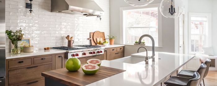
One-of-a-Kind Kitchen Design
While fixing a confused floor plan, architect Hannah Bell weaves together custom-built design elements, generations of family heirlooms, and an eclectic collection of artwork.
“This is my mother’s house and she is a ceramic artist and a sentimental collector, so display was a driving factor.” —Hannah Bell, architect
 |
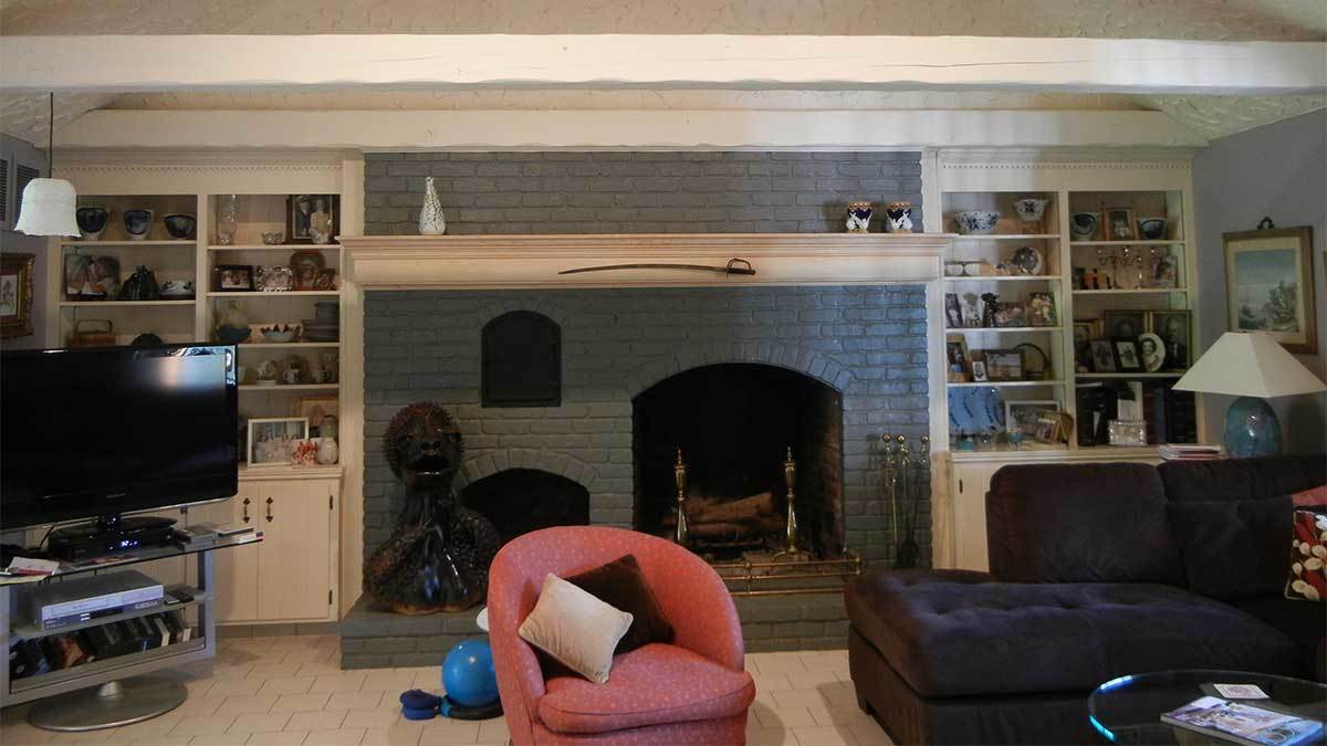 |
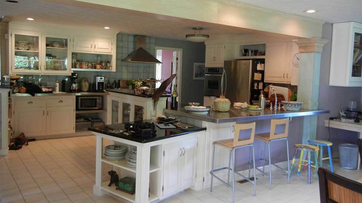
Before
When architect Hannah Bell and her husband, Kevin Bell (also an architect), took on the design challenge of revamping the first floor of her parents’ 1970s colonial-inspired house in Longmeadow, Mass., they had some hurdles to get over. First, they needed to rectify the boggling floor plan, which had the kitchen and dining rooms at the center of the house—sandwiched between a vestibule and a closed porch—making them dark, cavern-like spaces. Also informing their decisions were her mother’s desire to incorporate both her own artwork and generations’ worth of family heirlooms. Additionally, the wish list included pantry storage.
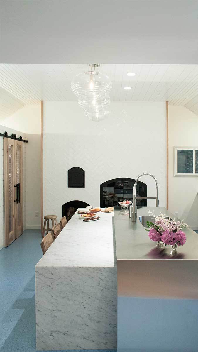
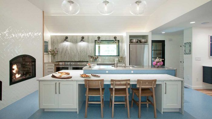
Their first move was to relocate the kitchen, thereby increasing access to natural light and improving the circulation between the main living areas and the rest of the house. The kitchen was moved into the former living room, where the fireplace was significantly altered; the hearth was removed, the height was raised to be above the counters, and tile was brought up beyond where the brick had stopped.
Now, the kitchen connects directly to the sun porch, which brightens the space. The room had previously featured a peaked ceiling, which the Bells lowered, removing some beams in the process. Interestingly, according to Hannah, the kitchen’s new location outside the main volume is more in line with the early colonial architecture after which the house was modeled.
 |
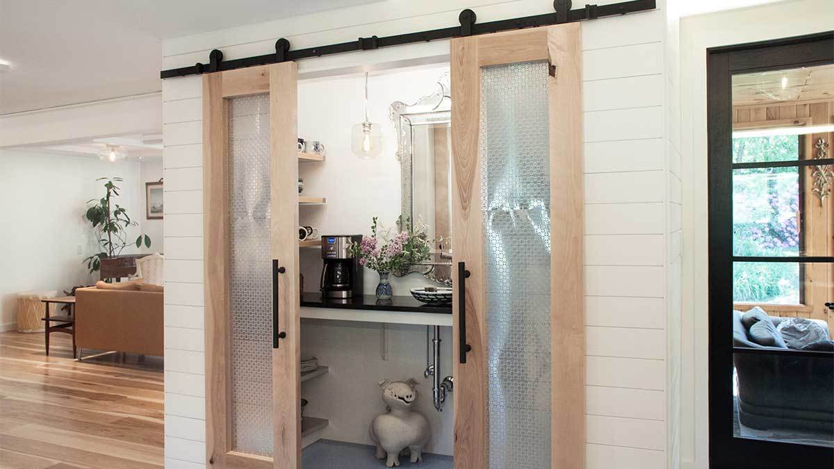 |
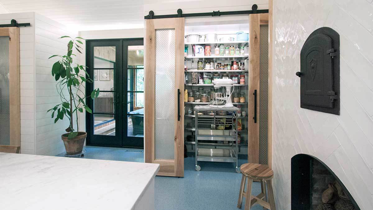
Reworking of the kitchen included narrowing the French doors to the sun porch in order to accommodate the new pantries. To compensate, they raised the door height to maximize daylight. Hannah designed the pantries and together she and Kevin built them. One is strictly utilitarian with floor-to-ceiling stainless steel shelving, the other is more of a coffee bar. With a kind of Victorian vibe, the latter is meant to be attractive when open. “I was trying to include my mother’s things,” Hannah notes. “That mirror belonged to my great grandmother.”
The sliding pantry doors are notable for their panel insets, which were fabricated from radiator coverings and installed with small nails on the backside. Another innovation was to use a Wood Panel X-Mold to create a reveal where the edges of the panels meet at an outside corner joint. This detail was used to hide imperfections in the ship lap’s alignment at the corners—caused by expansion and contraction of the wood.
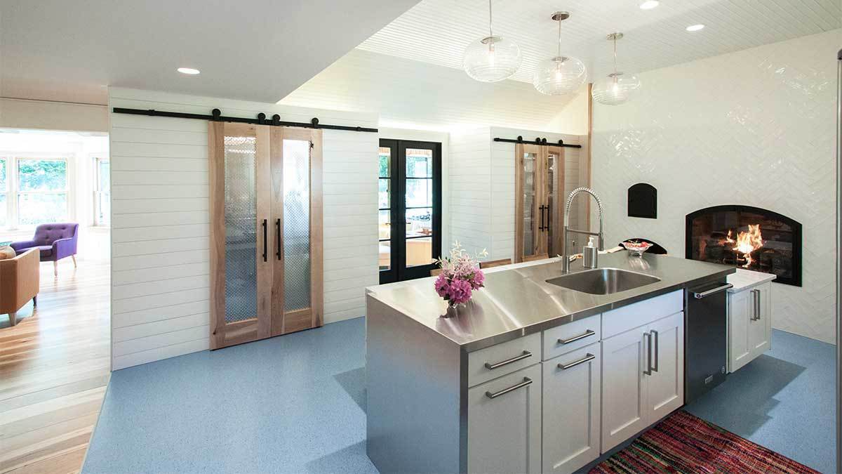
The dressier pantry sits beneath ceilings of different heights. This was done in order to make it align with the front door, which, in turn, expanded the kitchen. “That was a tricky part to figure out,” Hannah says. “It felt like we should keep [all of the kitchen elements] inside the tall portion of the ceiling, but this way, I was able to make the room a little bigger.”
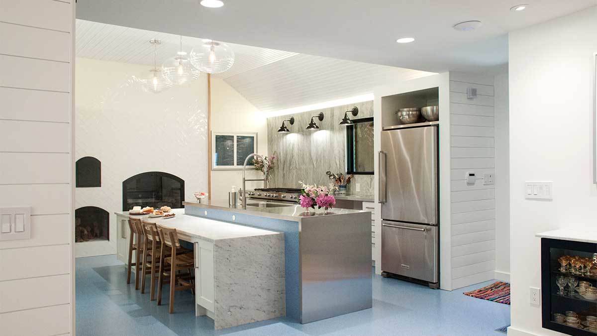
Of course, the waterfall stainless steel island is a defining feature. Hannah designed it and the couple installed it themselves. “We’ve started to perfect stainless steel countertops,” Hannah notes, adding that they make templates for a local fabricator to follow. “The trick with the island, which includes four corners, is that you can’t just slide the top on. You have to make a template that comes apart. You need to be able to take the outer boarder off and then reassemble it once they’ve welded the sink and countertops.” Where the stainless steel wraps around to meet the cabinet on the waterfall side, they added slightly loose-fitting steel in order to be able to slip beneath it. “It’s not hard to accomplish, but you have to think about it. And until you’ve done it, you don’t even know what to think about,” Hannah muses.
Other notables include the commercial-grade rubber floor and the unusual backsplash, which is made of marble thresholds typically used on floors. This was a cost-savings solution to the expense of a marble slab, which the contractor was hesitant to install, given the weight. “It was way less expensive and it added another layer of texture and pattern,” Hannah says. It also plays well with the high-gloss 3-in. by 9-in. herringbone-patterned subway tiles, which Hannah likes for their undulating, handmade look. The other treatment of note is the LED tape lighting that runs in a channel at the top edge of the tiles. Used to wash the ceiling in ambient light, it is yet another measure to transform the previously dim space. LED strip tape was also used around coffered ceiling in the dining room for the same reason.
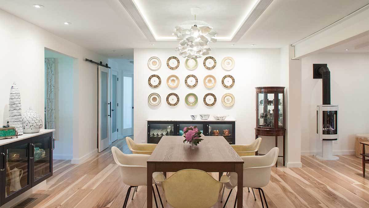
The floor plan shuffle included situating the dining room at the center of the house, and the living room was switched to the rear, where it is somewhat removed from regular foot traffic. With views of the gardens, it is significantly more inviting than it had been. The new dining room location, on the other hand, is meant for easy everyday circulation; and its openness allows the table to expand to seat additional guests.
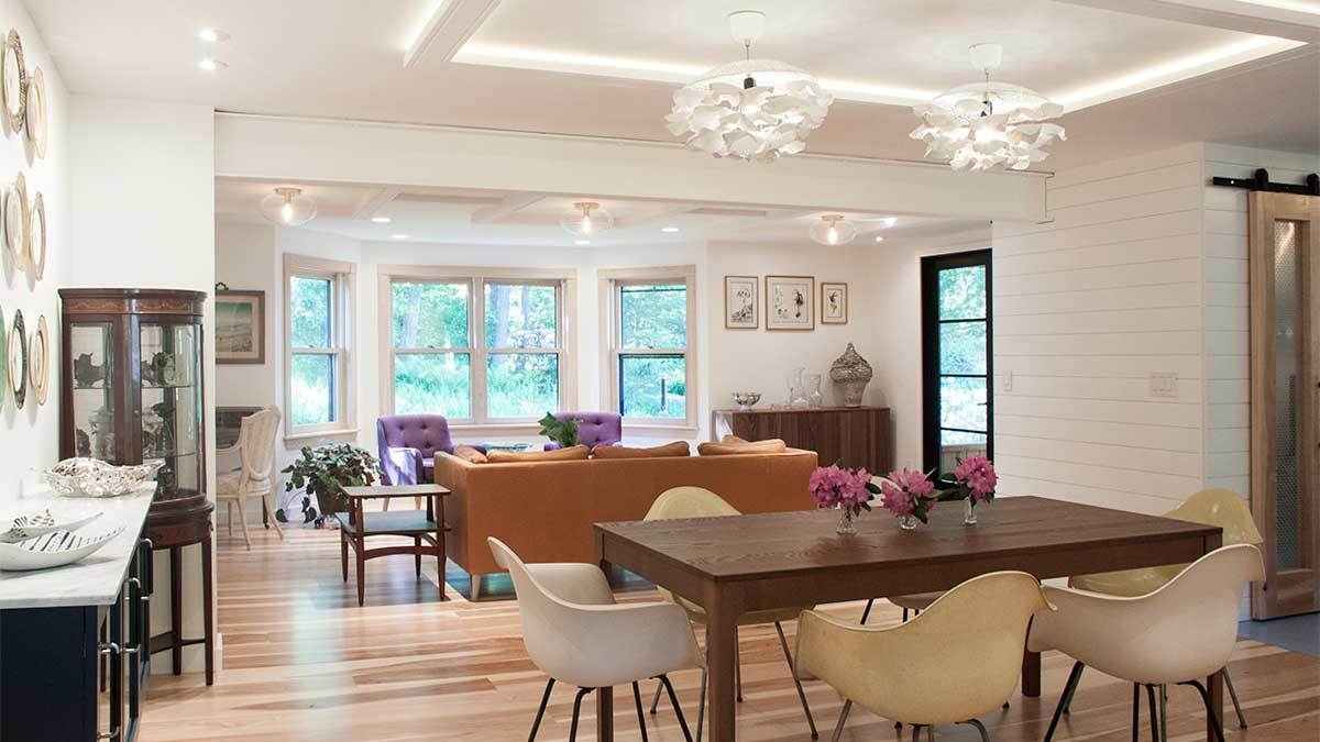
During the remodel, the designers discovered a 12-ft.-long steel beam that had been poorly disguised to look like a wood beam. The decision was made to leave it exposed and paint it, which pushes the contemporary aesthetic. Also contributing to the style are the homeowner’s many art pieces. “Her work is installed throughout the house,” Hannah notes, giving the examples of the hand-thrown counter sink in the coffee pantry and the chandeliers above the dining room table. “Places for antiques, watercolor paintings, prints, and future art were an important part of the renovation.”
Photos courtesy of Hannah Bell
RESOURCES
Kitchen flooring: norament grano from Interface; color: Agapanthus
Hardwood flooring: 8-in. solid hickory from Carlisle Wide Plank Flooring
Shiplap corner detail: Wood Panel X-Mold from Flannery, Inc.
Kitchen backsplash: marble thresholds from Daltile
Fireplace wall: 3-in. by 12-in. Artigiano from Daltile
If you have a kitchen project that might be of interest to our readers, please send a short description and images to kjacques@taunton.com.
For more kitchen remodel projects:
- Hyde Park Kitchen Remodel
- From Kitchen Refresh to First-Floor Remodel
- Modern Remodel of a French Tudor Home
Fine Homebuilding Recommended Products
Fine Homebuilding receives a commission for items purchased through links on this site, including Amazon Associates and other affiliate advertising programs.

Code Check 10th Edition: An Illustrated Guide to Building a Safe House

Not So Big House

A Field Guide to American Houses
