Row-House Kitchen Remodel
Reconfiguring an oddball bathroom vastly improves the functionality of a small kitchen.

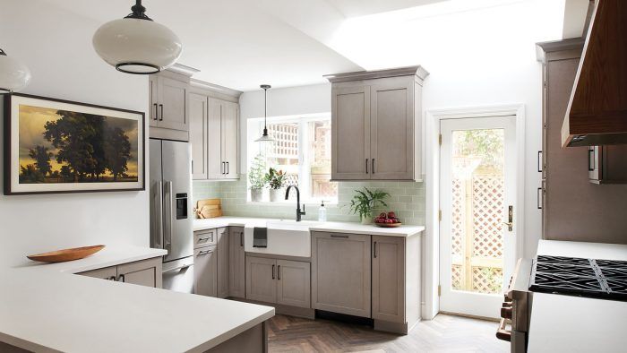
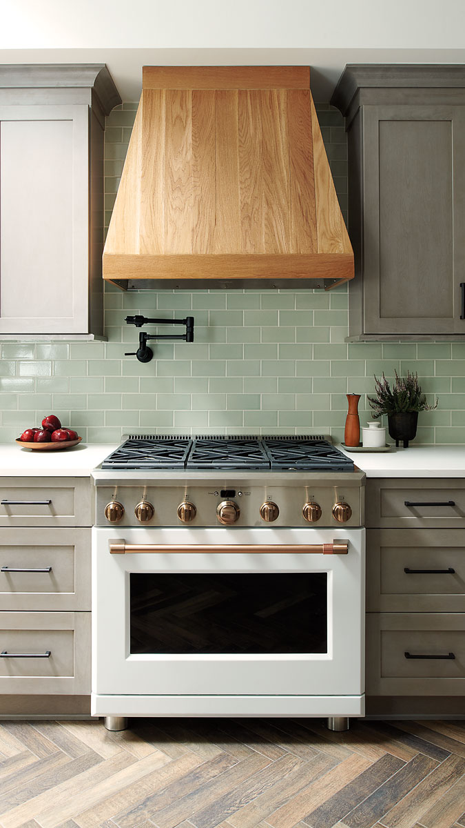
Synopsis: This late-1800s row-house kitchen had an awkward layout with a small half-bathroom encroaching on the space. The design team reworked the layout so the two rooms now work in tandem, incorporating a structural load-bearing post into the design. The five different ceiling levels in the original kitchen and dining room meant smoothing out the planes and creating a tray ceiling. A number of small but unique decisions including a wood range hood and an accent pendant light off-centered from the sink make this kitchen design truly shine.
Designer Nicole Cole, principal of vestige HOME, is accustomed to working in Philadelphia’s old row houses. She treasures their historical details and time-worn feel. “Even when it’s a new space, we want it to feel like there’s a bit of story to it,” she says. “It should be contextually appropriate.” That mindset informed the remodel of this late-1800s row-house kitchen. The homeowners wanted a new space optimized for frequent family meals, and materials had to be tough enough to handle two young boys. It was determined early on that the renovation would not be possible without also addressing the adjacent, awkward half-bath.
Working out the kinks
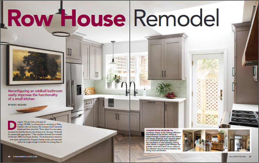
The oddly shaped and poorly placed bathroom’s curved wall pressed into the kitchen, eating up valuable square footage. Outside the bathroom, awkwardly located French doors, an exposed support column, unfinished cabinetry, and an obtrusive refrigerator also needed to be dealt with. “There was a lot of unusable space that made the whole area feel unconsidered,” Cole notes, adding that without adequate storage space, items ended up crowding the undersize counter space.
Builder Kenny Grono of Buckminster Green, who carried out the renovation, explains that originally, between the dining room and kitchen, there were five different ceiling planes—including two soffits and a skylight well. One soffit continued out of the kitchen on one side, and then turned 90° in the dining room. Another, on the opposite side of the kitchen, ended at the now-removed dining room wall. The soffits were off from one another by 1-1⁄2 in., and the main ceiling in the kitchen was roughly 3 in. out of plane with the main ceiling in the dining room. To smooth out the planes, Grono extended the soffit on the range side of the kitchen to create a tray ceiling. “That soffit isn’t functional,” he notes, “but it made things seem more intentional. We also evened out
the dimensional differences between things.”
 From Fine Homebuilding #285
To this article as a PDF, please click the View PDF button below.


