Warmly Modern
A straightforward kitchen remodel checks off every box on the clients' wish list.
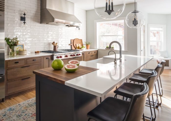
It’s not often Colorado-based designer Laura Medicus has the chance to remodel a kitchen in a newer home. “My projects usually involve houses from the 1950s, ’60s, and ’70s, so it was pleasurable in this case because not a lot went wrong—there weren’t any structural surprises.”
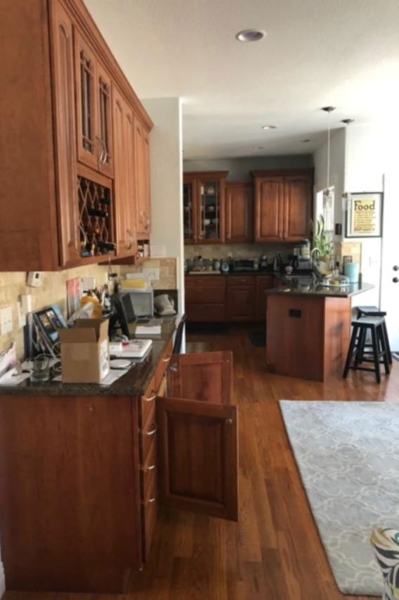
Built in 2006, the house features generously sized rooms, though the kitchen suffered from a poor layout. It also had that “wood-and-brown-leather” look, as Medicus describes it, that is common in the region. The configuration made it an awkward space to occupy, never mind in which to cook for and serve a family of four. The primary objective was to make the room function on the most basic level: as a kitchen.
Old Floor Plan
 |
 |
New Floor Plan
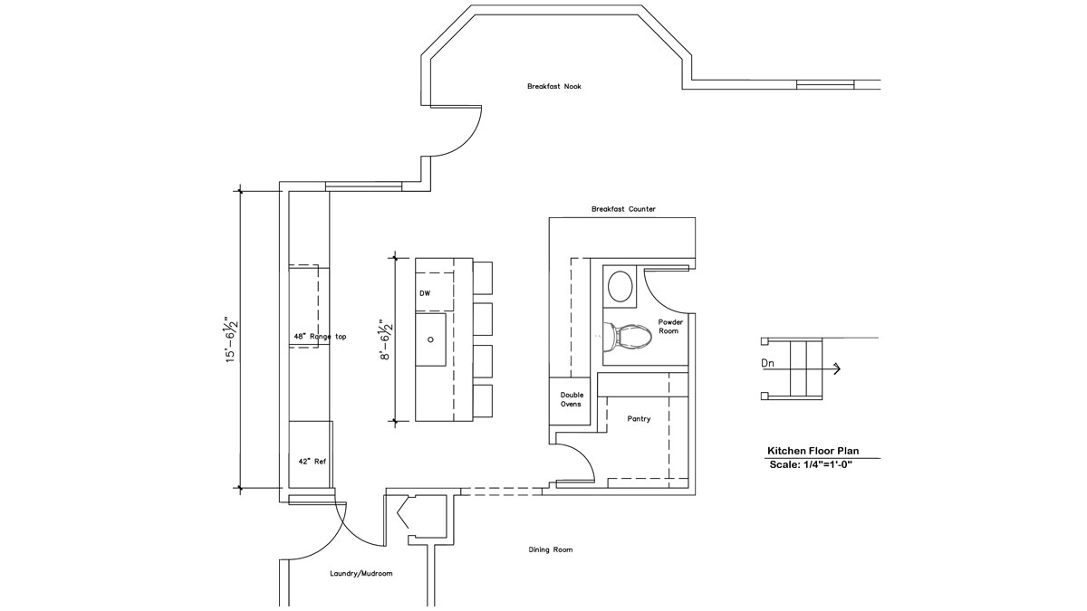
An island was key to improving functionality. Prior to the remodel, seating was limited to two stools at a peninsula next to an exterior door. The owners wanted seating for four, hence the island. They had removed the island that originally came with the house because it sorely outsized the space. When it was out, they discovered that the builders had not run wood flooring beneath it. Their solution was to patch it with tile. This incongruity of tiling in the middle of the hardwood floor made the odd space even stranger. To make a new island feel comfortable and appropriately scaled, Medicus reconfigured the floor plan by moving the powder room. That helped to make space not only for the island but also for a pantry, which was a top priority.
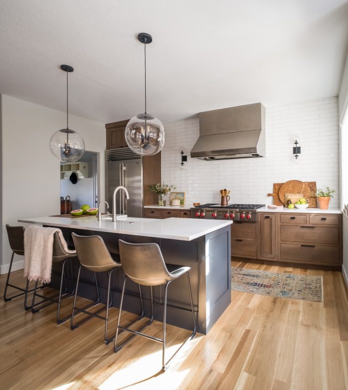
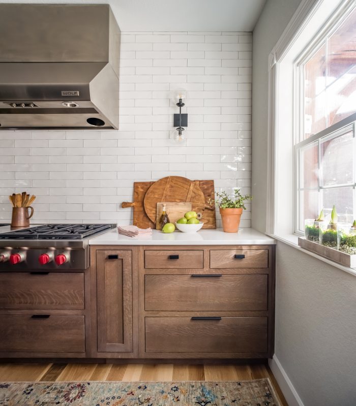
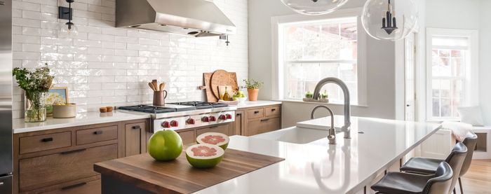
One of the owners loves to cook, so the work triangle Medicus designed works well for her. There’s a lot of breathing room given to the island, which features an inset walnut cutting board, as well as to the 48-in. Viking range and industrial-size hood. “That stove is a beautiful appliance, so giving it some space to show off was important,” Medicus notes.
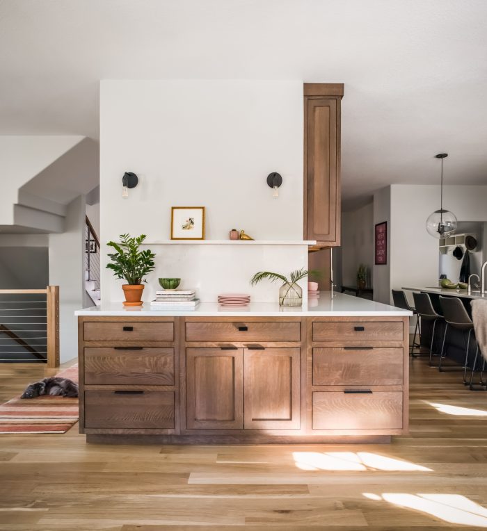
Cabinets were kept to a minimum. Storage was worked into the island and the workhorse of a central unit that houses the pantry and bathroom. “Any time I have a client who says they don’t need upper cabinets, I’m glad to omit them,” Medicus says, adding that their absence increases the breathing room she was after. “In a bigger home like this, there are ways to get around needing upper cabinets.”
The client had requested flat-faced drawers, which, in combination with the engineered quartz countertops, the designer says contribute to the room’s “warmly modern” feel. The high-gloss tile from Surface Art that she spec’d for the backsplash does the same. “It reflects the light beautifully and adds a special shimmery quality to the space.”
Together, the strategic floor plan and fresh materials make this a no-nonsense kitchen with wholesome appeal. Plus, it works as a kitchen should.
Photos courtesy of Laura Medicus Interiors
If you have a kitchen project that might be of interest to our readers, please send a short description and images to [email protected].
For more kitchen remodels:


View Comments
nice