How to Choose Paint Colors
There are no rules, but a bit of color theory and some expert tips will make your decisions easier.
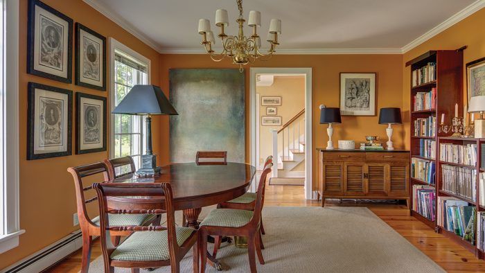
Architectural color consultant Amy Krane discusses the basics of color theory, the relationships of the colors on the color wheel, and the differences between “tone,” “shade,” and “tint.” When choosing colors for paint and décor, there’s much more to consider than just hue: color brightness, paint sheen, and even the light in the room will affect the outcome. This article shows some ways to create a color palette that suits the architectural style of a space.
So the sheetrock is up and you’re faced with a blank slate. You may be overwhelmed by the seemingly endless choice of colors, not to mention paint brands and finishes. You may doubt your design chops, fretting over which color “goes with” which, thinking there is only one answer. It can be paralyzing.
Choosing paint colors presents a challenge for homeowners and building professionals alike. I am trained as an architectural color consultant, but you don’t need to be a trained colorist to get architectural color right. Understanding some basics about color—how to combine colors, how light affects them, and how the human eye responds to color generally—should give you the confidence you need.
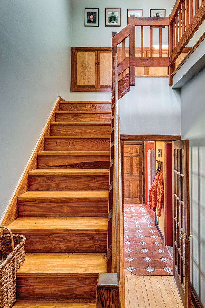
Hard-and-fast rules don’t work when choosing color. Each set of environmental variables presents options that work, but as one variable shifts, they all do. The number-one thing to remember is that every person comes to the painting party with their own individual likes, dislikes, and color associations that are just as important as (if not more than) any guidelines. Nevertheless, here are some fundamentals to get you started.
Repetition creates flow, cohesion, and balance
Flow refers to how we perceive our movement through a space. Is there a feeling of natural progression as we move from room to room, or does a color choice stop us in our tracks? There should be a pleasing rhythm to color placement as you advance through a house. Like the movement of water, we want to experience a home in a fluid way. Repeating colors or using variations of a few different hues helps with flow.
Cohesion is achieved when there are recognizable color relationships employed in the color choices. Using complementary or analogous combinations creates integration between colors in a room as well as the whole house. For example, if a yellow-green is used for the walls of a home office and across the neutral hallway sits a yellow dining room, the analogous relationship between these two colors ties the rooms together and helps unify the color palette.
Balance means the distribution of color feels even-handed. If the whole house has light or neutral colors, but there’s one public room that is saturated or dark, the palette won’t feel cohesive or balanced. (Nonpublic rooms where doors stay closed like bathrooms and bedrooms don’t really count here.) Mixing warm and cool colors in a space helps with balance because you’re using colors from opposing sides of the color wheel, which offset one another.
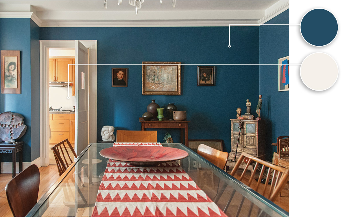
To enhance all of these effects, use colors more than once throughout a home. A home with a different color in each room feels chaotic and unbalanced. Choosing a few hues and employing different tones and shades of each throughout the home provides flow and cohesion. To make the choices easier, make public arteries such as hallways a neutral color to help with balance and flow. You want to have visual breathing room so the house won’t seem like a kaleidoscope of distinct hues butting up against each other.
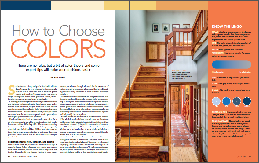
From Fine Homebuilding #300
To read the entire article, please click the View PDF button below.
RELATED LINKS
Fine Homebuilding Recommended Products
Fine Homebuilding receives a commission for items purchased through links on this site, including Amazon Associates and other affiliate advertising programs.

Not So Big House

The New Carbon Architecture: Building to Cool the Climate

A House Needs to Breathe...Or Does It?: An Introduction to Building Science
