How to Choose Exterior Paint Colors for a Home
For a timeless exterior aesthetic, consider the home, its surroundings, and your personal style.
Synopsis: Architectural color consultant Amy Krane discusses some factors to think about when coming up with a whole-house exterior-color palette, such as understanding a home’s architectural style, region, landscaping and hardscaping, and more. She lists a number of combinations and choices to avoid when considering exterior color, and how to think about trim and other decorative elements.
Whether they’ve just bought their home or are looking for a refresh, more people contact me about choosing exterior colors than about any other single topic. It makes no difference whether their house is a highly decorative Queen Anne Victorian or a more humble raised ranch. Even when the cladding is a material that comes prefinished in a limited color range, choosing a cohesive and pleasing color palette still creates anxiety. To make the process more approachable, here are the most important factors to consider when you’re coming up with a wholehouse exterior-color palette.
Know the Neighborhood and Plan Accordingly
Architectural style and region
Certain home styles are more prevalent in different regions of the country, and these architectural styles sometimes go hand in hand with specific color schemes. Think of the Pueblo- or adobe-style homes of the Southwest and Southern California. Their red terracotta roofs and facades made of adobe or stucco are commonly painted the colors of the desert, such as clay, tan, and cream. Likewise, Mediterranean and Spanish-style homes of Southern California and Florida, also with terracotta roofs and stucco exteriors, are often white or off-white, terracotta, rose, peach, or even gold.
Craftsman homes found in almost every region are usually painted in earth tones. Greek revivals are often a cool white. Victorian homes of the Second Empire and Queen Anne styles typically employ multiple colors on their facades and strong contrast between the colors. Homes in the Adirondack Mountains are frequently dark brown with red trim.
Besides a home’s architectural style, the climate also greatly affects the colors that are typical for a region. This is partly about the nature of the light received in that location due to its latitude. The closer to the equator, the more directly overhead the light is. The intense sun of the southern United States will bleach out pale and muted colors, so brighter, more saturated colors are traditional there—think of the turquoise, pink, and coral homes of Key West in Florida.
On the other hand, more northern climate zones such as those of the Pacific Northwest and New England receive light after it has passed at an angle through the atmosphere that gives it a more delicate and muted profile. This diffused light is more appropriate for softer, muted colors.
The more recent trend of deep, dark houses (more about trends later) is seen in many regions of the country, but not the South. Not only would the dark colors fade faster, but they would increase cooling bills and look out of place. The Department of Energy notes that dark, flat (not glossy) colors can absorb 70% to 90% of the sun’s radiant energy, which can be transferred into the home. Light-colored surfaces reflect the heat away from a house, keeping it cooler inside.
Fixed materials and hardscape
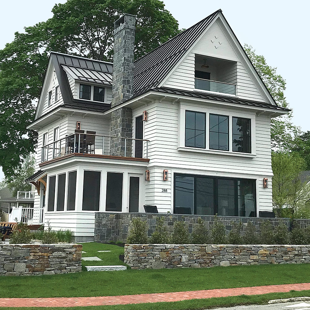
One of the biggest factors to consider is your roof’s color. Making sure the facade and roof coordinate well is paramount. Most folks use architectural shingles to cover their roofs; otherwise it’s metal or terracotta. While the latter two will be one solid color, the shingles are composed of granules that are almost always multicolored even though they produce one overall tone when considered from afar. This multitude of colors creates opportunities for pairing with various different paint colors.
If you’re deciding on roof color as well, keeping the roof more neutral overall, as with a midtone gray, gives the most flexibility when picking paint or siding colors. If your shingles are brown or green or even black, you’re more limited in what will work well. A very dark color like black will create high contrast with light colors on the house.
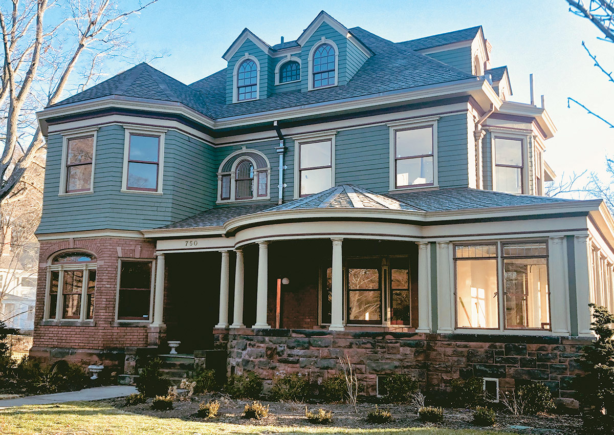
Likewise, any stone or brick on your home, be it on the chimney stack, the foundation, or anywhere on the body, will add a level of complexity when you’re choosing paint or siding colors. You need to decide if you want to have those fixed colors blend or contrast with the siding. If you choose a complementary color pairing, such as a pinkish stone with a green cladding, it will make each color stand out, whereas if you choose a brown for the siding with a pinkish stone (a neighboring color), they will mellow each other out and settle the whole color scheme down. When the house contains stone, you can pull from the stone colors or even the mortar to coordinate with your siding.
Red brick is a powerful color and requires careful consideration when you’re picking paint colors to work with it. Midtone neutrals such as warm grays, muted sage greens, dusty slate blue– grays, and tans work well, as do deeper colors like dark blues and greens and even some browns. Pale colors are more challenging to mix with brick, as they are overpowered by the red, and the color palette can feel unbalanced. Black is a stunning, bold choice to use with brick, be it red or yellow-tan.
Sometimes there’s more to consider in your color scheme than just the house facade. Think about porches, decks, railings or fencing, and nearby outbuildings. They all must be coordinated. For exterior decking and porch flooring, I like to consider colors that hide dirt, wear well, and simulate earth to a degree. These include both neutral grays like cement gray and warm ones like taupe. Also consider using tans or shades of brown. White shows dirt and wear more readily, while black is too stark. Keep in mind how cohesive your whole color palette needs to be. While it could look pleasing to highlight certain architectural details like brackets, corbels, railings, and a front porch, giving the porch its own color can cause it to feel disconnected from the overall aesthetic.
Color can also help mask an architectural detail you don’t like that may be cost-prohibitive to change. Painting a door the color of your siding helps it disappear. Painting your house’s facade close in hue to a low-pitched, unattractive roof will put less emphasis on the roof because your eye flows down onto the siding color without stopping to examine the differences between the two.
When the architectural style is ripe for applying a different color on the top floors than the bottom, it’s usually more pleasing to put the darker color on top, as it grounds the house by giving more visual weight to the upper floors. Many homes have exposed concrete foundations; if you want to paint or stain them, I suggest either using the siding color (unless it’s white or a light color) or choosing a warm earthlike neutral that can recede behind shrubs. A taupelike warm gray works well here.
HOAs and historic commissions
How important is it to be historically accurate? That’s up to you, unless there’s a homeowner’s association (HOA) or historic district commission dictating the colors you can use. People have misconceptions about the colors of yore, often imagining they were all muted. Historical paints were all made from natural pigments, and although those colors included white and cream, they also included orange, deep red, ochre yellows, and other bright colors depending on the period in which they were prevalent. One only has to tour Monticello, the home of Thomas Jefferson in Charlottesville, Va., and see its interiors, or to visit Historic Deerfield, Mass., and view those exteriors to realize how bright colors were in colonial times. If you are interested in historical accuracy, there are sources for that information. Try your state’s historical commission, academic institutions, and restoration organizations.
Your home might be in a development guided by an HOA. HOAs often value a cohesive, somewhat uniform look and prescribe what colors and materials are permitted on a facade. They may prohibit two homes of the same color next to one another, or they may request that you pick from a particular list of paint colors or otherwise limit your choice to certain kinds of colors.
Historic commissions usually aim to keep a home’s exterior looking as authentic as possible. They require paint-color palettes that fit within the context of the historical colors appropriate for the era of the home. Making sure your house’s exterior isn’t governed by some larger organization will save you money and headache when it comes time to paint.
Landscaping
It’s a mistake not to consider the plant life around your home, both foundation planting and the trees and shrubs farther back. Large deciduous trees can block a considerable amount of sunlight during the seasons they are leafed out. This means your home will be more in shadow during those months than otherwise. This lack of light will make colors appear darker. Dense foliage around the house can also cast greenish-toned light on the exterior, which can affect the appearance of colors. And don’t forget about flowering perennials—they may be short-lived, but many people consider their maximum curb appeal to be when the flowers are blooming.
Choosing Trim, Accent, and Door Colors
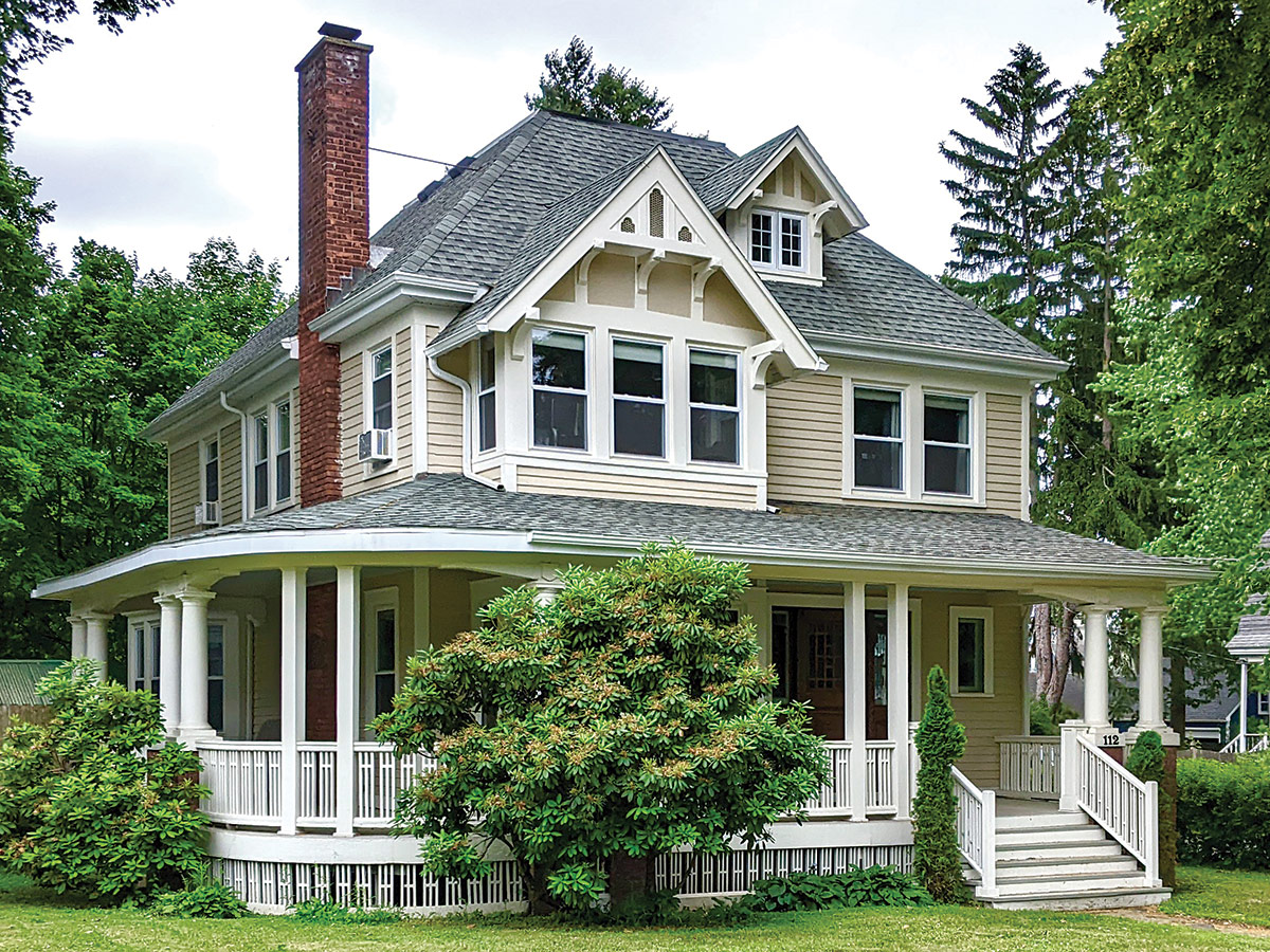
There is no magic formula when it comes to accent colors on a home. How you approach these choices should be governed by your answers to three questions:
- What is the architectural style of your home?
- How closely do you want to adhere to stylistic and regional norms?
- What color combinations appeal to you?
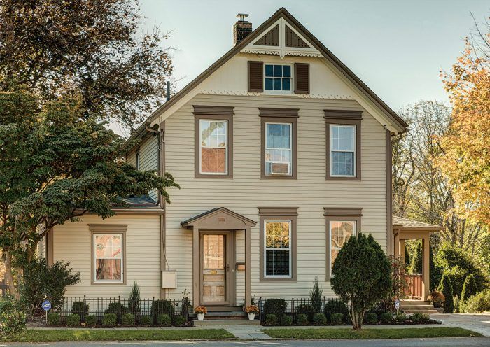
The body color of the home comprises the largest mass of one color on the facade. If your trim is the same color as the body, which is both a historical and modern approach, you will create a very calm exterior. In this scenario, visual variety will come only from the color of the door or doors. The more variety you introduce into the whole house palette, the busier it will look. It’s ultimately about your desired aesthetic.
If you like the dramatic results from high-contrast color combinations, then use contrasting color values (darks and lights) and/or different hues when picking trim, accent, and door colors. One color for all (or some) of the trim, one for the door(s), and one for shutters in addition to the body color is very common.
Doors
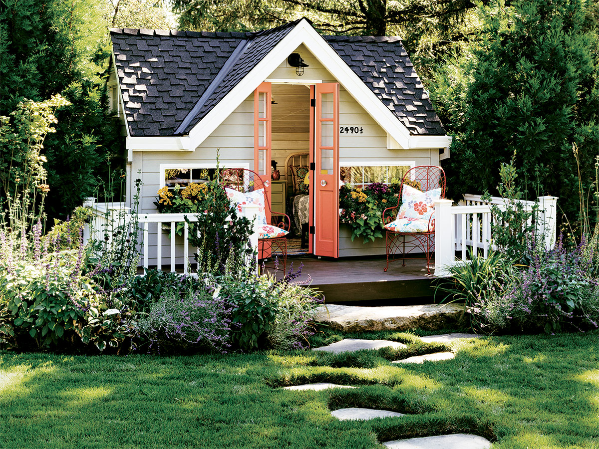
The front door is the place where people feel most comfortable making a statement. It’s where bright, saturated, high-chroma colors can be used without making the whole house appear garish. I usually prefer the door to be its own color. Look for a color that complements the body color. On a dark body, both a pale pastel and a bright color work well. If you use a distinctive color on the front door, you may want to consider a more sedate color on other doors. This will signify the importance of the front entrance. Consider having side entrances and back doors match the body color in a higher sheen.
Windows
Take into consideration the color of the windows themselves (sashes, rails, and grilles). The current trend of dark black, charcoal, brown, and bronze windows encourages the eye to travel through the glass, almost making these window parts disappear. White windows, on the other hand, stop your eye at the glass. If you want white windows and door trim, try a white that includes a bit of other colors. This undertone will “knock it down” and have it appear less stark. Some nice choices (depending on your body color) are Benjamin Moore’s China White, Capitol White, Mountain Peak White, Cloud Cover, and Acadia White. Or check out Sherwin-Williams’s Shoji White or White Flour. Beiges can even appear white outdoors. Colors like Benjamin Moore’s Calm and Soft Chamois fit this category.
Trim and accents
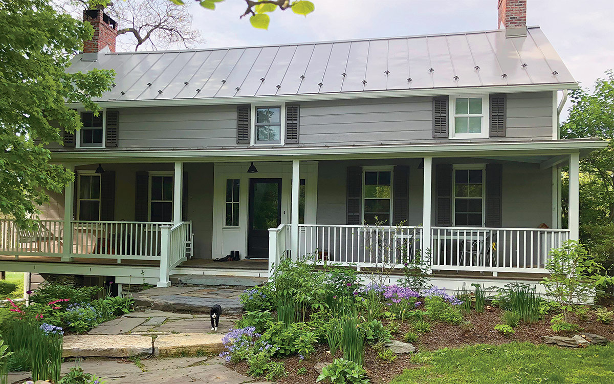
A distinct trim color can be applied on a variety of areas to accent the facade. It can go on the vertical corner boards, a belly band, soffits, fascia, brackets, corbels, porch posts, and even fencing. Typically fascia and soffits look best in the same color.
Only certain house styles look good with the addition of accent colors. Painted lady–type Victorians come to mind, as well as styles with gables in the front that can benefit from a color different from the body color. It’s all about how much pattern you want to add to the overall look.
Find Your Aesthetic
Inspiration
Start with how you want your home to appear within the context of the neighborhood. Do you want it to blend in with the surrounding homes or to stand out? It all starts with this question. Then move on to what color combinations appeal to you. Are you more attracted to a multicolored facade? Do you want to bring attention to your trim by highlighting it with an accent color different from the color on the body of the house? Do you like color combinations that blend softly into each other, or ones that create strong contrast? The answers to these questions will help you narrow down your choices.
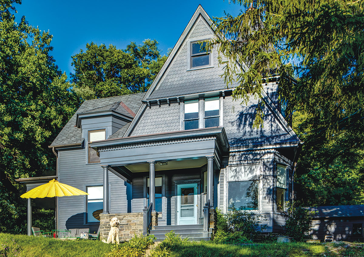
To help you zero in on what you like even more, take a drive around your neighborhood and see what’s already there. Take pictures. Nothing helps you visualize what a color combination will look like in the outdoors more than actually seeing it on a house. Just be careful not to emulate the houses right next door or across the street from you unless your whole street is of a similar architectural style and they’re all more or less the same color palette. I can think of a number of New England roads where the homes are all of one era and are all painted white with black shutters. That doesn’t mean you have to do the same, but if you don’t, your home will really stand out.
Next, seek more inspiration. I can’t think of a better use of websites like Pinterest than for looking at scores and scores of home exteriors. Though you may not find photos of your exact home style, you can get really close. If your house is two stories, for instance, a photo of a similar house with contrasting trim or shutters like yours will help you imagine how yours will look in those tones. Remember, though, that colors viewed online are inaccurate. It’s not likely that what you see on your computer will translate exactly to your home’s exterior.
Testing
Buying paint to test is imperative. Never simply choose a color from a picture you see online. You can start with large paper samples (these are available from color consultants and other design professionals), but ultimately, only painting large, 4-ft. to 5-ft. squares on the home itself, with two full coats, will tell you what it’s going to look like. I can’t tell you how many times I’ve seen test swatches only as big as a single strip of clapboard—it’s just not enough to know! Because of the amount of natural light outdoors, colors outside appear lighter and brighter than they do indoors. Though painting on a large board that’s primed will show you a lot, the actual substrate of the house might alter the appearance of the color, so painting on the house is best.
Talk to your painter about your options for the paint’s finish or sheen. Highersheen paint is more durable and adds reflectivity, which prevents some light and heat absorption, but a glossy house likely won’t be the look you’re going for, so you’ll need to weigh appearance against durability. Talk to your painter or paint store rep about the correct paint and stain options for all the substrates you are covering. Make sure to discuss the need for priming and the color of the primer best suited to the paint colors you’ve chosen. (For more on primers for exterior applications, see A Primer on Primers, FHB #280.)
Trends
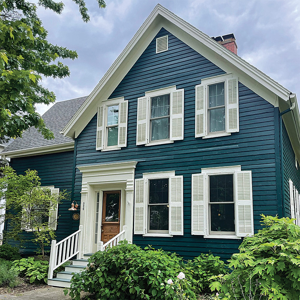
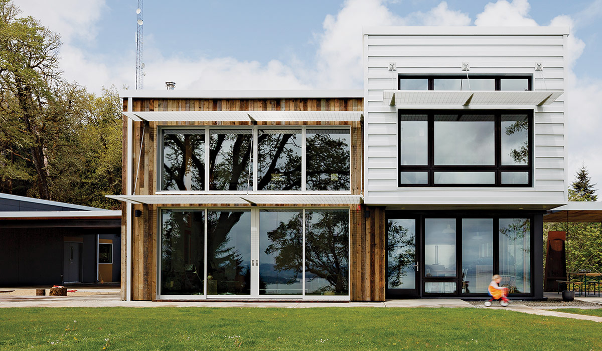
For the past few years, dark facade colors such as black, charcoal gray, and dark blue have been gaining in popularity and acceptance in many parts of the country. There have been other trends in the past few decades as well—like painting red brick white or off-white, and creating a modern farmhouse look with white board-and-batten siding and black windows. With the cost of painting an exterior sometimes running into the tens of thousands of dollars, you should think long and hard about investing in a trend that may not stand the test of time—or 10 to 15 years at the least. Dark house colors fade faster than light ones do, so not only might they cost more to get proper coverage, but depending on the environment where you live, they are likely to need repainting sooner.
If you plan on selling your house soon, it’s best to paint it in color combinations that are not considered trendy or idiosyncratic. We all have different tastes, and while a black house might excite you, it may seem ghoulish and unappealing to a buyer. There are plenty of colors and combinations considered classic, and that’s your best bet when planning to sell. Cream for a stucco house, white with black shutters for a colonial, or earthy tones for a Craftsman will never raise eyebrows.
Address all these considerations, and you’ll have your exterior colors chosen. And if it still seems too monumental a decision, hiring a color professional can alleviate the stress of making a costly mistake.
Things to Avoid
Bright colors
Colors muted by gray, darkened by black or brown, or tempered by white are more acceptable to the eye.
Fugitive colors
Fugitive colors become less permanent when they are exposed to certain environmental conditions. They should only be used in small areas that can be repainted often. These colors—which include some reds, oranges, and yellows—often soften and lose their vibrancy, fade, or even change drastically.
Unpaintable surfaces
Before you pick up a paintbrush, check with the manufacturers to make sure every substrate on your house—siding, windows, trim, garage doors—is considered paintable.
Bright whites
Many people have white vinyl windows that can’t be painted. When painting the whole house, you’re left with the dilemma of what to do about that bright white. If you choose to use white elsewhere on the facade, should you emulate the brightness of that white, or go softer? I always advise not to use the brightest whites on an exterior. Whites that are “toned” by the addition of a bit of gray or another color are best out in the sunlight. They will appear white, but not shockingly so.
Similar colors
Colors that are very similar but a smidge off can easily clash. For example, if you’re picking a siding color to work with red brick, don’t choose a bright burnt-orange red to match it. The best way to work with red brick is to go darker or different.
Amy Krane, owner of Amy Krane Color, is a professional architectural color consultant based in the Hudson Valley of New York.
From Fine Homebuilding #309
RELATED STORIES
