The Basics of Color Theory for House Paint
Find out what color experts mean when they talk about hue, value, and saturation so you can figure out exactly what you're looking for when choosing paint for your home.
Looking at a bunch of paint swatches and trying to decide the fate of your living room can be a daunting task. Will you regret it six months from now? Will you have to get all new furniture to match? Will the room’s ambiance end up making you feel relaxed or stressed? Sometimes, working with people who know a lot about color can end up leaving with you more questions than you had when you started. Before making any final decisions, learn what your options are when it comes to picking the perfect color and how to communicate with any painting and color professionals you may work with along the way.
Know the Lingo
Color is a natural phenomenon of the human vision system and it has three components: hue, value, and saturation. Put those three together and you have a specific color.
Hue—The major determining characteristic of a color. Red, green, and blue are hues.
Value—How light or dark a color is.
Saturation—How pure a color is. Saturated colors are clearer visually.
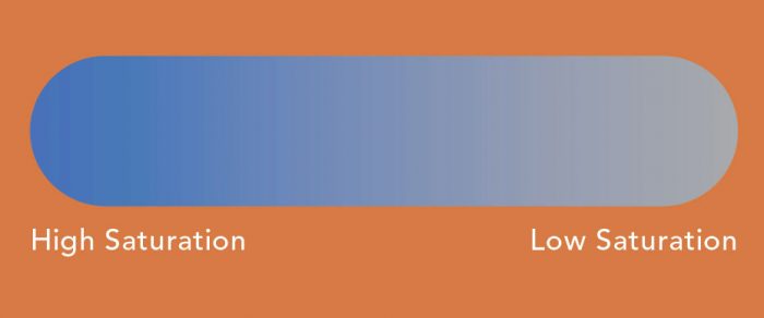
Tint—Add white to any hue and you have a tint.
Tone—Add gray to any hue and you have a tone.
Shade—Add black to any hue and you have a shade.
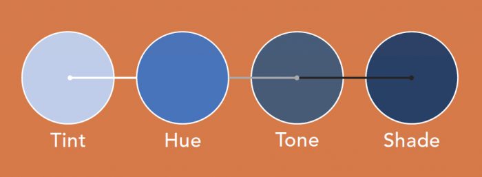
Muted Colors—Desaturated colors that are“grayed down.” You can still see what colors they are, but they are not bright and clear.
Neutral Colors—Neutral colors are desaturated (grayed down and/or lacking colorfulness) and typically include grays, whites, off-whites, blacks, creams, and beiges. While no one color can really work well with every other color, those colors that seem to go with most other colors are called neutral.
Work it Out on the Wheel
The color wheel is a chart that represents the relationship between hues.
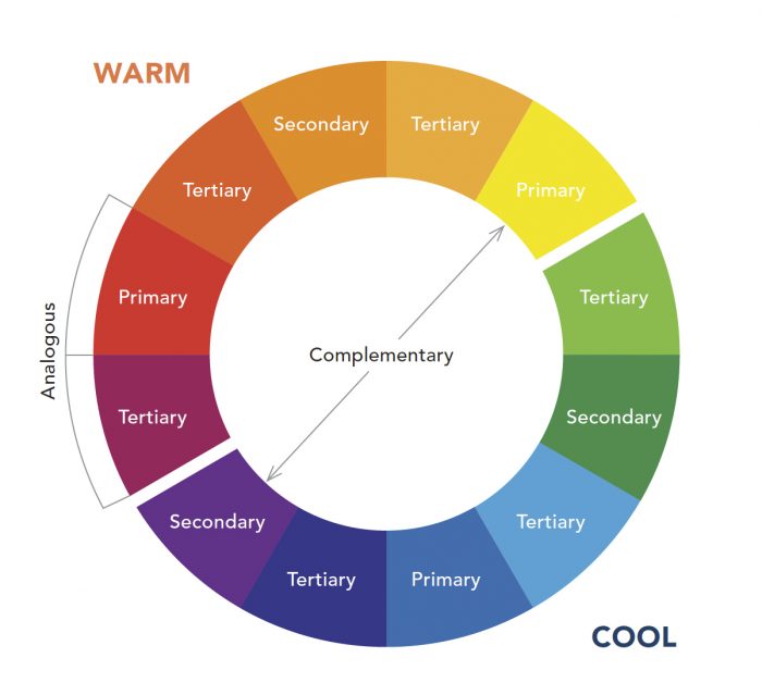
Primary Hues—The three unique hues: red, blue, and yellow. No other hues comprise their makeup. They sit equidistant from one another around the wheel.
Secondary Hues—The three hues that are comprised of the two primary colors they sit between: orange (red and yellow), green (blue and yellow), and purple (blue and red).
Tertiary Hues—The six hues that are created by mixing equal amounts of the secondary and primary hues they sit between.
Complementary Colors—Colors that sit opposite one another on the color wheel, sharing nothing in common. If the pigments of complementary colors were mixed, they would cancel each other out, creating a grayish, brownish black. But if these opposite colors are used near one another, it creates what I call an “energized harmony”—they enhance one another. All variations of these colors create this effect: A citrusy yellow-green and a dark red will complement one another, as will a muted gray-blue and a burnt orange. They don’t have to be saturated versions of the colors to work beautifully together as complements.
Analogous Colors—Colors that sit next to one another on the wheel and share at least one hue in common. Blue and green are analogous colors—”color cousins,” as I call them—since green is made up of blue and yellow. Using color cousins in the same room or in adjacent rooms is a no-brainer because the shared makeup of the colors guarantees they work well together.
The contents of this article were originally published in a larger article, How to Choose Paint Colors.
RELATED LINKS
Fine Homebuilding Recommended Products
Fine Homebuilding receives a commission for items purchased through links on this site, including Amazon Associates and other affiliate advertising programs.

Reliable Crimp Connectors

Handy Heat Gun

Affordable IR Camera
