Popular Period Windows Styles
Architect Lynn Hopkins describes both the characteristic and uncharacteristic features of four common American house styles.
Through their size, shape, arrangement, and trim, windows do much to establish the character of a house. Because they also must fit in as part of a larger whole, choosing windows that work well with a house’s overall style is important.
Most houses either date from a specific time period or reference a particular architectural style. Understanding that style and its design conventions can help you to select and arrange windows that reinforce this intended character.
Here, I’ll describe how window choices reflect and inform the character of houses in four broad architectural styles, including ranch/midcentury modern, Craftsman, Victorian, and colonial. I’ll also point out some common selection errors and missed opportunities.
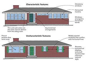
In the illustrations, I’ve intentionally avoided the labels “Do” and “Don’t” because sometimes breaking with convention is desirable. In this discussion, however, I’m assuming the goal is to choose windows that reinforce an intended style. Therefore, I point to the differences between “characteristic” window features of each style and the “uncharacteristic” features often misapplied to these styles.
Ranch/Midcentury Modern
1950s-present
Ranches are single-story houses with shallow pitched roofs, a 1950s building type that popularized organizational objectives from the midcentury-modern architectural movement. Unlike the preceding styles, however, many ranch-style homes never reached their full potential. This may be because few respond consistently to the broad, horizontal orientation of their one-story form. Many ranches in the Eastern part of the country have colonial-style multipane windows, sometimes with shutters—elements that are more appropriate on a colonial-style house. Often, they have a large picture window that lacks scale and not only provides a view of the neighbors’ house across the street, but also allows those neighbors an unobstructed view of the ranch’s occupants.
A more successful window strategy for a single-story home is to embrace its horizontal proportions by grouping windows together into long, horizontal bands. Trim can be painted the same color as the window sashes and made distinct from the siding to help unify these bands, downplaying and disguising places where windows are interrupted by solid walls. Horizontal muntins reinforce the lateral orientation further. Casement, awning, and gliding windows, all introduced in the mid-20th century, are appropriate and practical choices for modern-style houses. Clerestory windows, tucked high on the wall and under the eaves, are a great way to bring a band of natural light into a room while maintaining privacy, and they are inherently horizontal in character.
The midcentury ranch is a style that accommodates asymmetry, either on the facade as a whole or in more modest instances, such as a single sidelite next to the entry door.
Craftsman
1900s-1940s
This era also includes prairie-and bungalow-style houses. These houses have more horizontal proportions than their tall Victorian predecessors. The form, often with broad gables and wide, overhanging eaves, looks like a single-story house with additional living space tucked away in a large, secondlevel attic.
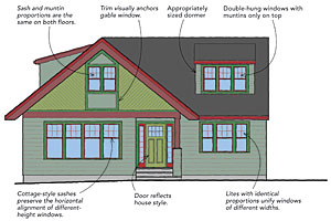
Technological development during this era enabled larger glass sizes than had been possible before, but some lite divisions characteristic of earlier styles were retained, either in the upper sash or a transom window. A 6-over-1 or 4-over-1 muntin configuration has the advantage of providing the visual interest of smaller panes, or lites, in the top sash, but it allows an unobstructed view through the single-lite lower sash. Cottage-style windows, with a bottom sash that’s taller than the upper sash, were commonly used in combination with conventional equal-height sash windows to unify windows of different heights visually. These two window types can work together when the upper sashes of both are the same height and align, even if the sills don’t.
Muntins also can help to unify a window assembly with a wider center window and two narrower flankers. If the glass in the wider window is half again as wide as the glass in the narrower windows, each lite will be the same size when the glass is divided into four panes on the narrower window and into six on the wider. The consistent size of the lites ties the various window widths together into a harmonious whole.
Dormers are typical of this style.
If your house has a dormer, make sure the dormer is sized so that it appears subordinate to the roof and is positioned so that there is adequate roof visible below. Use multiple narrower windows with muntins to help reduce the scale and make the windows seem smaller.
Victorian
1830s-early 1900s
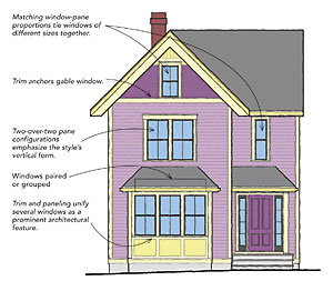
Greek-revival, Gothic, Queen Anne, shingle, and similar-style houses that reference the mid- to late-19th century often have distinctly vertical proportions. Rooms and houses tended to be tall, so windows also could be tall. Glassmaking technology of the time made fairly large panes of glass possible, and windows of this era often have a 2-over-2 muntin configuration. A new generation of architects broke with earlier conventions, often grouping windows together. Building forms were more complicated as well, often with multiple gabled or hip roofs, bay windows, and porches. The variety and asymmetry of this house form could accommodate a wide variety of window sizes and groupings.
Ornamentation was also highly favored at this time. Trim and panels around windows took on a marked exuberance. Stainedglass feature windows were common, especially in stairways.
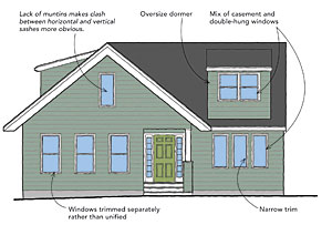
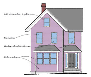
If the house you are designing has vertical proportions, consider reflecting those proportions with the muntin configuration of your windows. Houses with a variety of roofs will happily accommodate a wider variety of window sizes and shapes than a simple gabled box can. Keeping the glass panes in the windows proportional to each other helps to tie multiple window sizes together visually.
Avoid covering the wall below a bay window with the same siding used on the rest of the house. Instead, use trim and paneling to pull windows and walls together visually into a larger assembly. Likewise, don’t let an attic window float in an undifferentiated field of conventional siding. Add some trim, and/or change the siding type to tie the window into a focal point that celebrates the gable and the variety inherent in this house form
Colonial
1600s-present
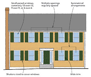
Colonial style got its start in the late 1600s and has flourished since, with multiple revivals and variations. Many stylistic conventions of colonial houses can be traced back to practical considerations. Colonial houses had small-paned windows because glass size at the time was limited. The panes, usually about 8 in. or 9 in. wide and 10 in. or 12 in. tall, were held in the window sash by muntins. Each window sash had multiple panes arranged in two, three, or four columns and rows. Double-hung windows, with their two sliding sashes, are often identified by the number of lites in each sash. In the colonial era, 6-over-6, 9-over-9, and 12-over-12 configurations were common. Muntins have the added design advantage of introducing a level of detail that provides interest and scale to a building’s facade.
Most colonial homes followed old-world design conventions that limited the widths of wall openings. Individual windows, often evenly spaced and all the same size, were common. Thus, consistent window sizes and a symmetrical arrangement are appropriate for a contemporary colonial house, or any house with a simple two-story, boxlike form.
Trim around colonial windows was wide, making a design feature of the need to cover the gap between window frame and rough opening. Shutters were common for weather-related reasons and were sized to cover the window completely.
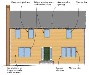
It follows, then, that large, single-lite casement windows with narrow or no trim look odd on a house with a boxy colonial shape. Because they lack muntins, these windows don’t provide a clue about human scale, making the house look vacuous and banal. Likewise, ganging windows together in multiples, varying their sizes, and arranging them in an asymmetrical fashion are also at odds with this form of house.
If the house you are designing is a two-story box with a simple gable or hip roof and other traditional details, a regular, predictable arrangement of similar-size windows will do the most to enhance its character. Add interest to the facade with the muntin configuration and simple but generous trim around the windows.
Drawings: Lynn Hopkins


View Comments
A true colonial, at least in New England, also has a center the chimney or chimneys inside where the heat was needed.