From boxy and closed-in to light and curvaceous
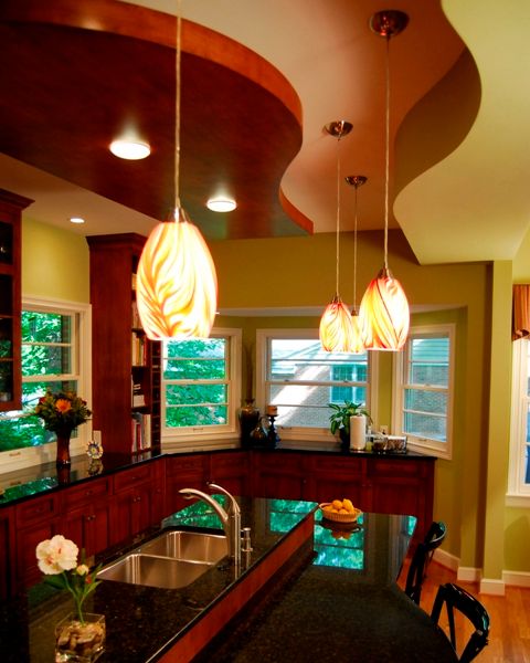
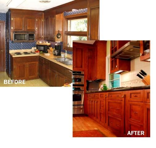
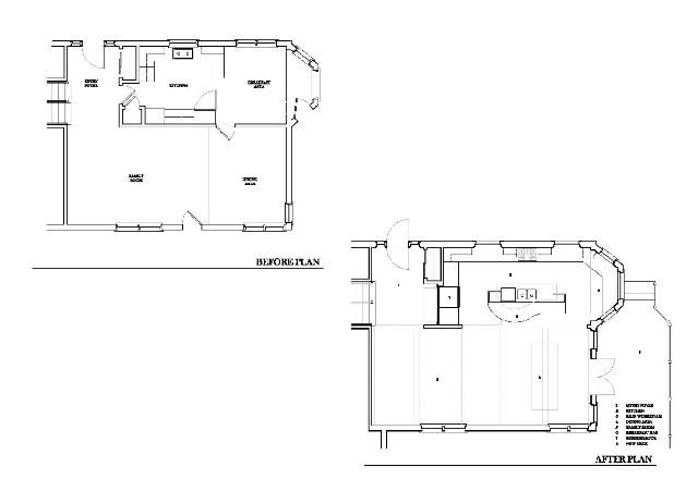
This home was a circa 1960 tri-level with the original room arrangement. There were distinct divisions between rooms (i.e., kitchen, dining room, living room). While the extended family gathered here regularly for Sunday and holiday dinners, the mother was isolated from her family while she prepared the meals. As well, the finishes and equipment were outdated; lighting in the room was poor and windows were scarce. The primary objective of the project became to redesign the kitchen and adjacent rooms such that the family gatherings would be fully participatory. Additionally, the program included enhancing the style, light and maximizing a magnificent view of the lake behind the home. The kitchen renovation was part of a larger project.
Aside the typical organizational challenges of such a project, there were numerous desires to be accomplished. Storage and workspaces for grandchildren was incorporated into the kitchen via low worktops at the bay window, along with special “project and supplies” storage. Seating for twelve was accomplished by opening and sharing existing spaces, and raising the floors to one level. We also resolved the “he wants a traditional kitchen table” versus “she wants island seating” by making the island seating reminiscent of a kitchen table. Bearing walls were removed by adding beams, and previously-unused plenum space was maximized by raising and articulating the ceilings. There was mixed excitement and trepidation about going from a boxy and uninteresting house, to pursue a more daring, open, colorful and curvaceous design.
This once-cloistered kitchen has now become a hub of multi-generational family activity-connecting the cook with guests within the kitchen as well as in adjacent dining and living areas. Connection to the garden and lake beyond were enhanced by removal of view-blocking walls, and reconfiguring windows. Equally important, the spaces were transformed into vibrant, lively and exciting places to work and enjoy.
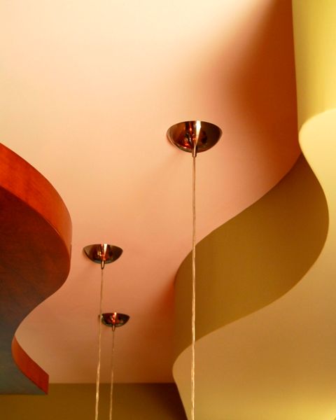
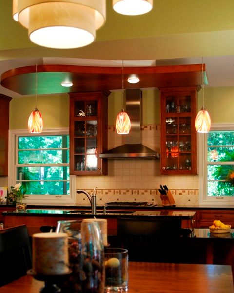
The result of the project is a light, engaging and open space. Custom cherry cabinetry, granite tops and stainless appliances enhanced the beauty and organization in a kitchen with multiple intended functions. Much attention was given to the “fifth wall” – by raising and sculpting the ceiling with playful drywall and cherry wood forms, and plenty of ambient, task, and architectural lighting. Accommodations for grandchildren were built-in to this fabulous kitchen, including magnetic chalk boards inset into pantry cabinet panels, and special craft supply storage.









View Comments
This is a grate space the lighting is the best.I would like to do something like this for my kitchen but need help with getting started,
Thanks wspol