A Master Bathroom with Views
Mike, the client, felt cramped in his own master bathroom, especially when he had to work around a tub that took up most of the room, which he never used. Showering in a small fiberglass stall was unappealing and when it started to leak and ruin the wood floor outside the door, he had to stop using it altogether. Now using his guest bathroom as his master, he knew it was time for an upgrade.
Living in a popular hillside neighborhood in downtown Burlington with spectacular views of Lake Champlain, Mike knew that updating his master bathroom would be value-add if he ever chose to sell his home.
The design concepts worked around some basic needs:
- Better Layout for space
- Smaller Tub area
- Larger Shower area with a place for toiletries
- Tile Flooring with Heat Mat for the cold Vermont Winter days
- Updating counter to include two sinks for a Master
- Quality construction
- And a WOW Factor
With that to go with, the designer worked with the client to create a plan that would stay within the footprint of the existing bathroom to keep the costs manageable, while still incorporating all the wish list needs.
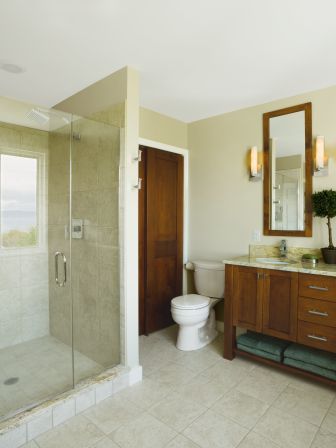
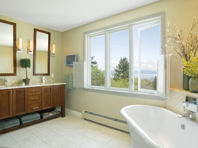
The stone tile was used on the floor and in the shower to anchor the room in a basic theme that would stand the test of time, as well as give the room a richer feel. The heat mat was placed under the tile so that the flooring never felt cold (especially during the long Vermont winters).
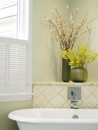
A white cast iron pedestal tub was placed at a diagonal to fit the room better, and for its’ size, clean lines and great look, as well as its’ height, so while bathing the view could be enjoyed. The corner shelf was a functional use of space for the tub spout as well as adding to the wow factor the client wanted.
The counters and cabinetry, as well as the linen closet doors, were custom made. The cabinetry’s dark wood was chosen to bring in warmth and richness to the room as well as having the linen doors and custom mirrors stained to match, bringing continuity to the room. The double sinks added market value for a master bathroom, and centering the cabinet and taking it off the wall makes it look more like furniture.
The shower, now over four feet square, with a large recessed toiletry area, a corner seat, and a custom glass door and wall had plenty of room to move in, as well as views of the lake and the flat screen television tucked in near the vanity.
The polished chrome fixtures and lighting have an angular modern look, which was what the client was looking for. The hardware on the cabinetry was chosen to work well with the angular look, while still being round.
Quality construction, better layout, more functional, as well as having a strong design element, this bathroom with many views, has truly turned from outdated to outstanding.

