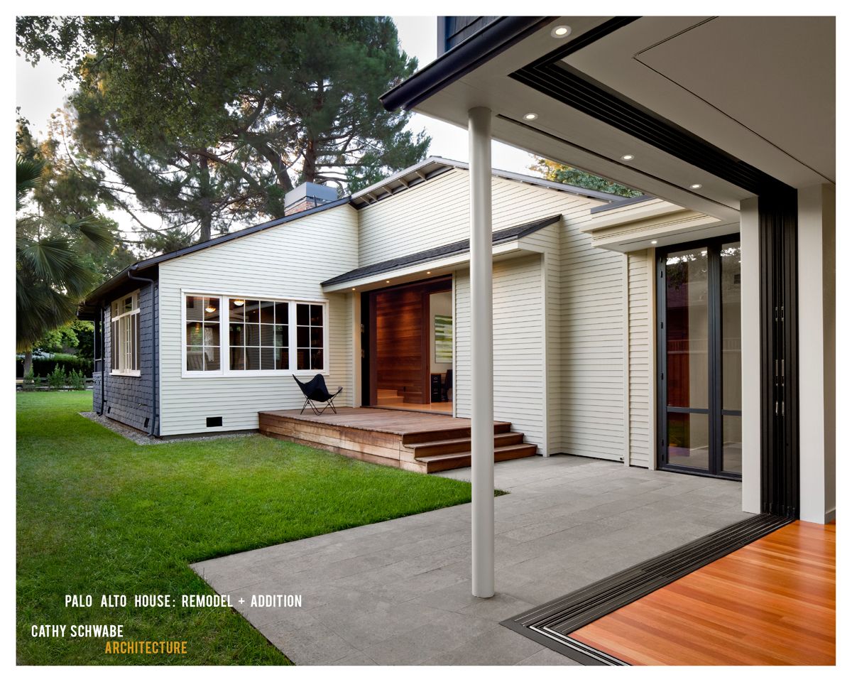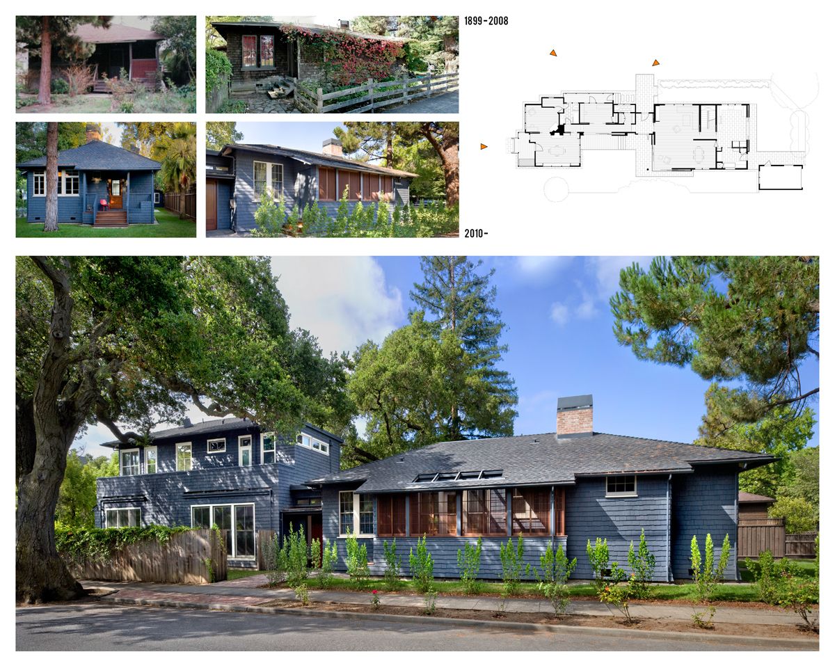
Located in an historic residential district filled with abundant mature trees, the project is the renovation and addition to a one-story cottage. Built in 1899 and listed on the National Register of Historic Places as a Category 4 structure, it is set behind a deep front garden dominated by large pines, on a long and narrow lot with three street frontages. The application for registration noted the contribution to the historic neighborhood, the simple, rustic, Craftsman style, the front and side porches, the front garden, and a vaguely Japanese character.
Built as a rental, likely for a single academic tenant, it is now owned by an academic couple with a child who host family and guests, often for extended periods. The existing house with its interconnected bedrooms and tiny awkward kitchen and bath no longer supported comfortable and contemporary living.
The challenge of how best to re-use the existing interior to suit the current family’s needs, while preserving the two public, largely porch edged facades drove the programmatic and organizational investigation.
The two largest, un-altered, rooms were theoretically big enough for a new kitchen but not without significant demolition and loss of character. The new kitchen was thus sited in the addition, given a morning exposure, and paired with living/dining. Bedrooms, baths and decks were placed above. The southwest rear quarter of the original rectangular house was deconstructed to form an “L”, restored and partially reconstructed for a library, studies/guest bedrooms, and baths. Work done on the original house to improve structural and thermal performance, upgrade the plumbing and electrical systems, including the addition of radiant heating was done from the exterior of the frame so as to preserve the interior materials.
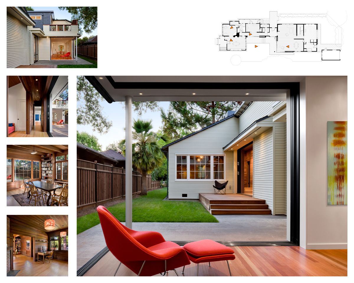
Architecturally the diagram is a “U shaped” courtyard plan; a compact two story addition, linked to the original house with a one story central entry, frames an interior garden. The diagram satisfied several conditions: National Register requirements that an addition be visually “hyphenated” to the original to clearly delineate old from new; a private exterior space whose orientation brings daylight and natural ventilation to the interior; and, three part zoning with family living set under sleeping held apart from a quiet older wing for scholarship and guests.
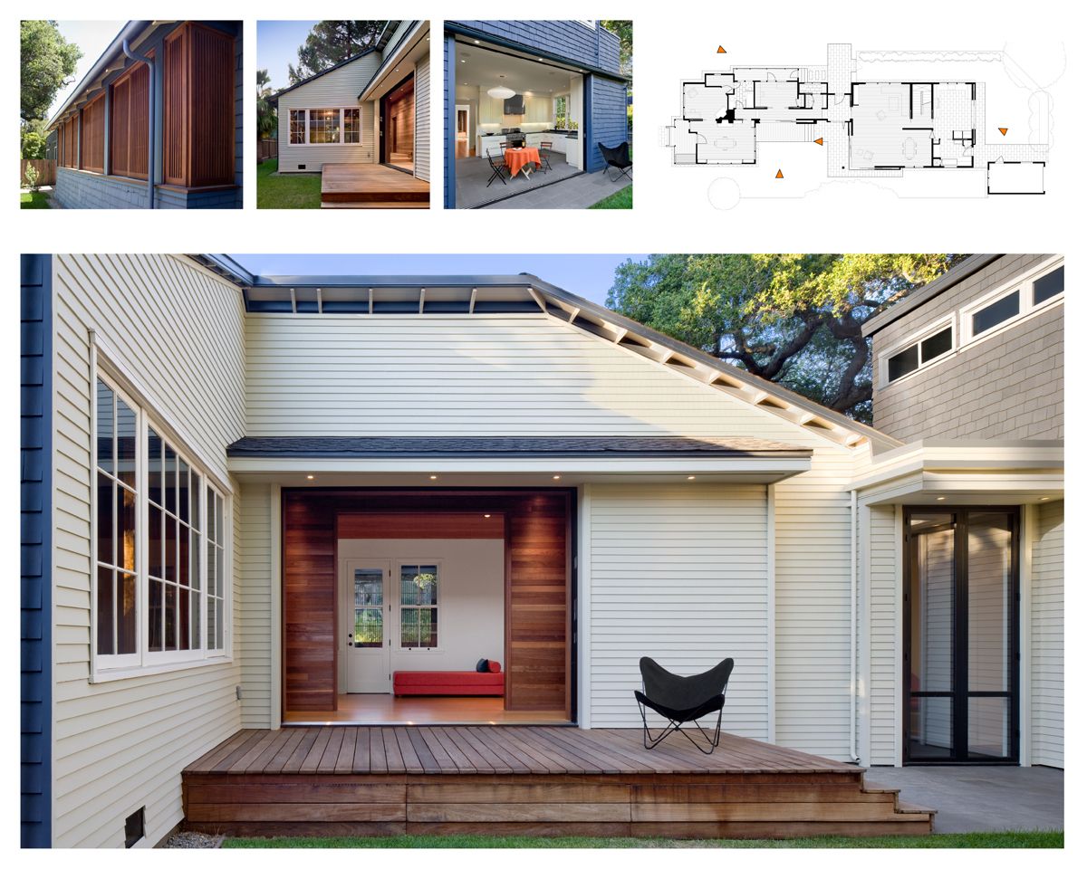
The addition takes its cues from the original to create an architecturally sympathetic yet understated extension of the old house. New sliding wood screens replace non-historic lattice at the reconstructed north facing porch and a cut out in the roof bring light and filtered views into the internally reconfigured section of the old house. The screens reinforce the “vaguely Japanese” claims and invite the eye to land first on the old house before taking in the two story addition.
The blue rustic shingle cladding of the public faces becomes white painted shiplap boards set over a ventilated rain screen at the courtyard walls as if to suggest that day light has carved a space into the interior. The openings in the courtyard are all newly placed including at the old house where salvaged windows from the deconstruction were added to better balance light in the dark wood clad interior.
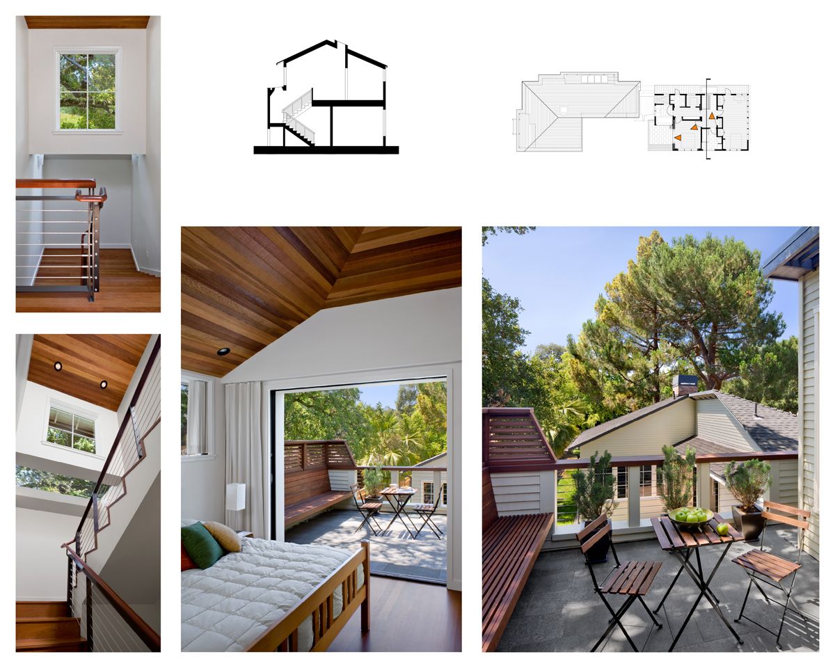
The original theme of open edges of light filled porches is continued throughout the entire house with decks, terraces, and large sliding glazed panels that open to make rooms into porches. A related iteration happens at the new stair landing. The stairs rise within a one story section of the addition. At the landing, the exterior wall shifts back from the street and bridges overhead as the stairs continue upwards beneath. A skylight spans the entire landing ceiling- invisible from the street – to lift, with light, the compressed height. Set under the oak tree on the street it feels as if one is walking up into the canopy. Located within the private part of the house, it creates a daily moment of delight.
