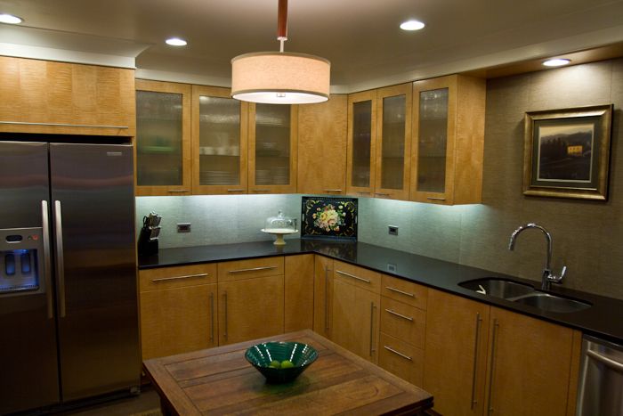
We purchased a 1957 one story rambler 10 minutes from downtown Salt Lake in 2008, with the intention of doing a full blown remodel. The first priorities were the kitchen, master and guest baths. The kitchen was 8’x12′ with very little counter space or storage We captured 4′ from the adjacent bedroom to increase the usable footprint.
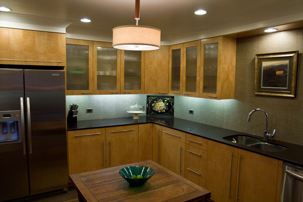
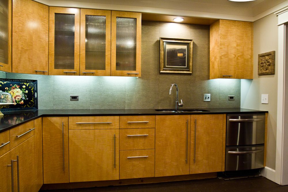
Our decision was to do a contemporary style kicthen. Curly maple was the species of choice, and I was able to have veneers layed up at a local specialty mill. The owner allowed me to assist in the process, and my knowledge was greatly increased with the experience. The flitches were layed up in a sequential bookmatch with some of the most gorgeous curly maple I have ever seen, uninterrupted for over 13 feet.
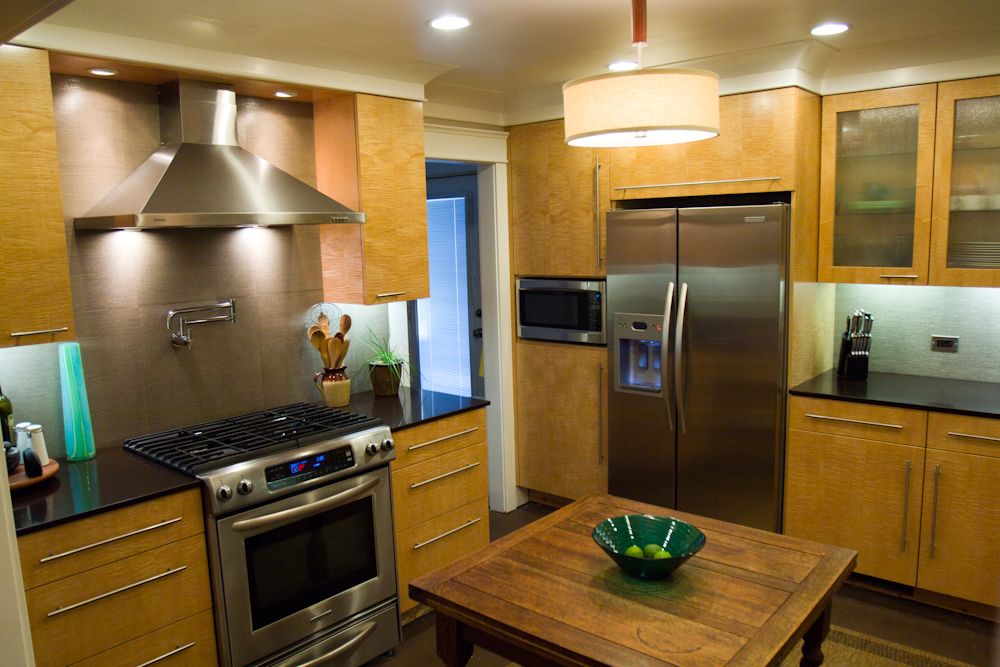
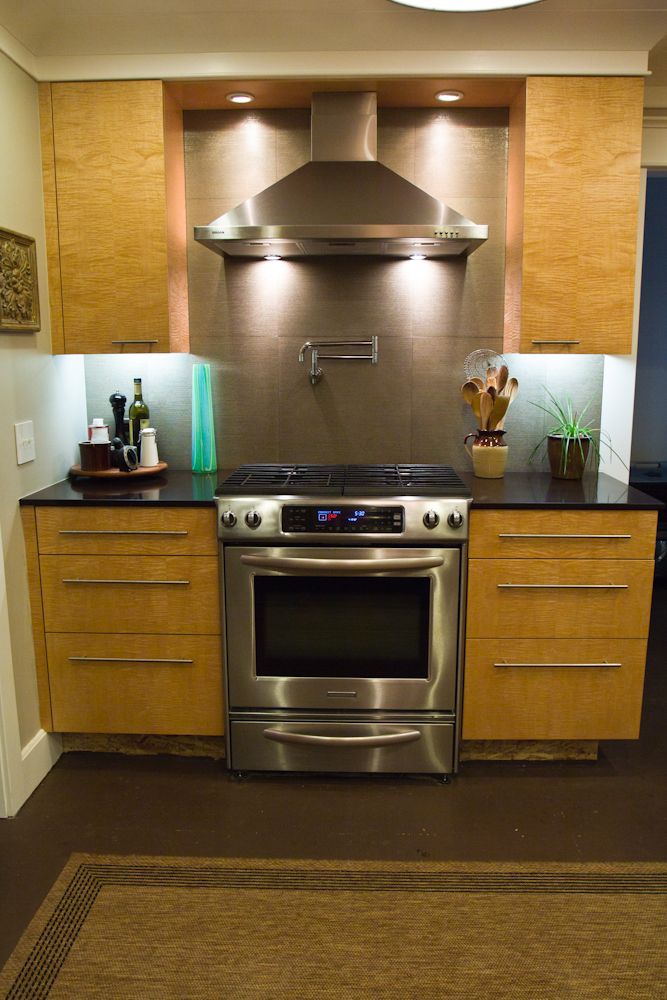
The countertops are Caesarstone Espresso. If absolute black granite were brown, it would look like this. The backsplash is a 20×20 tile which people usually think is grasscloth, or wallpaper, until they touch it. Its brown tone exactly matches the counter, while the raku-like undertone picks up the stainless appliances and electric plates.
The appliance suite is KitchenAid. Dual fuel freestanding stove/oven/warming drawer, double drawer dishwasher and side by side fridge. The hood is Broan, the sink is Blanco, the pullout faucet and pot filler are Grohe.
The cabinetry has Accuride soft close drawer slides, as do the eleven pull out trays, and there is a generous amount of storage in a kitchen of 138 sq. ft.
The kitchen is a well lit work space that accomodates many cooks at once. A picture of the Tuscan countryside above the sink provides an atmospheric vista, free of the neighbor’s garage roofs and playsets.
The floor, while not installed at the moment, will be 5/16″x5″ engineered Ipe, with microbevel edges, as is the rest of the flooring throughout the house. It’s chocolate color matches the counter tops perfectly.
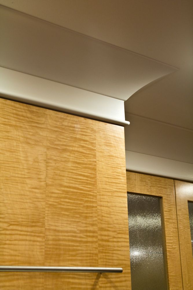
The cove is a profile I have never seen, in thirty years of finish work. It is milled from 3/4″x6″ stock and has a very gentle curve, as you might imagine. Very modern, yet timeless enough to fit in with the classic farmhouse style that were have chosen for the rest of the house.
In closing, this kitchen has given us a space we all enjoy working in, and being surrounded by. Wherever the eye falls, there is something worth looking at. As it should be.







View Comments
Not only does the remodel appear to be perfectly functional, but the materials used are so intuitive that they convey a sense of harmony, with just the right amount of contrast. Everything is also low maintenance. If the rest of the house has the same thought and flavor, I hope to see more this.
Thanks for your observation, and insight. Our intent was to create a subtle horizontal vibe, with the maple flowing around the room, pulling your eye with the bookmatched sequence. The striated tile whispers, " ...psst...", and grabs your attention as you reach the sink and stove. The tile was our first choice, and after many, many attempts to find something better, realized we couldn't. The stainless appliances and hardware add their own note to the chord.
As a woodhead, I can't stop looking at it. It's kinda like what the harmonic convergence could have been. Thank you for for taking the time to comment, and I hope ,as well, that you get to see more.