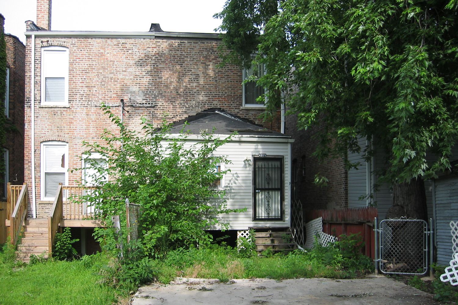
If Chicago is personified by Nelson Algren as a woman with a broken nose, then Grand Boulevard’s descent from a fashionable neighborhood at the time of the Columbian Exposition in 1893 into dereliction could be personified by Ms. Havisham in her yellowed and faded wedding gown. This narrow masonry rowhouse was a ruin recently roughly renovated by a contractor who cut the rear of the eighteen foot wide property off from light and air. In his defense, the rear yard was not much to look at: a gravel and dirt pad. We set out to create an inside/outside space employing effects with light, color and material that would create a volume for family, community and mindfulness. And we had to make this on a tight budget.
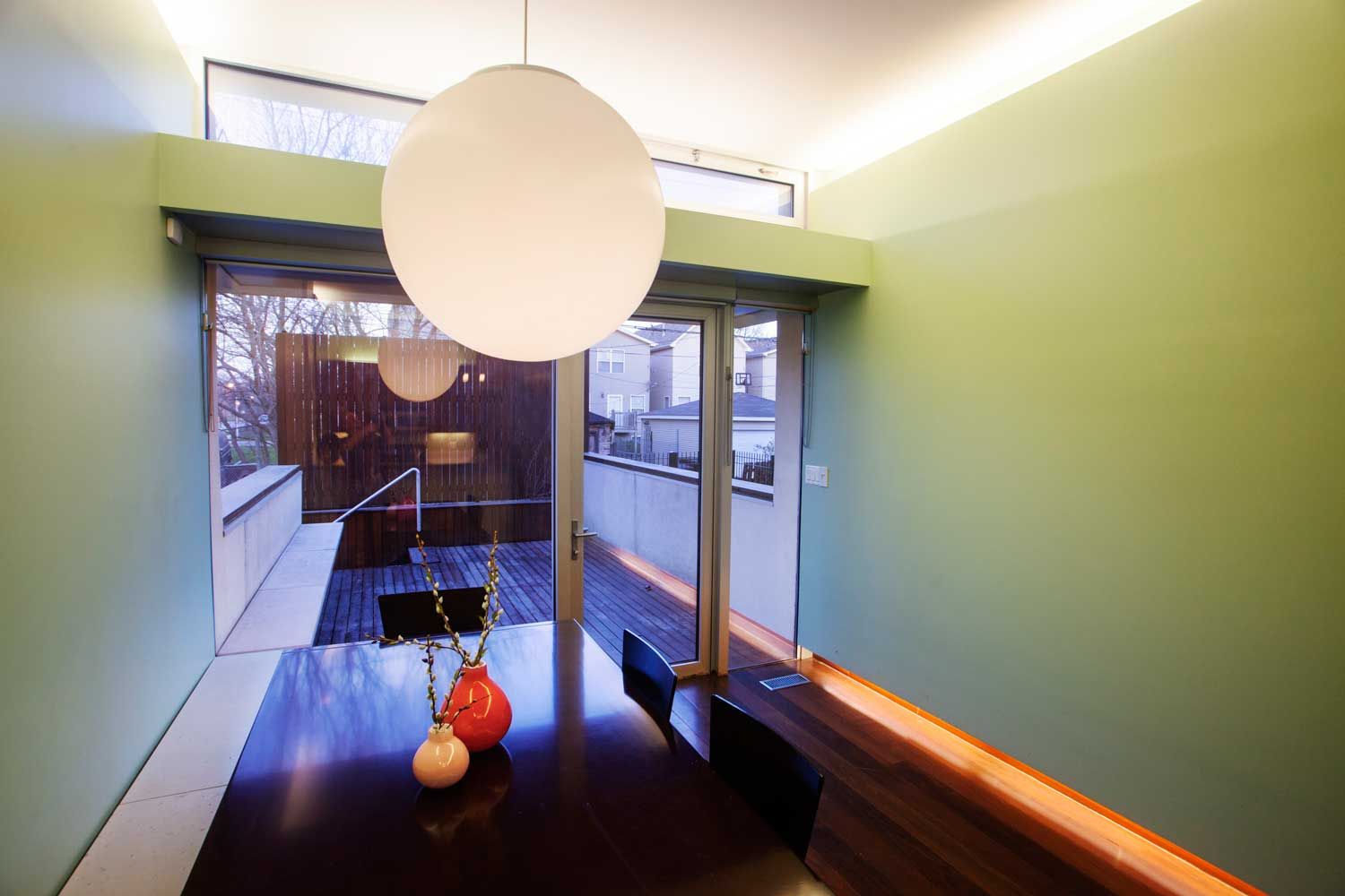
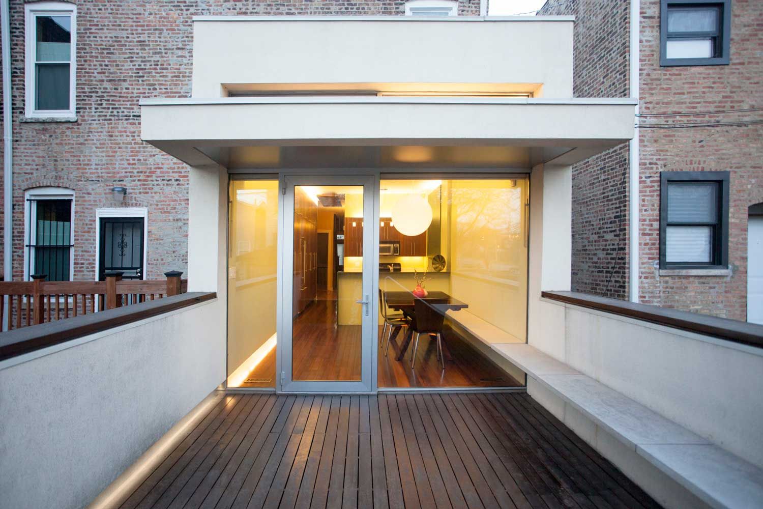
While only six inches over ten feet wide, the interior space is roomy yet fits like a glove. The light shelf bounces natural light deep into the space and is the gusset which braces the lightweight metal frame. A hopper window above the shelf assists with natural ventilation. The overhang allows the door to be open in the rain. The flooring and stone bench draw your eye from inside to outside creating a seamless space to watch the seasons unfold. We call it right sizing.
Facing east, it is the perfect breakfast room or a late afternoon refuge from the sun. It can be a place to enjoy the company of others or to meditate on the changing light alone.
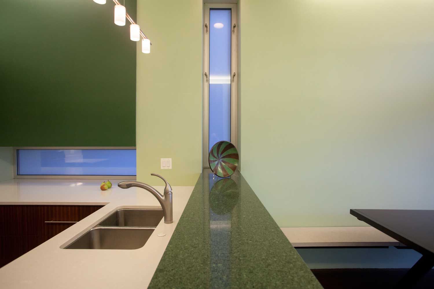
The glass is low iron glass and allows colors to be seen in their truest light. Good Architecture has effects that delight and amuse. The bench floats as it passes from inside to outside. Almost all of the lighting is indirect, dimmable and fluorescent. It helps the room take on a character more akin to the experience of a James Turrell space or a Dan Flavin light study.
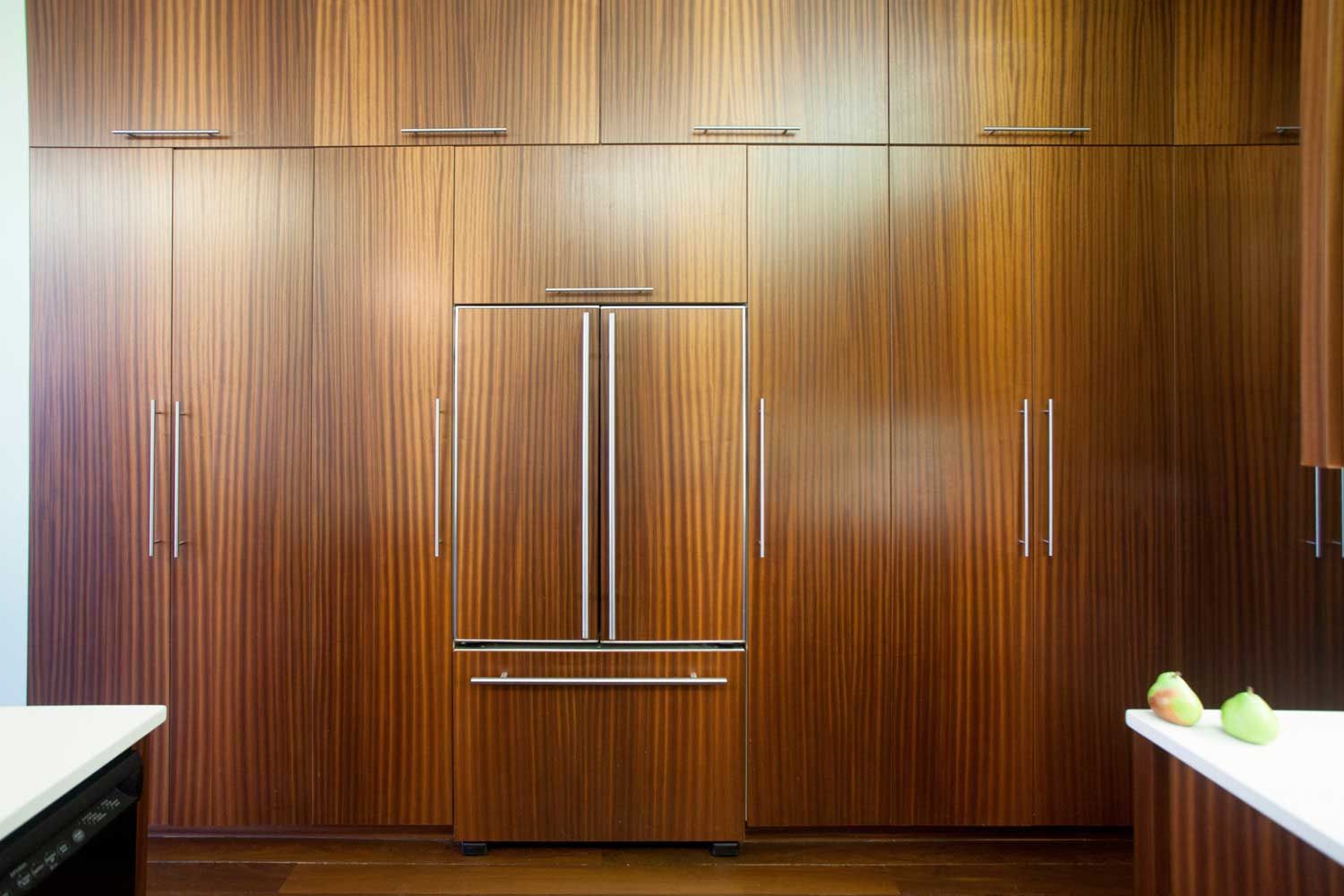
The original bids for the custom cabinets came in at 25% of the total budget. We purchased custom size formaldehyde-free core MDF boxes from a manufacturer and had doors made locally. We saved over $25,000.
A fan was installed above the rear cabinets to draw in air and push it through the roof.
