
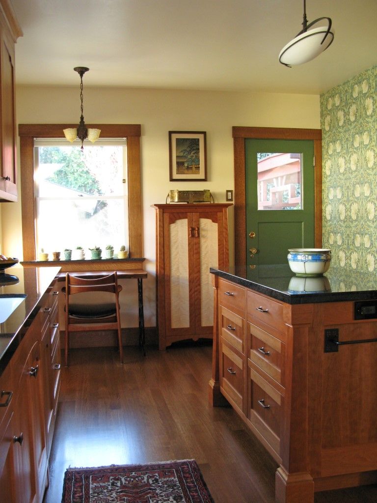
We started off with an historic kitchen from the 1920’s that was dysfunctional. There was not enough counter or storage space and no modern amenities like a dishwasher, disposal or a stove vent hood. The refrigerator blocked the back door and there was no task lighting.
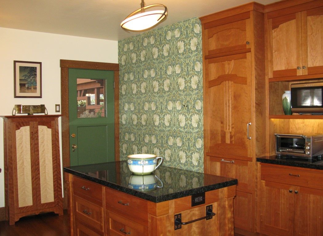
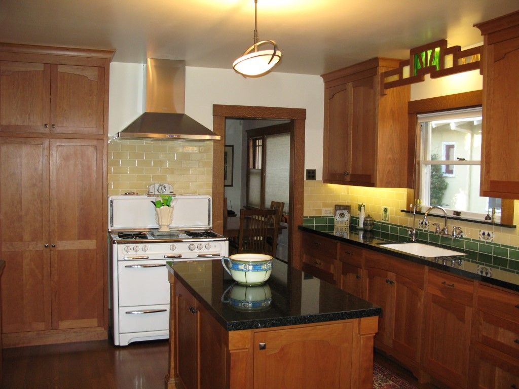
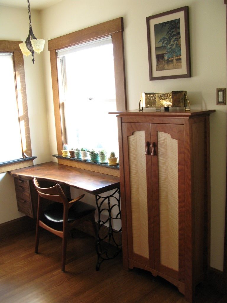
We demolished the lathe and plaster, cabinets and floor, tore out an arch and completely redesigned the floor plan to make it more functional. The design of the floor plan was difficult because of the small 16′ x20′ footprint. To solve the design problems we used mock-ups and SketchUp to optimize the island dimensions allowing us to add an area for a desk without compromising the walkways. We installed a smaller, counter depth refrigerator which solved the problem of blocking the back door and allowed us to make better use of wall space. Plumbing and electrical were upgraded to accommodate task lighting and new appliances. Finally, we removed a soffit to make room for venting above the stove and gain more cabinet space.




View Comments
Really nice work, great design. Wondering what the wood is as well as the counter tops?
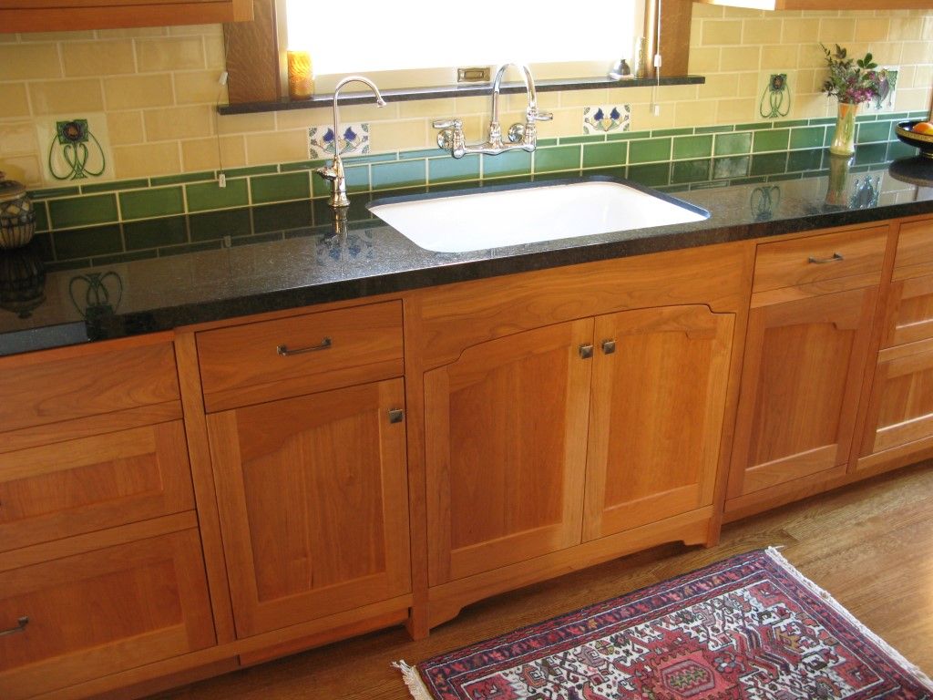
Thanks, The main kitchen cabinetry is cherry. The back desk is Claro walnut and the back pantry cabinet is made from select figured cherry with figured maple door panels. For the countertops , we selected “ blue in the night “ granite , a subtle black and grey granite with flecks of vivid blue.
Historic kind of kitchen looks more traditonal which definitely compliment your home if done by best of the best brand which you see at , http://www.studiokitchengroup.com/ will give you number of ways.
That is some pretty neat job you have done there. Everything looks so organized and tidy, which is a highly unlikely scene you get to see in a kitchen (for mine, at least). The kitchen is the place where storage is in an endless demand. Things seem to pile up on a regular basis, be it food products or any other utensils and cutleries. Therefore it is indeed a necessity to ensure there is always ample storage space to keep things concealed inside to avoid being an eyesore, while being neat and tidy for easy retrieval.