Leslie and Allan Saunders met at Madison’s Surf Club over 30 years ago. Leslie notes “I guess we always had a connection to the ‘shoreline'” – often centered around Allan’s avid interest in canoe racing and Leslie’s fondness for Hammonasset State Park where she spent many summer days in her youth. They met through friends while working at Sargent/ASSA ABLOY – and both still work there, meshing marriage and careers.
The couple kept their relationship salty and settled in a beach cottage in West Haven for the first 20 years of their marriage. But the more open landscape of the eastern shoreline had a real appeal for Allan and Leslie as Allan had long participated in his canoeing in the Hammonasset/Clinton area.
Leslie recalls “Driving up Commerce Street in Clinton, in the spring of 2002, Allan spied a ‘for sale’ sign on the lawn and immediately felt the connection to his new home. 3 short months later, we moved into the 1870 late Victorian era colonial perched in the western bank of the Indian River.”
The site is exquisite – set high and dry facing east and south, overlooking the river as it winds to the Sound through salt marshes. You can walk from the house to Clinton center in 2 minutes, kayak to Hammonasset Park with ease and bask in the both the flow of the river and the endless rise and fall of the tide. The house has a detached outbuilding – a garage that has a finished Music Room facing the river as well.
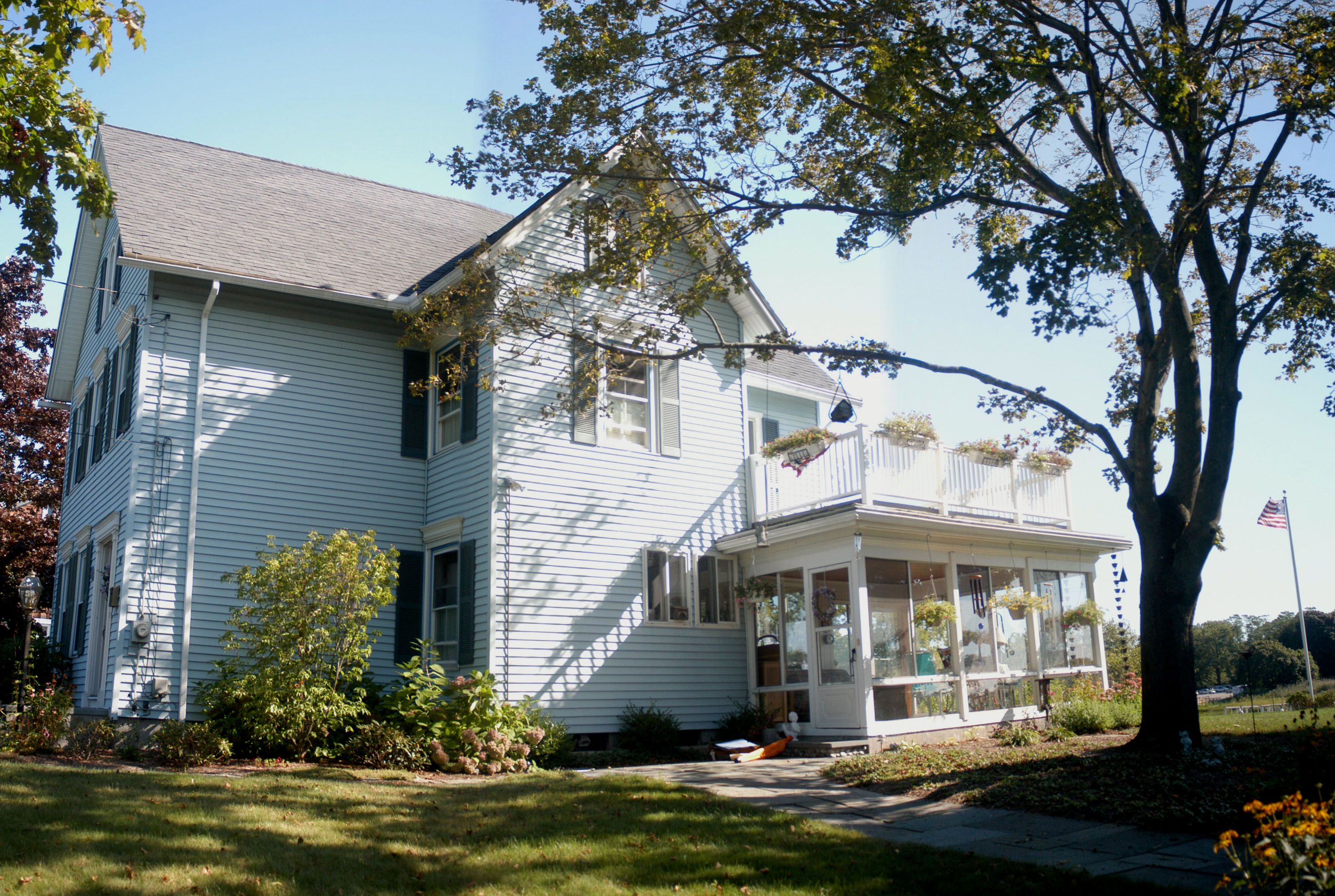
As good as the site and building locations on it were, its simple “Federal” layout of a side mounted stair in a two story gable roofed rectangular shape had a series of odd tack-on additions and interior “remuddlings” in the 20th century. Getting into the house from the driveway involved traversing thru an unheated flat-roofed “sunroom”.
The street facing front door was starkly uninviting, so access to the house was a lose-lose proposition. While large windows had been cut into the rear, and these 1970’s sliding units leaked both air and water into the home when you wanted a tight seal, and had trouble opening when you wanted ventilation.
But the worst misfit was the shoe-horned kitchen, wedged between the sunroom and the living room with no room for socializing or any way to take in the exceptional view.
The Saunders called me in to look at their options. As an architect who has executed hundreds of coastal projects I honestly told them that buying when they did where they did was good, but the site and the location of the home on it were terrific investments.
We explored some options to detox the kitchen, create a heated finished place to bask in the beauty of their salt-marsh river site. But I was honest with what these ideas might cost – and that gave the Saunders pause as the economy went through the 2008 collapse.
I encouraged them to look at all their options – they had bought well, just before the boom, and the market was as soft as its ever been so a trade up without construction might be possible.
There were better homes out there, but no site was even close to the one they had in hand. Their search brought home a golden rule for all homeowners to take to heart that is often overlooked in the hype of developers, real estate agents, and yes, architects: you cannot build a site.
No matter how great a design might be, it cannot overcome a lousy piece of land or a rotten location. No matter how compromised a house is, if it’s on a sweet piece of dirt in a lovely setting, it can be a joy to come home to, and any amount of money spent in renovation makes a good thing better.
So it was with the Saunders home – good bones and great land meant it made sense to undo clunky renovations made over the last hundred years by well meaning owners trying to get better connected to a remarkable site.
The leaky, low and alternatively freezing or baking sunroom was a dead space standing. The master bedroom deserved a bath. And most of all the kitchen deserved to have a view and be at the center of the active family and social life the Saunders enjoy.
But while building during the recession can net competitive bidding, the downsides of outspending the value of construction can be seen all around us and chasten the “why not?!” spirit present during a real estate boom’s “irrational exuberance”.
In the cost-containing imperative existing bathrooms were maintained (though spruced up). The finishing of the new 3-season room waited for a recently completed Phase II with landscaping finally underway. And the Saunders used the internet to “shop-till-they-dropped” to find fixtures at rock bottom prices.
But every master plan needs clear headed prioritization, even if there is an ample budget, and when value is imperative – as it was for Leslie and Allan – every improvement was separately priced out and contemplated. Leslie and Allan had spent over a year looking at alternatives to building – existing homes and all their misjudgments, so they went into the design process with a grounded perspective about what features in homes create value.
So beyond the obvious needs of connecting their house to the site – functionally and visually, the Saunders implemented renovations that are classically needed in millions of typical American homes – independent of any specific site or family.
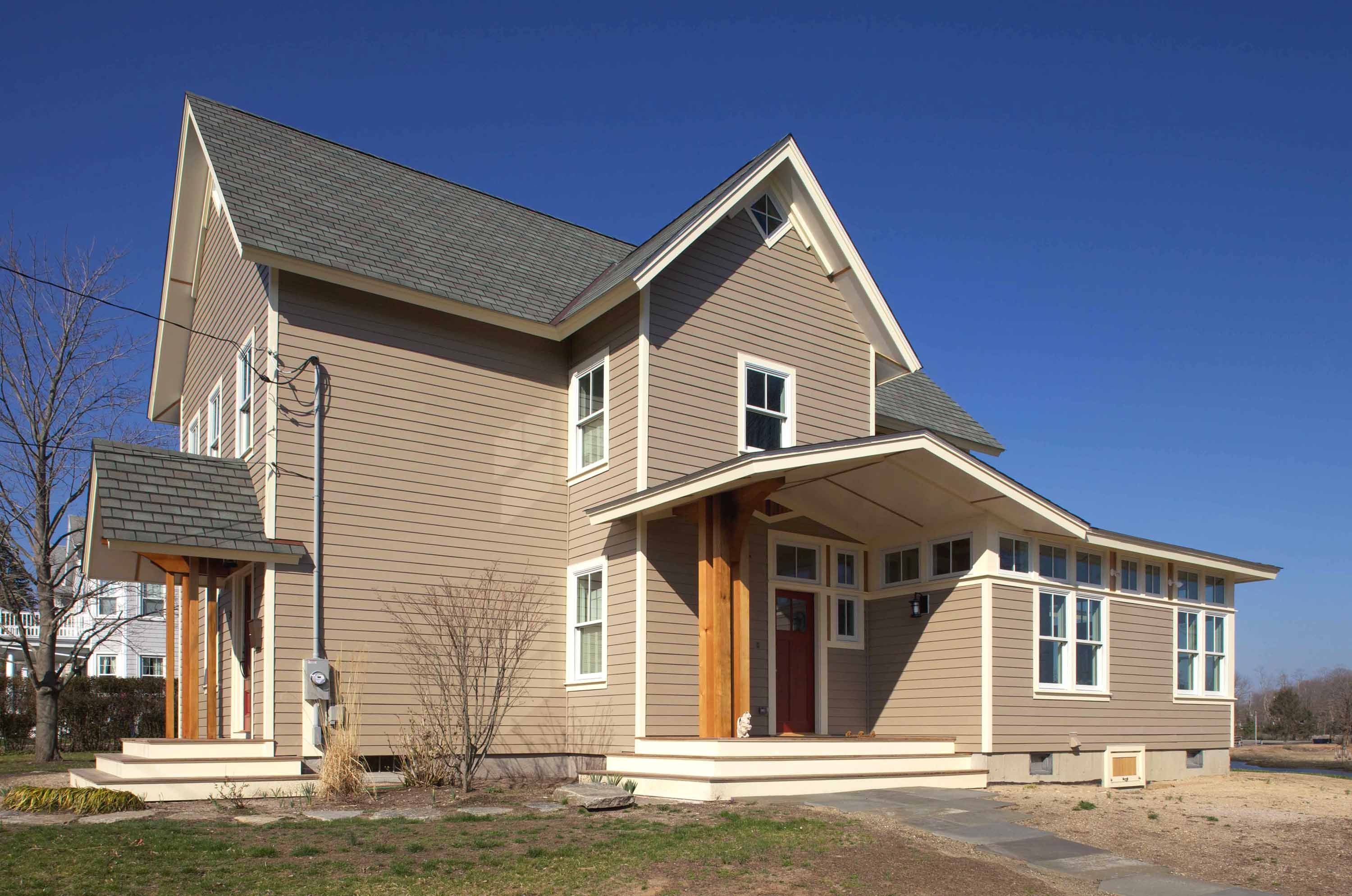
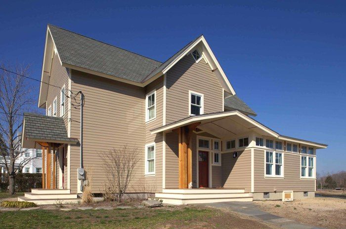
First, “back door”s are no longer apologetic – they are celebrated by detailing, easy access and most importantly with fully optioned “Mud Room” spaces – closets, shelving, pantry, laundry and the kind of roof overhead that gets you out of the weather before you get into the house. The Saunders version of that desirable feature hits every note and lives up to the visual promise of the home from the driveway. A natural cedar column and bracket of sculptural scale and detail supports the now focal entry roof – the reverse of the invisible sunroom shrouded back door the Saunders found when they bought the house. Cement board used as soffits and siding is a cheap and “forever” material, and when natural clear finished wood, again, cedar, is used as battens to cover its seams, art is created – and repeated throughout the detailing of the entire facade design.
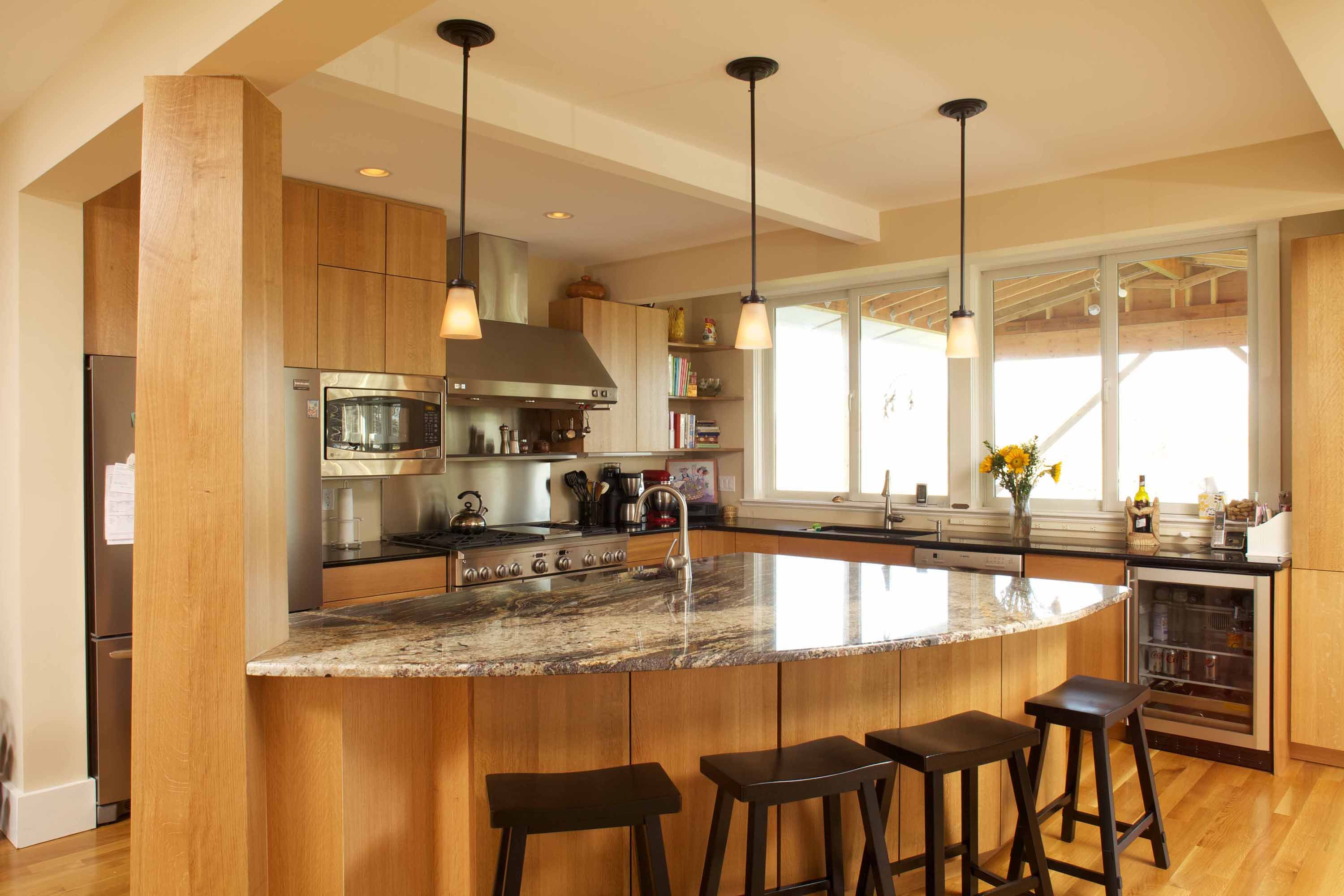
Second, a social kitchen is virtually a requirement for most homeowners – here the view mandated few upper cabinets and a large sit-able island -as well as the aforementioned pantry. But the materials and design made a functional necessity into an art piece. People presume custom kitchens are unaffordable – but if you know how cabinets are built (yes, I worked in a woodworking shop for years in my early career) and keep things simple, great materials can be used – here solid white oak and exquisite stone countertops.
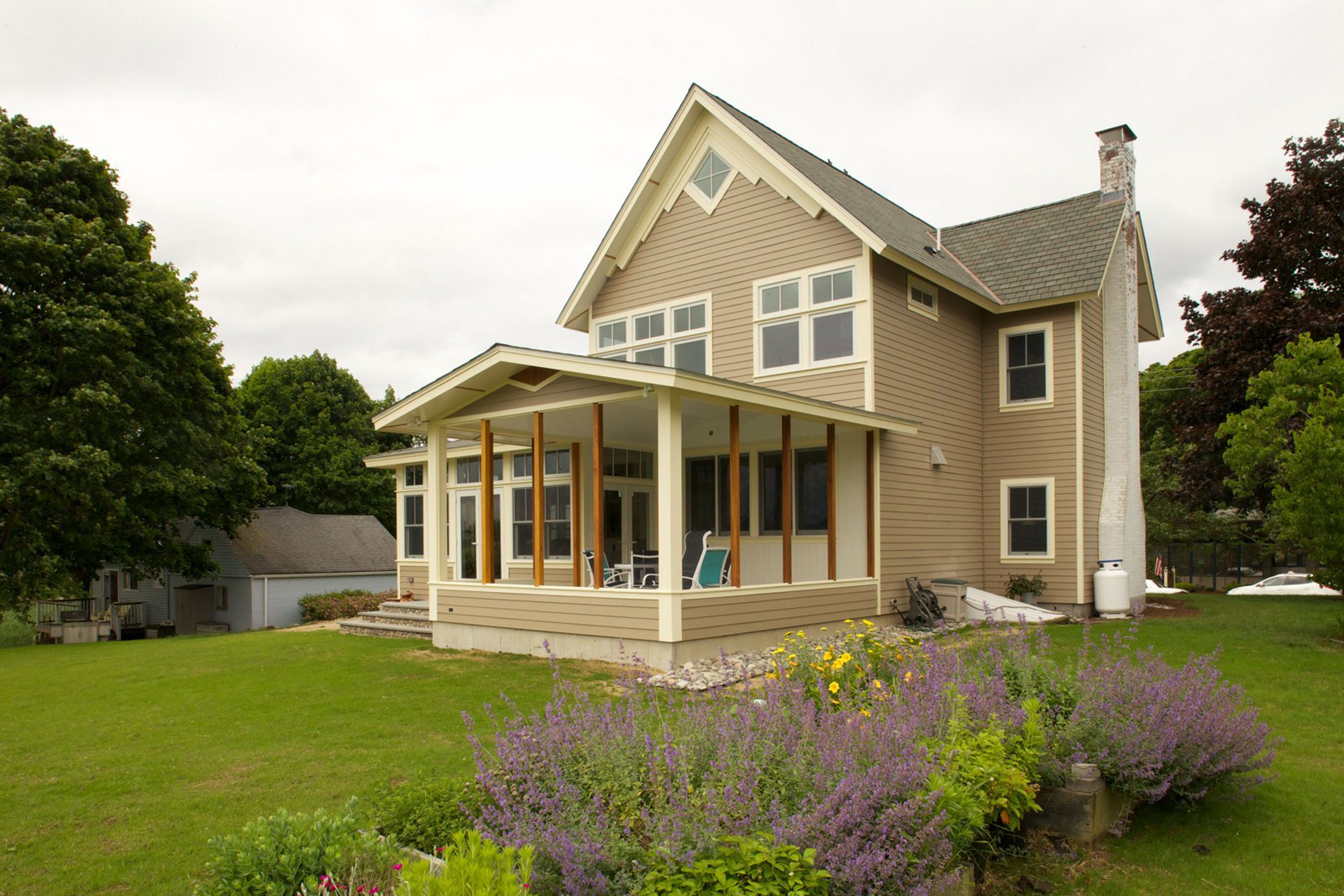
A “real” master suite was one place where budgetary angst leveraged resolve. In order to have a tub as well as a separate shower, and to accommodate a large bed, the Saunders opted to push out the second floor over the new first floor kitchen by 4 feet. That does not sound like much – but tens of thousands of dollars spent for the extra space meant that the Phase 2 of landscape development and 3 season room finishing had to be pushed off for a year.
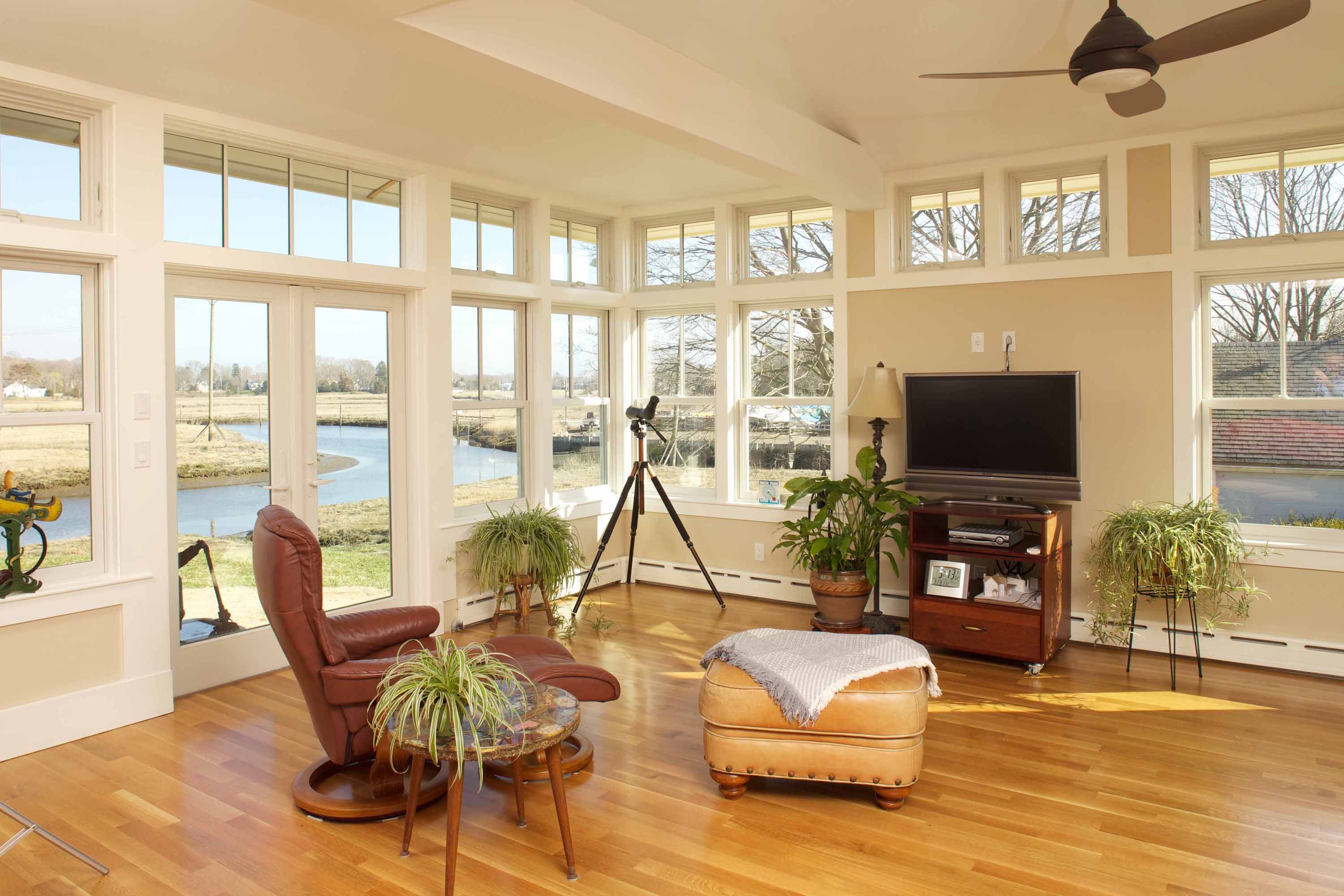
Lastly, connection to the outdoors is now viewed as being a universal positive for almost any site, let alone one as richly inspiring as the Saunders’ Indian River perch. The new 4 season replacement for the 3 season box is filled with glass and has a pitched roof, with some vaulted ceilings to enhance the space where it was cost effective. A new 3 season room was a perfect complement to the finished interior spaces – a step away from the new kitchen. Adjacent to both new view-worshipping spaces will soon be an outdoor terrace.
A new front entry roof was worth the zoning variance it needed to be built – as it protects visitors from the elements but also wraps the new construction’s fresh aesthetics to the street side of the home.
Serendipity can be found during construction at little or no cost – if you are careful. The ceiling of the closet could go all the way up to the roof – enhancing storage capacity, a relic galvanized steel water pressure tank could be kept and celebrated by pulling the ceiling of the new master bath. When the attic beam was set too low, an expressive trim-out of the newly extended second floor gable crisply reflected the light Victorian aesthetics of the 19th century house.
While all these objectively valuable decisions are zesty enhancements, homes are more than the wood and nails (and cement board) for most homeowners. Allan Saunders has an inspiring spiritual view of the land and what comes of it – his Mohegan heritage is not just in his lineage, it’s in the warp and woof of his outlook. When he blessed the new home with smoldering sage in the sacred rites of his Native American tradition, he saw the deeper meeting in my design. “You did not know it at the time, but you knew exactly what you were doing.” he told me as he gave me several intricate and fascinating Dreamcatchers made of feathers, beads, twine and twigs to celebrate the home’s completion.
Those new clear cedar columns and brackets that support the side and front entry roofs are made in four separate vertical pieces – north, south east and west. And the design of the 3 season room incorporates cedar columns on each of its sides as well putting cedar on each side of the home, facing each of the earth’s four directions. For Allan that sacred recognition of the four directions means that the home invites the spiritual ordinates and embodies the natural world’s embrace and inspiration of all life – including families recreating a home.
That insight and hundreds like it by the families I have worked with are the hidden gift of my life’s work as an architect. Those intimate embracings of my craft change it, and me, with each home that is created.
When Leslie says “The end result was everything we had hoped for! The design is respectful of the original house while at the same time being fresh and new. Just the right juxtaposition of traditional and contemporary and wonderfully reflective of what is important to us.” it means that I have honored my mission – making each home fit each family and each site.
