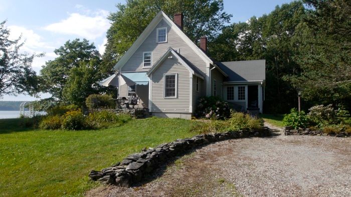
Our clients bought this site with an existing house. Unfortunately, it couldn’t be upgraded in a cost-effective way; what looked like an acceptable poured foundation turned out on closer inspection to be too shallow, and it showed subsidence cracks. Almost every system in the house failed that kind of close inspection.
Fortunately, we discovered this before the purchase, and although the clients were still toying with the idea of a renovation, we decided the site alone was worth the price-so when the time came to face the un-upgradeable nature of the existing house, there was little gnashing of teeth.
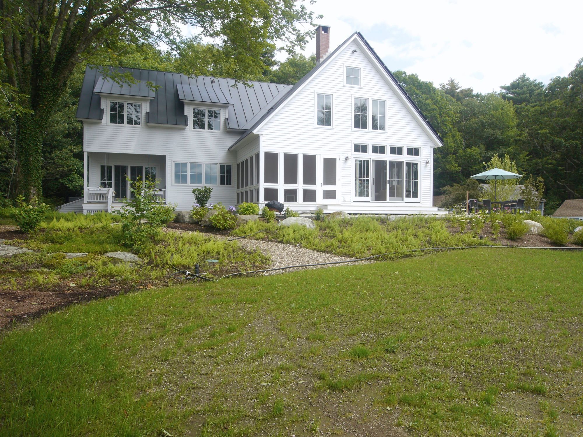
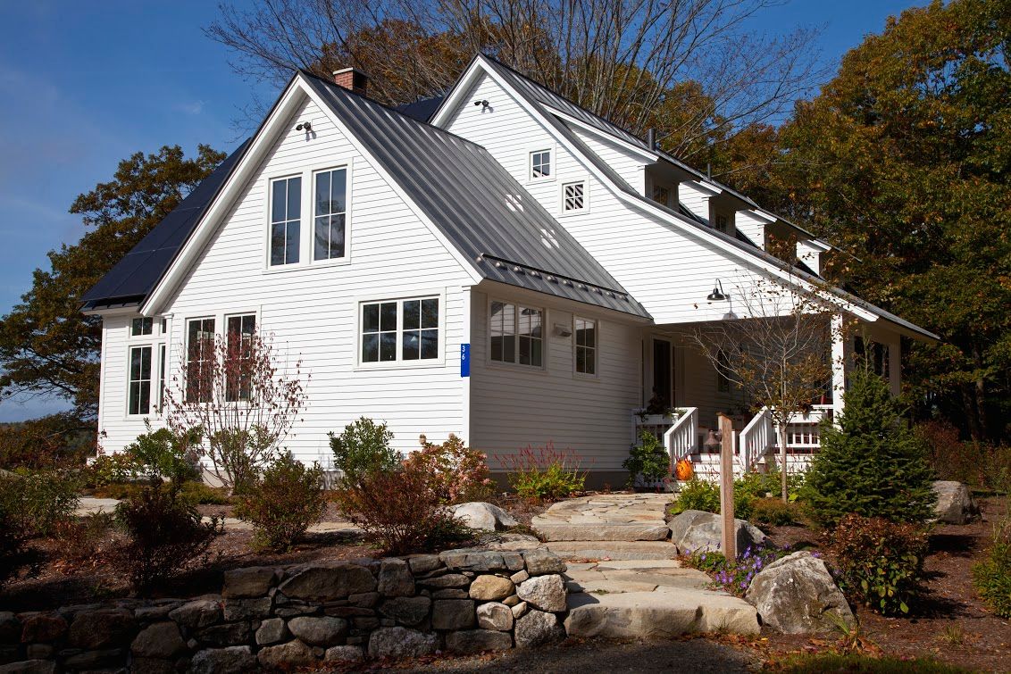
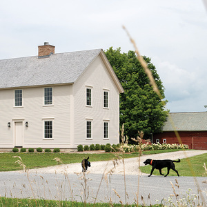
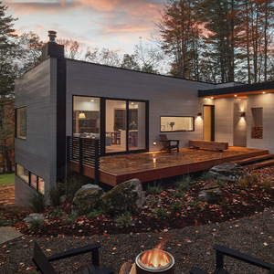
When a house sits on a piece of land for many generations, though, expectations grow up around it over what looks right and what looks awkward. Our clients wanted to honor those feelings to the extent possible, and so did we. This newer house, while somewhat smaller than the old one, presents itself to the approach and to the water in much the same way as the existing house did.
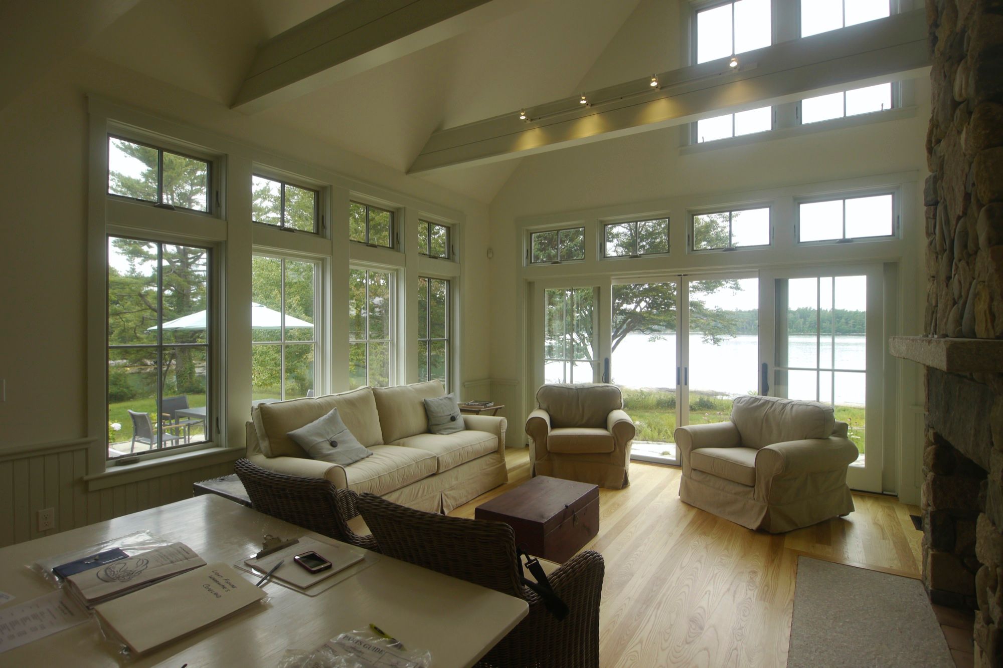
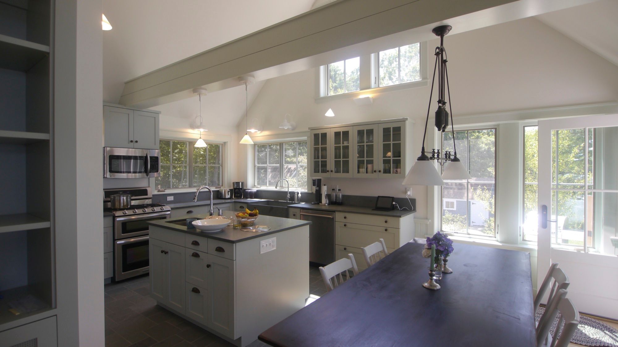
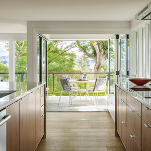
To us, this feels like a farmhouse, but it’s updated for contemporary clients who toil inside in front of a computer rather than toiling on the land. This house engages you with views from every room of the beautiful surrounding land, it captures a great deal of winter sun, and it makes a lot of its own energy. It presents itself as New England vernacular, albeit with a bit more edge.

