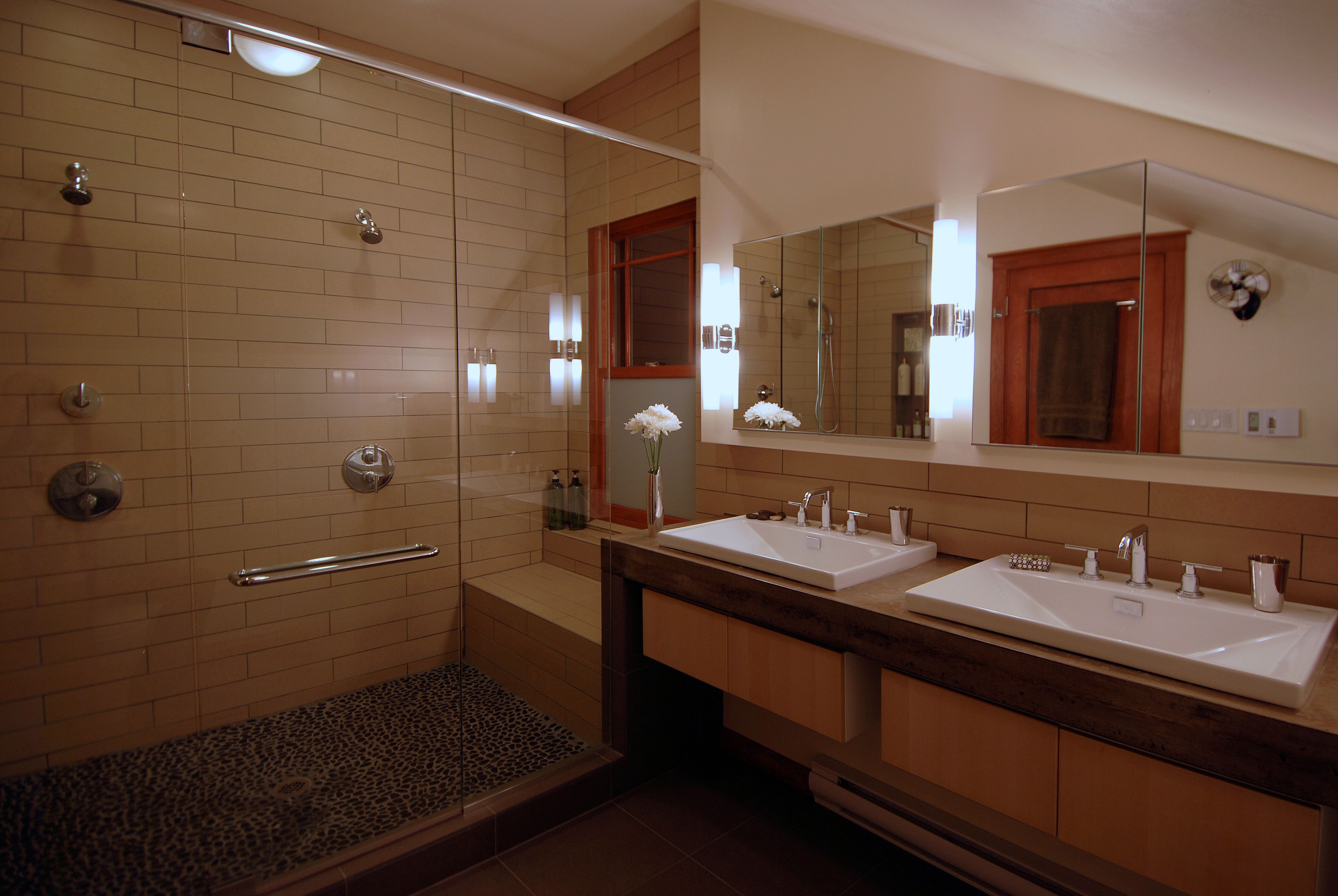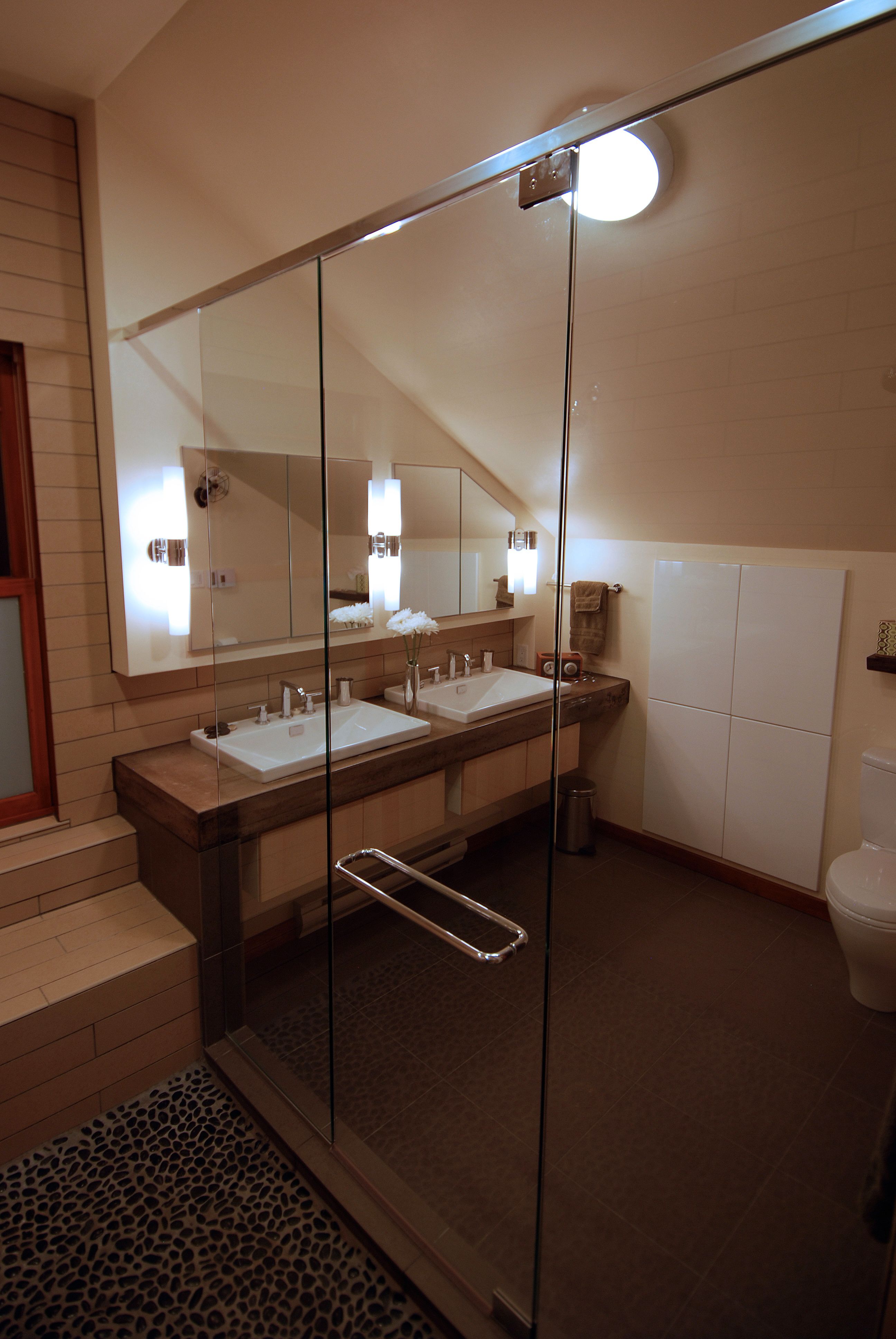
This 1924 craftsman home in South Minneapolis had been well maintained throughout it’s long life, but the lack of updates left much room for improvement. When the current homeowners purchased the home, the second story contained an entirely unfinished upper level with a peak over eleven feet high. Their long term dreams were to convert the entire upper level into a master suite with a separate walk-in closet and a true master bath. Stylistically, the team envisioned an intentional departure from the craftsman styling found on the main level. A desire for clean lines and contemporary finishes drove the design process from start to finish.
Fortunately for the project’s budget, the original framing was in excellent condition and we chose to incorporate the existing window location into the new design. The unfinished nature of the space was a blessing as it allowed us to have notable freedom in layout-it also significantly saved in cost as there was virtually no demolition needed. All new plumbing did have to be brought from the basement through the first floor. Thankfully an easy route was available in the back of a deep closet on the main level.
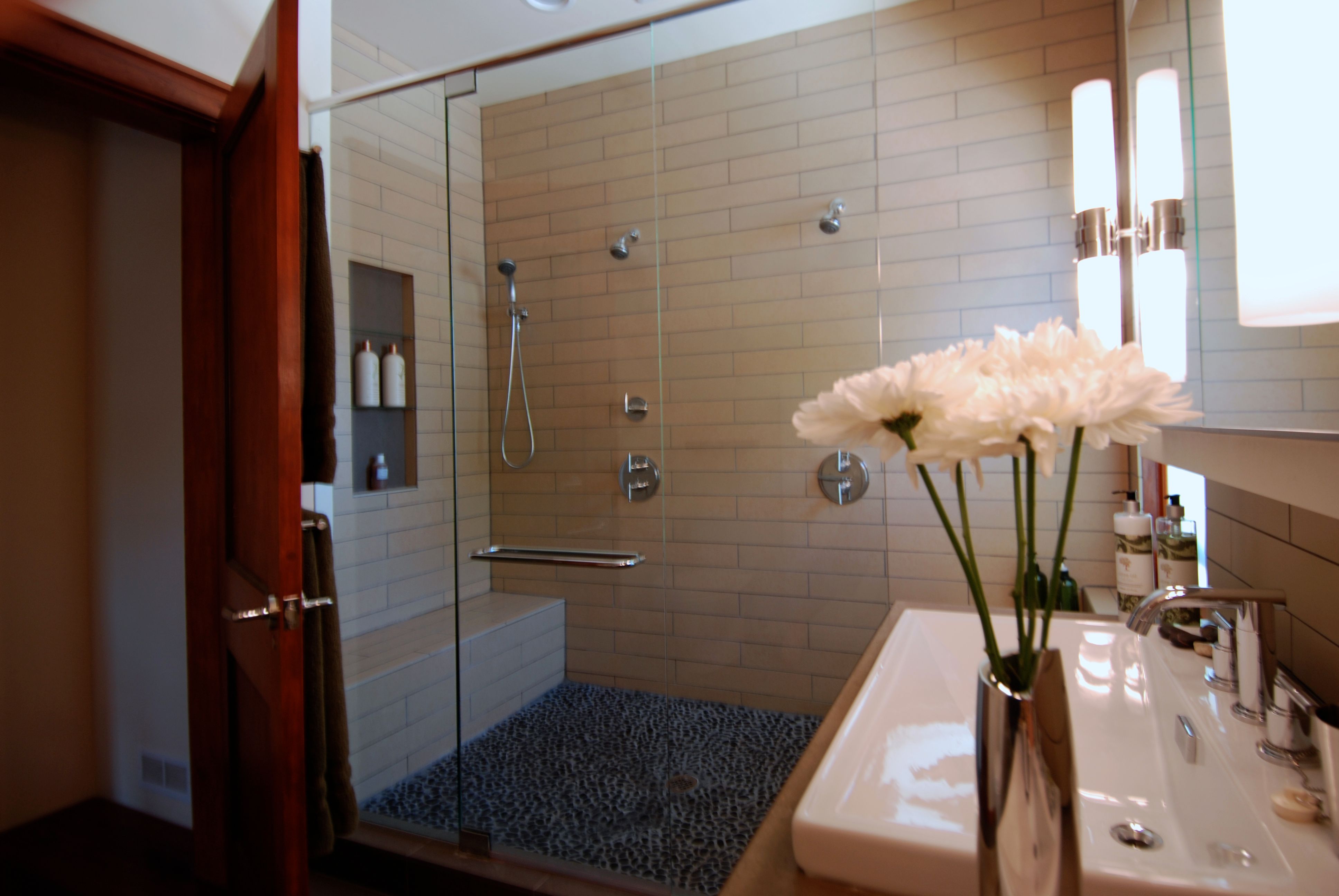
Because of the generous width of the new room, we were able to frame a secondary wall inside of the insulation. This allowed us to locate plumbing and recessed cabinets on the ‘exterior wall.’ In places without plumbing or cabinets the wall was carved back to the original plane creating a visually interesting effect between the two wall planes. The shower was centered below the ridge line and centered on the window opening, giving full ceiling height, ample light and wonderful opportunities for fresh air in the spacious two person shower.
There were also a number of cost saving measured taken throughout this process. Although the rough-in costs associated with bringing plumbing from the basement were unavoidable, the homeowner was able to save money by using IKEA cabinetry and modest lighting selections. An electric baseboard was installed as an alternative to tying in to the heating system on the floor below. The paneled maple door was reclaimed from a separate renovation in the home, and refinished to match the cherry trim in the master suite.
Large format tiles on the heated floor and large linear tiles on the walls were chosen for their simplicity while a river rock floor in the shower helps to balance the otherwise sleek lines of the bath. As a bonus, the non-slip floor is great for the entire family.
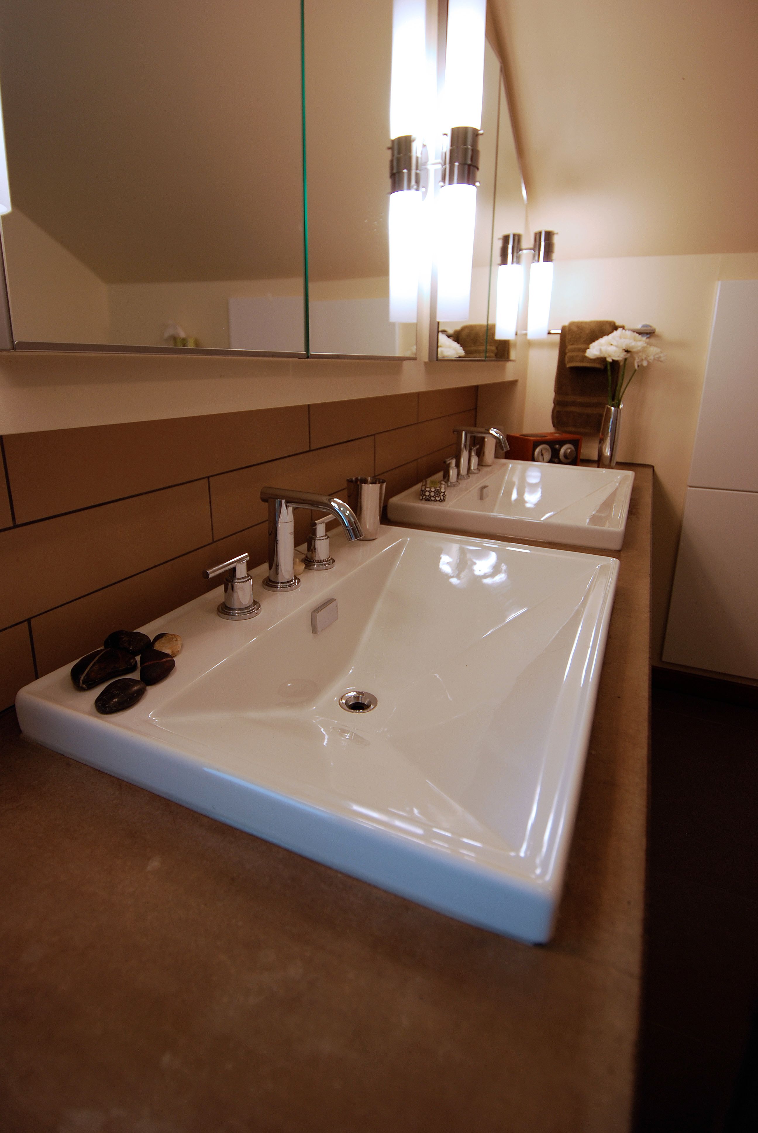
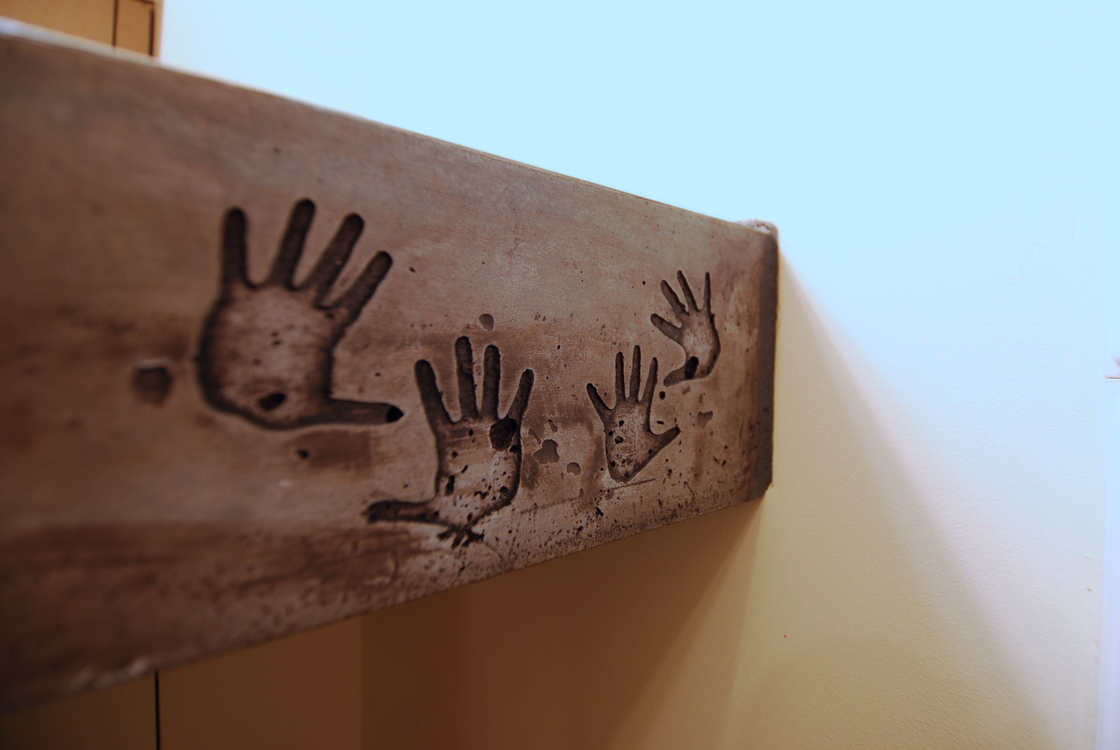
The grandest gesture in this bath is definitely the one-of-a-kind concrete countertop that was cast on site. A pair of Toto Lloyd lavatory basins with Grohe Atrio faucets are set into the 4 1/2″ thick concrete countertop. A pair of miniature ‘handprints’ belonging to the homeowners/builders was cast into the front edge of the countertop as a lasting reminder of how ‘hands-on’ this project was for all involved.
