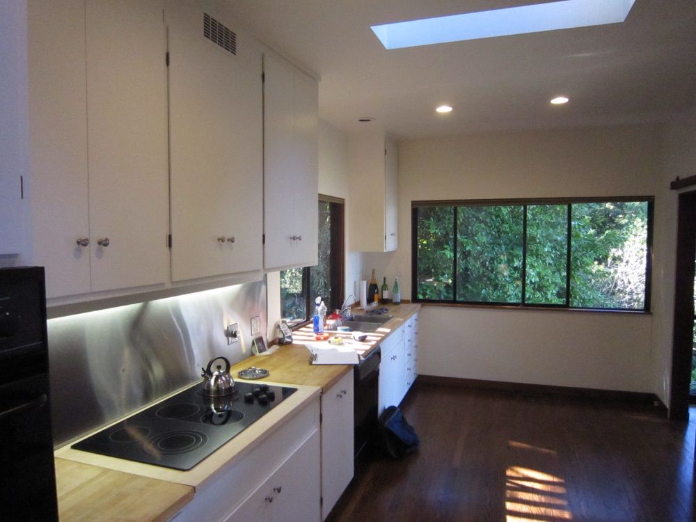
The project was a complete kitchen renovation in a landmark mid-century (early 1960s) house in the East Bay hills above Oakland, California. The design team sought to develop a solution that updated the kitchen to serve contemporary needs, while respecting the integrity of the original structure’s design.
From the outset, the renovation was limited to the extent of the existing kitchen; no reconfiguration of rooms or expansion of the house was to be considered. While the budget was not overly restrictive, design choices were frequently weighed for their financial impact. Construction coordination was made somewhat more challenging by the fact that the owners were out of the country during much of the project’s duration. However, the owners were conscientious about prompt communication and decision-making, and the architect and builder worked to anticipate issues well in advance.
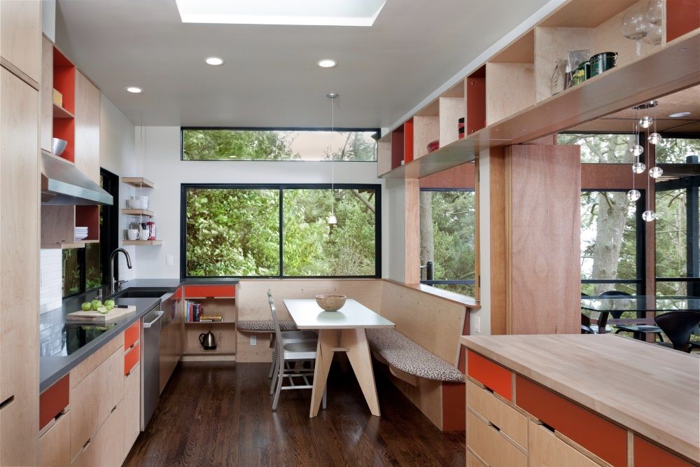
The initial program was typical of kitchen renovations in older homes: to enhance the utility of the room; to update its aesthetic (it was last remodeled in the 1980s); to open the room to adjacent spaces for visual connection, views, and light (while also providing a means to close off the room); and to provide a built-in space for dining. This was to be achieved in a relatively tight space (the room measures approximately 10′ x 19′-4″).
While working to meet these programmatic requirements, the design team-architect, owners, and builder-sought to achieve two additional goals with this project.
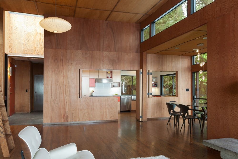
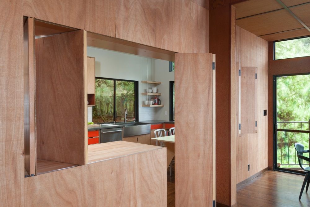
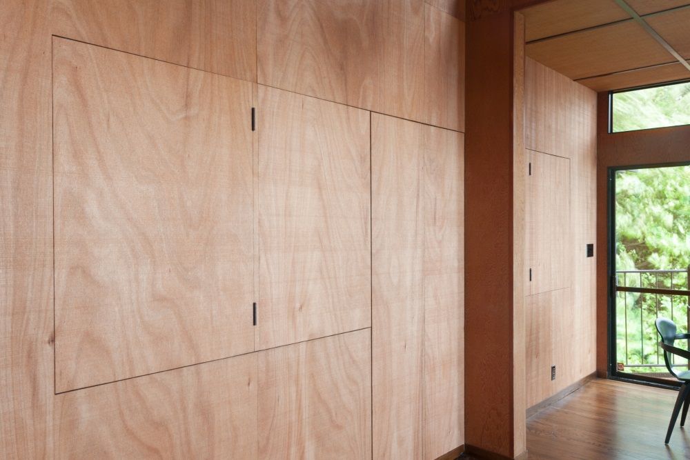
The first was to preserve, to the extent possible, the spatial and material qualities of the main living space of the house, a model of clarity and simplicity of construction and expression. Therefore, the question of how to treat the openings in the demising wall between this space and the kitchen seemed crucial. 3-D computer models of various schemes-louvered and translucent panels, pocket and barn door configurations-were tested and rejected. The final solution pays homage to the simplicity and restraint of the original design and serves to mediate between the original and new. The large panels and person door, echoing the original pass-through shutters, were carefully detailed to align with the adjacent wall surface and crafted by the builder on-site. Rough-cut wood veneer was used that closely matches the original redwood plywood and the entire wall was re-clad.
The second goal was to adhere to the same virtues of simplicity and honesty of expression in the design of the kitchen itself. The cabinets, fabricated by a shop in the Pacific Northwest, are simple but carefully crafted maple-veneer plywood and plastic laminate; the owners appreciated the shop’s light, contemporary aesthetic, and selected the laminate colors. Finishes-quartz and butcher block countertops, white ceramic wall tile, and stained oak flooring-were selected as useful, durable surfaces that recede into the background. A new clerestory was added above the south window to bring in additional natural light and views to the room.
