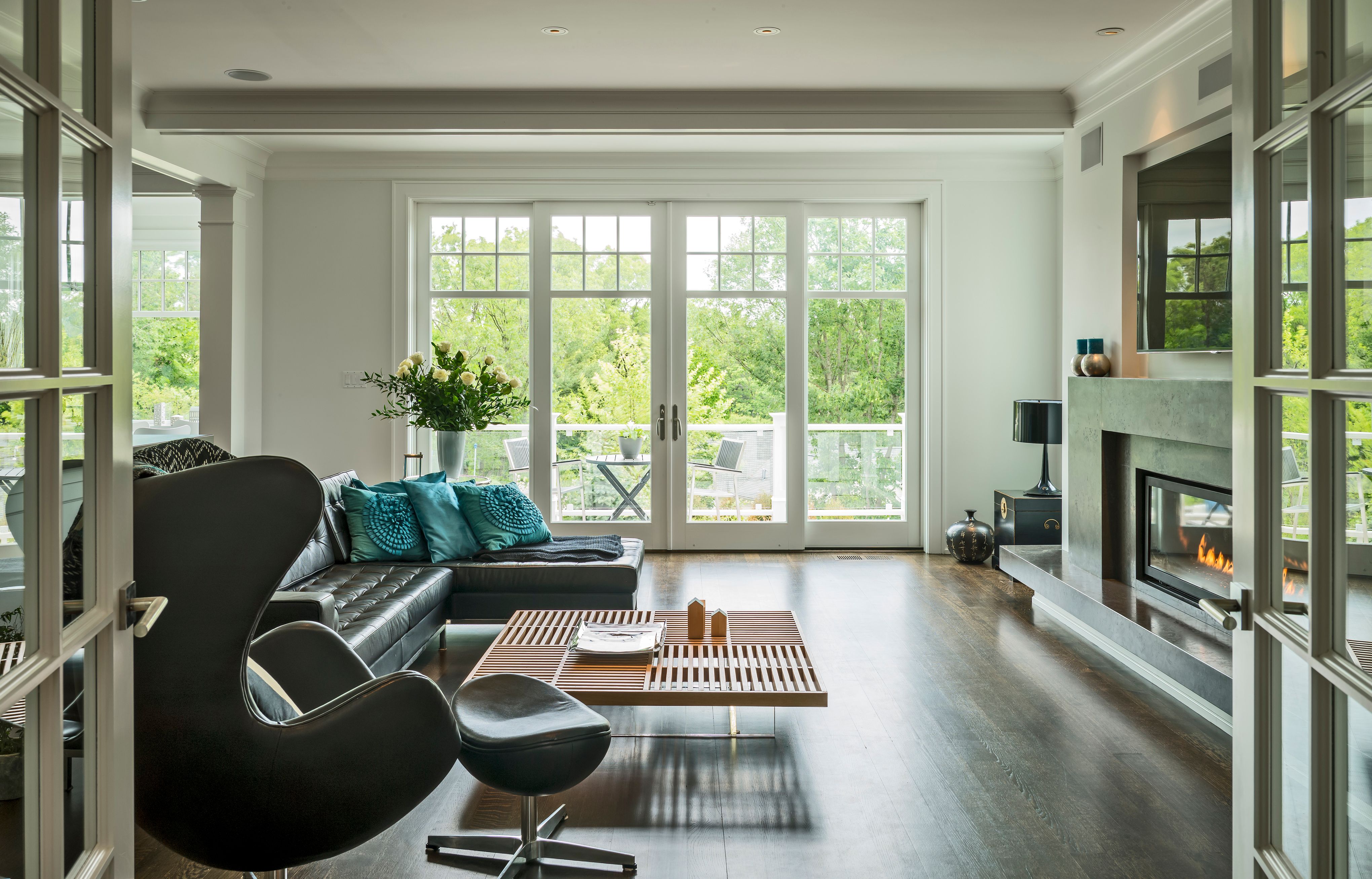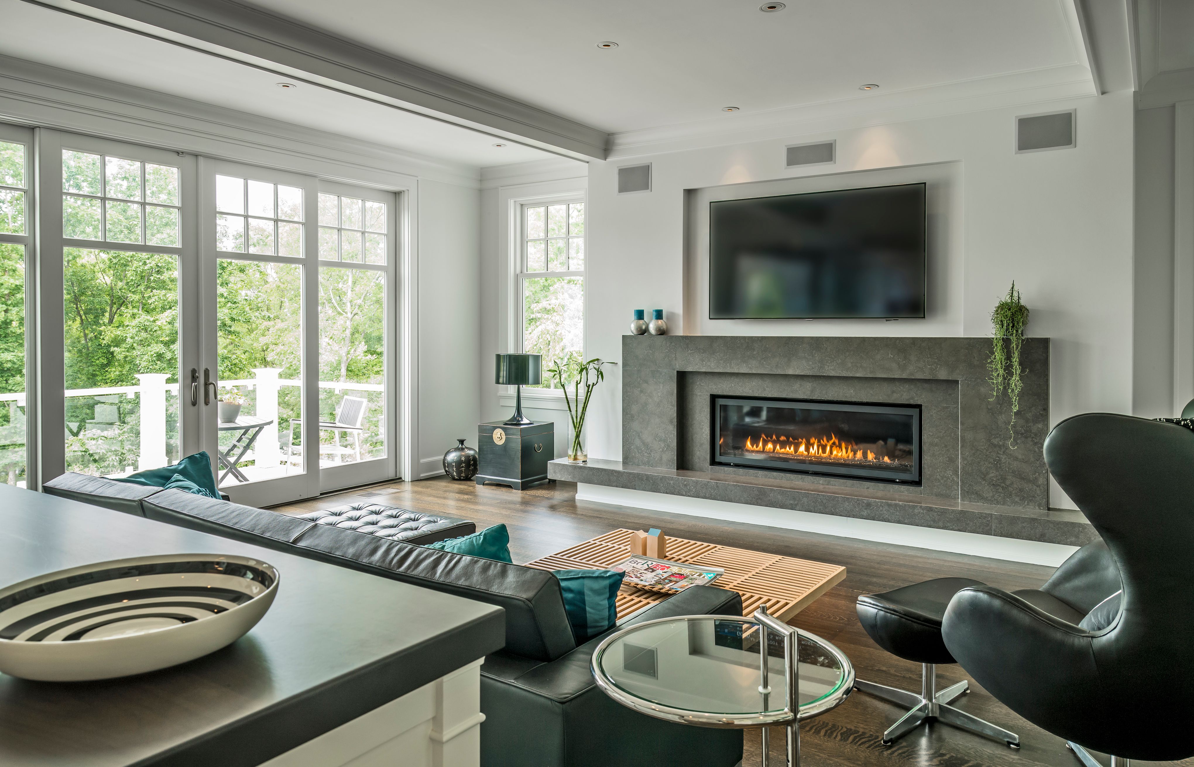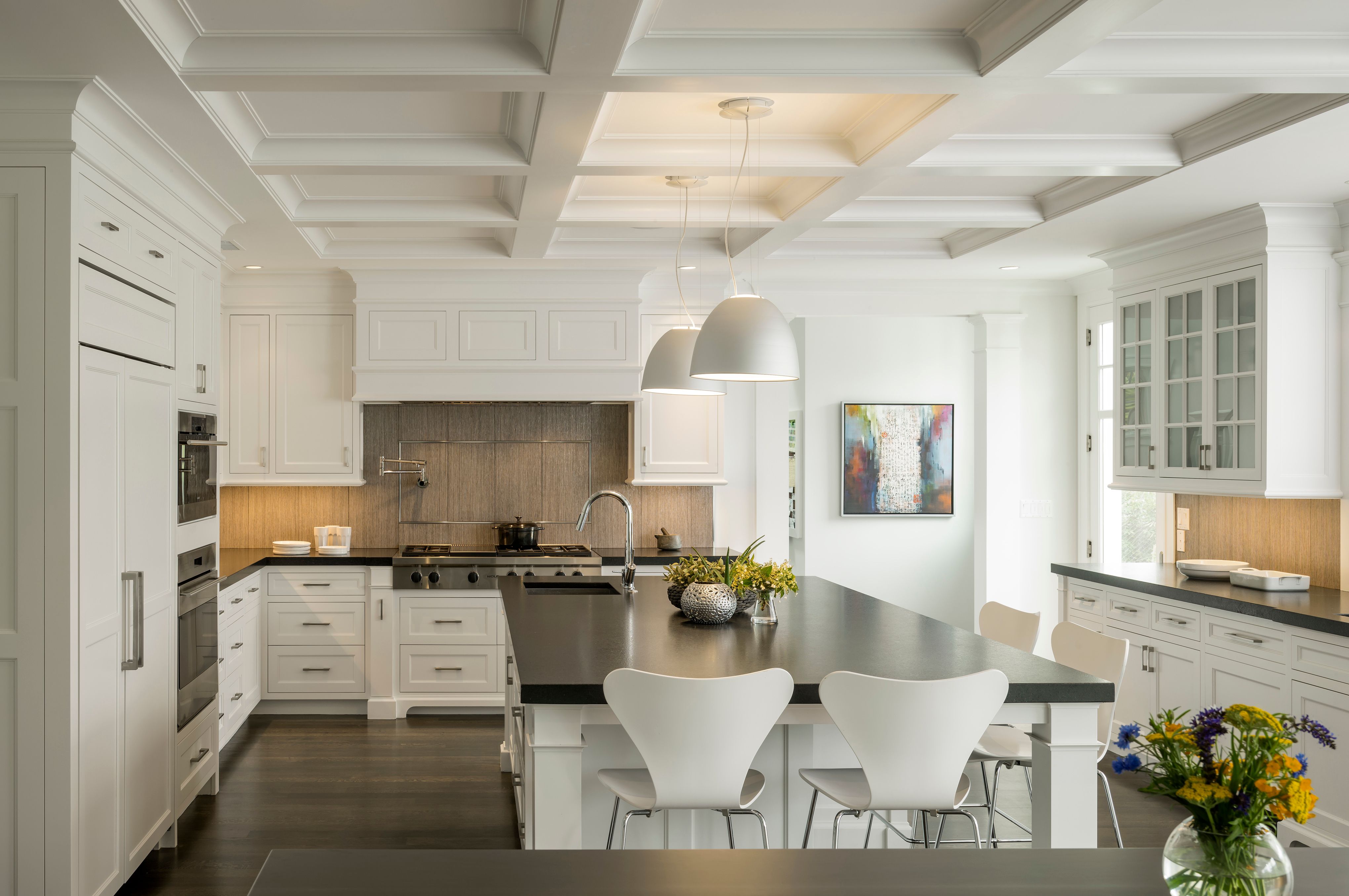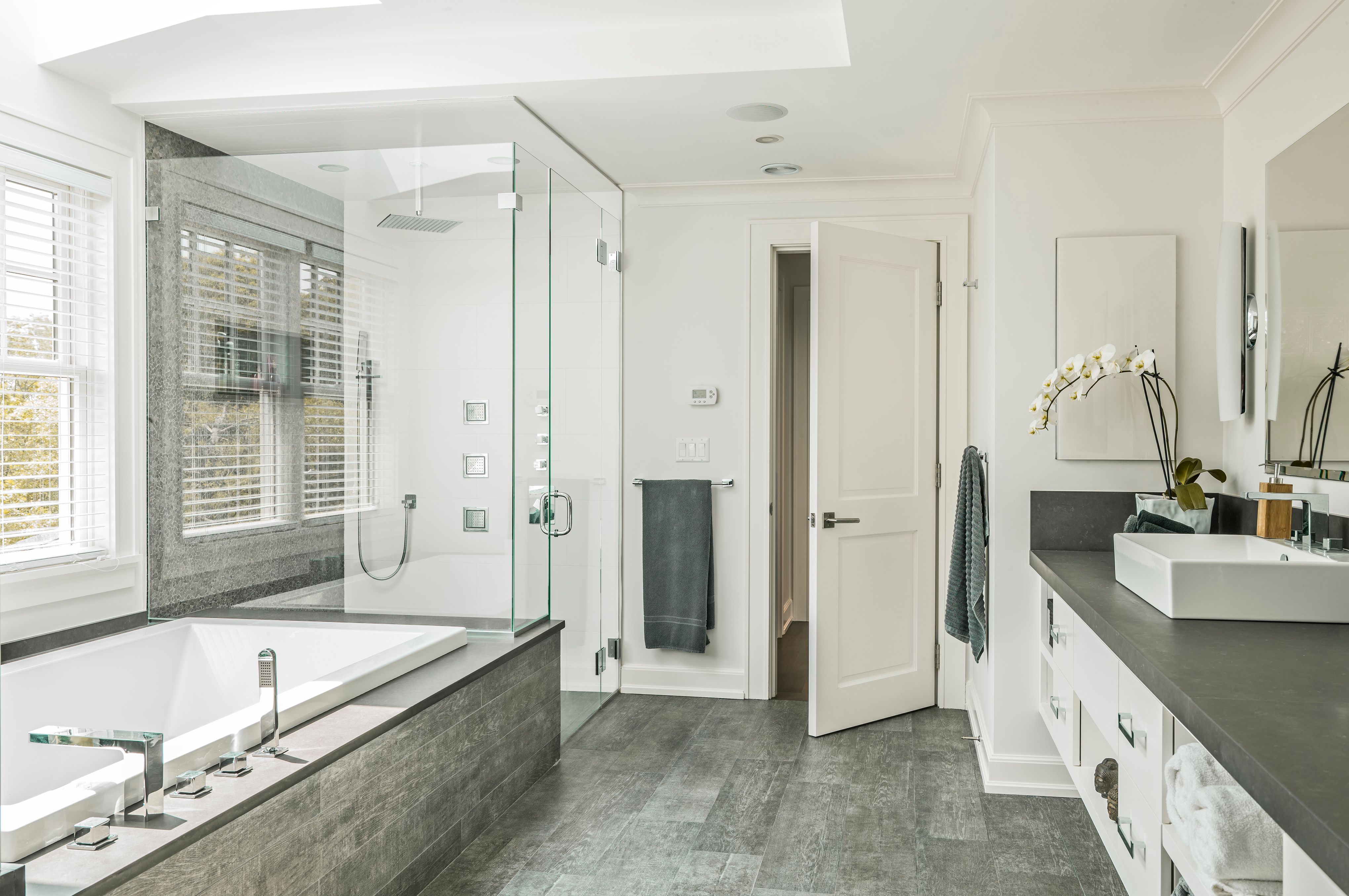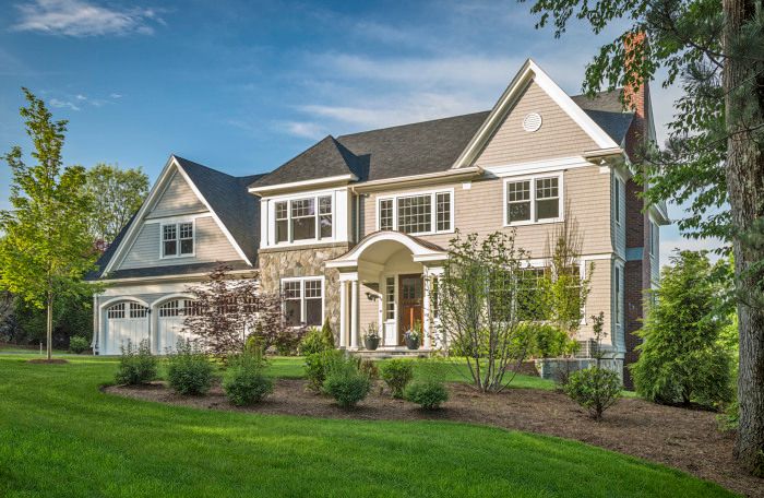
The design of this shingle and stone residence is a dialogue between modern and tradition. While the clients enjoy modern aesthetic and furnishings they also wanted a traditional floor plan and embraced their traditional New England neighborhood.
Large deposits of ledge had left an undeveloped lot in the middle of an established and largely traditional New England neighborhood. Rather than fighting the natural conditions of the site, ledge removal was kept to a minimum by using a compact footprint with a multi-level basement. The street facing front façade was leveled to meet the neighboring lots, while the steep slope of the terraced rear yard provides surprisingly dramatic views and terraces for the family. Glass railings provide unimpeded views from the family and breakfast rooms. The steeply sloped site even allowed for a sun-lit walkout basement rec room.
The simple massing reflects both the traditional floor plan and modern restraint. Traditional shingle and stone details wrap the exterior of the home. A curved copper portico marks the center entrance to the main entry hall. The stone “tower” is a play on articulated stair towers often found in shingle style homes and breaks the symmetry of the façade. By siting the house to face the street in a traditional manner, the rear façade faces almost directly south. Generous windows and several skylights take advantage of the southern light along the rear façade.
The home’s interior, on the other hand, follows a traditional floor plan but the modern detailing steals the show. Dark oak floors contrast sharply against the white walls. Skylights bring in diffuse light in unexpected ways throughout the home – over the master tub, trickling down the mudroom stairway, or in a dressing room tucked in the center of the house. Moulding and trim profiles were chosen for their simple, clean lines. By using almost identical paint colors on the wall, trimwork, and ceilings the line between wall and ceiling becomes blurred. When combined with the diffuse light from the skylights and the treetop views, the home takes on an unusually light, open, and airy quality.
Interior finishes and details are clean, striking, durable, and surprisingly cost effective. Simple details stand out by playing up the contrast in color or finish. A linear gas fireplace with a floating stone surround is the focal point of the family room – also visible from the kitchen and breakfast room. Kitchen counters received a leathered finish to give a new twist to a common material. White vessel sinks pop against the gray counter in the master bathroom. Much of the tile throughout the house is ceramic – chosen for durability and cost.
The design of this home is not only a collusion of modern and tradition, but also a true representation of the clients. The result is a refreshing take on traditional, suburban living

