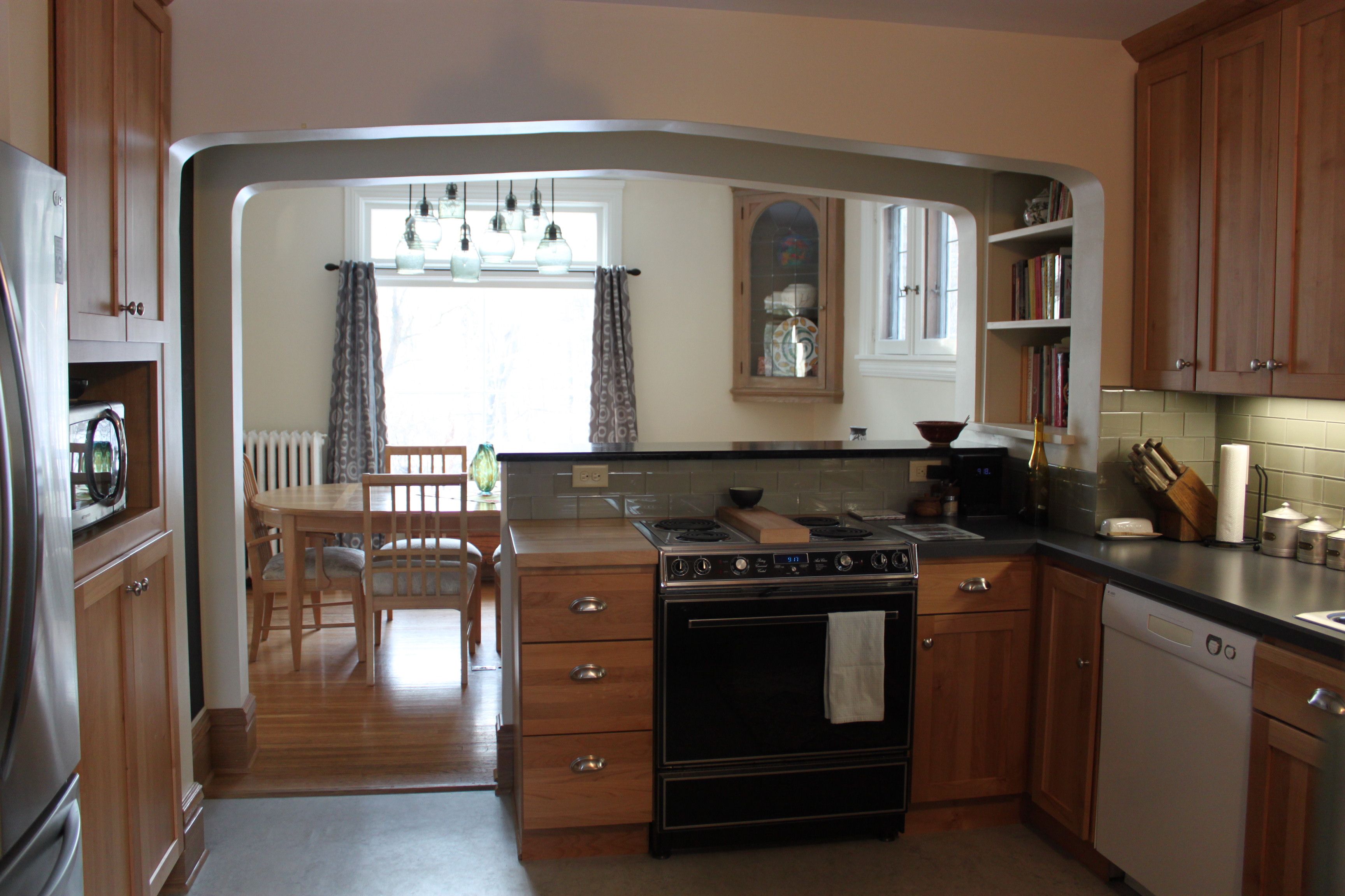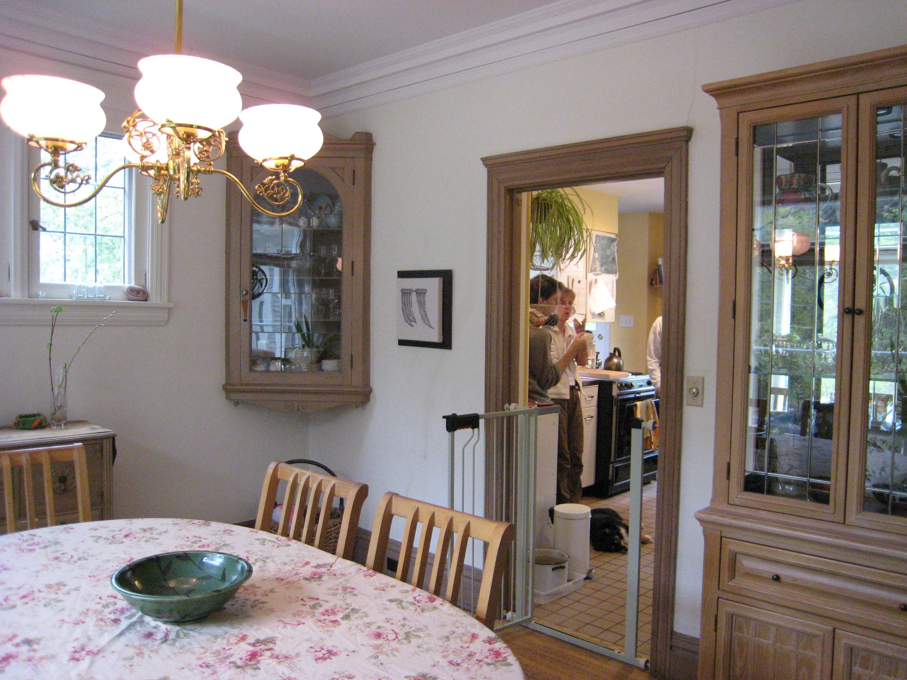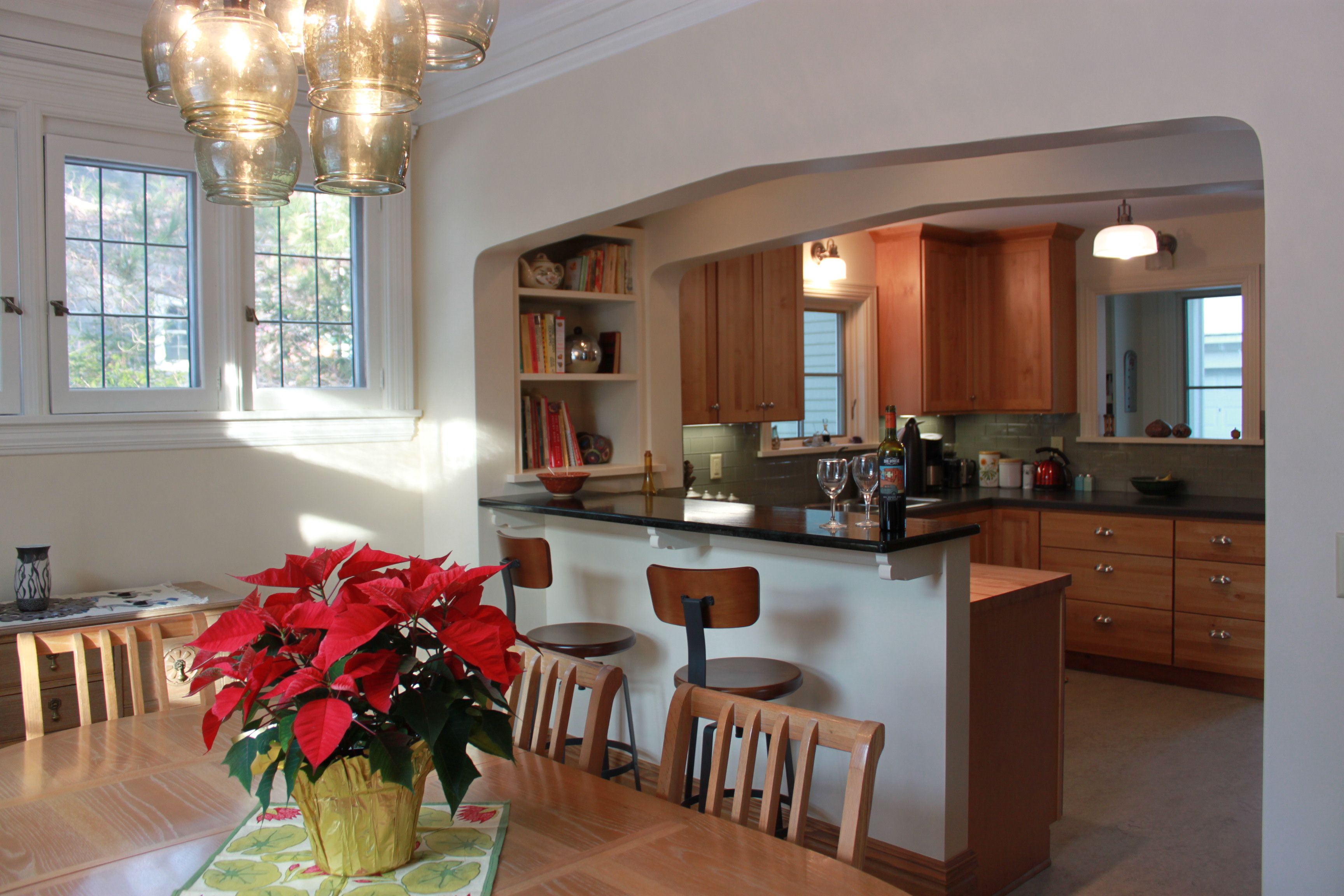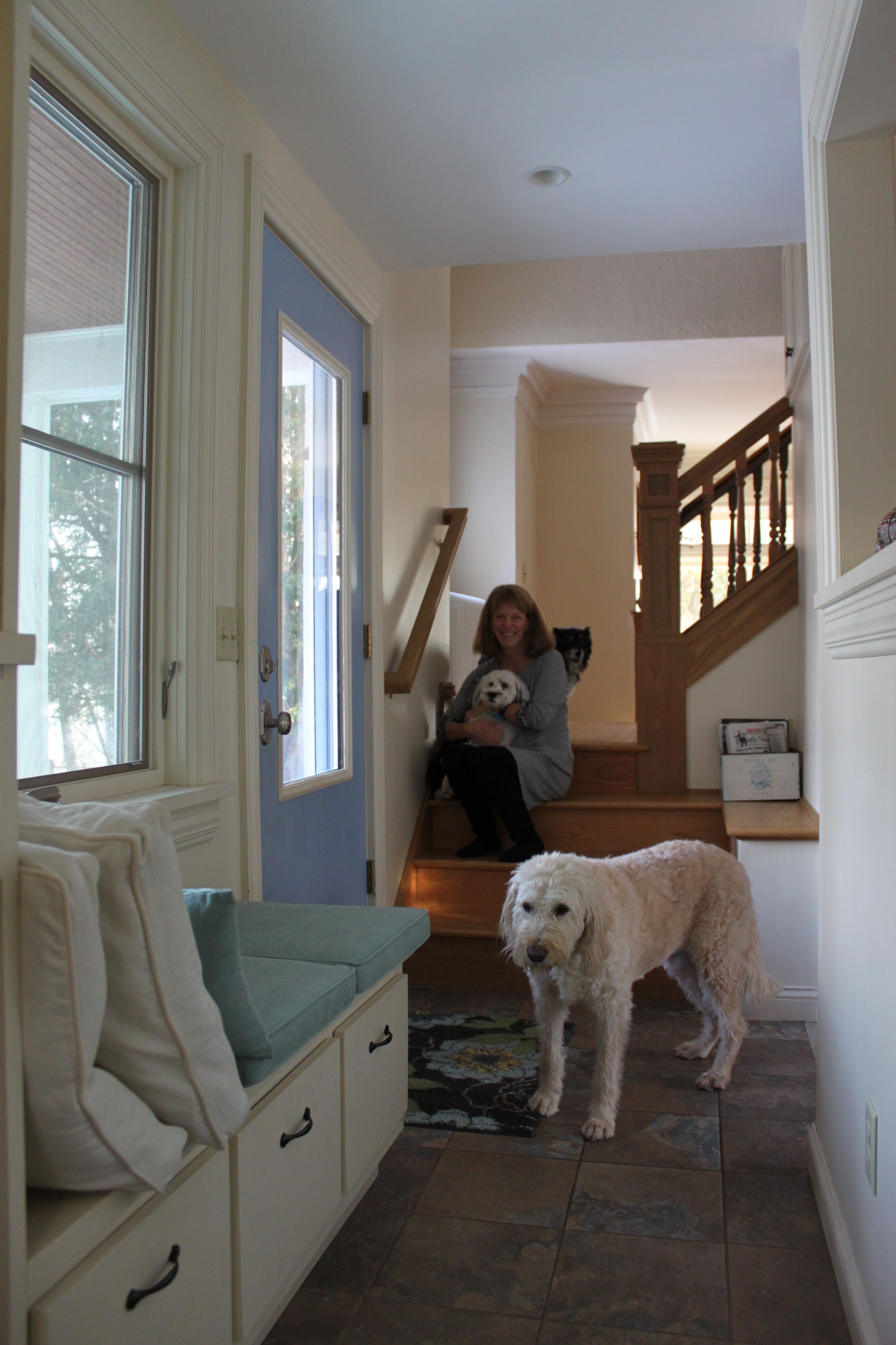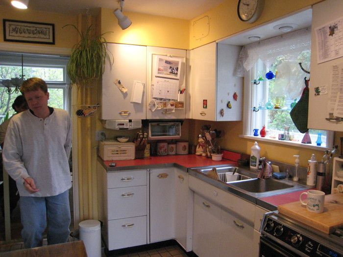
The owners were clear in their goals for a much-needed overhaul of their entry and kitchen: more natural light, more functional spaces, more beauty, more flow and connection between spaces, and less clutter – everywhere.
The site, the existing style of house, and the budget made increasing the house size unlikely. The tiny back entry was crowded and cold. The kitchen was cluttered, awkward, and poorly connected to the other living spaces. We found opportunity in underused space within the kitchen and dining room and then used our creativity and skill in space planning to answer all the clients’ interior needs using the existing footprint of the house.
The inspiration came with three big ideas. One: we took about two feet of width from the dining room and “gave it” to the kitchen, simultaneously increasing connection and light with the kitchen peninsula and bar counter. Two: when we removed the bearing wall between kitchen and dining we needed to add a beam there, and the beam line sat awkwardly to the inside of the peninsula counter. We created a “double arch” that matched the arch between dining and living and the result was a structural solution that added beauty and functionality appropriate for the existing space. Three: we moved the location of the entry door close to the existing stair, and reworked stair, entry, and mudroom to create attractive, functional space – again with more light and connection to the kitchen.
The kitchen is the heart of most homes, and this one is no exception. In essence, this home got a heart transplant, and the result has the occupants happy and rejuvenated.

