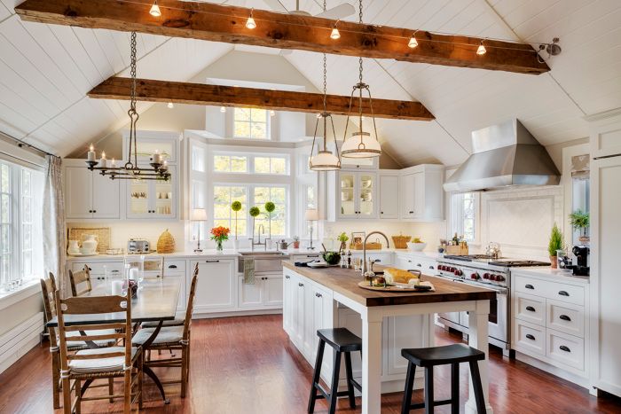
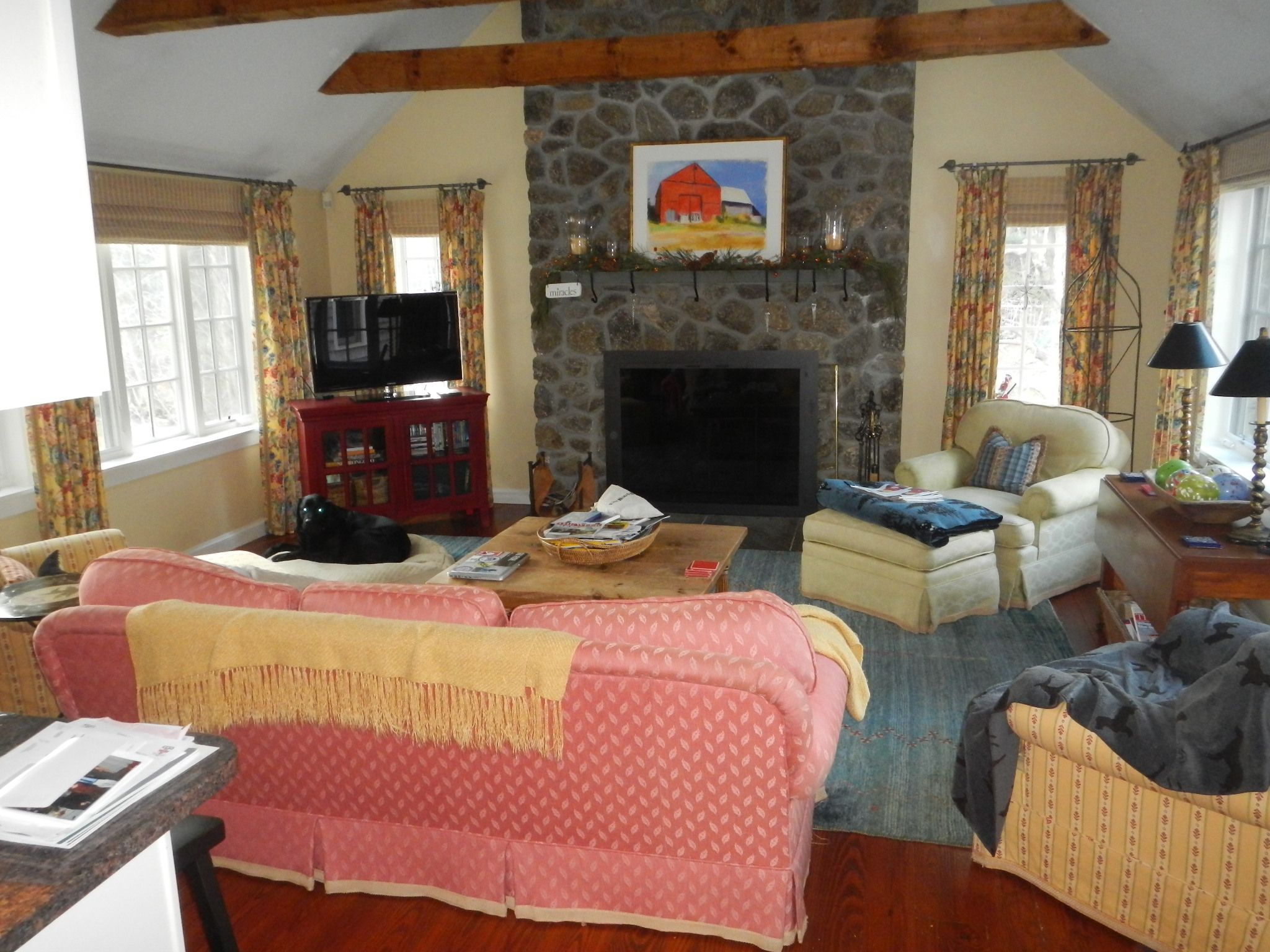
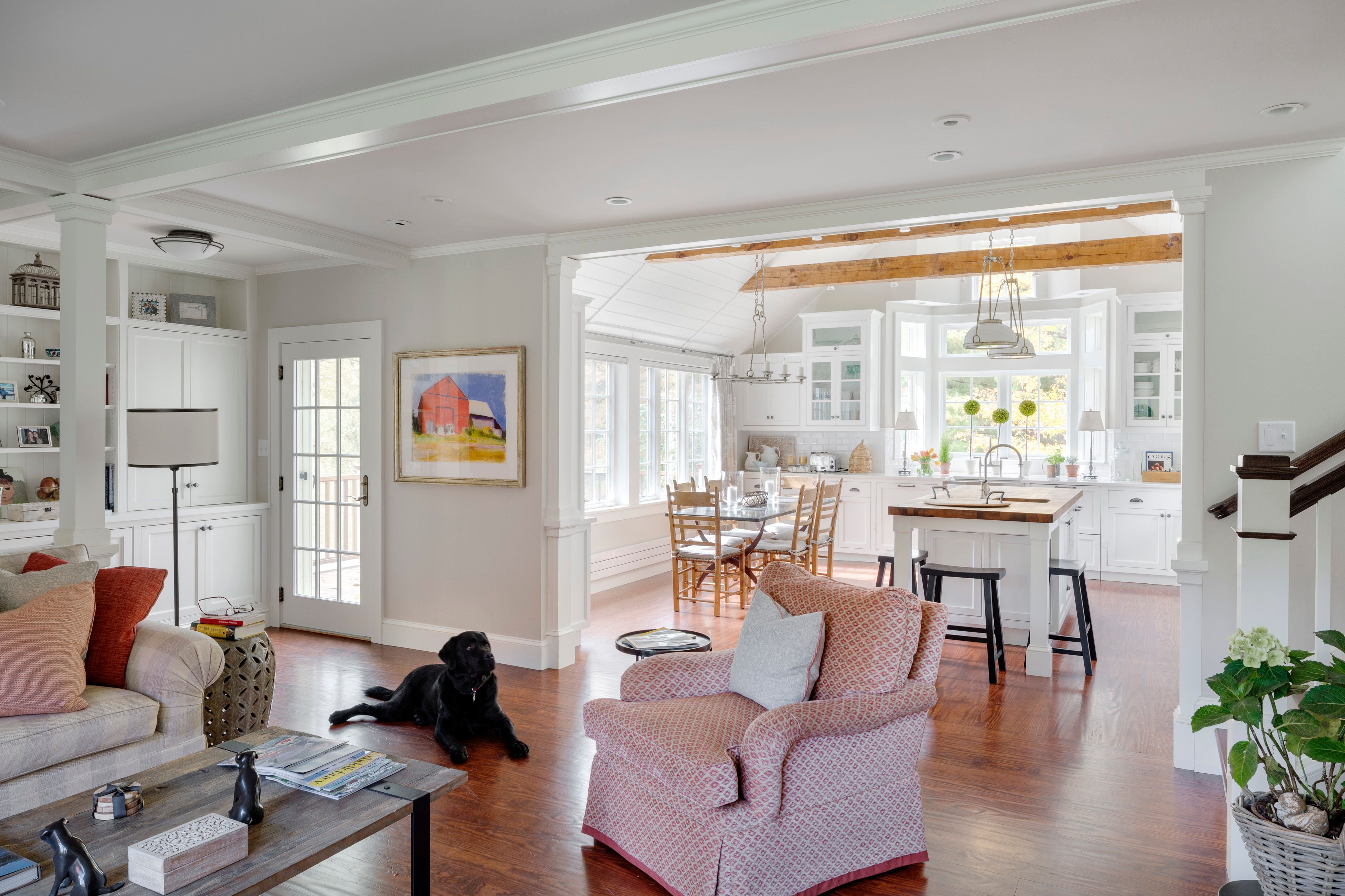
The homeowners and their architect devised a plan to swap their kitchen and family room spaces, working within the existing footprint. The project improved this home in many unexpected ways:
*The kitchen became a destination instead of a walkthrough.
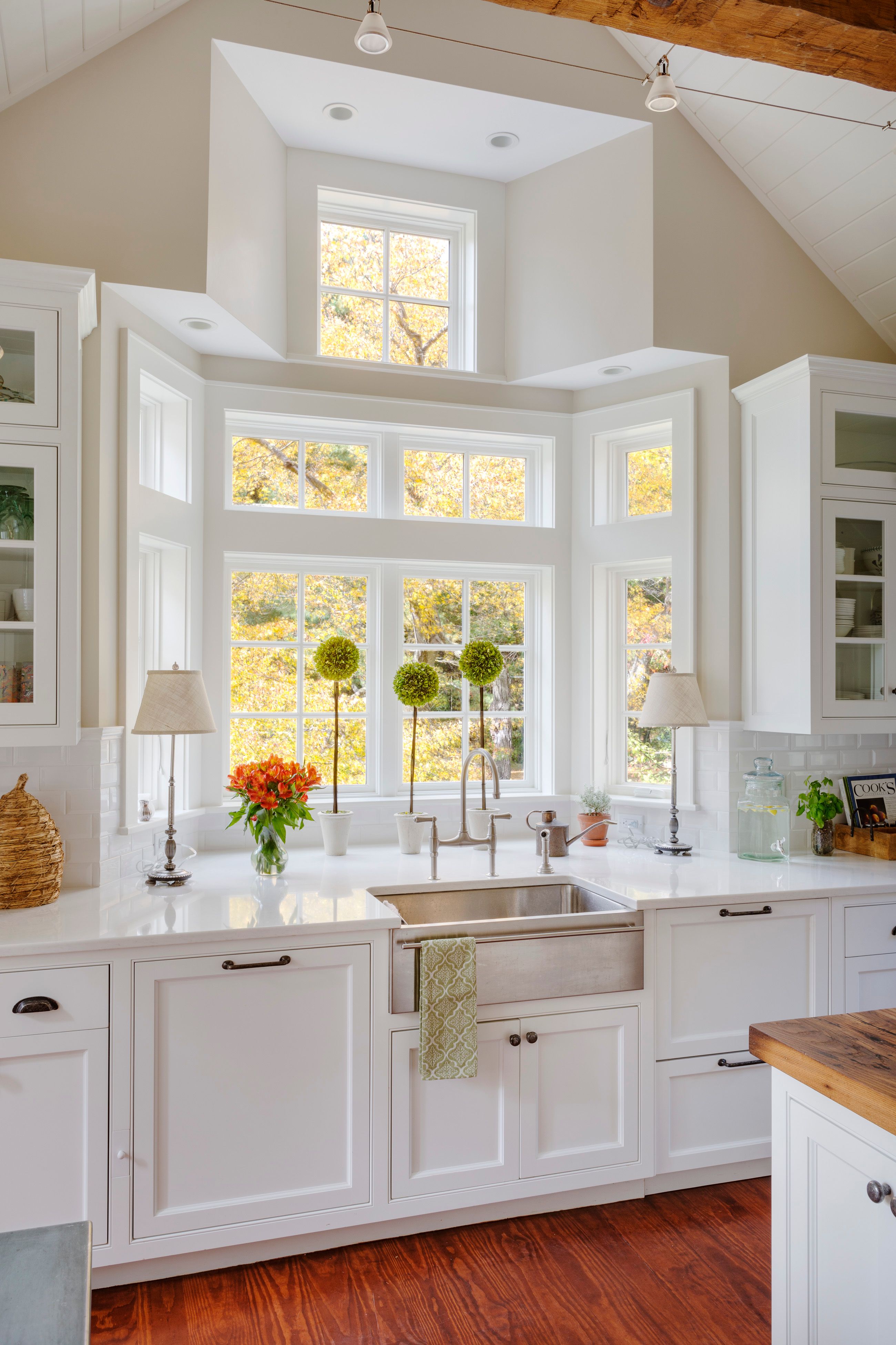
*The stone chimney in the former family room was removed and replaced with a tower of windows that allow more light into the space.
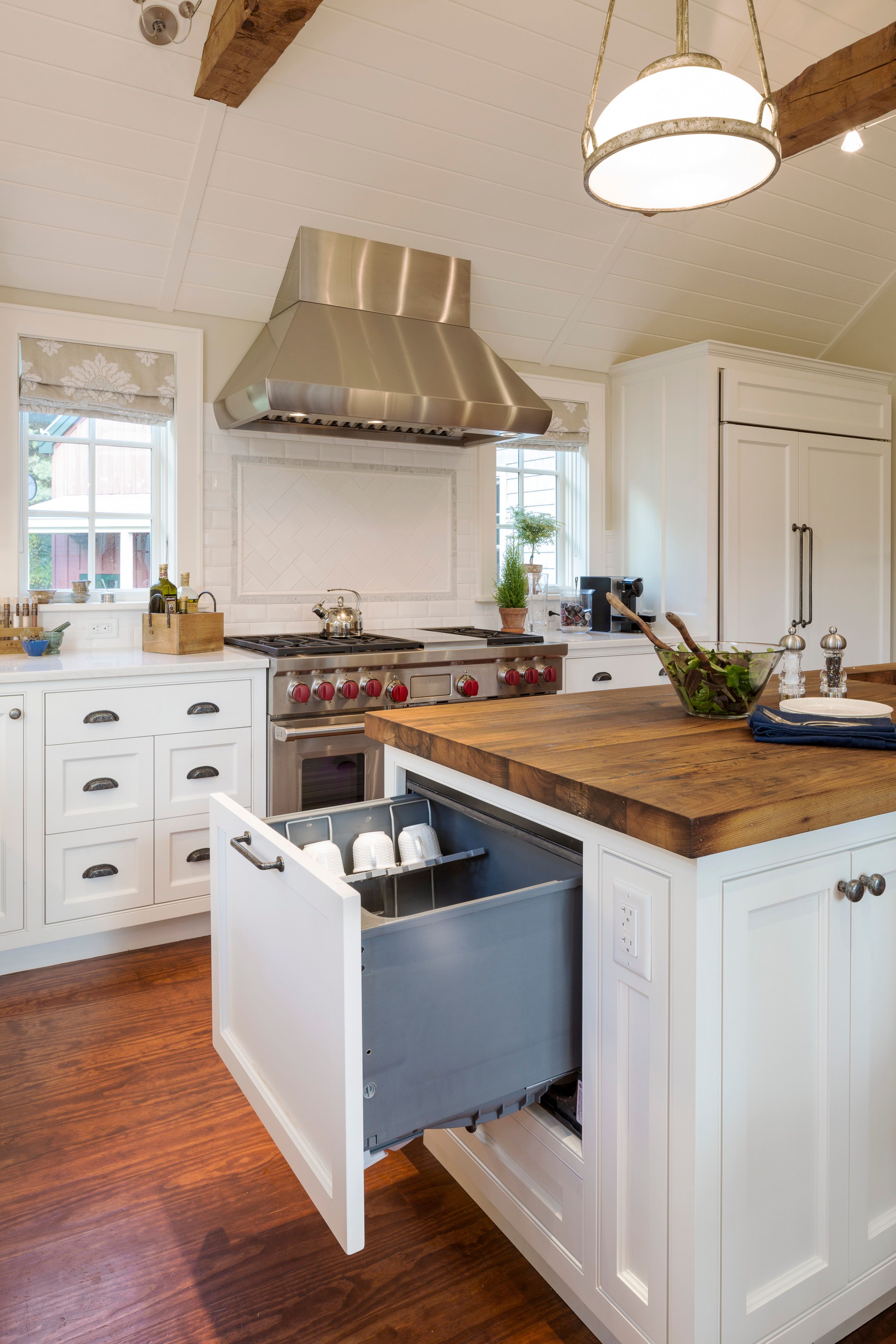
*The exposed beams, wood counter tops and floors unite in a mix of wood with the painted white cabinets.
*The kitchen layout was improved so that the refrigerator is not the first thing one sees upon entering the room.
*Personalized features have been added such as an additional dishwasher on the end of the kitchen island and a special drawer insert for kitchen utensils next to the gas stove.





View Comments
Hi J Platt, I saw your kitchen entry. Nice looking project. My name is Birdie Miller, I'm a cabinetmaker in NJ. I have an entry also.
I saw that your kitchen had a faceframe case with inset doors and you used concealed hinges.
Since we are both into traditional projects, I wanted to invite you to check out something I invented.
A faux butt hinge. If you get a chance check it out.
Best of luck!
http://eurobuttsystemshinge.com/