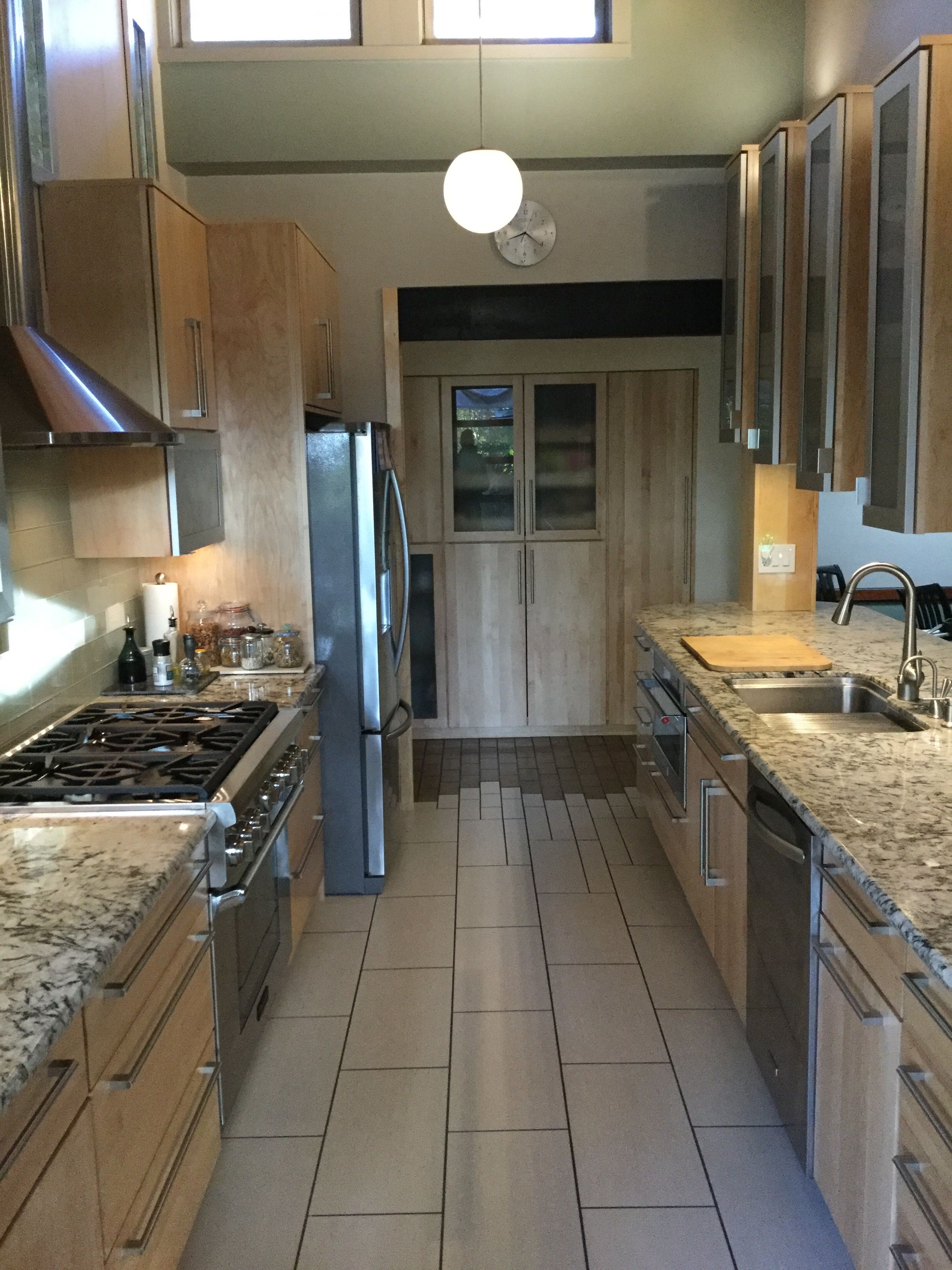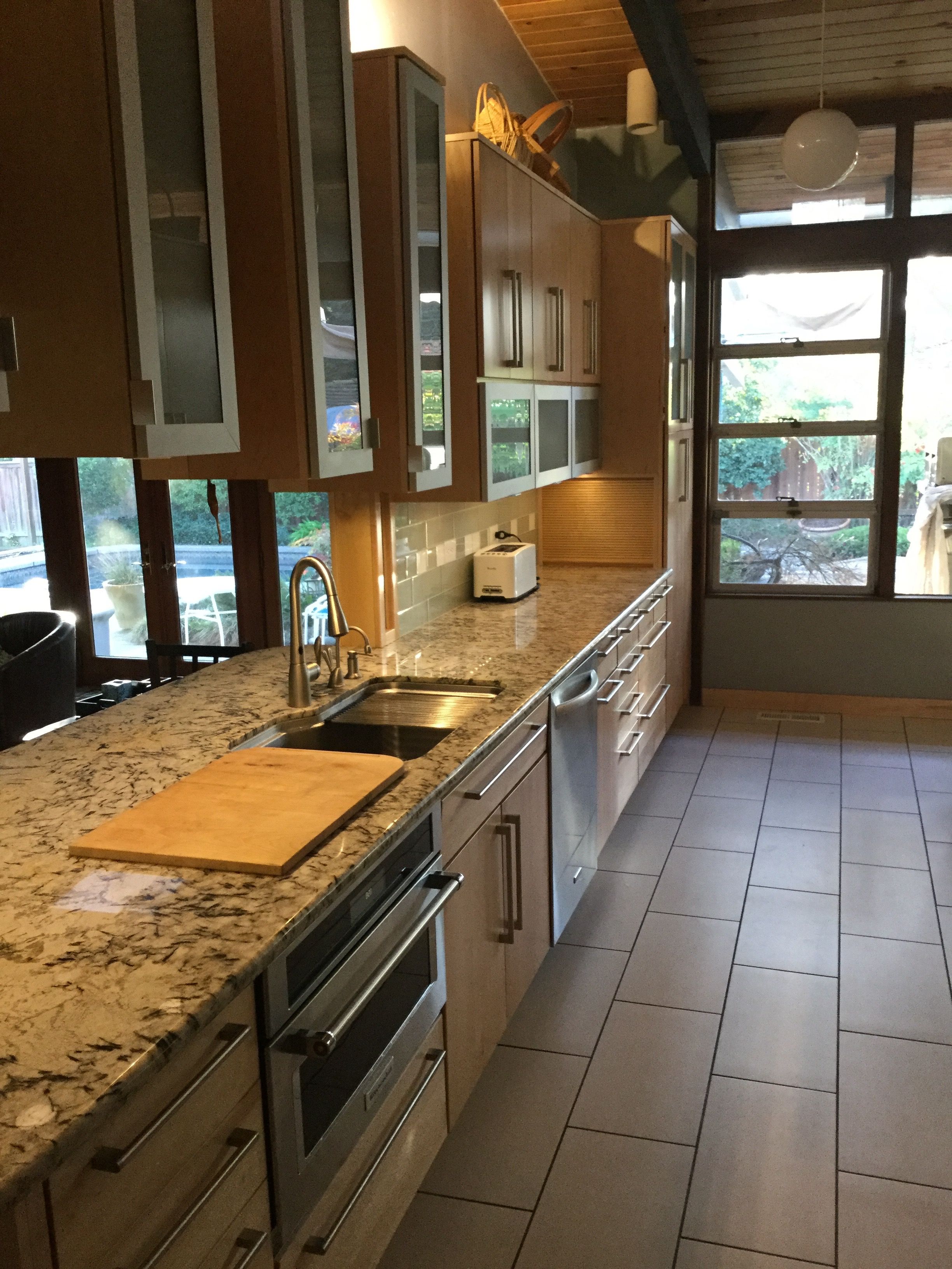
The kitchen in this midcentury modern was the last room in the house to be remodeled. It reflected design norms of its time (1968) so the room was largely separate from the rest of the house. A pocket door was the main entry, and a double-hung pass-through window barely connected it to the adjacent family room. Very dated finishes would have looked better if they hadn’t been given a mediocre facelift just before we bought it in the mid-80’s. The Pullman style kitchen seemed cramped, despite a vaulted ceiling, due to the severe horizontal cabinet lines and overhead lighting that discouraged awareness of the high ceiling. Base cabinets restricted the refrigerator to a 30″ wide model, necessitating a second unit in the utility room, 25′ away down a small flight of stairs. A telephone desk, cool in its day, was now just wasted counter space.
The overall philosophy was to honor the original design theme but modernize the design while upgrading everything. The finished product needed to tie into the rest of the house as though it was always that way.
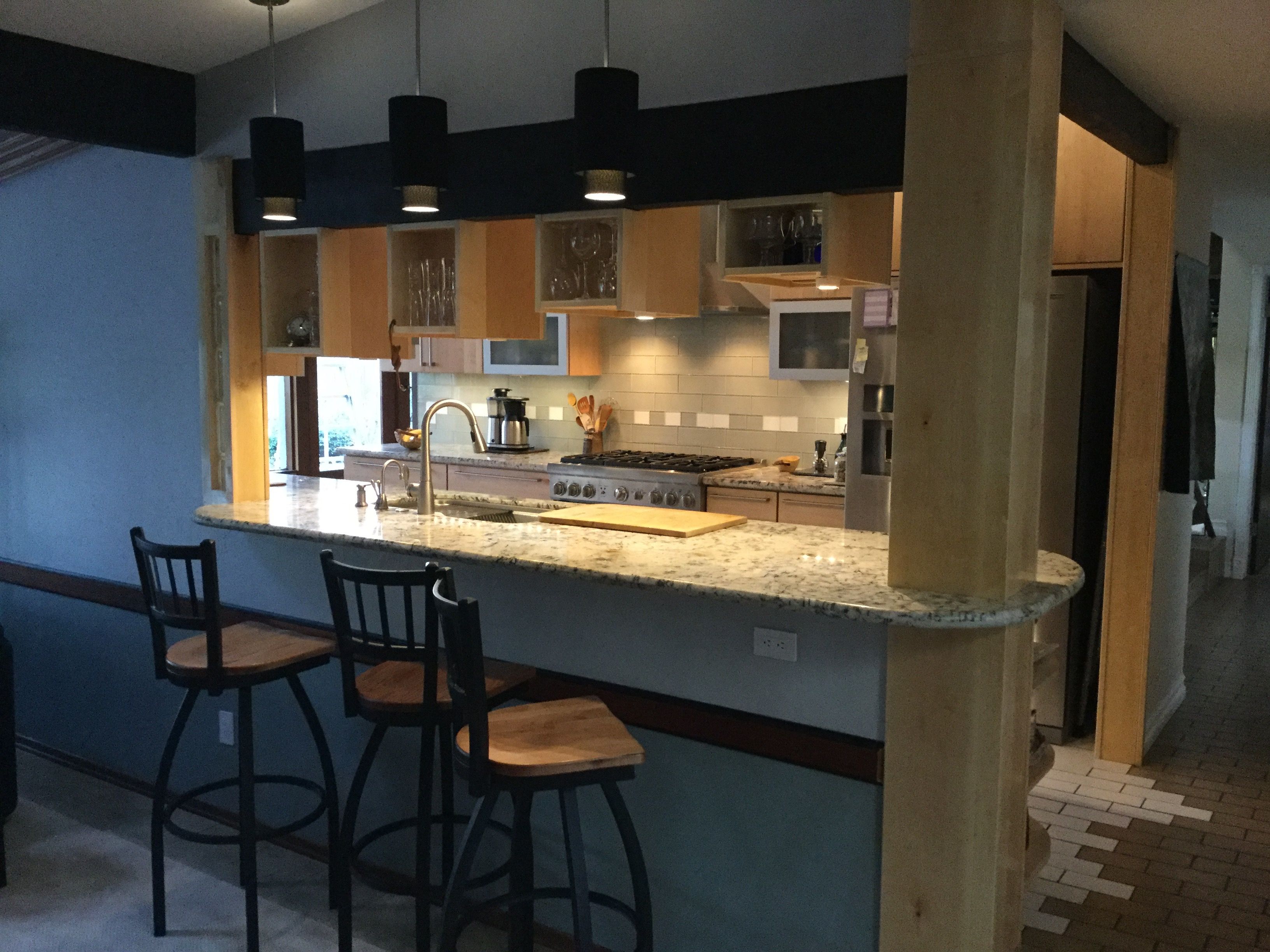
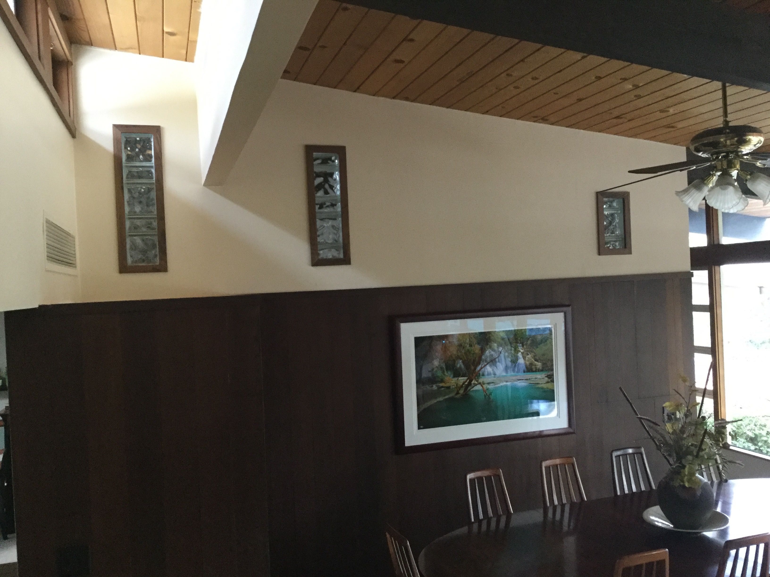
The solution was to remove the pocket door completely, opening up the entryway, while also removing much of the wall into the family room, replacing it with a beam and building a peninsula bar. On the opposite wall, holes were cut into the wall and filled with glass block to connect to the dining and living areas on the other side. This gives the room an open feeling, allowing conversation with people in the family room while in the kitchen, and lets the quality stereo and TV be enjoyed in the kitchen.
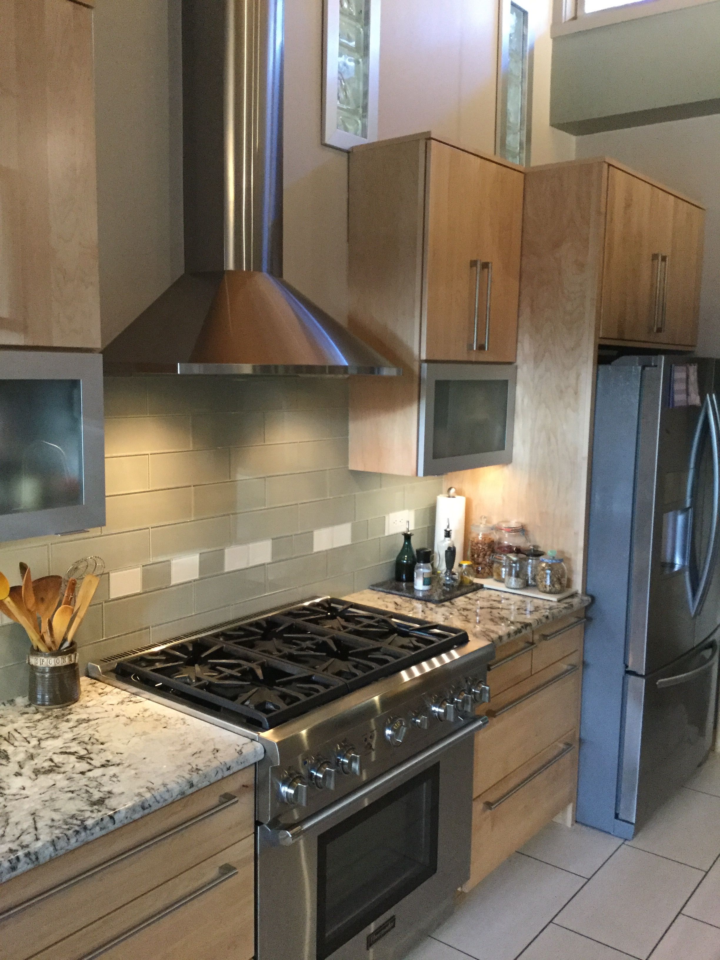
The horizontal lines were retained as an important element of the modern theme, but they were broken up with the addition of a chimney hood, and by varying cabinet depths. Some doors have glass in maple frames, and aluminum frames on horizontal doors help blend the stainless appliances while providing a little bling. Also, certain cabinets were mounted in an ascending pattern, following the ceiling line and drawing the eye upward. Overhead ceiling washer lights enhance the effect. The glass blocks on the opposite wall mirror the ascending cabinets and further enhance the effect.
The refrigerator was moved to where the telephone desk once was, and nearly double the capacity was then possible while at the same time freeing up counter space with the move, and reducing the work triangle.
