
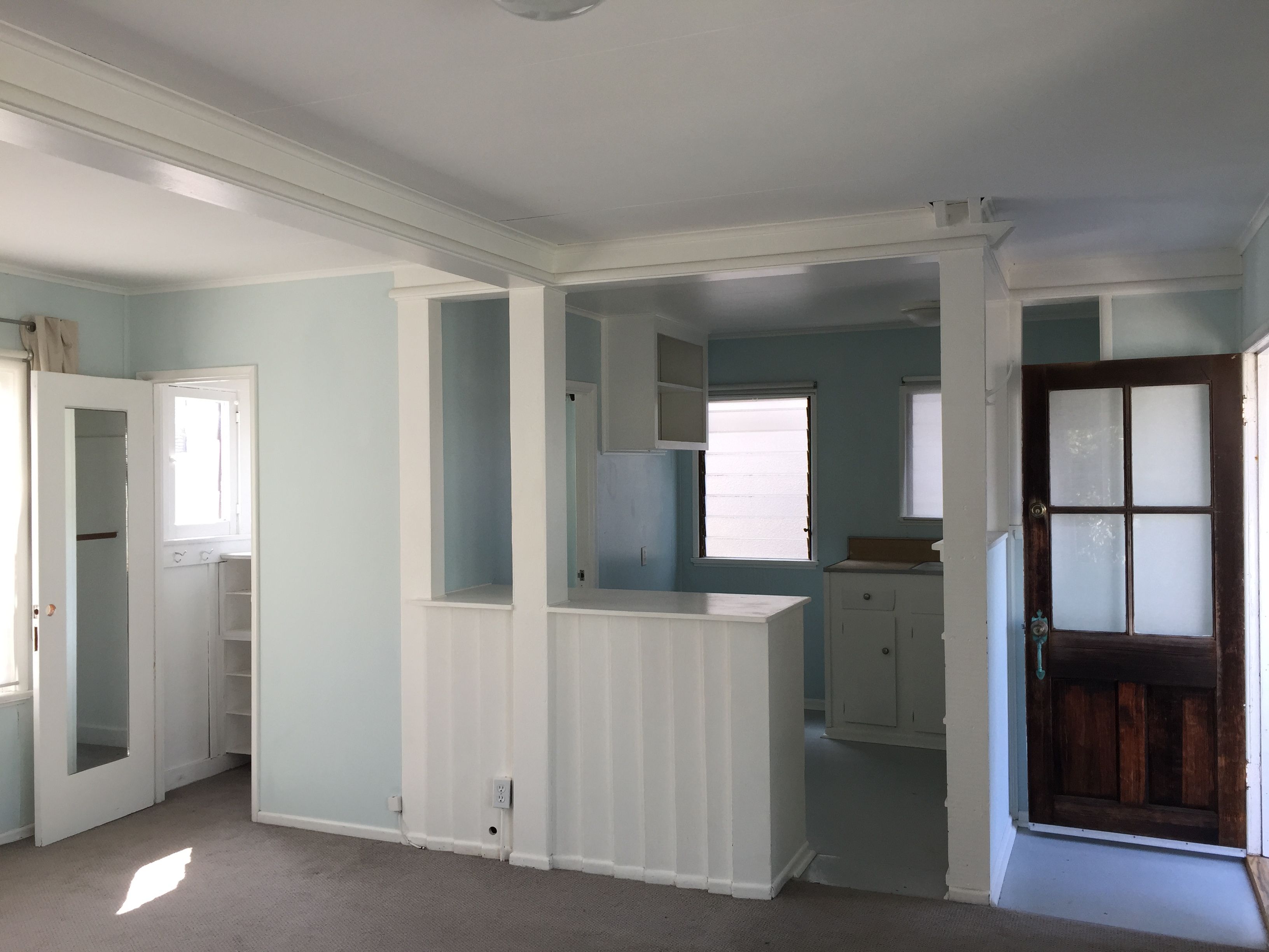
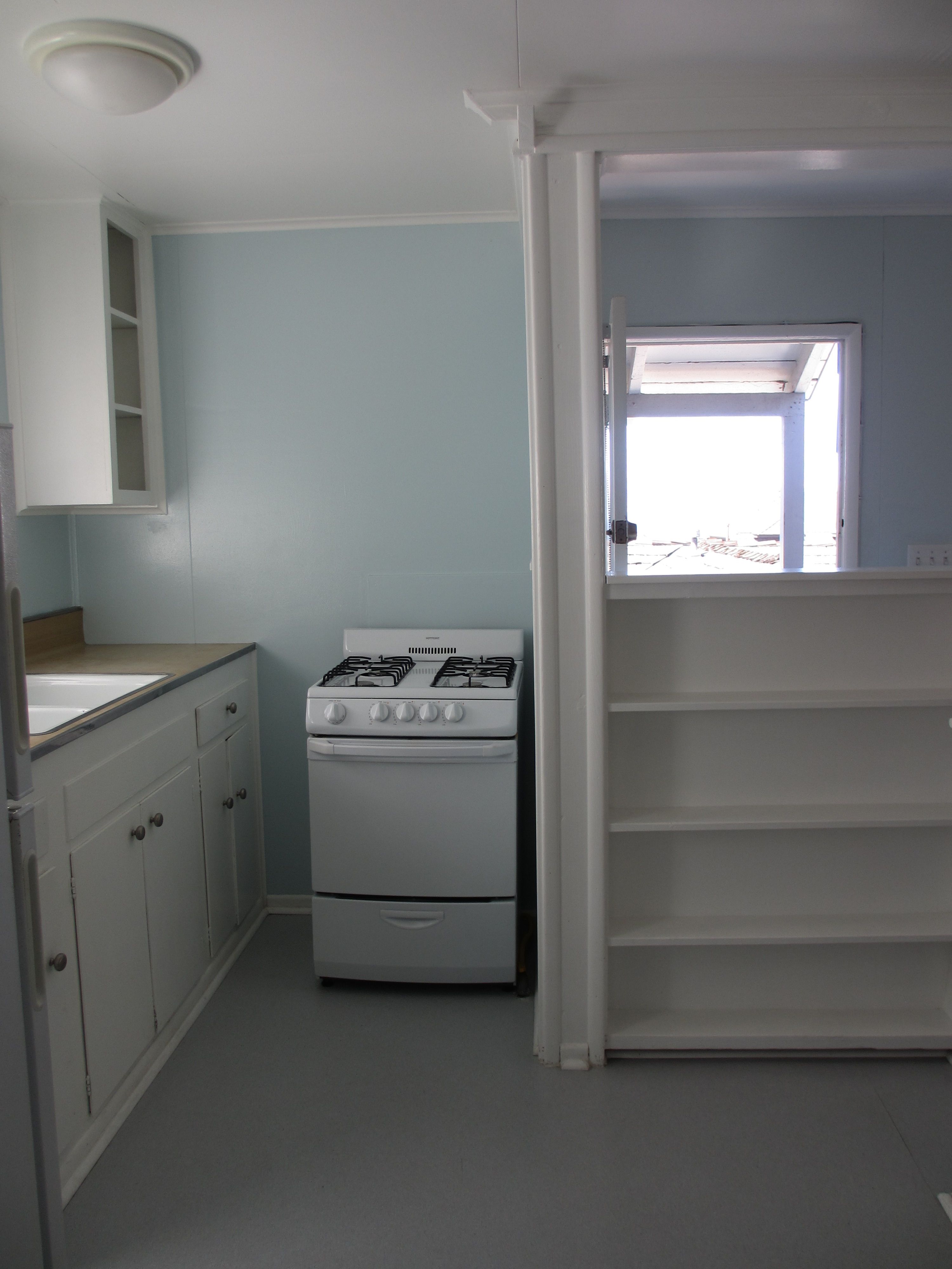
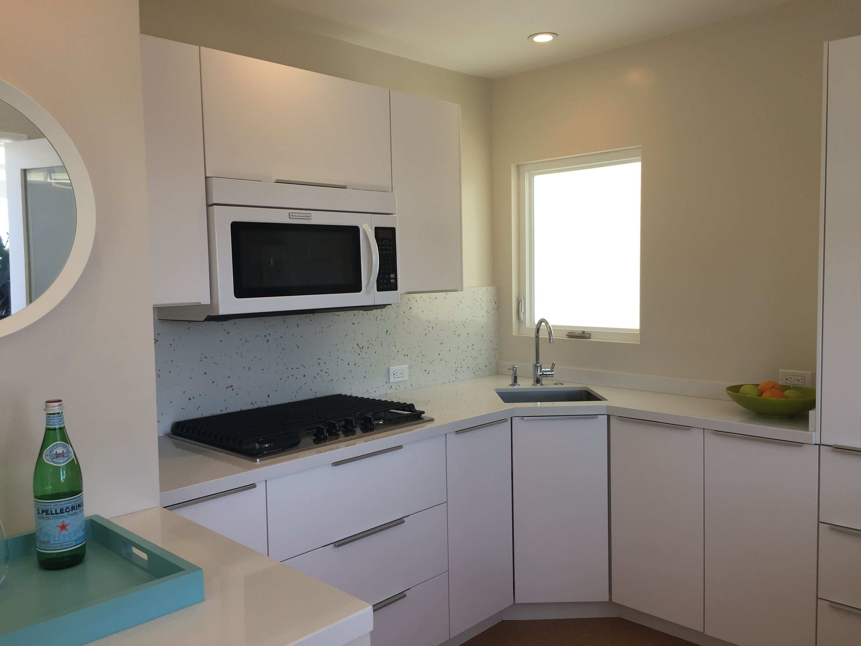
This project is close to my heart as it was my childhood home. The goal was to revitalize a 350 square foot studio, built over the garage in 1923, located in a Hermosa Beach, California. The space was choppy, the entrance to the bath was through the small, inefficient kitchen, and the closet nearly non-existent with a 30″ rod.
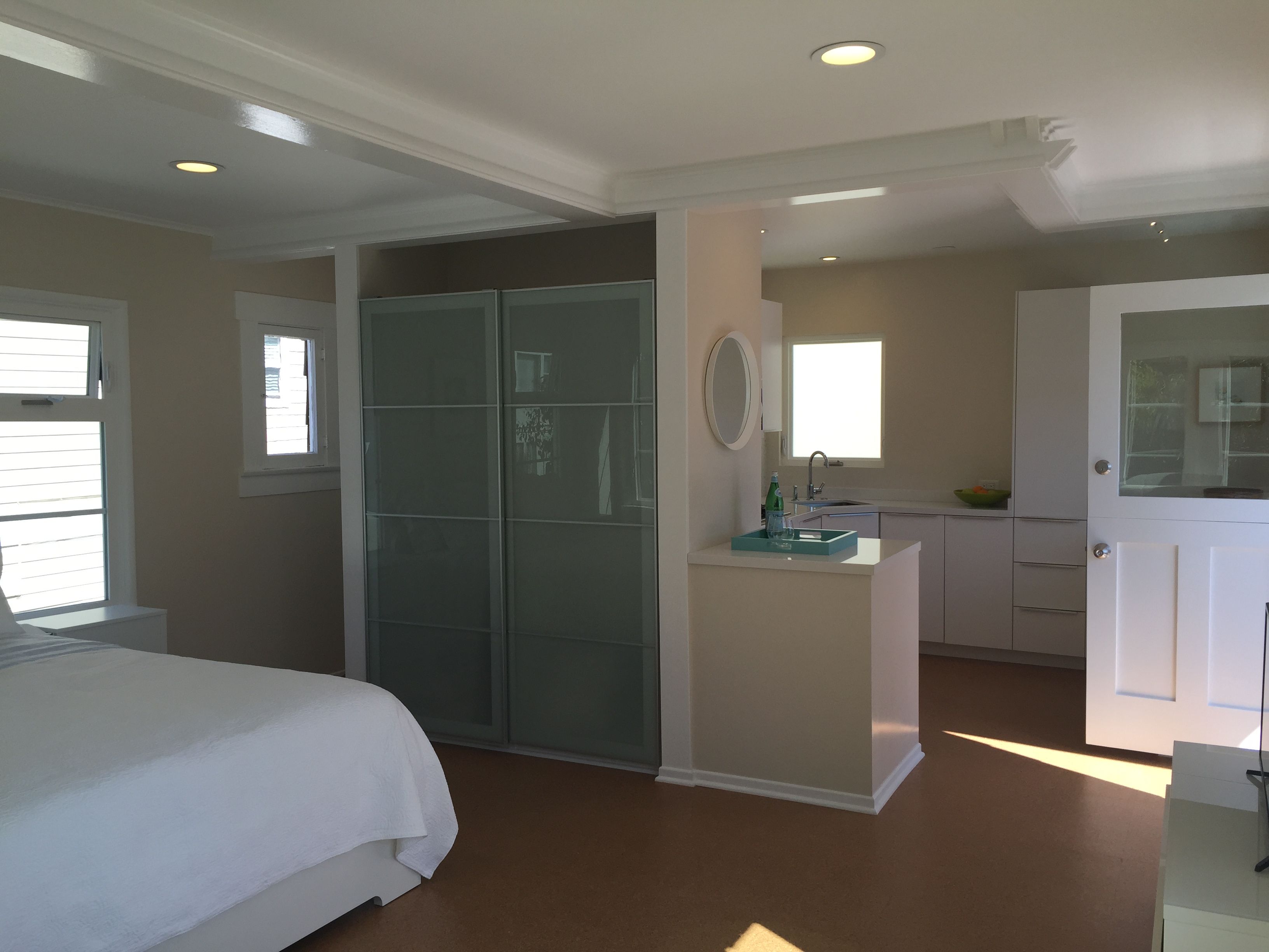
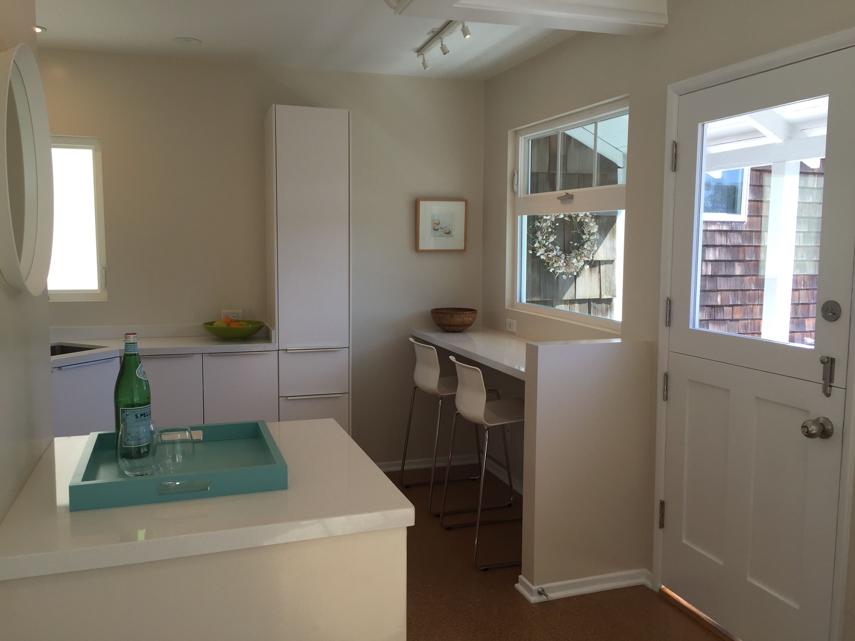
Since there was no way to increase the square footage, I removed the 42″ high bar and shelving that offered a 24″ opening to the kitchen, moved the entry to the bath and re-partioned the existing space.
The result is an improvement in the overall scale, which now feels appropriate in the compact space, creates a logical flow, and provides a gracious blending of old versus new.








View Comments
A beautifully done project. I love how you took a run of the mill, jumbled floor plan and created a great flow path with huge interest. The update was tastefully done and feels like a place I would feel comfortable in. I'm so tired of the "storefront" showcase redux. Kudos on making a very small studio feel lavish and open. This is quite refreshing!
Love the light, bright feel of this remodel. The space grows with the new floor plan and the window addition and breakfast bar bring the ocean in. A nice blend of original character and clean, modern design. My favorite.
I am always interested in small spaces, and this one is really exciting. The design really capitalizes on the views and manages to make tiny apartment feel spacious.
Even though everyone seems to love the design because it is so small, I love all the special details. It looks like someone really thought about how to make the apartment feel like home.
Wow, what a beautiful, beachy feel!
Smart idea to do an under-the-counter refrigerator. Great use of space and budget...very European!
This project feels like the best of both worlds in preserving memories
of the studio's former life but updating it with spare yet elegant improvements.
I appreciate the blend of light and view while giving room for rest and
comfort. Simplifying and opening the floor plan from 'large room' to
small kitchen created a more usable home. Thoughtful ideas and
aesthetic execution!
I'm impressed by warm, inviting feel of this small space! It welcomes the eye and looks much more open and larger in the new photos. The design seems functional and easy for daily life. There's a taste of zen with the flow and the light. A great model for creating an inviting cozy and modern space.
I am a huge fan of small spaces that work well. I think this project epitomizes that concept. I love that without adding square footage that so much could still be done. I love the addition of the closet as well as the layout changes. Well done!
Outstanding renovation with a very minimal chic European vibe. Opening up the entrance with a pony wall and breakfast bar is brilliant. The recessed lighting adds to the contemporary feel. This renovation adds refreshing energy to the space.
I
I was attracted by the crispness. Right away I had to toggle back and forth between the images to realize what and how it was the same place. The kitchen doesn't even look like the same building. The windows even seem in a new place.
The fresh feeling made me want to stay there. The cool pristine palette was balanced with a heartfelt warmth of the feeling in the room. It was a labor of love and you could feel it. There is definitely a unique combination of talents going on in the design. Those would be, original expression, knowledge of resources, confidence and blending of elements in a truly harmonious result.