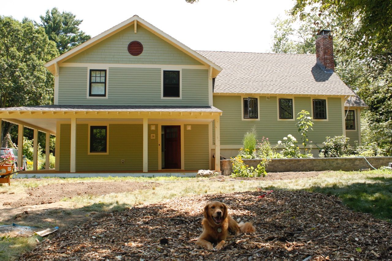
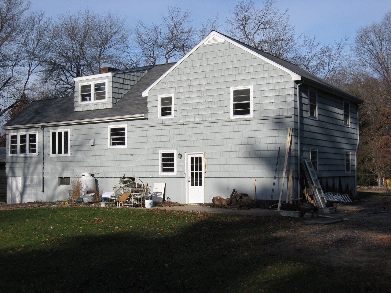
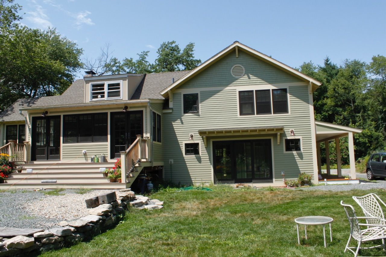
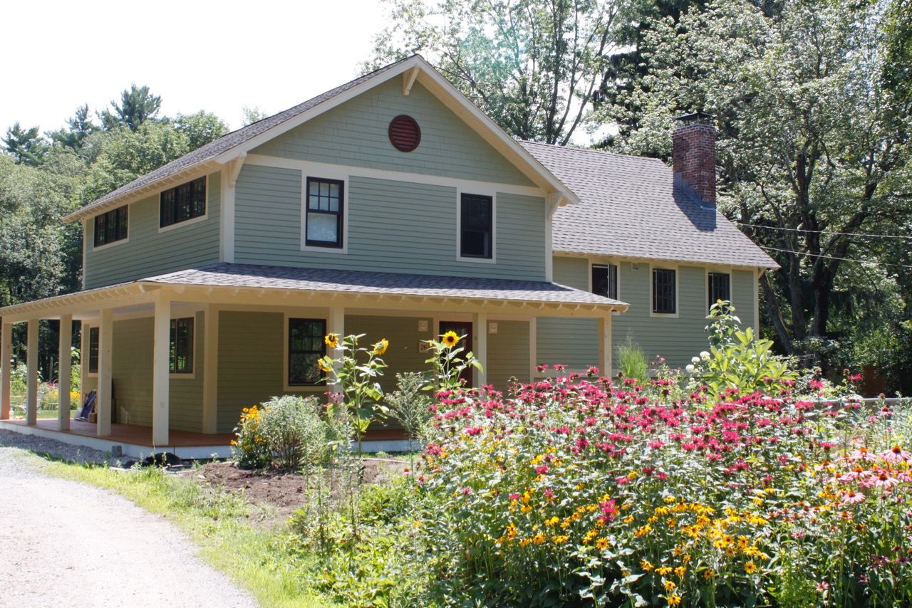
How to Disguise a Split Level Ranch


Sign up for eletters today and get the latest how-to from Fine Homebuilding, plus special offers.

Get home building tips, offers, and expert advice in your inbox
In this time of weather extremes and power disruptions, it's important to learn from the past as we think about the future.

Dig into cutting-edge approaches and decades of proven solutions with total access to our experts and tradespeople.
Start Free Trial Now
Get instant access to the latest developments in green building, research, and reports from the field.
Start Free Trial Now
Dig into cutting-edge approaches and decades of proven solutions with total access to our experts and tradespeople.
Start Free Trial NowGet instant access to the latest developments in green building, research, and reports from the field.
Start Free Trial Now© 2025 Active Interest Media. All rights reserved.
Fine Homebuilding receives a commission for items purchased through links on this site, including Amazon Associates and other affiliate advertising programs.
Get home building tips, offers, and expert advice in your inbox
Become a member and get instant access to thousands of videos, how-tos, tool reviews, and design features.
Start Your Free TrialGet complete site access to expert advice, how-to videos, Code Check, and more, plus the print magazine.
Already a member? Log in
We use cookies, pixels, script and other tracking technologies to analyze and improve our service, to improve and personalize content, and for advertising to you. We also share information about your use of our site with third-party social media, advertising and analytics partners. You can view our Privacy Policy here and our Terms of Use here.
View Comments
This is incredible ...I'd be interested in more details and photos!
Great makeover. Especially opening up in the back.
It was a little hard to look at the photos though. Some kind of news (fake news) video about fast food partially covered the photos. I'm not a fast food fan either, but I still don't like having to hear about how bad it is when I'm trying to look at the Gallery photos.
That looks really sharp. Great design sense.