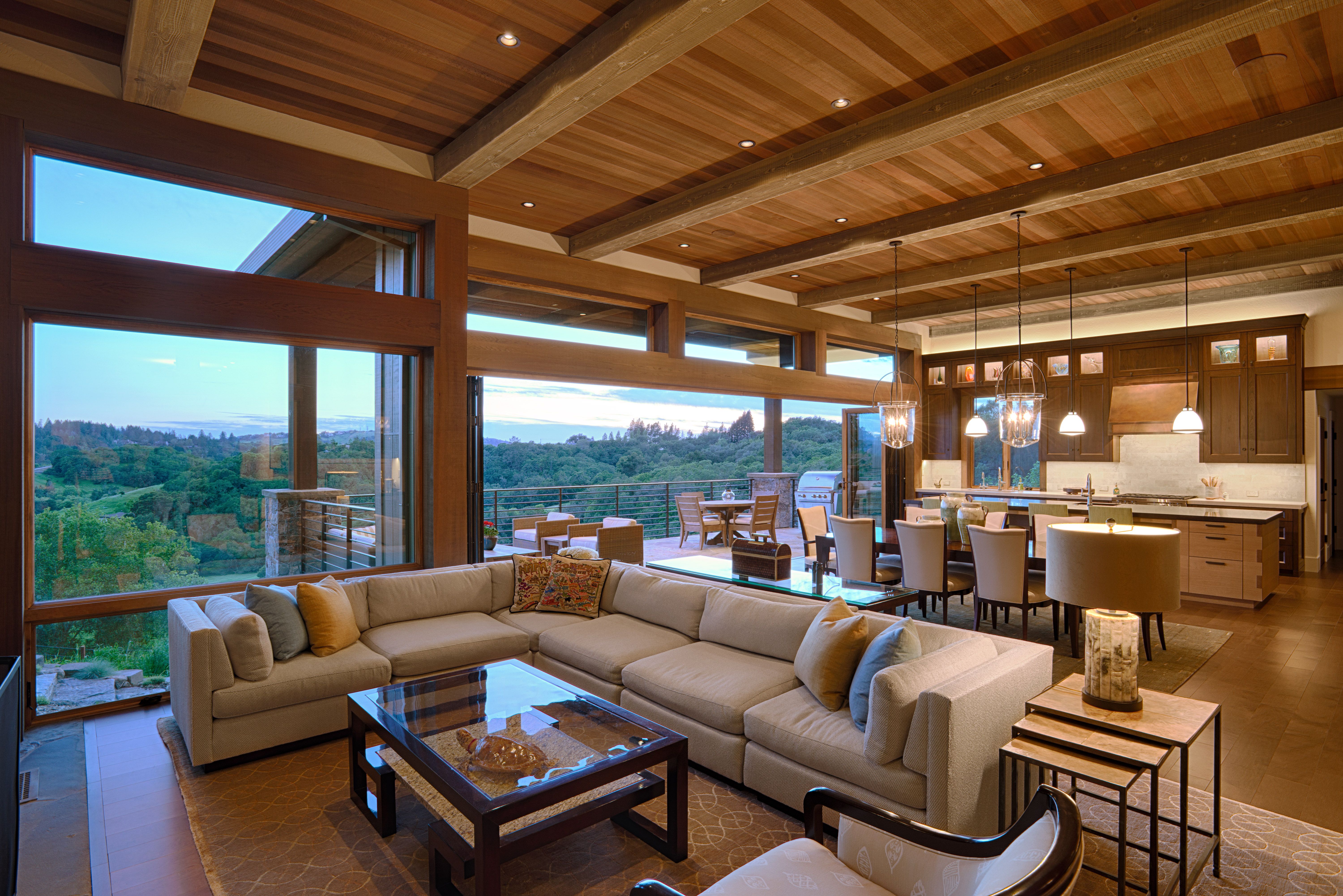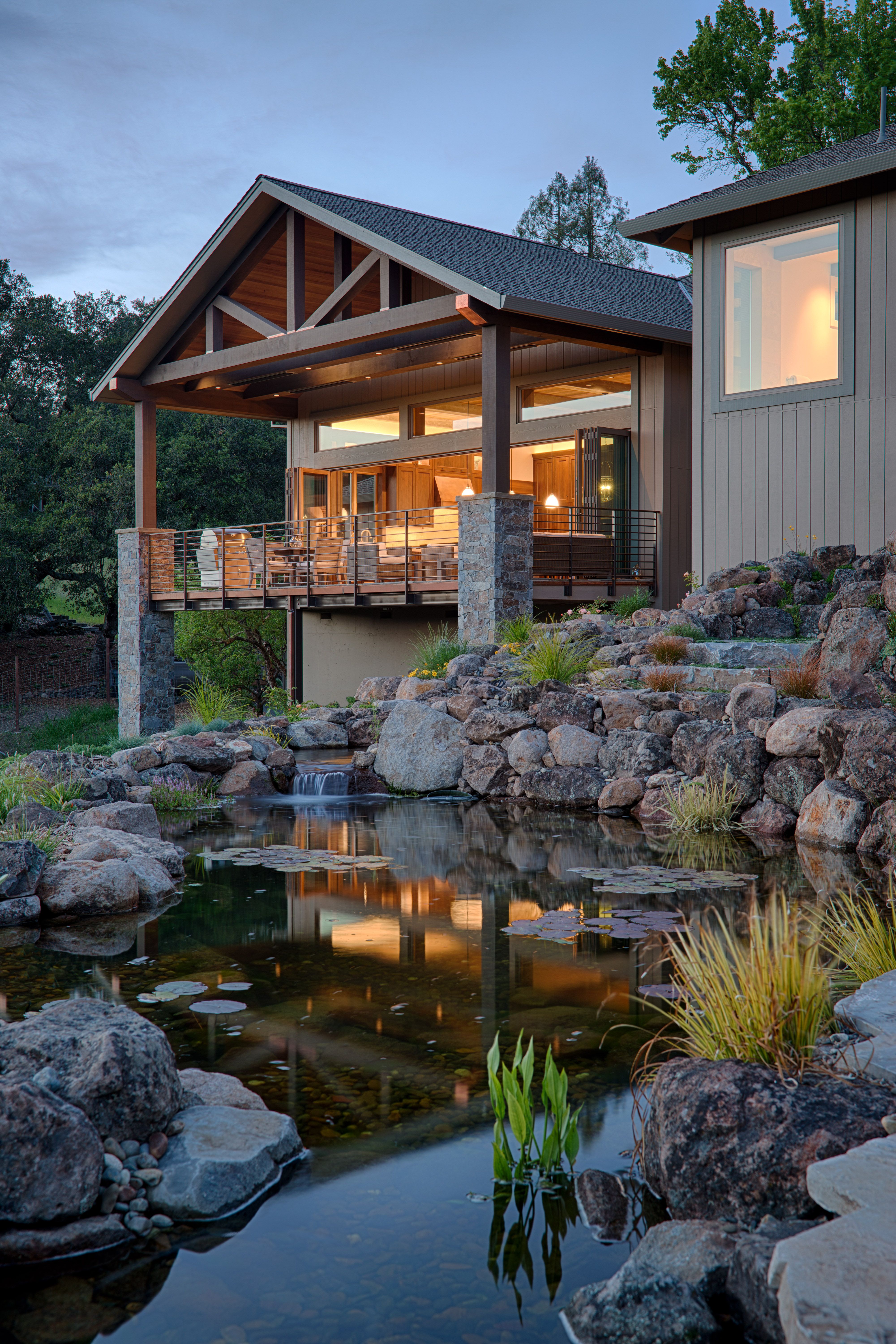
The new homeowners fell in love with this property for the spectacular panoramic view of gently rolling hills and sweeping valley that graces the back and side of the house. However, the home itself (an ubiquitous California Ranch Style) was an ungainly collection of many past remodels and additions, resulting in awkward circulation, wasted space, a mishmash of varying aesthetics, dark rooms, and the worst possible sin: cramped views. The owners immediately started the process to redesign the house, with the challenge to create a space that they love just as much as the view.
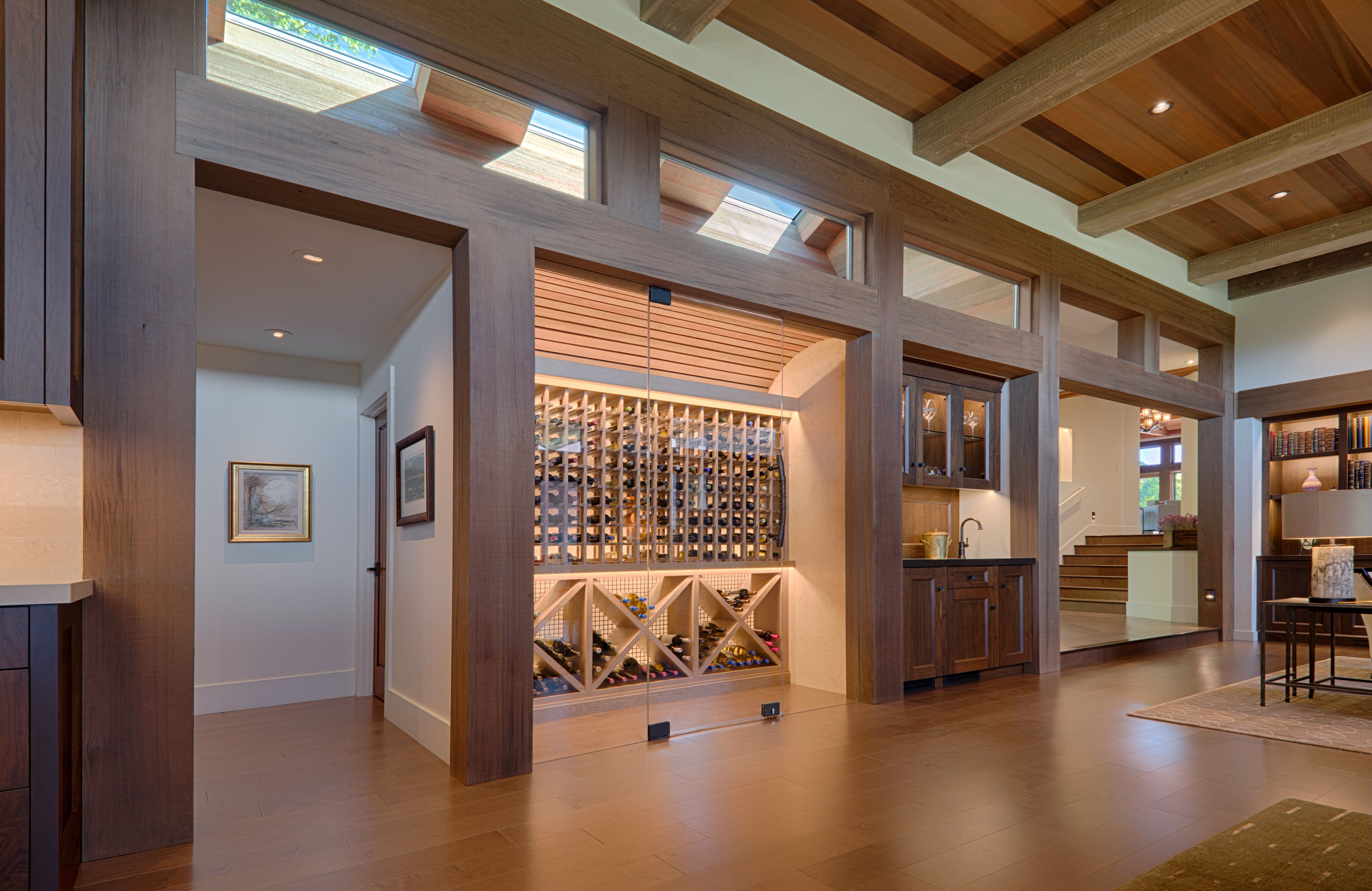
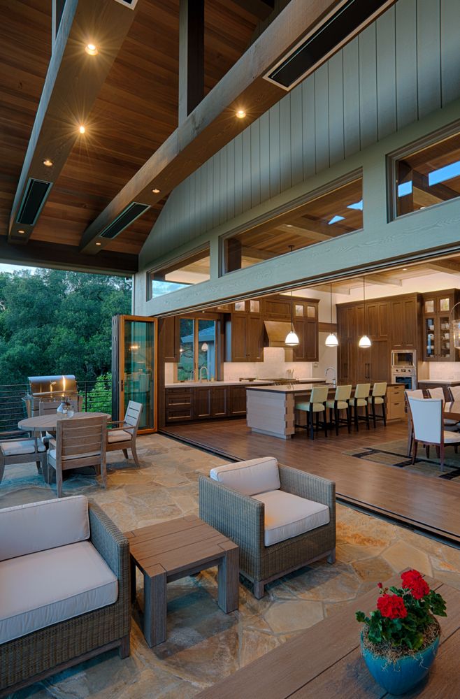
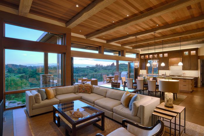
The great room became the heart of the project. The area was completely restructured allowing a higher ceiling and extensive glass maximizing exposure to the view. The kitchen, dining and family areas were shuffled and reconfigured to create one large room with better flow, and a redundant hallway was converted into a custom, glass-faced wine cellar and bar area. The fully operable window-wall in the dining and kitchen areas opens to a new large covered porch inviting you out to sip your favorite California Chardonnay as you breath in the view and toast the cows grazing on the hills below. A skylight well carved into the adjacent attic space on the opposite wall provides ample daylight to the room at all times of day.
Much creativity and effort was also put into what you don’t see. Wood posts and beams conceal a new massive structural steel moment frame, as well as window and doors tracks, operable screens, and motorized sun shades. The TV disappears behind an art panel above the fireplace. And the slatted arched wood ceiling in the wine cellar hides the temperature control system while permitting the chilled air to enter the space.
The clean detailing and modern touches pair with natural, organic materials, and lightly distressed finishes, to walk the line between contemporary and traditional aesthetics serving to blend the styles of the existing house with tastes and existing furnishings of the Owners.
The rest of the house was similarly remodeled to bring a cohesive style to the whole home. The guest area was reconfigured to create in-suite bathrooms for all bedrooms, and an elevator was added to connect to the lower level garage to the main floor. The reconfigured floor plan maximizes the use of existing space, creating a much expanded sense of space with minimal additional square footage. The Office, Living room and Master bedroom were spruced up with new cabinetry, window trim work, and new stone masonry with a large rustic stone mantle at the existing fireplace. New lighting throughout provides varied lighting scenes, and ensures comfortable illumination even after the sun has gone down. Similar detailing and consistent use of a limited palette of finish materials creates an uncluttered aesthetic that flows easily from room to room, indoor and out.
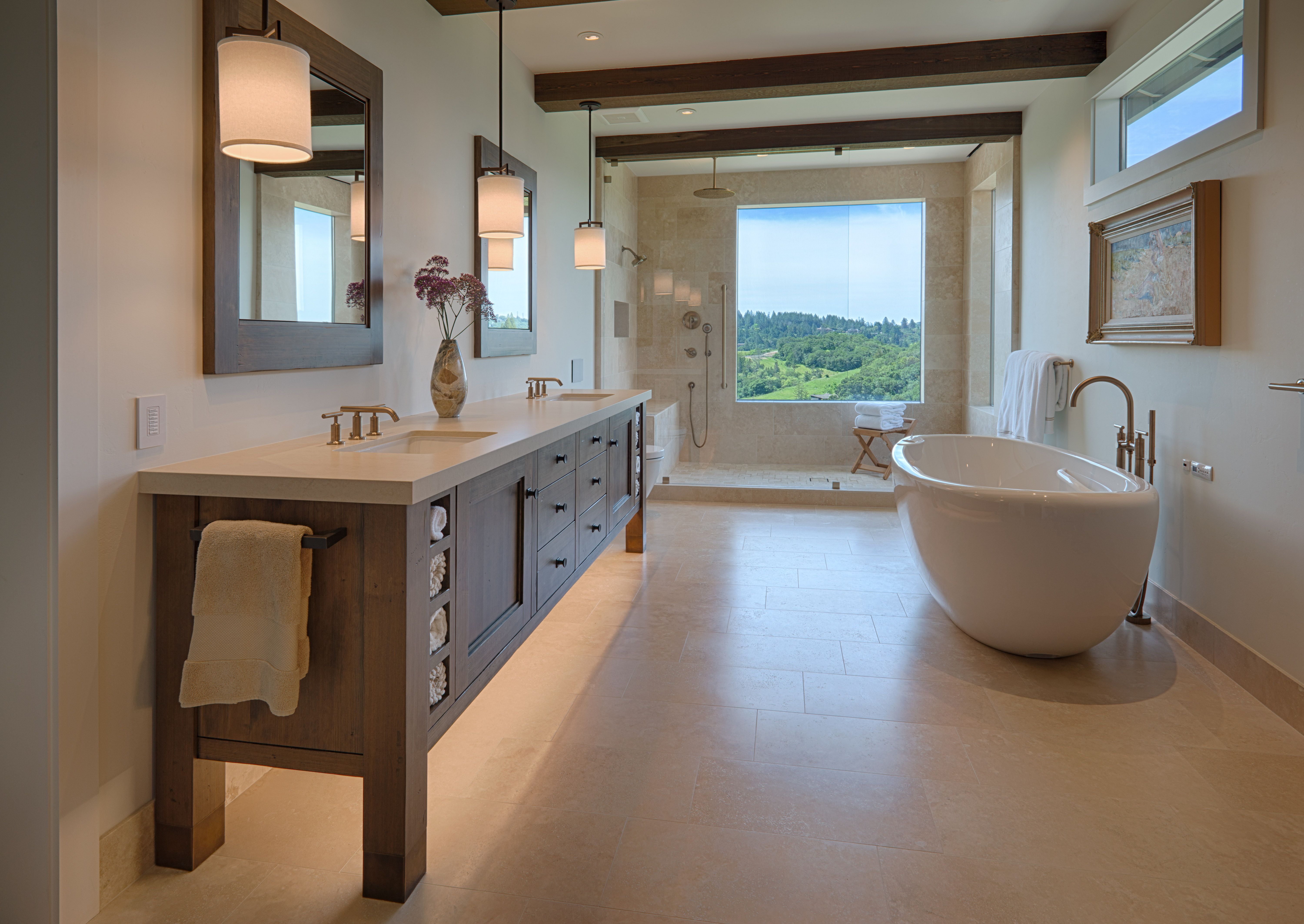
The Master Bathroom in particular was transformed from a jumble of poorly related parts to a spa-like sanctuary, featuring a freestanding soaking tub, a large walk-in shower and custom cabinets. While the bathroom was slightly reduced in size, but with the simplified arrangement, open furniture-like cabinetry, and expanded windows, the final result feels larger. The neutral palette creates a soft elegance and allows the view of the rolling hills to take center stage.
Much of the design throughout the house focused on more efficient use of the existing space. The result is a house that is exactly the same size and shape from the front, but has become virtually unrecognizable once stepping through the front door. By adding a small amount of space in a few areas but subtracting it in others, the overall change in living space was very minimal. In the final tally the house only gained 71 sq. ft, yet feels greatly expanded.
The construction process of this project was not for the weak-hearted, and owes its success not only to the experience and talent of everyone involved, but also to a commitment to working as a team. The original permit was only for the guest bathroom remodel and new elevator, allowing construction to start, while the design of the larger remodel continued to be developed. By thus fast-tracking the project, the drawings were in a constant state of evolution, the design just barely staying ahead of the rate of construction. The General Contractor (Ellis Construction) and all the various sub contractors handled this piece-meal flow of information with amazing thoughtfulness, often adding their expertise and experience to better the outcome. Also included in the team were several other designers. Walden and Company contributed designs and fabricated the cabinets and other custom woodworking. Gigi Lombrano, an out of state interior designer, who having worked on Owners prior homes, intimately knew their furnishings and artwork, and adeptly placed them in the new layout, and Vita Pehar Designs created a sophisticated and multi dimensional lighting design. It was a pleasure to work with every one of them, and the final result is a home in both design and quality of construction that we are all proud of.
Fine Homebuilding Recommended Products
Fine Homebuilding receives a commission for items purchased through links on this site, including Amazon Associates and other affiliate advertising programs.

Graphic Guide to Frame Construction

All New Kitchen Ideas that Work

Homebody: A Guide to Creating Spaces You Never Want to Leave
