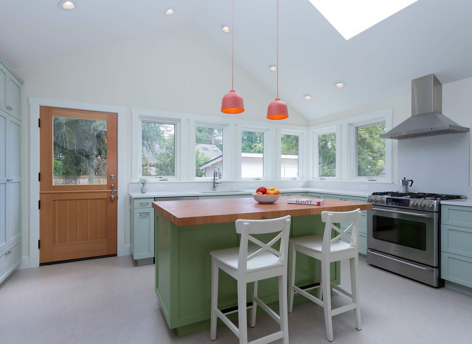
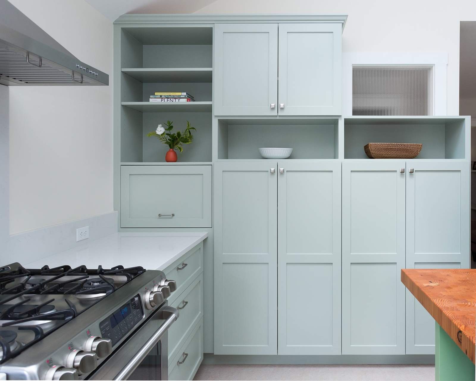
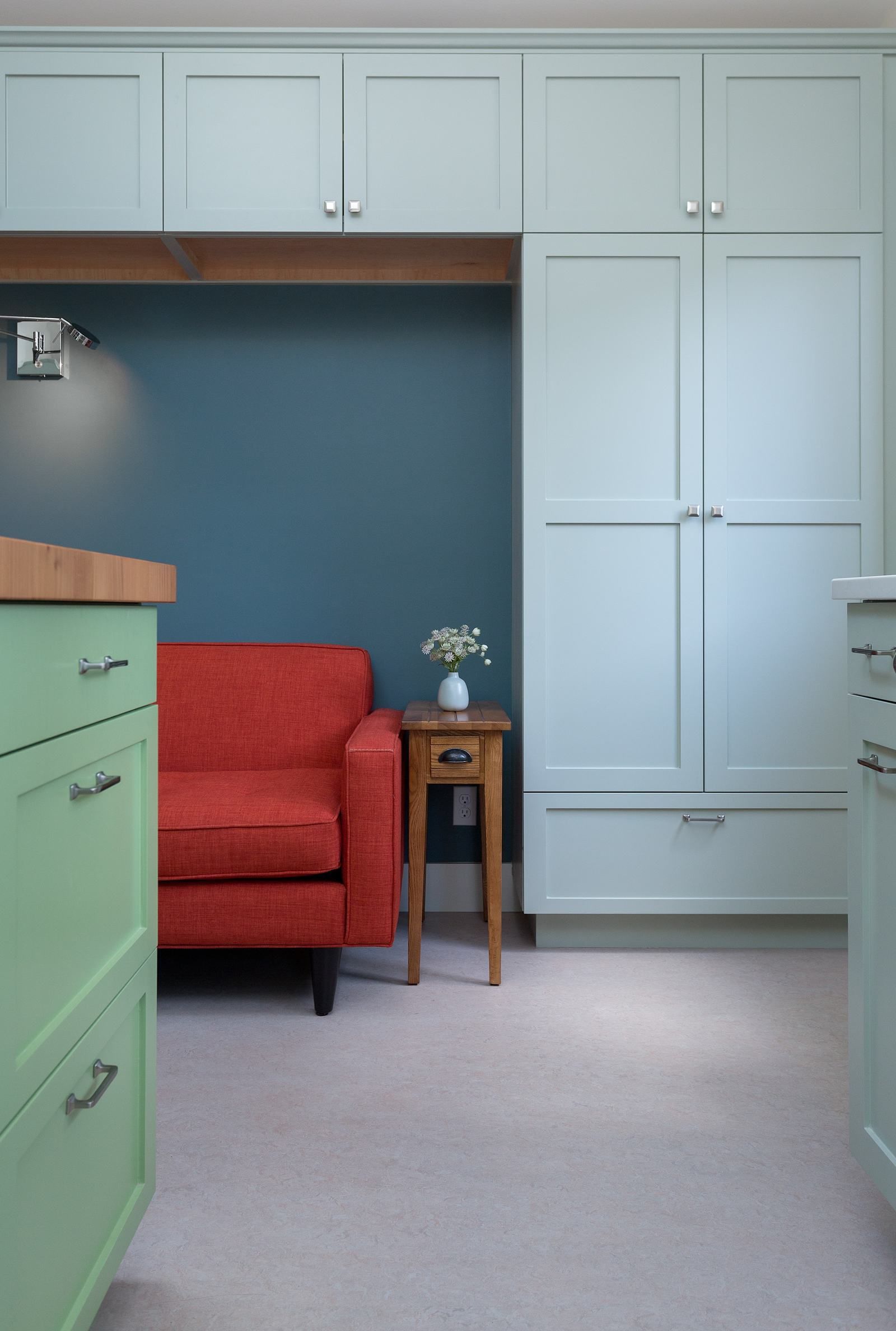
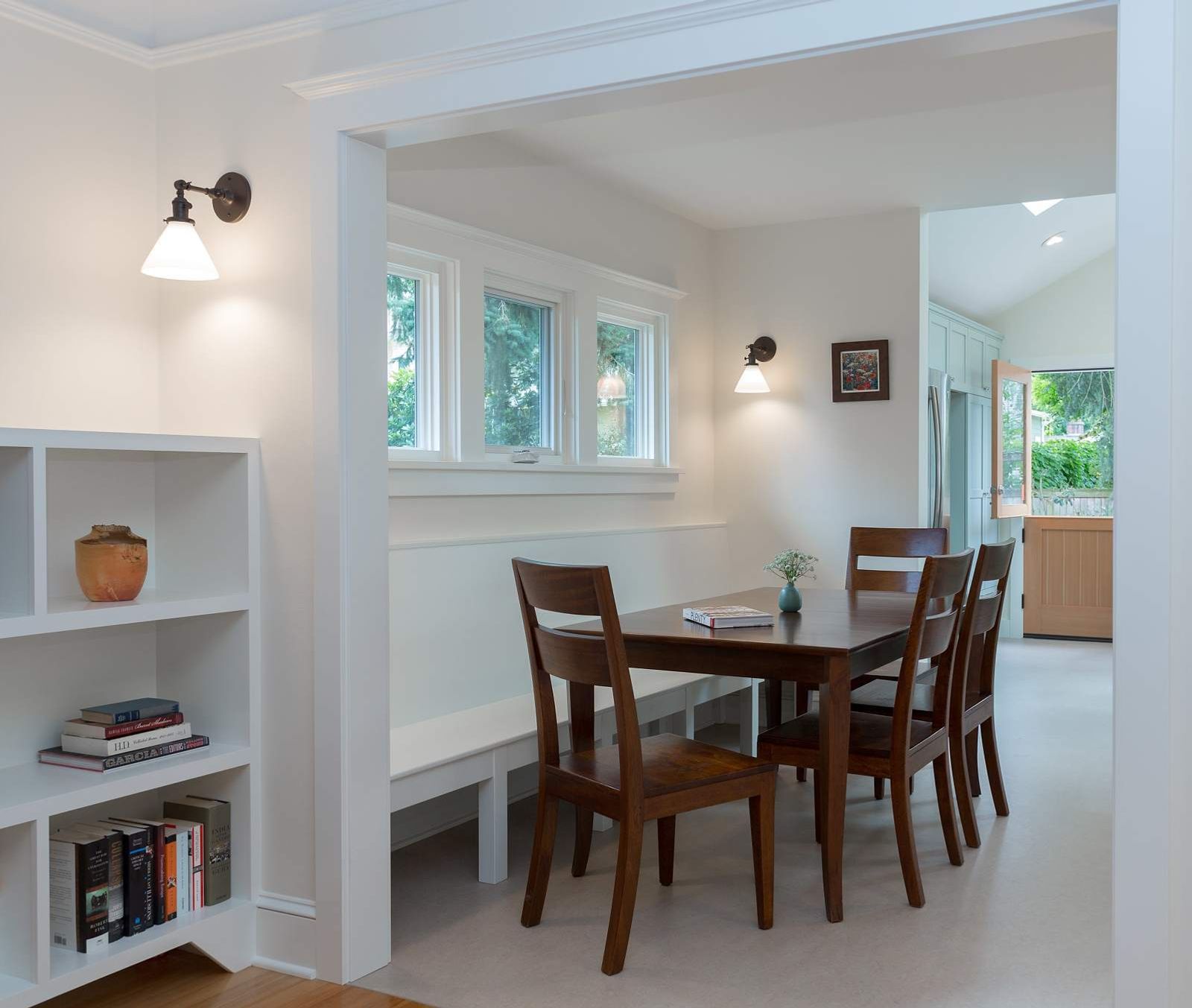
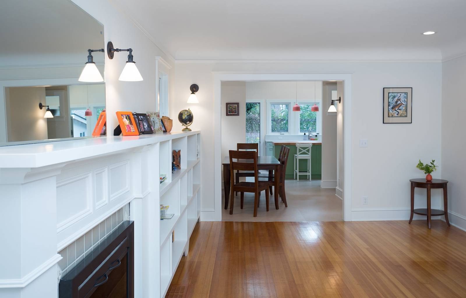
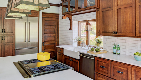
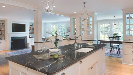
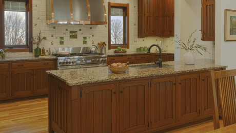
When we met our clients, they had a light-filled but cramped kitchen, which they squished themselves into with their two children. The living room contained the dining table, which felt out of scale and cramped. They always gravitated towards the kitchen, eating at the small peninsula partly because it was the lightest room in the house, and that is where the action is. In Seattle, the grey winters leave most people craving light and sunshine, so we designed a kitchen addition for them which allowed us to capitalize on the south and west light with a dining space adjacent which also has become much brighter. We avoided upper cabinets on the south and west walls to keep the kitchen feeling open and light and designed all the tall storage to be on the north and east walls. The clients’ one request was to have space for a small love-seat in the kitchen so their children and guests have a cozy place to sit and converse with the cook. The dutch door to the yard allows them to leave the top half open in the summer for better connection with the yard.
Up Next
Video Shorts
Featured Story
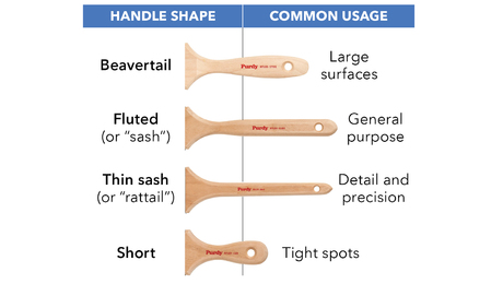
Tips for picking the right paintbrush based on paint type, surface, and personal comfort.
Discussion Forum
Highlights
"I have learned so much thanks to the searchable articles on the FHB website. I can confidently say that I expect to be a life-long subscriber." - M.K.
Fine Homebuilding Magazine
- Home Group
- Antique Trader
- Arts & Crafts Homes
- Bank Note Reporter
- Cabin Life
- Cuisine at Home
- Fine Gardening
- Fine Woodworking
- Green Building Advisor
- Garden Gate
- Horticulture
- Keep Craft Alive
- Log Home Living
- Military Trader/Vehicles
- Numismatic News
- Numismaster
- Old Cars Weekly
- Old House Journal
- Period Homes
- Popular Woodworking
- Script
- ShopNotes
- Sports Collectors Digest
- Threads
- Timber Home Living
- Traditional Building
- Woodsmith
- World Coin News
- Writer's Digest
