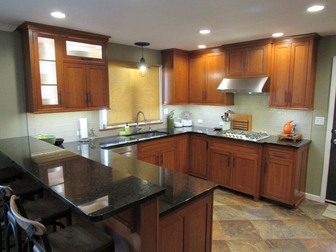
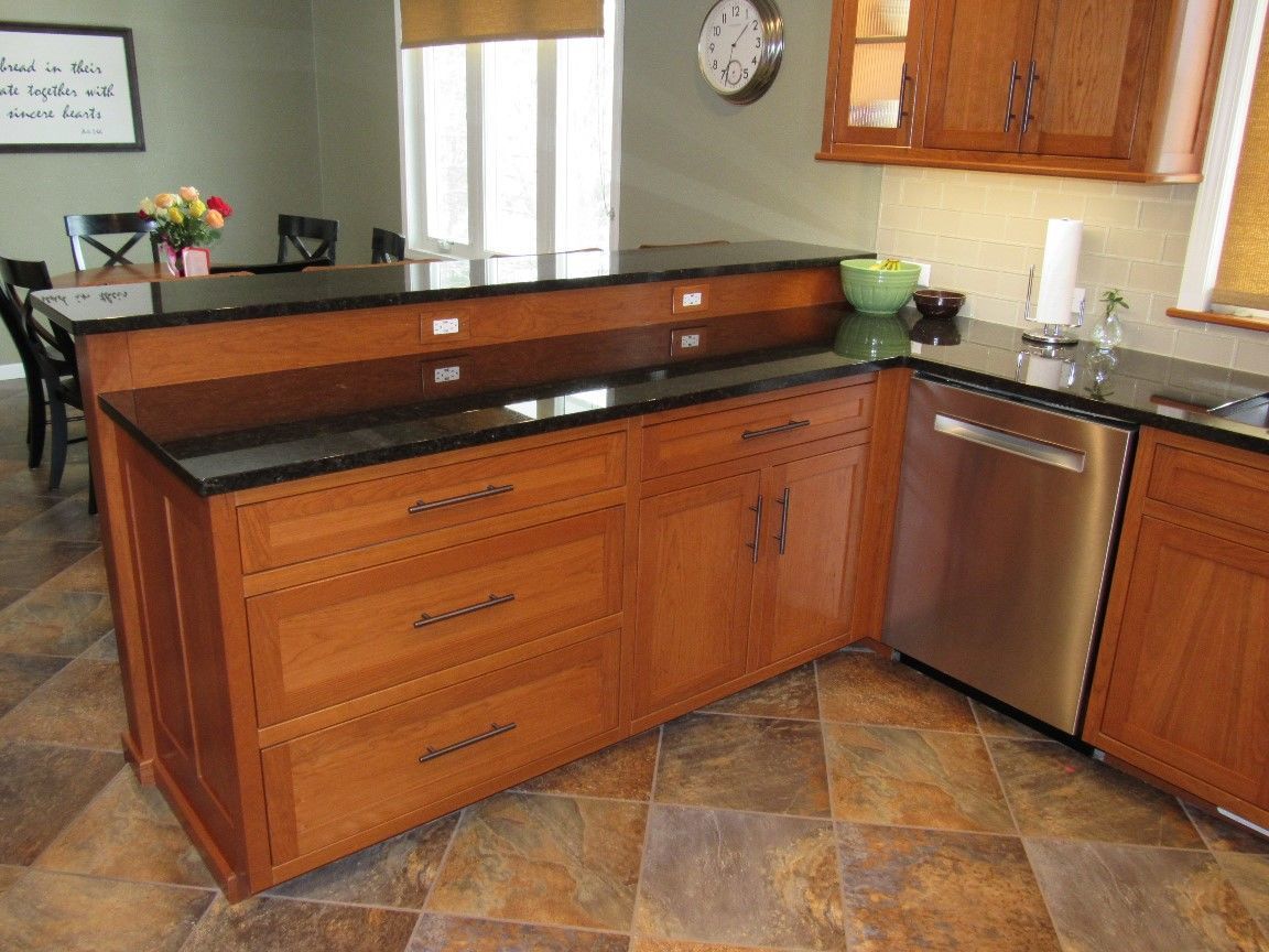
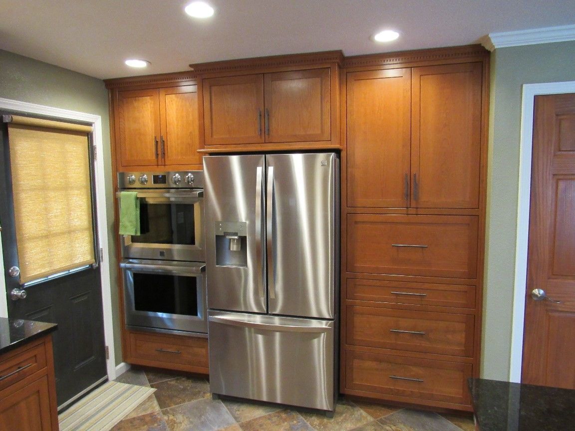
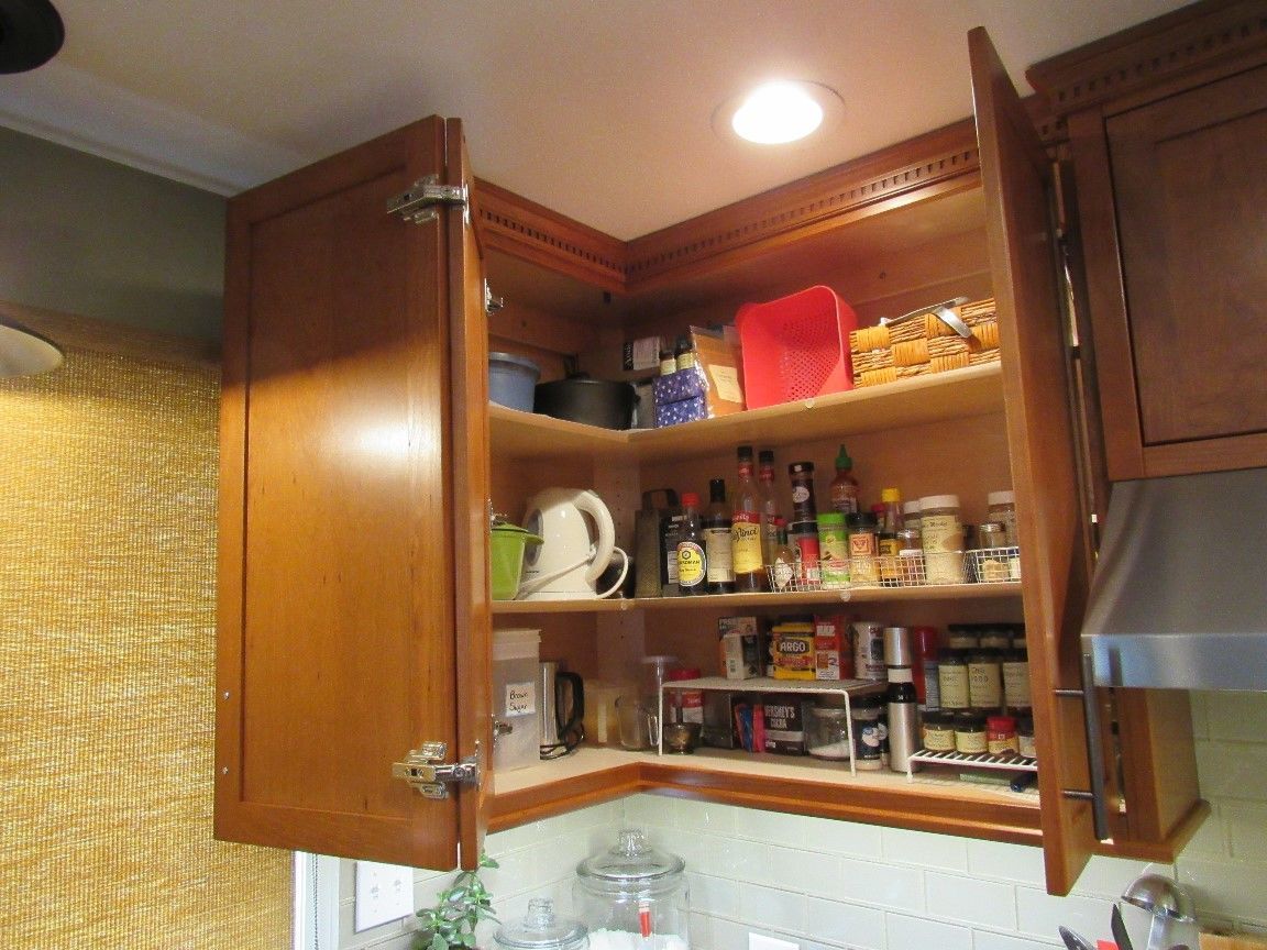
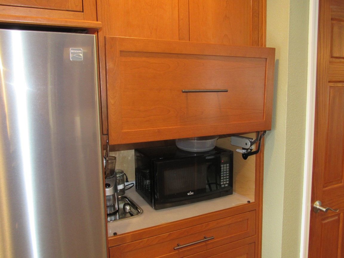
For this kitchen renovation the homeowner requested a cabinet style with simple clean lines. I had wanted to create a kitchen using the hybrid frameless/face frame system so this seemed like the perfect opportunity to do so. This hybrid system is functionally a frameless modular system with all the doors and drawer runners attached to the case sides but with a single common face frame. This system visually creates the effect of built-in-place cabinets by eliminating the vertical face frame seams, especially in this inset application. The simple clean lines were further enhanced by square or chamfered moldings and corbels. The challenges for this kitchen renovation were to maintain a budget, create additional storage while at the same time remove the hanging cabinets above the peninsula, and dealing with a kitchen window that is less than thirty inches from the corner of the room. Maintaining the budget was made possible in two ways; designing the new cabinets that largely left the appliances where they were and the homeowner doing some of the work. The refrigerator and microwave switched places, but the existing electrical plugs were able to be utilized. The sink was moved to be centered under the window but the re-plumbing was relatively minor work. The homeowner’s contribution included replacing rotten joist and subfloor, installing the recessed lights in the ceiling and other electrical, and laying the new floor. Creating additional storage while also removing a section of hanging cabinets was accomplished three ways. The first was to move the peninsula over about a foot taking space away from the dining room. The reduced space to the dining room isn’t noticeable after the fact, but the impact to the kitchen was tremendous by giving symmetry and balance to the kitchen on both sides of the window. The second way space was added was to take the wall cabinets to the ceiling, and the third was to bump out the cooktop cabinet, the cabinet over the range hood and also the cabinet over the refrigerator. The kitchen window being less than thirty inches from the corner of the room proved to be a design challenge. Using a typical base corner cabinet would leave a space next to the sink too small for a usable cabinet and a typical forty five degree upper corner cabinet looked awkward without another cabinet next to it. The answer was to create asymmetric bi-fold corner cabinets for both the lower and upper corners. This utilized all available space, is full access, and is visually pleasing.
Up Next
Video Shorts
Featured Story

This electric pressure washer is compact, lightweight, and easy to maneuver.
Featured Video
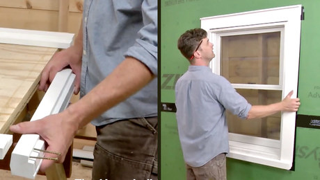
How to Install Exterior Window TrimDiscussion Forum
Highlights
"I have learned so much thanks to the searchable articles on the FHB website. I can confidently say that I expect to be a life-long subscriber." - M.K.
Fine Homebuilding Magazine
- Home Group
- Antique Trader
- Arts & Crafts Homes
- Bank Note Reporter
- Cabin Life
- Cuisine at Home
- Fine Gardening
- Fine Woodworking
- Green Building Advisor
- Garden Gate
- Horticulture
- Keep Craft Alive
- Log Home Living
- Military Trader/Vehicles
- Numismatic News
- Numismaster
- Old Cars Weekly
- Old House Journal
- Period Homes
- Popular Woodworking
- Script
- ShopNotes
- Sports Collectors Digest
- Threads
- Timber Home Living
- Traditional Building
- Woodsmith
- World Coin News
- Writer's Digest
