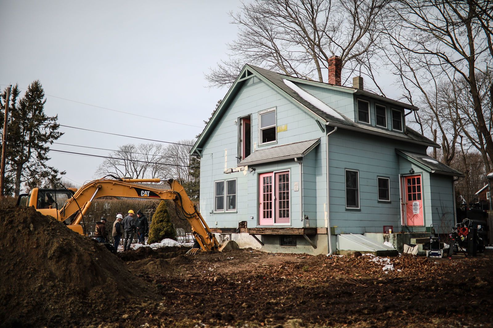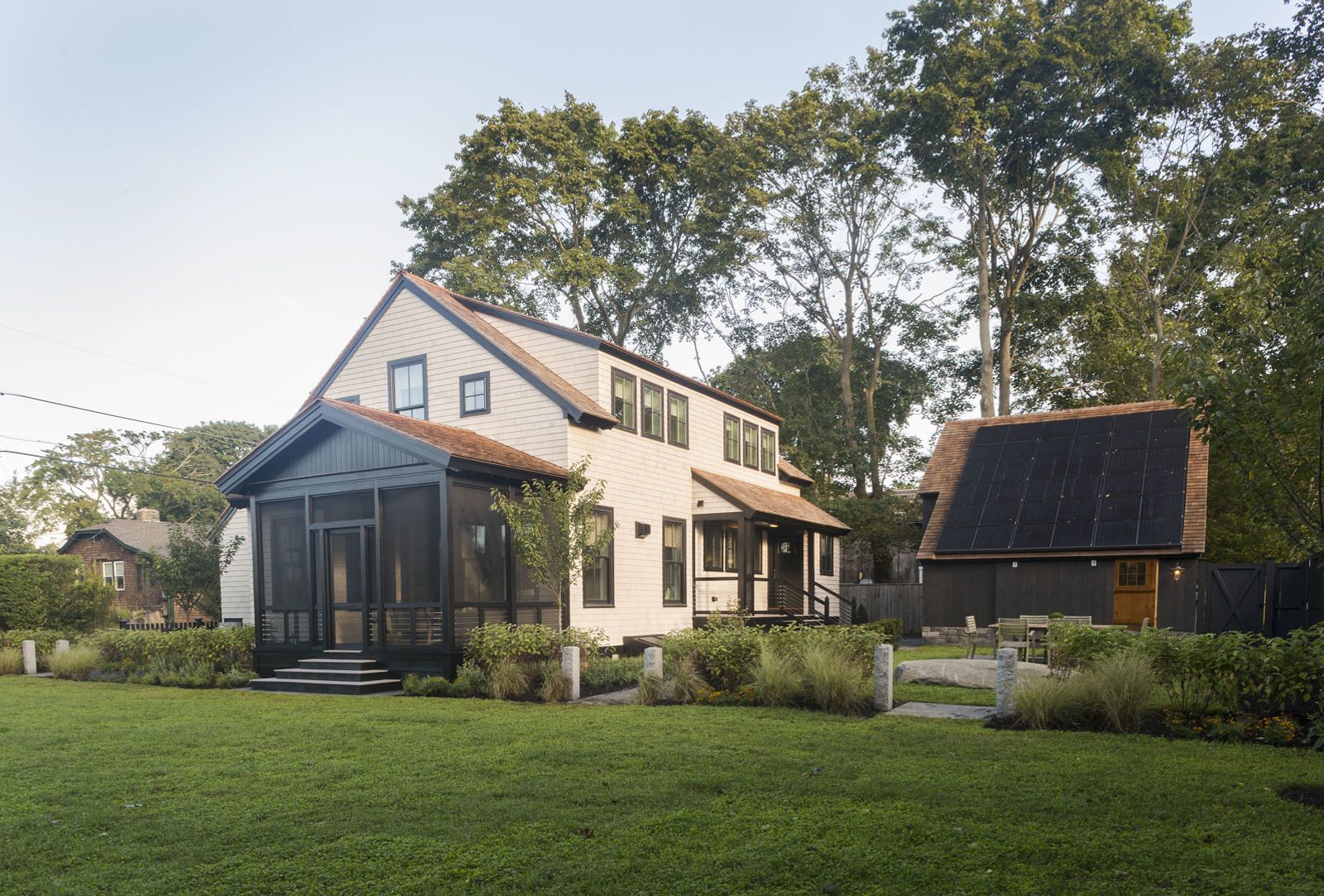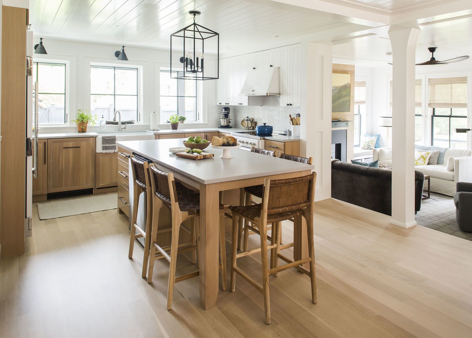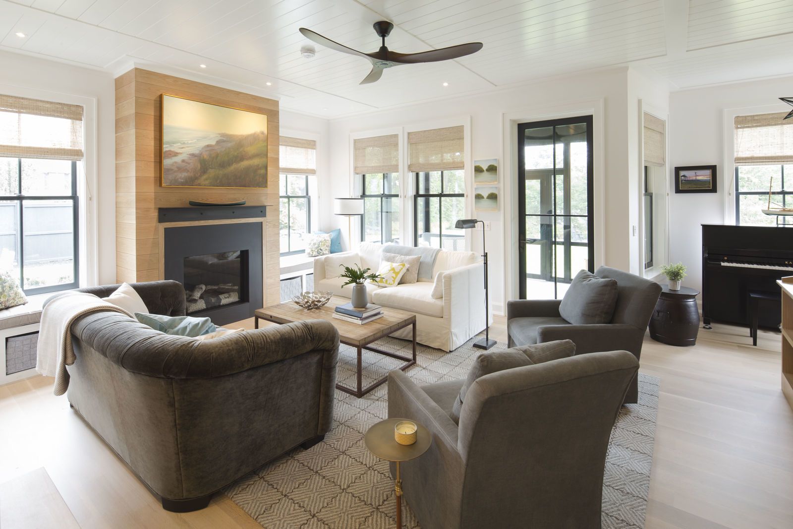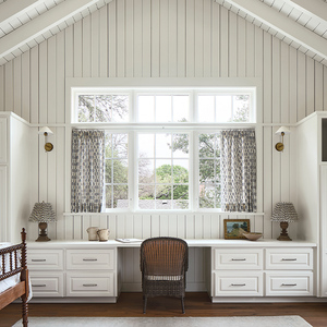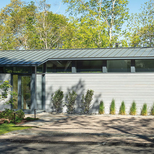
There’s a feeling of simplicity and continuity, from the soothing palette of materials and colors: quartersawn white oak floors and cabinetry, white-painted walls and trim, black window sashes. The interior feels very comfortable and helps many of the spaces feel bigger than the room sizes might suggest.
Throughout the course of the project, daily interaction and conversation between the architect and builder led to on-the-spot problem solving and a steadfast commitment to architectural details that would ensure the house’s bungalow charm. During evening visits to the construction site with his family, Donald would pin up notes, often accompanied by drawings, for the crew. Sometimes, he would find a question scribbled on a stud, and Donald would leave his answer right there. “It was so easy to exchange ideas and work through decisions this way,” he says.
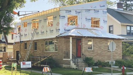
Creating a sense of open space in the first floor’s kitchen, dining, and living areas was key to making the small house live larger. Even though the house was doubling in size, it still comes in at less than the national average of 2,555 square feet for a new single-family home. To raise the ceiling height in the new living room to 9½ feet, the addition was designed to be two steps down from the kitchen, in the existing part of the house, where ceilings are just 8 feet.
Built-ins are another design theme that optimizes space and utility by ensuring that areas serve multiple functions. Display shelving was incorporated in the half wall alongside the stairway from the living room to the lower-level playroom; window seats flanking the fireplace were built to increase the living room seating options. Bookcases line one side of the second-floor hallway so it doubles as a library. With a smaller house you can’t afford single-use space.
The couple also wanted to incorporate special areas for each of their sons. For 13-year-old Nate, a talented pianist, a music nook was designed in the living room to give him a dedicated place to play that keeps him near the rest of the household activity. For 7-year-old Theo, a secret room was designed inside his bedroom—a hideaway just large enough for two or three kids to hunker down.
The pale palette and consistent use of quartersawn white oak—for floors, interior doors, kitchen and bath cabinetry, bookcases, the fireplace wall—with subtly varied finishes keeps the overall look light and bright. The floors were lightly whitewashed and given a protective matte clear coat to create the look of nearly bare wood, while the kitchen cabinets have a slightly darker ceruse finish. “We wanted a very simple palette throughout the house with lots of repetition and a few breaks, such as the navy-blue mudroom,” says Donald. “It’s peaceful rather than exciting, and that’s exactly what we wanted.”
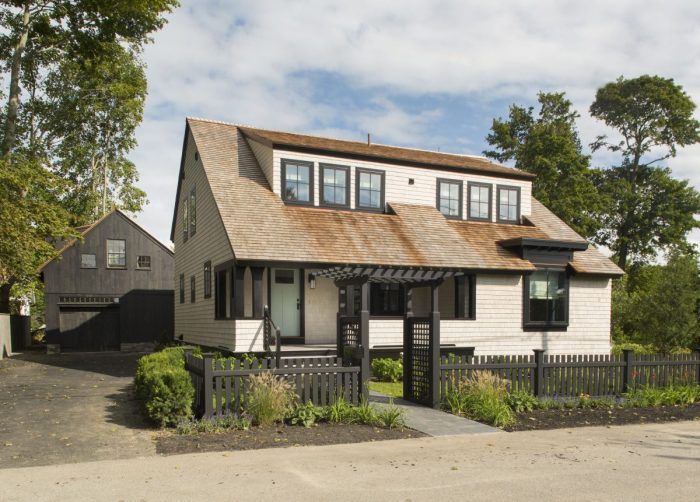
All that simplicity is punctuated with some special touches. In the kitchen, there’s a restaurant-grade refrigerator and a handcrafted Italian stove that uses ultra-energy-efficient induction heating. And the couple added interest to some surfaces that are often ignored, such as the first-floor ceilings, which are clad with poplar tongue-and-groove boards painted high-gloss white to emphasize the cottage look. To add contrast, black is used as an accent throughout—on the windows, the living room fireplace’s fabricated steel mantel and black slate surround, the light fixtures, and the ceiling fans, as well as on the exterior trim, the screened-porch enclosure, and the barn siding.
More than anything, however, there’s an emphasis on comfort—whether that means delivering a comfortable interior temperature no matter what the New England weather brings or filling the living room and den with roomy upholstered furnishings for entertaining and snuggling up. “We wanted a great house with or without net-zero,” Donald says.

