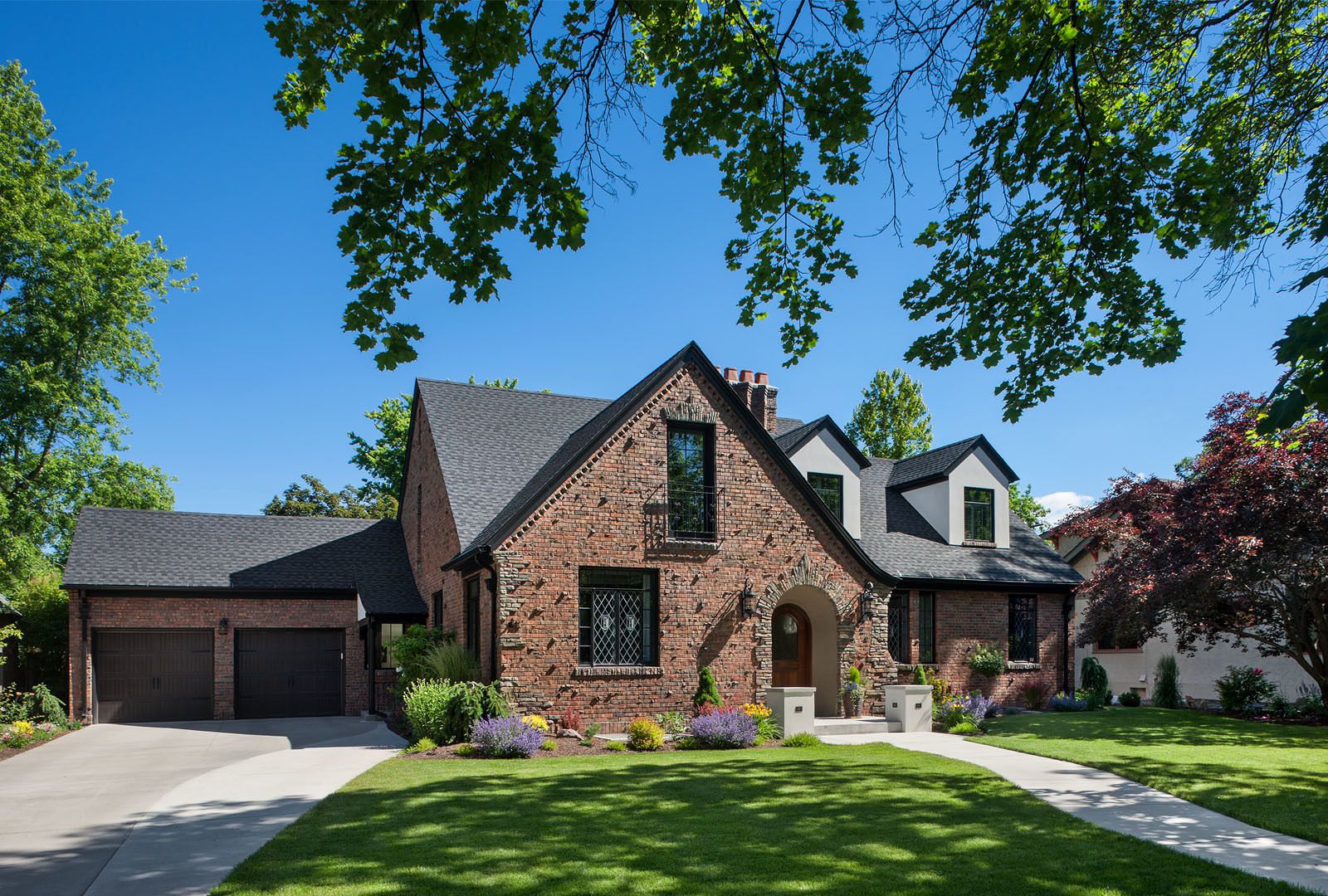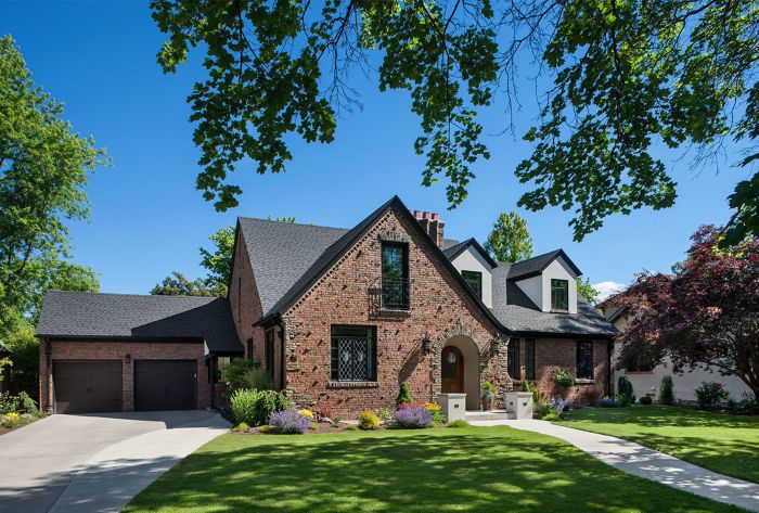
At first glance, this 1939 Spanish Revival home appears as though it has always existed on its quiet tree lined street. Upon closer inspection, a crispness of modern detailing is perceived. In fact, a surgical intervention has taken place with contrasting objectives: to maintain the home’s historic façade and relationship within its long-established neighborhood, while rejuvenating its inner functions and spirit to fit the needs of modern family life.
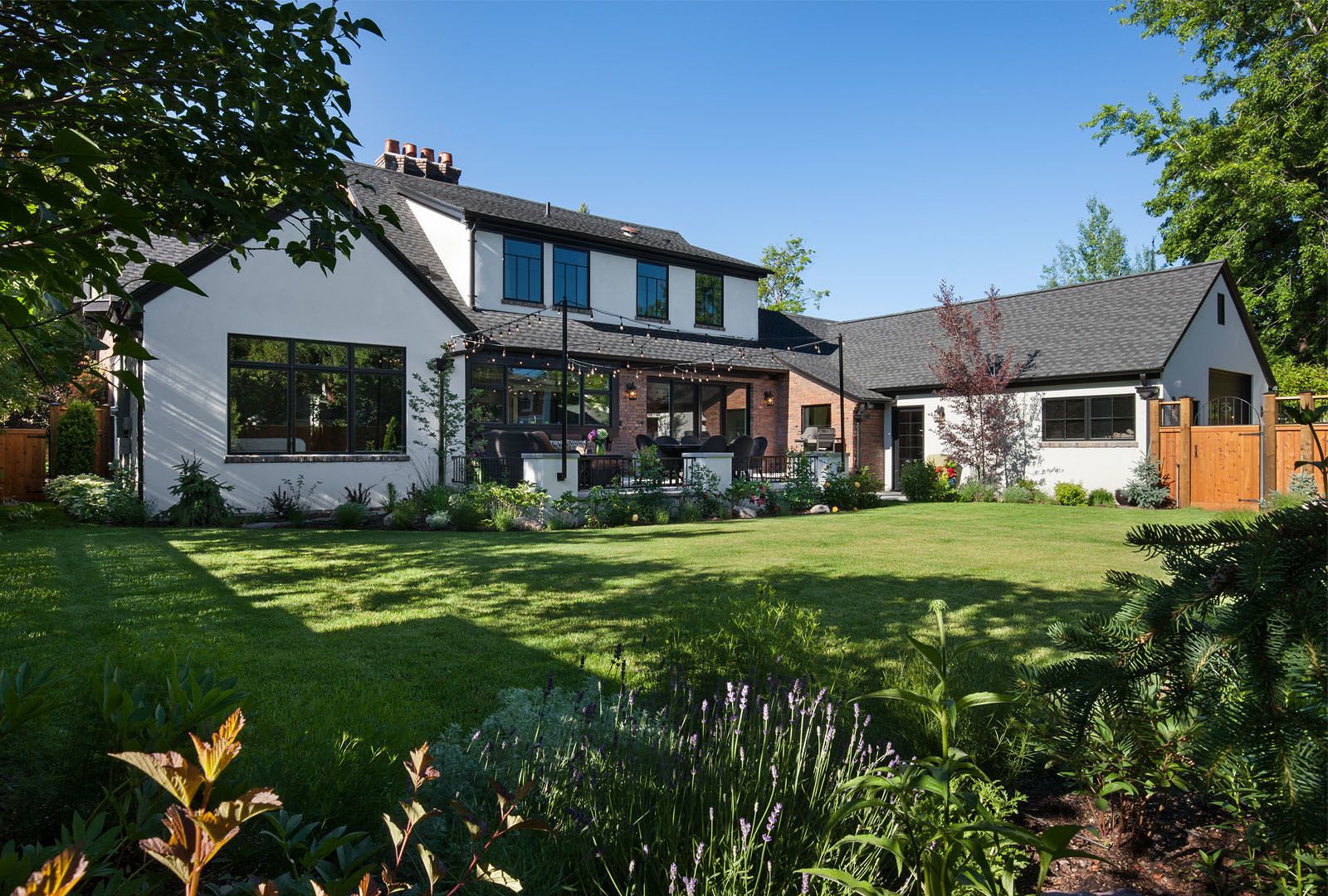
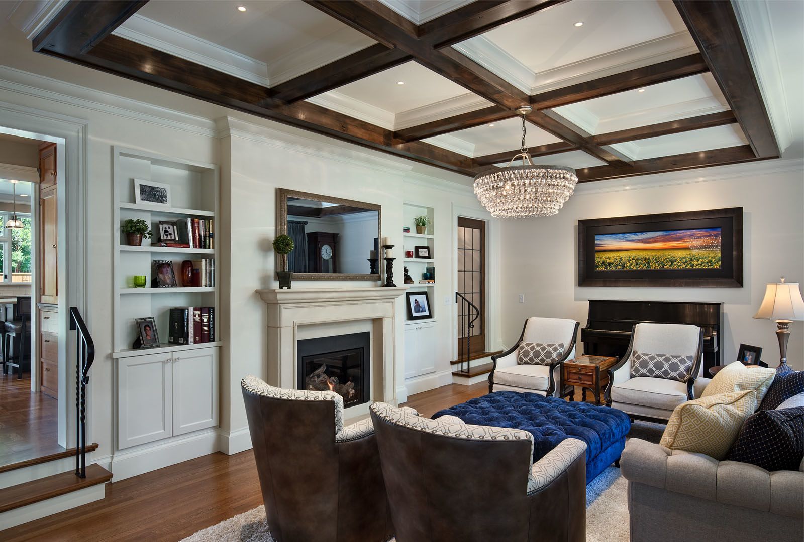
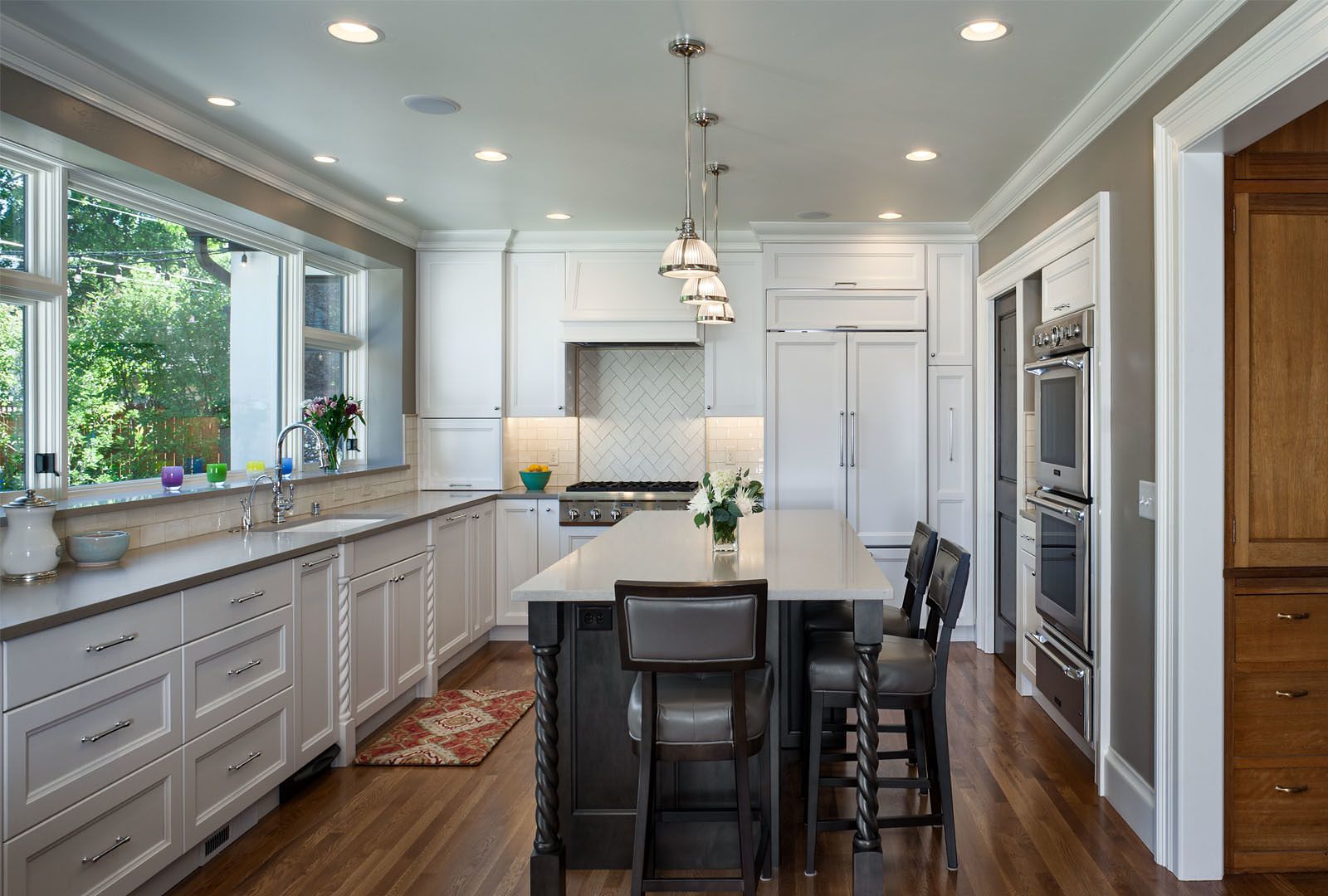
With minimal expansion of the footprint, the home area was increased by 1,262 square feet. This increase was made more potent by reorganizing the circulation and layout of the rooms. On the light- filled main level, the rooms flow one to the next, with level changes highlighting the transitions between spaces. Adding large windows and doors to the kitchen and dining room opened up a side of the house previously disconnected from the backyard. An unused covered porch was framed in and converted into the master suite, which contains a walk-in closet and bathroom and can be accessed either from the living room or the kitchen. The exterior brick wall was cleaned and left as the finish wall in the bedroom to highlight the extent of the original house. The color palette on this level is calm and airy, providing a relaxing home base for a busy family.
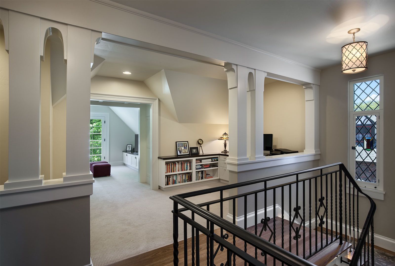
Upstairs is the teenagers’ domain. Two new gable dormers were added street-side to the son’s suite to enliven and expand a previously unfinished attic space. The brick chimney was left exposed to add a little edge to his world. Though these dormers are visible from the street, they blend seamlessly with the existing architecture by matching detailing on this more formal side of the home. Additionally, an area of unused attic was finished to make space for a small TV / study room. For a touch of whimsy, a steel ladder in the hallway leads up to a low ceilinged hideaway tucked up into the roof gable. This area is called “The Perch” and used by the son to read, think, day dream.
In contrast to the main and upper floors, the lower level has a cozy, hunkered down feeling with its dark earthy colored walls and thick carpet. This space was made for family movie and game nights during long Montana winters. In the new wine cellar, the original round-top gothic front door and an exterior stained glass window were reused. Cork floors, reclaimed wood for shelving and stone that matches the exterior complete the feel of this room. Original light fixtures were rebuilt and reinstalled throughout the basement. An original fireplace was reused in the billiards room and retrofitted with a gas insert to create a cozy pub feel.
To fit an expanding fleet of vehicles as the owner’s two children get their driver’s licenses, the existing garage needed to double in size. Without affecting the front façade, the garage was expanded into the backyard. A driveway was added from the alley to allow four vehicles to be parked in the garage. The backyard was revamped with a new concrete patio and fire pit.
Often in historical remodels, so much weight is placed on the history. Here we have a series of sensitive interventions that preserve the character of the home but allow it to breathe fresh life and meet the needs of a new generation.
