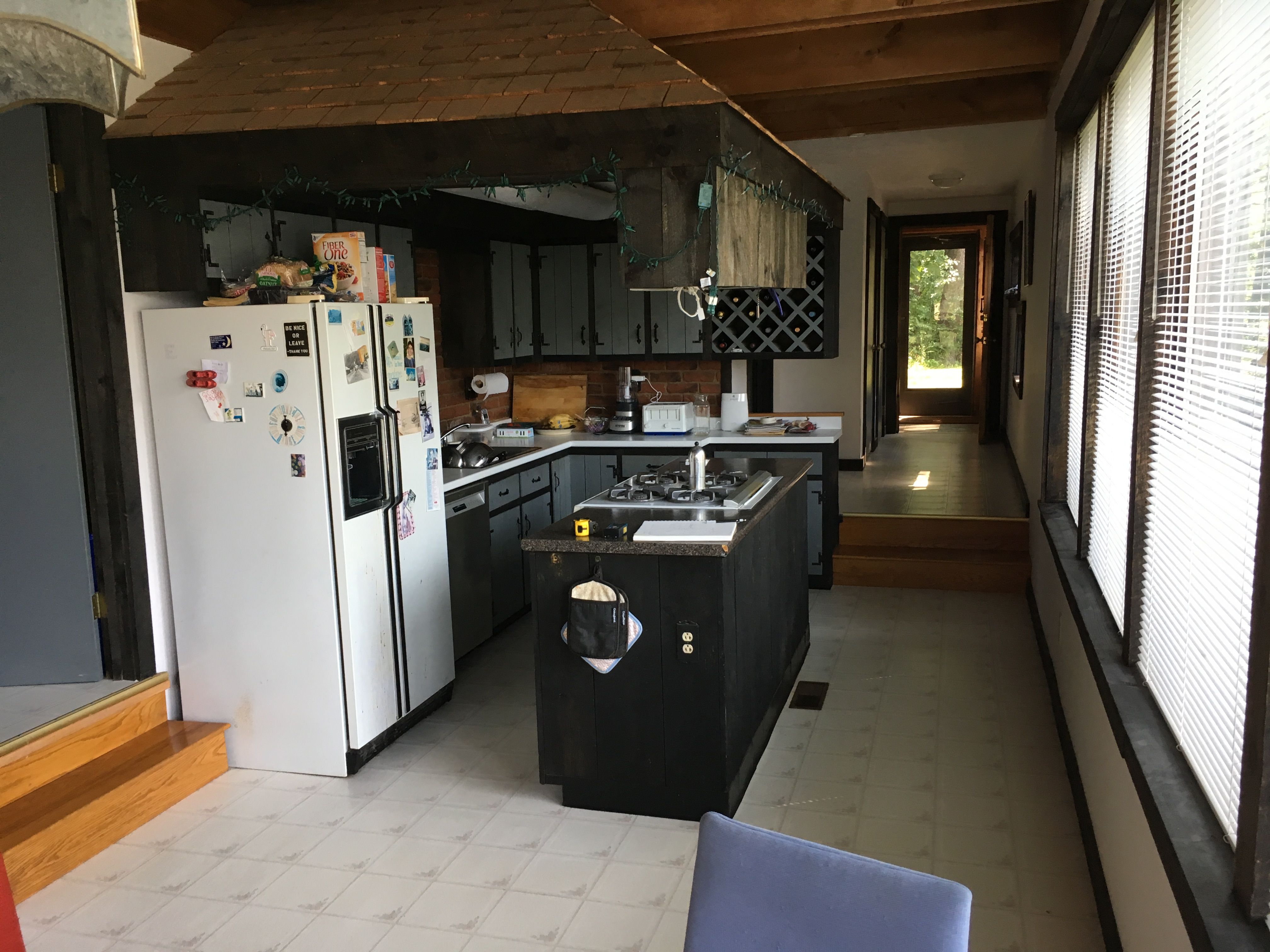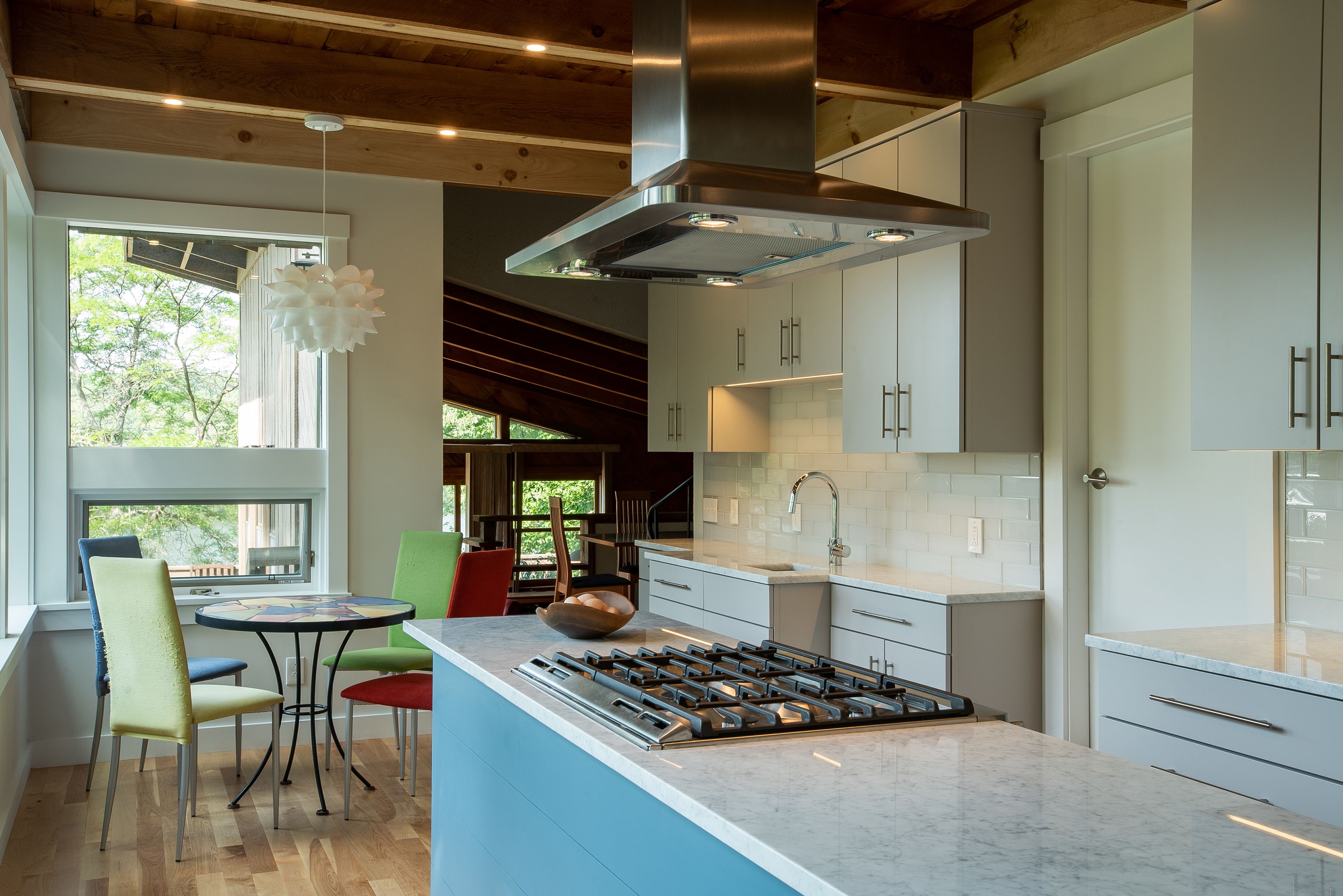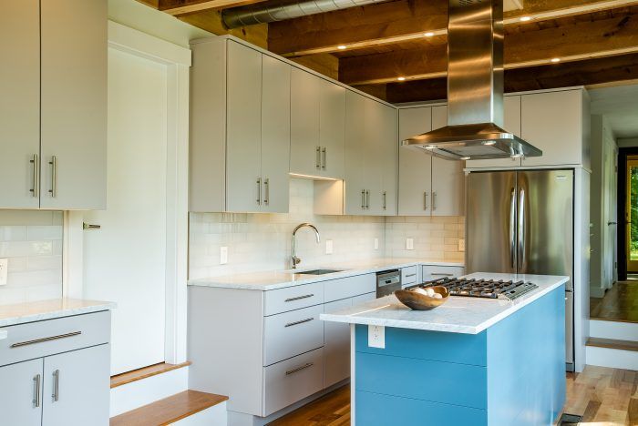
Originally designed and built by The Shelter Institute, a well-known company in Maine for creating timber-framed and other wood-friendly homes, often with the help of students from their frequent classes, this house was probably one of their first projects. The design has held up well; today’s Passive House consultants would appreciate the orientation and overall design, though they would lament the single-glazed, uncoated glass that overheated the interior on all but the coldest sunny days. The kitchen was the worst aspect of the house: with the fake “Tiki Hut” roof and dark-painted, rough-sawn cabinetry, a layout that made it hard for one person to cook in, much less multiple cooks, and a design that cut the cook off from any visitors, even in an expansive, sunny space. The floor was worn-out sheet vinyl and there was not much storage. The room has lofty, nearly ten-foot ceilings, and a generous length, but one of the main design restrictions was the width—not really enough for an island and circulation space, but no other design made sense, so we squeezed the width as much as possible—including a very custom solution for the inset gas range.
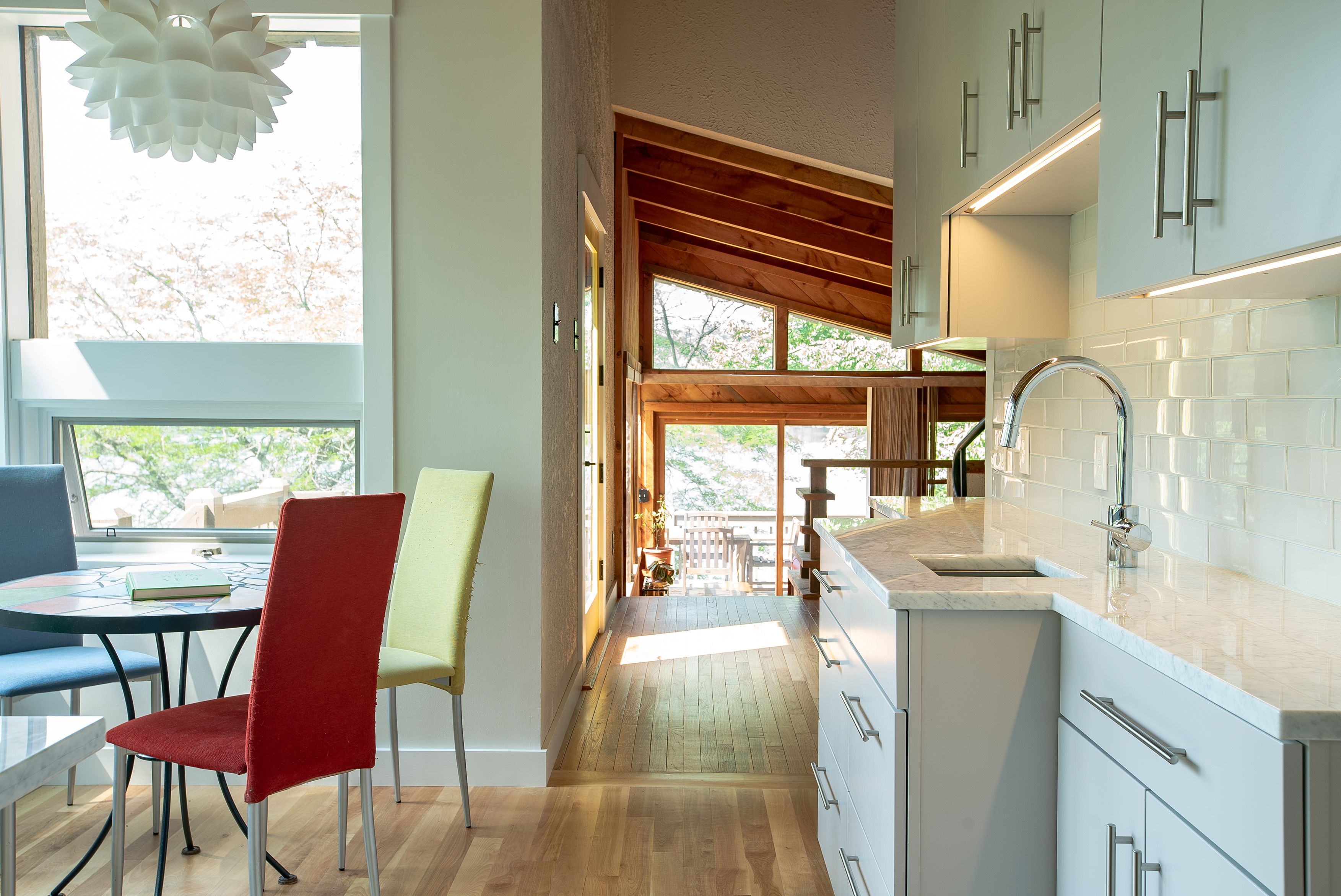
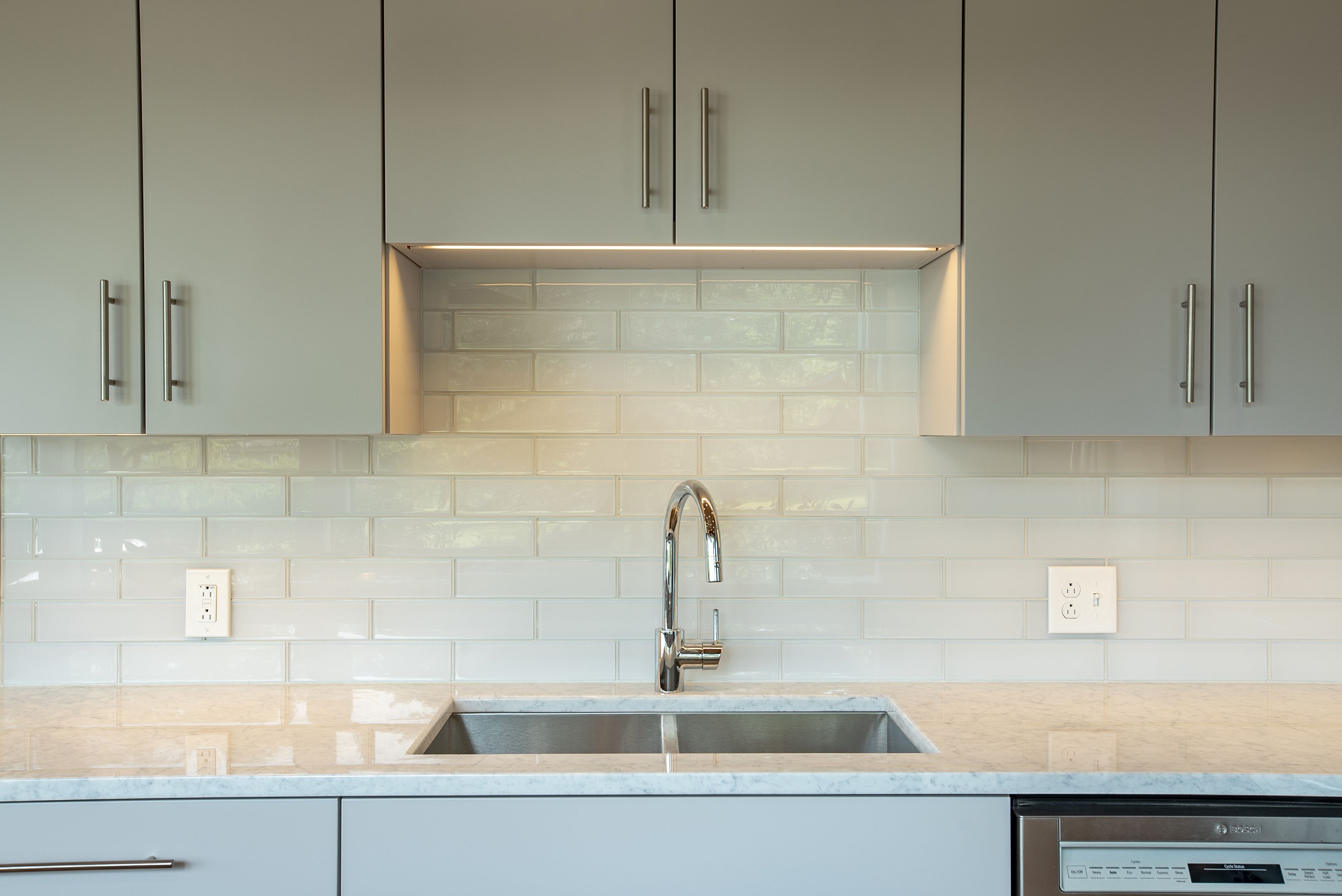
The original kitchen had a useless recirculating range hood but we installed a new hood that vents to the exterior. Installation was tricky due to the location over the island and open framing in the ceiling, but we came up with an elegant (and affordable) solution. We considered painting the ceiling but ended up leaving the warm wood tones; the trim boards we added will eventually darken to match the older wood. We installed locally-sourced red birch flooring, which is hard but lends a rich warmth to the space. We replaced the windows with insulated direct glazing with coatings to reduce overheating, and changed the rough-sawn, warped, black-stained trim for clean, smooth white trim. The cabinets have overlay doors and drawer fronts and are designed for easy access to items used while cooking. The finish is a pigmented lacquer, in a light gray that changes color over the course of the day. The countertops are Carrera marble, with an overhang at the island partly for guests to perch but mainly for the hand-crank pasta maker the owners learned to love while living in Italy. In the cabinet above the fridge we built a simple tray rack, in two parts so the space can accommodate larger items if needs change. Behind the fridge is a custom wine rack.
