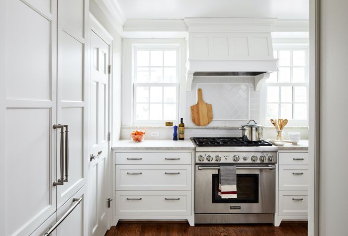
This project is the renovation of a Georgetown rowhome that included a new custom kitchen, a new master suite, custom built-in shelving to house a historic box collection, and the addition of a new attic dormer that created a valuable third bedroom in this modestly sized 1990 sf home.
The existing 113 sf eat-in kitchen was original to the 1950’s home. The L-shaped layout allowed for a small table but offered very limited storage. An ill-placed powder room door limited countertop depth along the window wall, and on the adjacent wall the range and refrigerator took away valuable upper cabinet potential.
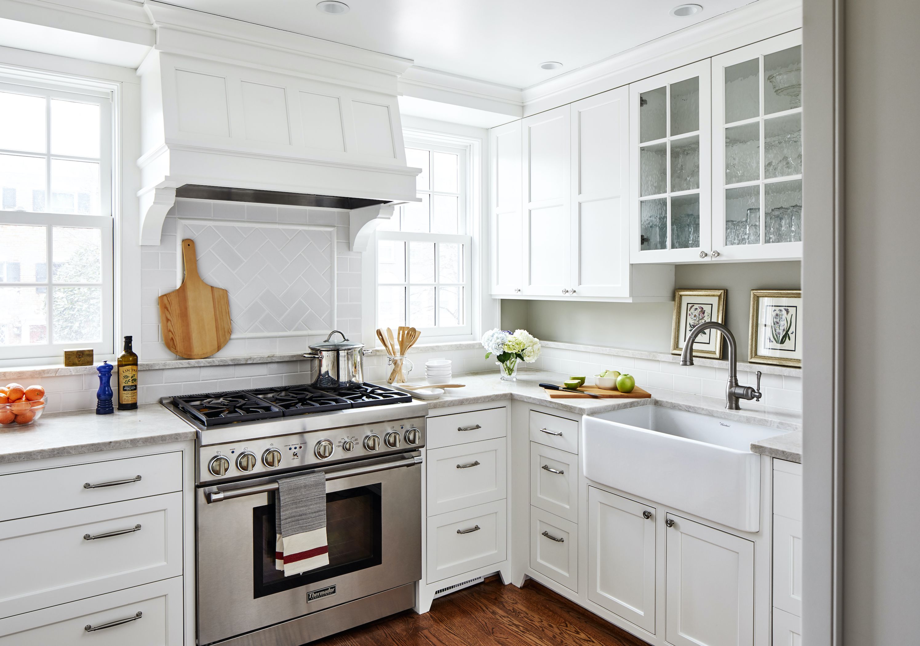
The solution to the inefficient layout of the existing kitchen was the unorthodox decision to reduce the overall size of the room; by simply shifting the location of the east wall six inches, we provided a new powder room door location, room for a built-in Thermador refrigerator and a small, yet valuable, pantry cabinet.
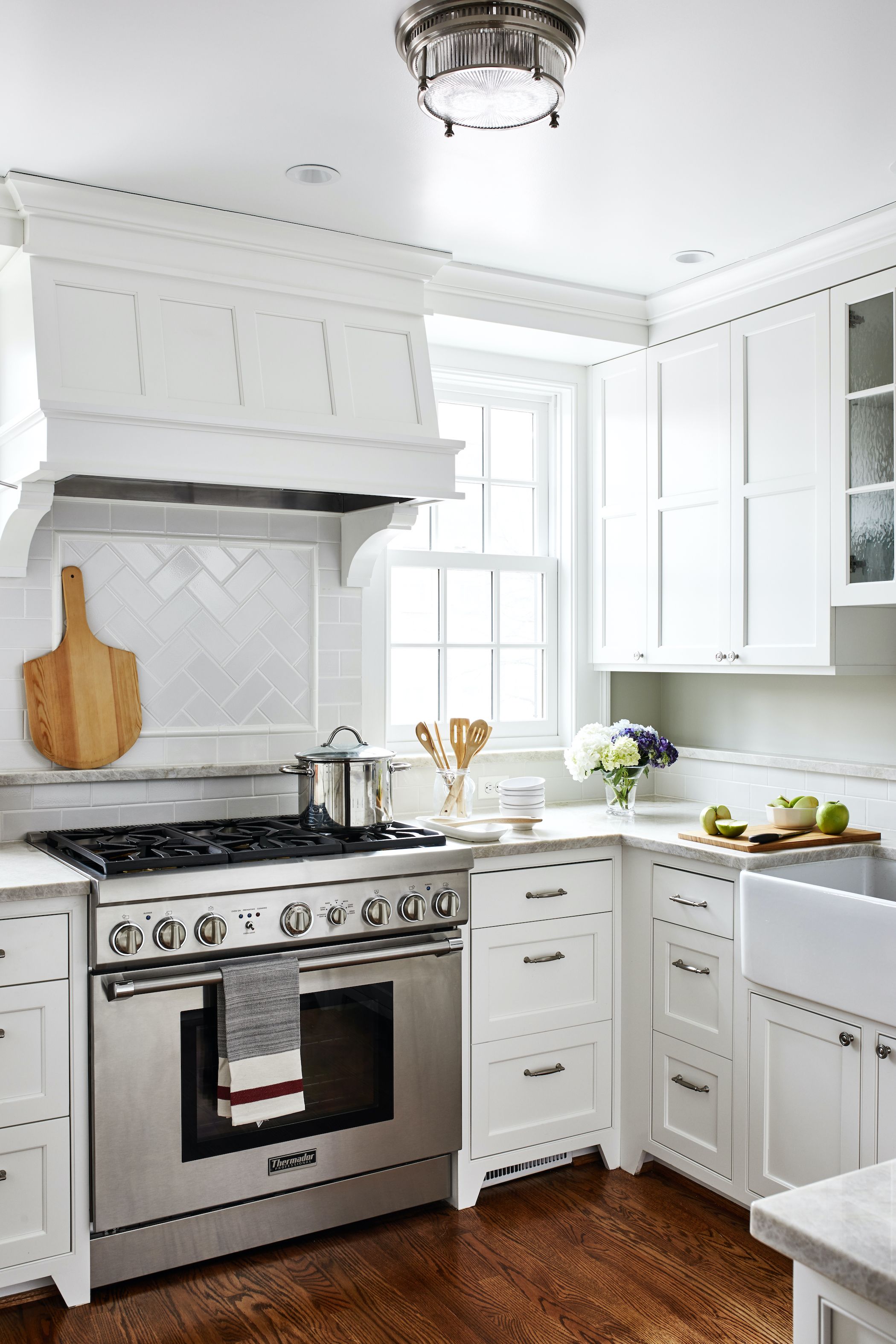
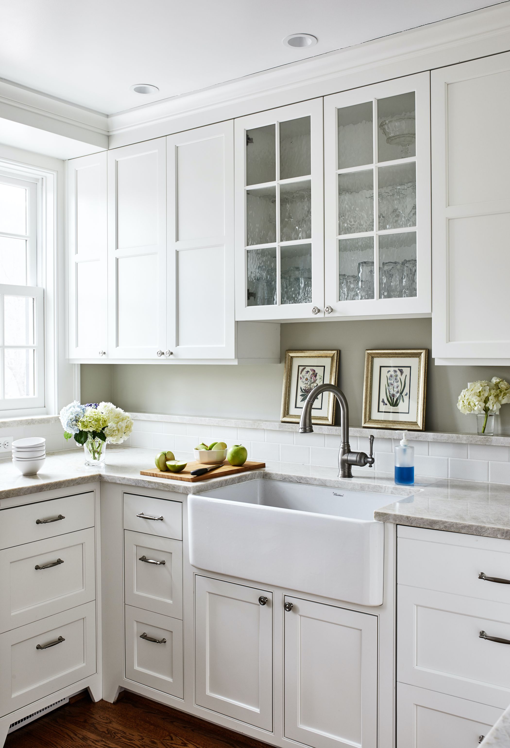
Other alterations to the kitchen included rearranging the appliances and cabinets. The range was moved to a more central spot between the two south facing windows. The refrigerator, now a built-in on the eastern wall, allowed for an unrestricted area for upper cabinets. A new hutch with pocketing doors was placed opposite the range to create balance in the small kitchen. The hutch’s depth is deceptive as it is recessed in an existing wall to maximize it size. Lastly, a new 3 ½” stone ledge rings the countertop at the level of the existing window sills. This ledge provides for more countertop space for small items like olive oil bottles, flowers, and decorative art. Lower cabinets were treated uniformly to look like farm-house kitchen drawers, concealing shelves, drawers, space-saving blind corner cabinet accessories, and internal pot drawers.
As part of the overall renovation of the home, we sought to maximize function within the existing small kitchen footprint. The existing windows provide generous southern exposure, bathing the kitchen in natural light. With a new range relocated between the windows, and the sink relocated on the adjacent counter, the space and light became balanced, and the room feels more spacious as a result.

