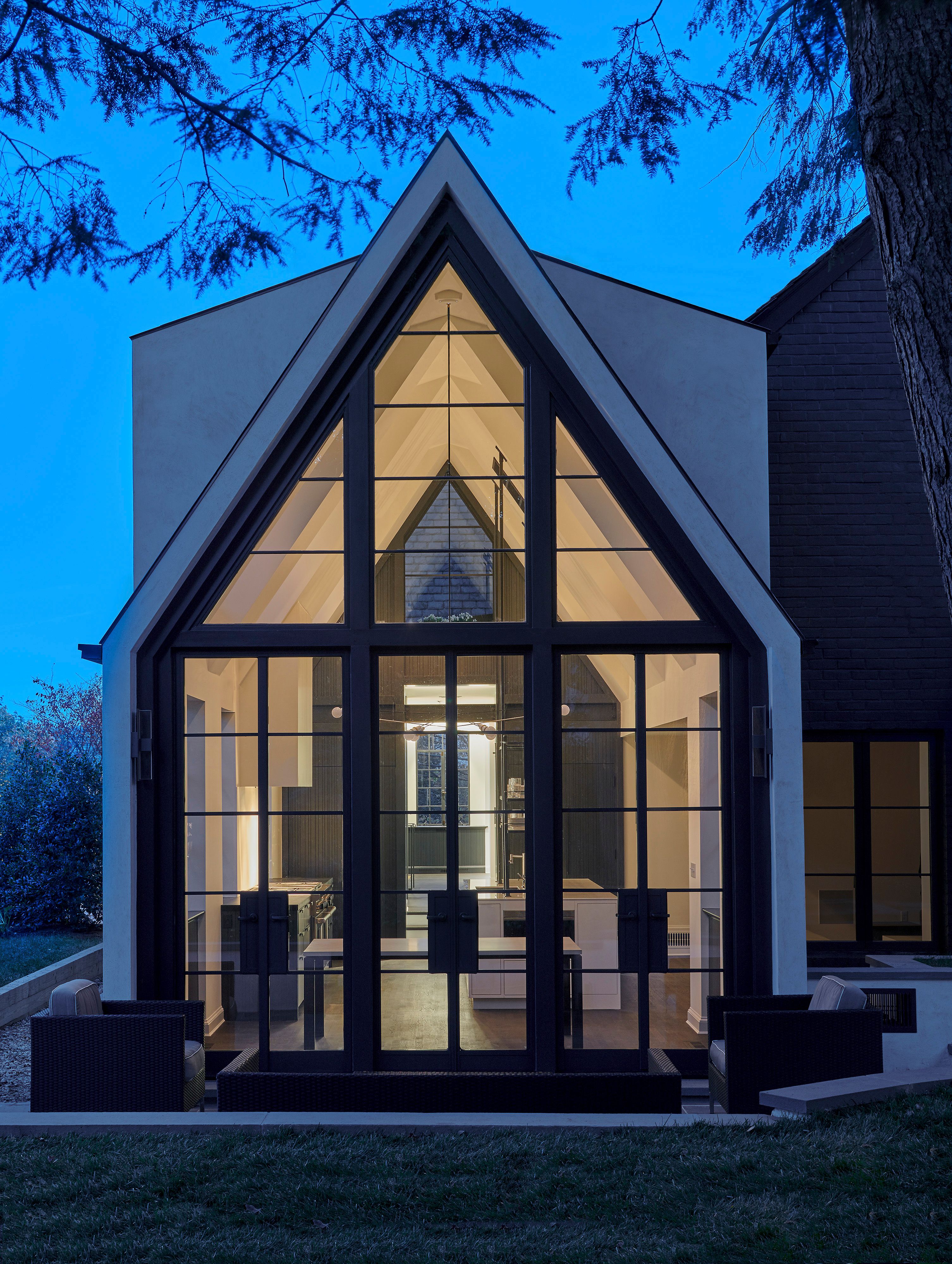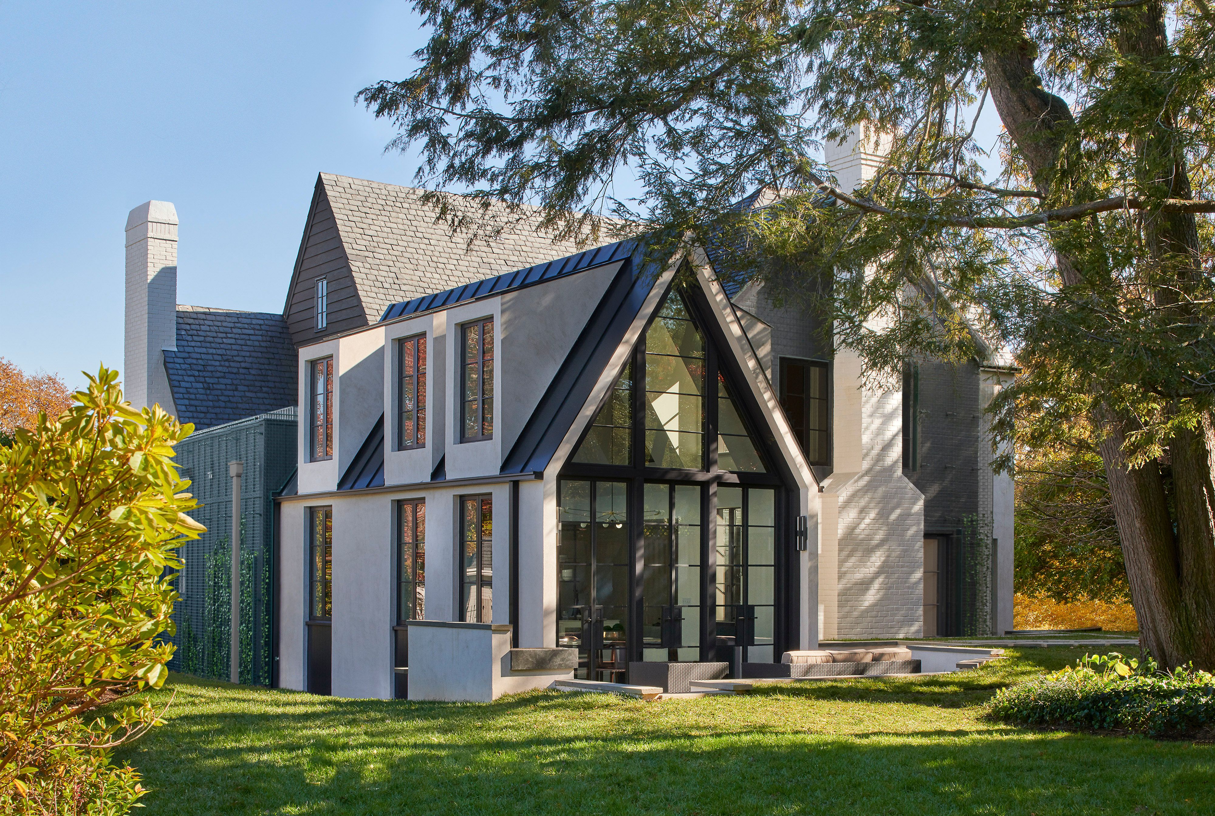
The top priority for the home was to create a contemporary and revived Tudor with a central modern kitchen. Upon initial inspection, there were architectural inconsistencies. An insensitive addition and fieldstone fireplace, neoclassical trim and wainscoting over existing walls and unrelated millwork imposed themselves. Inherited architectural forms that were unreconcilable to the original house also strained the architectural vision. In the kitchen, there were also a set of task-based challenges: the first was creating a space that respects the traditions of a 1940s Tudor with a modern kitchen at the same time, the second, designing an open kitchen with continuous sight lines while assuring all one needs is at arm’s length, and lastly, making a kitchen the center of the home when it had been placed in the most remote corner of the house. For rectifying inconsistencies, the stylistic conflicts were removed to reclaim the Tudor’s integrity, allowing the inherent nature of the Tudor to reveal itself. Existing black metal windows that juxtapose the newly exposed chalky, simple plaster walls become the defining design motif that encourages an addition whose seemingly contradictory modern identity not only elicits but highlights the Tudor’s character.
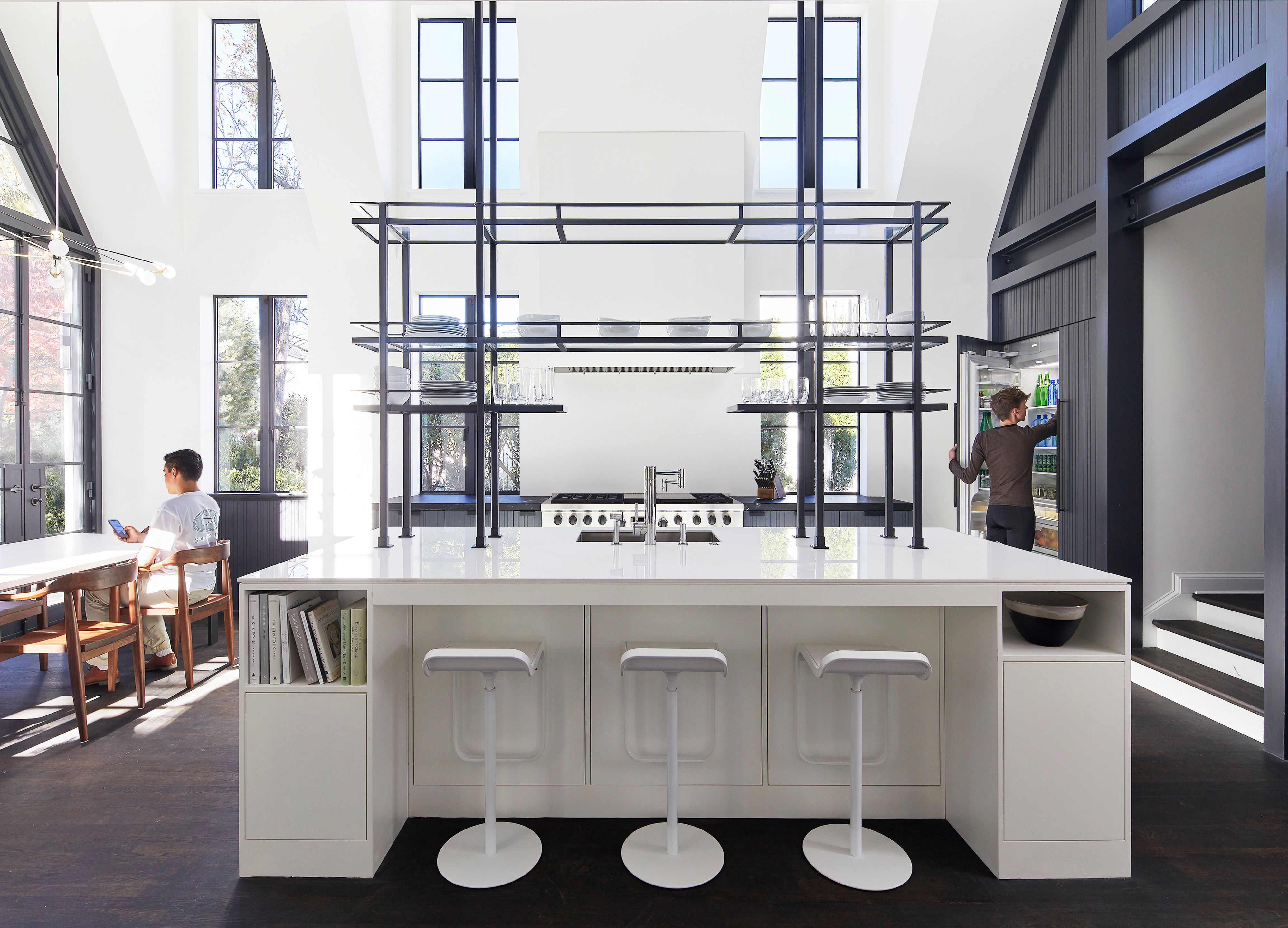
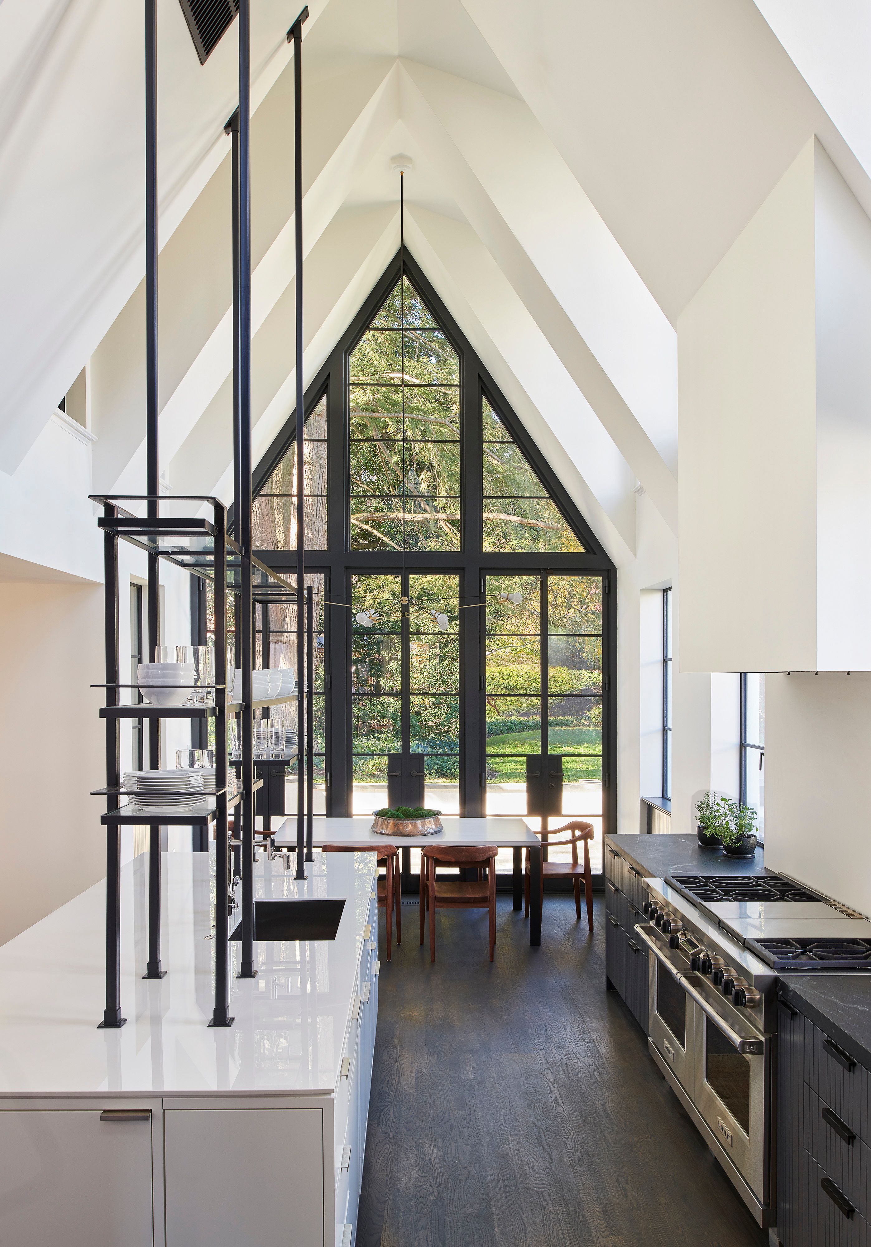
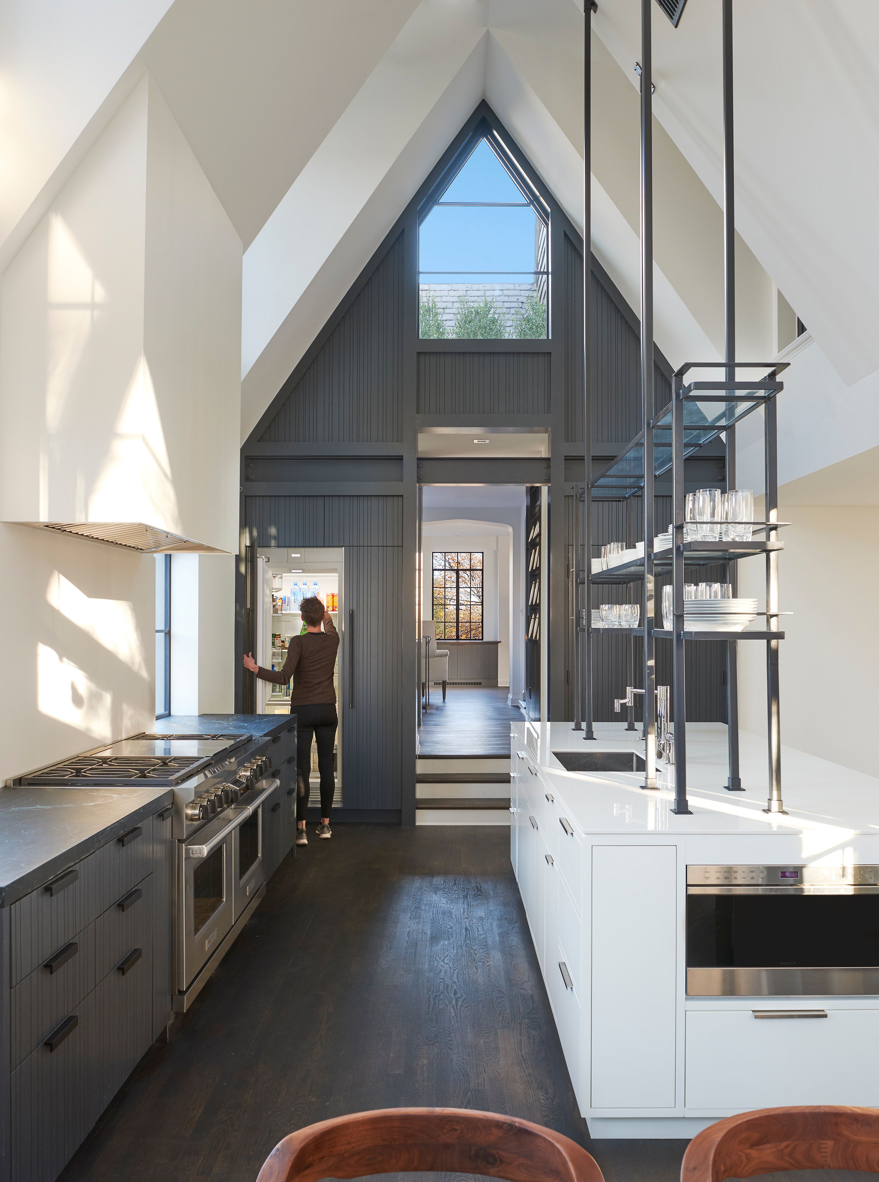
For irreconcilable architectural forms, green screens fashioned over walls deemphasize shapes and highlight the new Tudor pitched roofs adjacent to them. English ivy was chosen for these walls and on a green roof added on the enclosed porch. In the kitchen, the reconciliation between traditional and modern was achieved by taking cues from the newly revealed language of the existing 1940s Tudor. Like the existing, the addition’s white, simple walls are a backdrop for black metal architectural elements including island shelving and steel I-beams with exposed bolting. Original machine age steel windows were cues for modern applications to follow, allowing for a contemporary kitchen. A focal example is the 13-foot-tall custom transparent steel tower that has metal elements similar to the window members and existing steel door. Glass shelves further the machine age-window parallel. The tower also answers the challenge to design a neat and uncluttered yet convenient kitchen. Even though it holds dishware and glasses for eight, its thin members with transparent shelves afford the kitchen open space. This sculptural element provides ample room for remaining cabinetry to store necessities from staple appliances to cookware.
