Kitchen Islands — More Solutions, More Photos
Masterfully tailored to their spaces, these kitchen workstations designed by Johnny Grey show how to combine utility with panache
Editor’s note: Johnny Grey’s article, Getting the Most from a Kitchen Island, appears in Fine Homebuilding‘s Kitchens & Baths 2006.
Three more solutions
A proper kitchen island balances a challenging list of requirements. It needs to provide the necessary functions, such as counter space for cleanup, food preparation, cooking, storage, seating, or all of the above. And the island has to fit the shape of the room and the personality of its cook. Here are three solutions to different sets of circumstances and requirements that strike that balance.
A place for preparation and clean up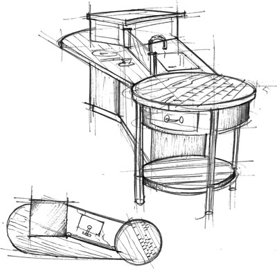

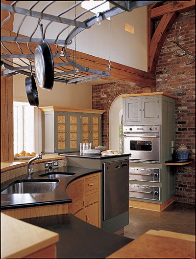
This design incorporates a sink cabinet and wash-up facilities into the center of the room — always a difficult task. The raised-height dishwasher at one end is at a slight angle so you can unload it and put china into a nearby cupboard without moving your feet. The dishwasher can be loaded without interfering with food prep, cooking or snacking. In addition, there is room for a generous prep area and a semi-transparent glass screen to conceal unfinished dishes from visitors as they come in.
One of the reasons a design like this works is because there is furniture around it to support other functions. The size is compact (overall about 12 ft.) and the modeling of the shape is function specific with materials on the countertop related to tasks — stainless steel for the wet area, end-grain maple for the chopping block and polished wood for the breakfast bar/severing surface.
The round approach
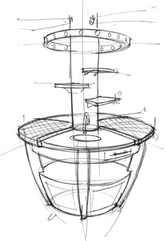
A circular island with a diameter of between 6 ft. and 7ft. creates a satisfying geometry. People seem to like it because we associate a circle with a sense of completeness. This basic pattern can accommodate from two to six dedicated work areas. The sense of easy circulation is unparalleled. The shape encourages two people to use the island at the same so eye contact and sociability make it a double pleasure to use. The only disadvantage is that the shape causes the work area to fall away quickly. This can be addressed by making the diameter at least 7ft.
An unusual design for reparation and cooking
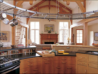
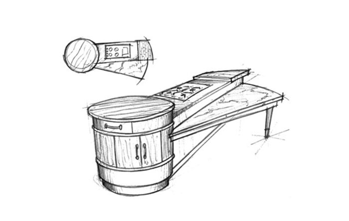
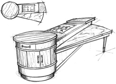
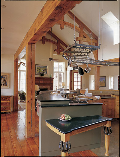
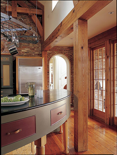
The idiosyncratic geometry of the keyhole-shaped island makes more sense than it would first appear. The straight section can be comfortably aligned with a sink cabinet or other wall-based cabinetry so that they work in parallel, leaving the circular end piece (or drum as we often call it) to provide an “easy-to-approach” and friendly prep areas that can be used by at least two people at once. While standing at this end piece you have clear sight lines the full length of the island. Because you can use drum at any point you have eye contact with your partner in cooking. You are thus encouraged to treat the prepping as non competitive, a ‘join-in’ or pleasurable activity. During quiet moments when no one is using the island, the nature of the shape allows for easy circulation and sends a message of relaxed sensuality.
Additional photos and out-takes from the article
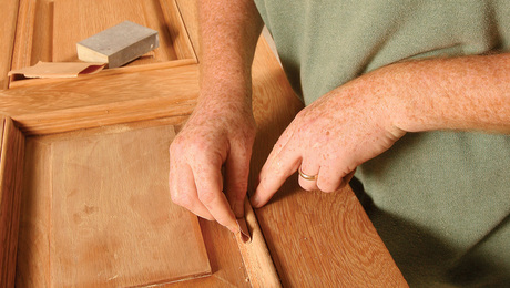
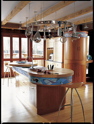
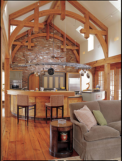
Picking the photos for a magazine article is an exercise in compromise. Does a close-up shot best describe the article’s lessons, or is the reader better served with a photo taken from farther back, so that the entire room can be appreciated? The Web gives us a chance to have it both ways. With that in mind, we present here the uncropped photos and the out-takes from the three projects that illustrate Johnny’s article.
 |
 |
 |
 |
Johnny Grey (www.johnnygrey.com) is a kitchen designer with studios in England and San Francisco. He has written and lectured widely on kitchen design.
