
UL Disapproval: Ugly Lighting is NOT Approved
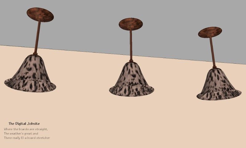
While there are more than a few light fixtures available in the SketchUp Component Warehouse, if you can’t find the one that is “just right” for you, this will show you some methods to create your own to match a style you have in mind. With these steps as a guide, there’s no limit to the possibilities.
Getting Started: Layout Curves for a Glass Bell Shape:
Some things are just predictable: the first step I use to begin creating a pendant light fixture component is to draw a “layout plane”. With a vertical plane established I begin layout of the compound curves that will make up the shape of the pendant’s glass bell.
Next Step: Use the Follow Me tool to sculpt the glass bell shape:
This is the part where SketchUp does most of the work. With an established profile for the glass bell a few mouse-clicks generate the bell shape we’re after.
Glass Act
With a specially applied Translucent material it’s possible to create some remarkable “glass” for your light fixture. Much better than just “painting” the glass bell with a Translucent material, I create a “Projected Texture” for a more realistic appearance to the patterned glass. Follow the steps shown here for similar results in your model.
Metal Shop
A process similar to creating the glass bell is used to design and create a metal “fitter” which will hold the glass bell to the tube stem and the ceiling.
Metal Shop Part 2:
Using the “fitter” created in the previous video clip, here I add a “projected” metal texture to the grouped geometry. For a ceiling escutcheon for our pendant light, a copy of the fitter is “scaled” into a mirror image of itself. I find this quicker than using the rotate tool, especially on a round object, but that’s just my preference. Now the scale tool can be used to increase the diameter of the fitter to make it into an escutcheon typical of a ceiling mounted light fixture. This video shows the steps (I appologize for the slow rendering of the model… my PC seems to have some speed issues this evening)
Possibilities:
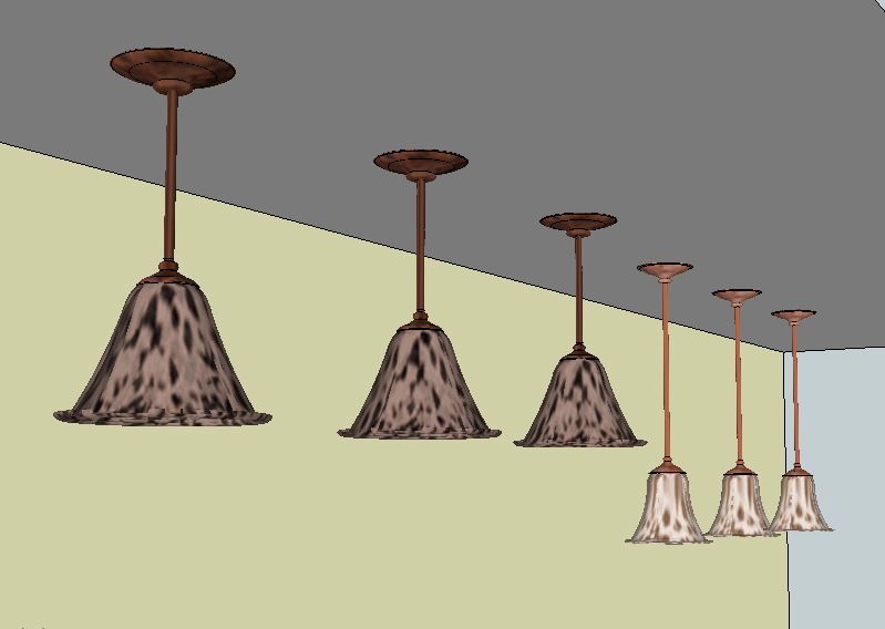
I hope the processes shown in this tutorial are helpful to enhance your SketchUp models. With a little imagination I think you’ll get an idea of limitless possibilities for creating light fixtures to suit your preferences. The pendant light shown at the start of this tutorial as well as the one created during the tutorial are available for download here at the SketchUp Component Warehouse. Feel free to share your questions or comments here at The Digital Jobsite or at The Timber Tailor’s Channel on YouTube. Happy modeling!
Fine Homebuilding Recommended Products
Fine Homebuilding receives a commission for items purchased through links on this site, including Amazon Associates and other affiliate advertising programs.

A Field Guide to American Houses

Homebody: A Guide to Creating Spaces You Never Want to Leave
Graphic Guide to Frame Construction







View Comments
FLUFF!
In a Sketchup model, I call the extraneous stuff "fluff". I keep the fluff on it's own layer so that it can be quickly turned off when unneeded; to get it out of the way while making modifications to the model or to just speed up the performance of the computer. Fluff items are often complex and eat up lots of computing power. Take, for instance, the lamp in the example: lots of curves, translucency, unique texture/color. One is fine but in a model that may have dozens of different fluff items thats a lot of strain on a processor.
Before fluffing out a model, one must ask why they need fluff. I do it because I use computer models - rather, I use photorealistic renderings of computer models - to convince homeowners to pay me thousands of dollars for my design opinion and/or my carpentry services. So, if you are a design+builder like me then it may make good business sense to learn Sketchup and work in some fluff.
But if you are Joe Homeowner, thinking about a DIY bathroom remodel, you may want to hold back on some of the fluff. Sure, adding a light fixture would provide a better understanding of what the space could look like but possibly at a major cost of time. While the light that Matt makes above may only take 15 min. for a proficient SU user, more complex bathroom light fixtures - say one with triple rose globes set on viney curved arms blooming from a repoussé floret escutcheon - could take a few hours to properly model such that it is suitable for a convincing render. If it's your bathroom, this would certainly be a wasted endeavor for most.
Back to the professional level, I first recommend obtaining the "Architectural Components Pack" from the Sketchup website. It will provide a good number of fluff elements. The next step is to scour the "Google 3D Warehouse" for fluff items already drawn by fellow SU users. You can save anything that looks promising for future use so say you were looking for a dining room table for a kitchen remodel but you stumble across a great picnic table; grab it up for that deck design you might have someday. Once you develop a good collection you will be 90% there. Of course you will probably never find everything you need on the web... like that soon to be released Meile oven that your prospective client absolutely must have in her kitchen remodel. If you are veeeeeeerrry lucky the product manufacturer will provide a SU model but, while becoming more and more common, that is still rare.
Sometimes you will just have to buck up and draw. At this point you must decide how detailed to make it to get the best bang for your buck. Most of the time you can just forget about the 'guts' of the product - this is a model not a working drawing for the product. You only need to concern yourself with the main outer dimensions (for fitting) and the face that shows in the render output. Often a stove, oven, or the like can just be a cube with some differently colored 2D rectangles and circles on the face to mimic windows and knobs. If you are just starting out in SU and just plan to output a standard SU render then this will suffice (maybe Matt can give a quick blog tutorial later). Obviously a photorealistic rendering requires more attention to detail (distance appropriate) but that is probably waaaay more advanced than most users on this forum..........yet certainly something to consider.
DC
DC
Thanks for taking the time to post such an insightful comment. Its in-depth perspective will benefit those who visit The Digital Jobsite by helping them evaluate the level of detail appropriate for their models whether it be "bare bones" or full-on "fluff". Either way, SketchUp is a great way to achieve the desired end result.
Matt
TTT: Great tip! Thanks for sharing. I would love to hear more tips on quick fluff.
DC: Unfortunately, its the Fluff that sets us apart from the "ihavecad's".
If you don't mind, have a look at http://www.studio3v.com and I'd appreciate your input. Lighting is my biggest struggle so, lately, I started hanging out with a photographer friend and learning think like he does. Can't hurt ;)
Reece
This tips are truly inspired for me!!!