Evolution of a Floor Plan
How a challenging program influences whole-house design.

Architectural design starts with defining the program — a list or narrative of what the building needs to include. Below I’ll describe how we incorporated the FHB House program into four iterations of schematic design (plus a lot of additional sketches). I describe program development to clients as defining the needs and the wants, with the goal of getting all the needs and as many of the wants as the budget will allow.
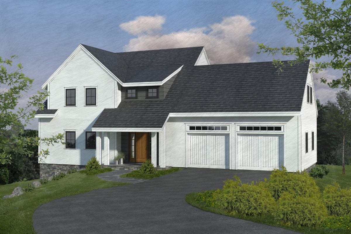
The FHB House was not designed for a specific client, so developing the program was a little different than normal, but in the end it is designed to be evocative of a farmhouse, suitable for anyone from a family buying their first home to empty nesters, anywhere in the country. The house is designed for the specific site, but at every step we thought about how it would fit in other locales and for different occupant configurations, with the goal of creating a superefficient but comfortable and flexible plan that also worked with a modern take on a traditional exterior. It was also designed to balance energy use so it could be net zero anywhere in the country.
The original goal was to do this in no more than 1500 sq. ft., but that proved impossible while also meeting the full program. Ultimately, we were able to do it in just over 1800 sq. ft. There aren’t many newer, four-bedroom, 2-1/2-bath homes with comfortable spaces and a generous entry in that size range; usually those specs would require a house that’s at least 2200 to 2500 sq. ft.
Additional program requirements
Starting off, Mike Guertin had suggested possibly putting the garage below the house. In looking at the site plan, I wasn’t sure if this would work, but I kept it open for the first few iterations as a possibility, particularly in considering stair locations and dimensions. The long side of the buildable envelope faces south, with the street on the northwest. It’s important to be able to see the front door when you approach a house, so we kept it visible.
Keeping accessible, single-floor living as an option meant that ideally the garage and main level, including a potential flex room or first-floor bedroom, should be on one level. From an aesthetic viewpoint, we wanted something other than the typical suburban box-with-flanking-garage, evocative of a traditional farmhouse but with modern appeal. A tight budget and net-zero-energy goal meant minimizing corners, porches, and any wasted space.
In my opinion, good design dictates a single point of entry rather than a formal front entrance and a separate, more commonly used side entrance. We wanted something that could function as a formal entry but also with access to a mudroom and garage, and close to the kitchen and a first-floor bathroom or powder room. For comfort, I tried to keep the entry away from the living room and dining room.
We wanted to provide for a fireplace of some sort and a pantry — ideally a walk-in, but a tall cabinet could suffice.
Stairs typically go to a private space — the bedroom level — but I also like to have them start in a relatively private space on the main level. When you wake up in the morning, do you really want to walk through a mudroom or foyer? Maybe that doesn’t bother everyone, but I prefer coming downstairs into a cozy part of the house, ideally with good access to the coffeemaker. At the second floor, to minimize hallways, stairs should terminate at a point accessible to all rooms. For the FHB House, the stairs ideally would also provide access to the bonus room over the garage, with minimal space wasted for circulation.
I wanted the FHB House’s master bedroom to have a good, attached bathroom, with another bathroom shared by two other bedrooms. I wanted a laundry space, ideally in a separate room, and for the bathrooms and laundry to be stacked over plumbing or service areas below (on the north side so as to not block light), and to have their own windows. For all rooms, I wanted to consider acoustic privacy. Finally, I wanted all rooms to be of adequate size with decent closets but no bigger than necessary.
We weren’t sure what would ultimately happen at the basement level, so I tried to arrange everything to be flexible down there, keeping the east and south walls clear of stairs.
With the program reasonably well defined, and a few of my many personal design rules noted above, following are descriptions of the major design iterations.
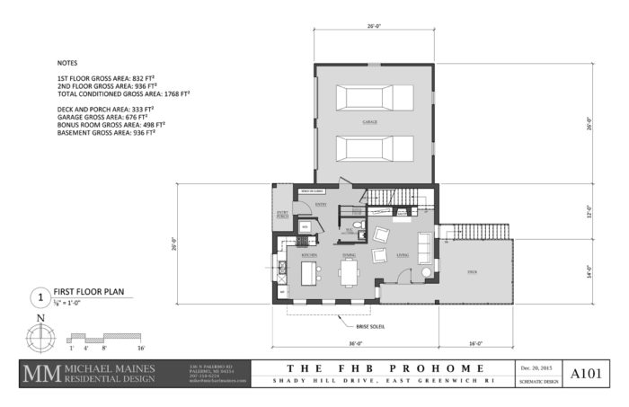
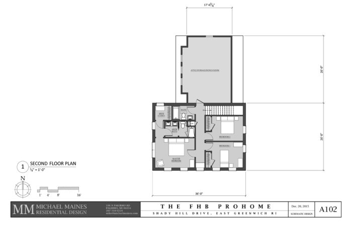
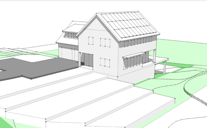
SD1: A farmhouse needs a porch, but we couldn’t afford to add anything unnecessary. By leaving the flex room/first-floor bedroom as a potential future addition, with the garage on the north, we were able to get an efficient floor plan with recessed porches at the entry and living room. The recesses protected the spaces from sun and rain but also allowed for more room on the second floor, which we needed to meet the program “needs” — which we did in under 1800 sq. ft. The major spaces are arranged to borrow elbow room from each other, gather natural light, provide for good circulation on the interior and to the deck, and to not draw attention to the south view.
Downsides: Access to the stair was tight and compromised the living room; the master bathroom was tight and had no window; there was no room for laundry on the second floor (and the location shown on the first floor was prime real estate for such a utilitarian function), and the central hallway on the second floor seemed to waste space. Most important, the desire for a first-floor flex space was determined to be important and was missing from this plan, and although there were practical reasons for the recessed porch at the living room, it would be nearly as expensive to build as to make it conditioned space. Once I realized that Rhode Island does not consider the wetland setback to be the building setback but that an additional 10 ft. of setback was required, it was clear that the garage on the north would not fit the site. I went back to the drawing board, but I am still fond of this design.
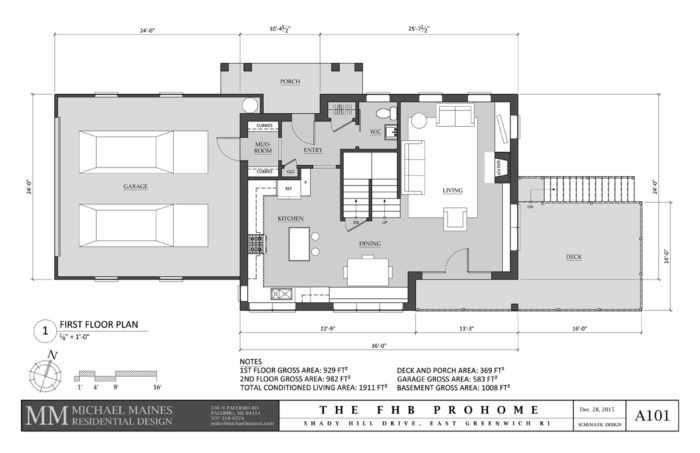
SD2: The big changes here were moving the garage from the north to the west, and moving the stair to a switchback style in the center of the house. The garage overhead door is not located on the primary facade, which is now drawn out with modern, horizontal lines, including an integral entry porch. The kitchen and living room are luxuriously large, and the dining room includes a return wall perfect for a built-in bench. On the second floor are larger bedrooms, luxuriously sized bathrooms, and a laundry closet.
Downsides: “Luxuriously sized” was not something we were going for, the total size of 1900 sq. ft. was deemed too large, especially considering there was still no flex room, and the recessed porch off the living room was expensive space for what was gained. On the second floor, a lot of space was given to circulation at the center of the house (although skylights above would make it a pleasant space), the laundry closet was still tight, and there was no direct access to a potential bonus room above the garage. Mike Guertin was steadfast against the “sugar scoop” roof in front of the shed dormer, and he discovered that due to the existing septic-system design, the overhead doors could not be located at the end of the building. But the general idea was accepted by the group, with a few requested changes.
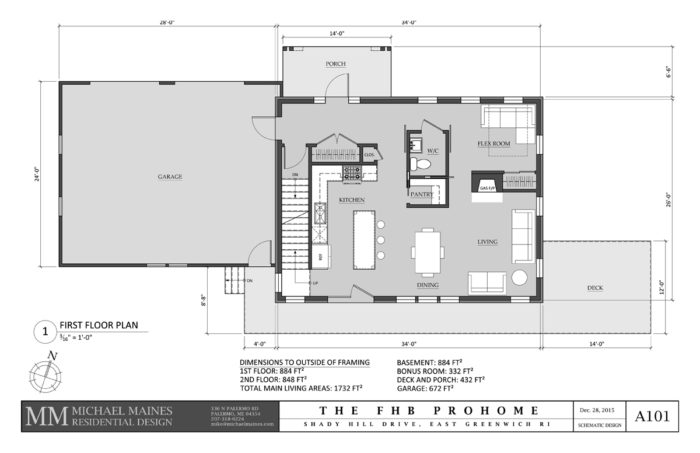
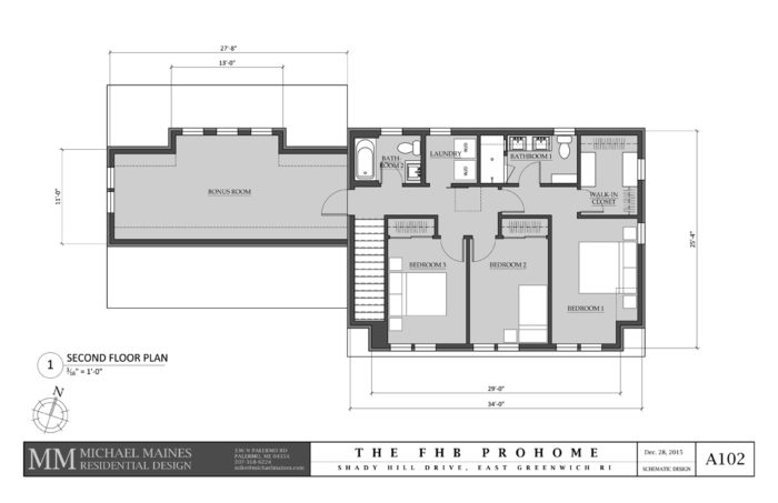
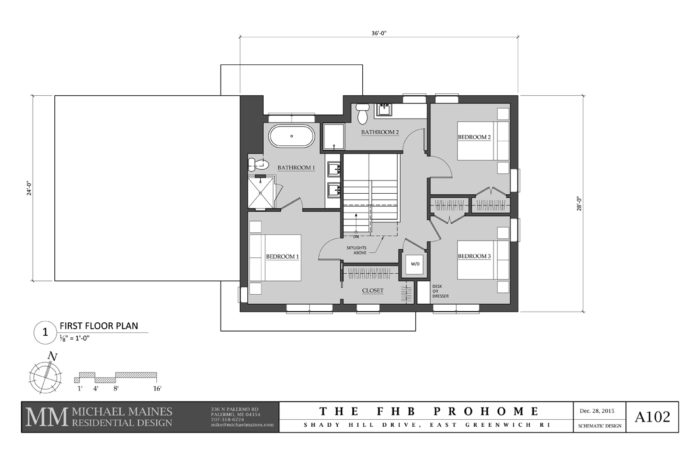
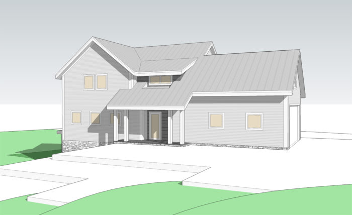
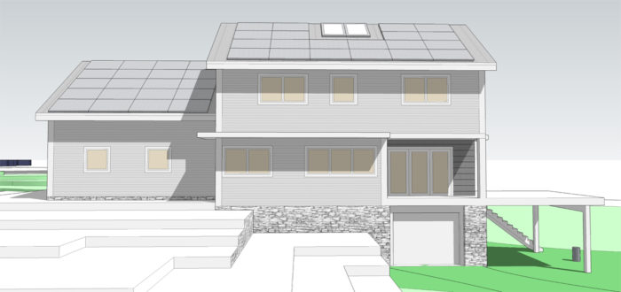
SD3: By eliminating the recessed porch off the living room and relocating the stairs, we found space for both a flex room and a living room along the east wall. Moving the stair meant that we lost a kitchen window, and eliminating the recessed porch meant that we needed another location for a door to the deck, but we solved both problems by placing double French doors off the kitchen. The new stair location squeezed the great room in the long direction, but it would still be adequate. To take the pressure off a smaller kitchen, we gained a walk-in pantry, grouped together with a powder room as an island at the center of the house, with circulation all around to expand the sense of space. On the second floor, the stair leads to a central hallway, accessing three bedrooms, a full laundry room, and the bonus room over the garage, all in a package of 1732 sq. ft.
Downsides: With the deck now projecting south of the house as well as to the east, and with an oversize two-car garage, the house would no longer fit on the site. Mike Guertin didn’t really want a two-car garage anyway, and aesthetically it made for a long elevation. The master bathroom lacked a soaking tub separate from the shower, one of the program “wants.” The powder room lacked a window, and its “island” location meant that three of the flex room’s corners were dedicated to circulation, a bit too much. Besides those items, we were almost there.
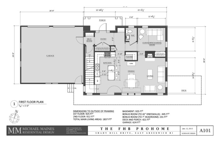
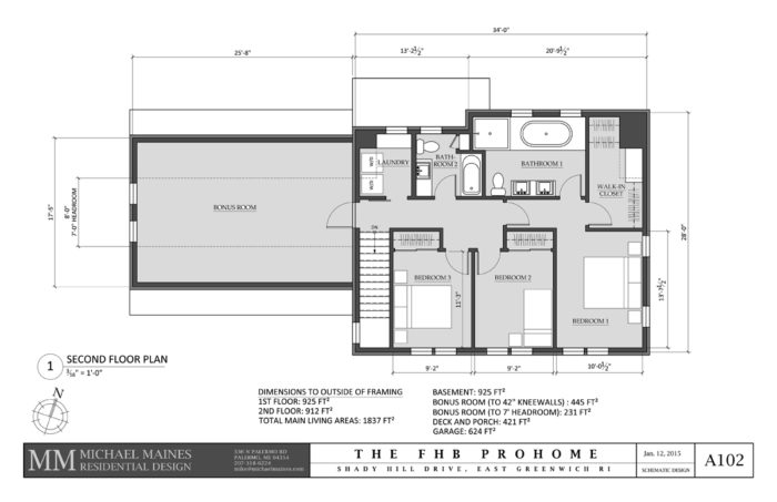

SD4: Just a few minor adjustments finished up the fourth schematic design. To make room for a master bathtub, we expanded the footprint in the north-south direction, which we also used to create a little more elbow room on the first floor, and made the wall flush with the garage wall for a modern, planar look on the exterior, while maintaining the farmhouse theme. Moving the powder room to the north gave it a window and a multifunction vestibule. We ultimately shrunk the garage to an oversize one-car size, and the integral entry porch-roof height ended up being too low, so we disengaged it from the main roof. I was sad to see it go, as it tied the elevation together, but we were running out of dials to turn on the design at that point in order to stay on schedule. The south facade is not as articulated as it had been, losing some character in the process. To make up for it, we put more effort into the window arrangement. Those issues aside, after a lot of fussing, we were able to hit all the program elements in 1837 sq. ft. of conditioned space, not including the basement.
Fine Homebuilding Recommended Products
Fine Homebuilding receives a commission for items purchased through links on this site, including Amazon Associates and other affiliate advertising programs.

Plate Level

Graphic Guide to Frame Construction

Pretty Good House
