Tile Backsplash Layout
Professional tilesetter Tim Keefe offers advice on how to make any size and shape tile look great in your kitchen.
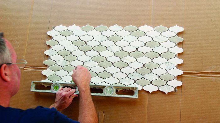
In “How to Install a Tile Kitchen Backsplash,” veteran tile setter Tim Keefe walks us through the complete process of setting classic 3×6 subway tile with a popular mosaic feature behind the range. From setting up the job site and prepping the area for installation to sealing the tile and choosing the right thinset, grout, and caulk for the crackle-glazed ceramic tile, Tim’s experience offers a helpful guide to our own tiling projects.
Before you start cutting tile and spreading thinset, however, it’s worth taking some time to make sure that you have your layout worked out. In fact, experts agree that often the difference between a professional looking tile job and an amateur’s work is revealed in the layout (the same is true for showers and floors). Tim dedicated a lot of his article to layout, but had even more tips to offer, which you’ll find here.
No two tile backsplash projects will lay out the same
Aside from the fact that tiles vary widely in size and shape, the height of the backsplash, placement of electrical outlets, whether there is a window or not, and how the tile will terminate at either end of a run are all considerations. There’s no right or wrong way to approach a layout, and there are absolutely always trade-offs, which is why I approach each job with a list of priorities, and work from there.
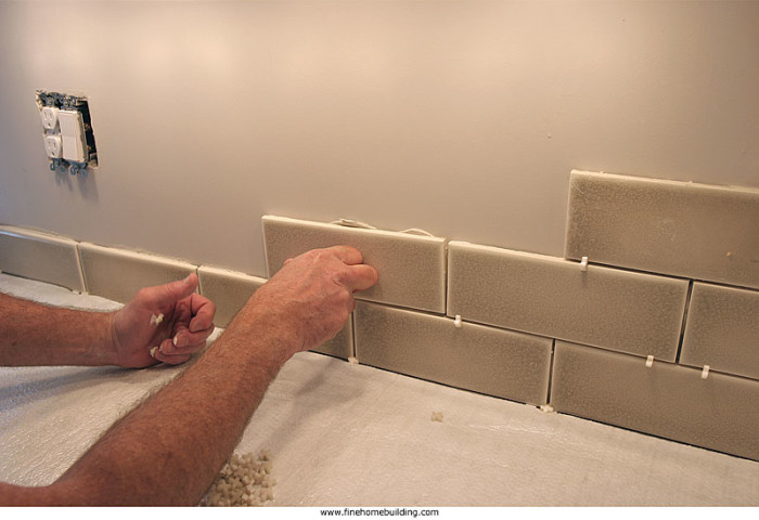
Start at the countertop
For a subway-tile backsplash like this one, my first priority is to always maintain the running bond pattern. I also like to start with a full tile at the countertop, and let the uppermost row of tiles fall as it will, cutting the pieces to fit against the bottom of the wall cabinets. From there, the layout is a bit more trial and error.
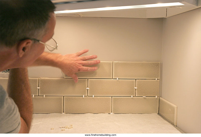
Keep the running bond pattern running
There’s no universal starting point for the layout, so I plan horizontal and vertical layouts around focal points, such as a range hood, inside corner, or any highly visible area. If the kitchen layout includes inside corners, I prefer to carry the layout from one wall to the other without deviating from the running bond pattern.
There’s no perfect layout
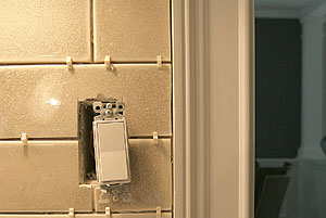
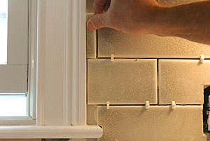
The key is to do your best to avoid narrow slivers of tile butting up against cabinetry or trim, especially in particularly visible areas, but accept that they may be unavoidable in certain situations, and that’s OK.
 |
 |
If you have a feature detail, get it right
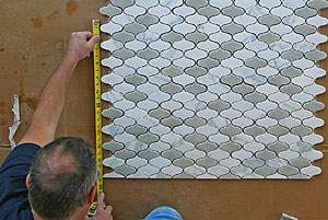
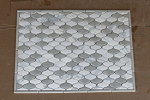
For mosaic tile accents it’s more about symmetry than anything else. Don’t let the size of the mosaic be dictated just by the space it’s going into, but also by the tile itself. The tiles closest to the edge of the mosaic should be either full, or half—anything more or less than half looks like a mistake.
 |
 |
More About Tiling a Backsplash:
 |
 |
 |
 |
