5 Small Home Plans to Admire
To help get the design of your small home right, check out these 5 small home plans to inspire the way you live.

Designing a home is more daunting than any venture you’re likely to encounter, as the challenges placed upon it are borne out of the most personal of demands. Get the design wrong, and its faults will reveal themselves on a daily basis. Get the design right, however, and you’ll effortlessly live in your home with the truest sense of comfort and reward.
Small homes lack the excess square footage that can absorb flawed spaces and details, which can so easily be skirted in much larger homes. Such adjustable livability isn’t possible in a small home where every square foot matters.
In an effort to help get the design of your small home right, here are 5 small home plans to inspire the way you live.
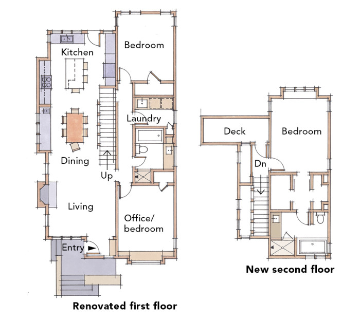
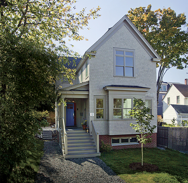
Roughly 1000 sq.ft. smaller than the average American home, this traditionally inspired project by Anne Callender of Whipple-Callender demonstrates lessons in practical planning. It’s also the 2014 Best Small Home of the year.
First Floor Highlights:
The shotgun-style floor plan creates an open contemporary atmosphere on the first floor of the home. Kitchen, living and dining spaces are organized around a large stair case that also serves as light well, which floods the first floor in daylight. Furniture and small partition walls define the individual spaces of the first floor and lend flexibility to the home should lifestyles change or household events require them to expand.
Second Floor Highlights:
In dense urban neighborhoods access to daylight and view is typically more prominent on the second floor than on the first. To capture as much daylight as possible, living spaces are organized along the north side of the house. Circulation areas are placed on the south side of the home, with plenty of windows to bring daylight into the bedrooms and the office. The latter is easily modified into an additional bedroom if needed.
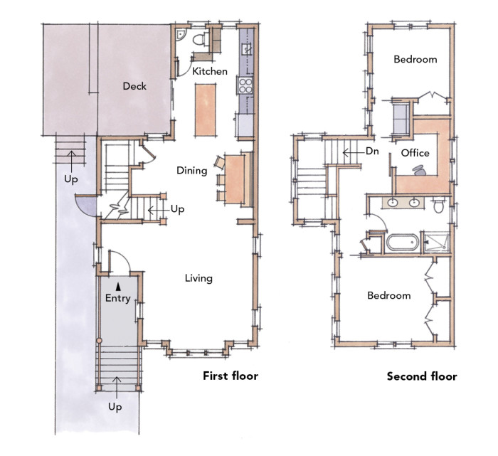
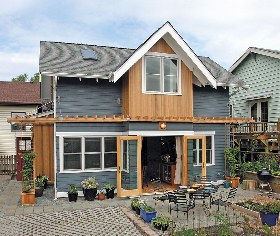
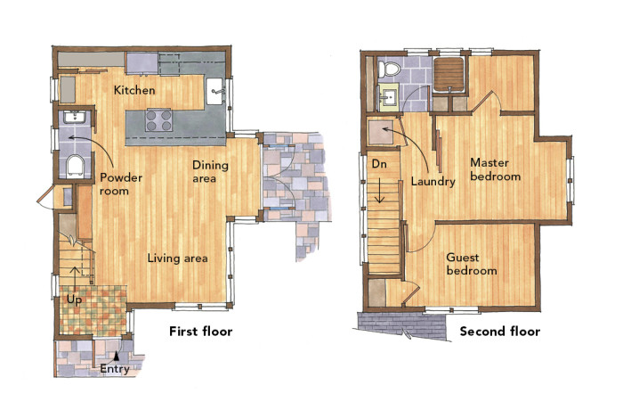
This 800 sq.ft. backyard cottage was designed by Matt Hutchines of CAST architecture for Seattle –based retirees who love to travel. Clustering storage, stairs and a powder room along a single wall allowed the rest of the home to function comfortably as an open living space.
First Floor Highlight:
An entry that doubles as a mudroom keeps clutter from entering the main living areas. In a similar effort cabinets, a powder room and mechanical closet are strategically tucked below the stairs on the home’s west wall. Isolating these spaces to this part of the house creates a solid exterior wall that helps keep the living spaces private from the nearby neighbors. The arrangement also allows the living, dining and kitchen areas to be as large and contiguous as possible.
Second Floor Highlights:
Sliding barn doors to the master bedroom establishes a l loft-like atmosphere in the second floor that feels larger than it actually is. A stackable washer and dryer near the top of the stairs is a convenient alternative to a full laundry room and helps conserve space. Though the owners had to compromise by sacrificing a tub, a spacious bathroom with a walk in shower occupies the north east corner of the home.
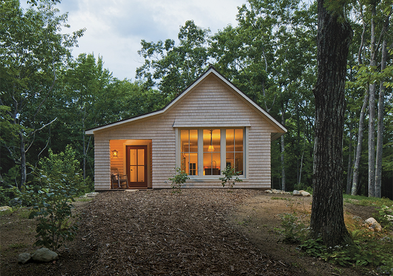
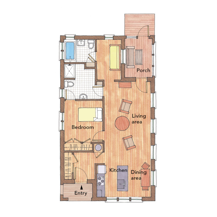
The footprint of this house is a basic rectangle to make insulating and air sealing its walls and roof easier. (Lots of jogs in the exterior walls and complicated roof lines make energy-related work more difficult.) The simple, compact plan was created to be replicable and easily modified for homeowners with varying demands.
The placement of the kitchen, living, and dining areas is easily adjustable within the single open living space. The one bedroom arrangement (shown) can easily be turned into a 2-bedroom plan by reconfiguring the flexible space and bathroom in the southeast corner of the house. Floor space is conserved by eliminating hallways throughout the house. Beyond the interior, two outdoor spaces influence the living experience. A covered entry, an asset to any house, is especially important in regions that have seasonally inclement weather. A screened-in porch, which is carved into the back corner of the house, creates a retreat that can be used as a getaway for the homeowners-an important feature in a small home.
Size: 1000 sq.ft.
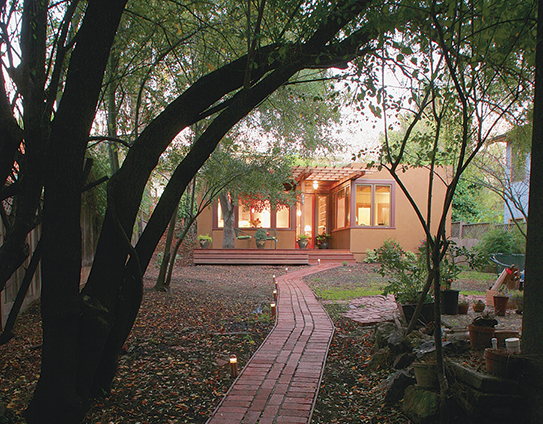
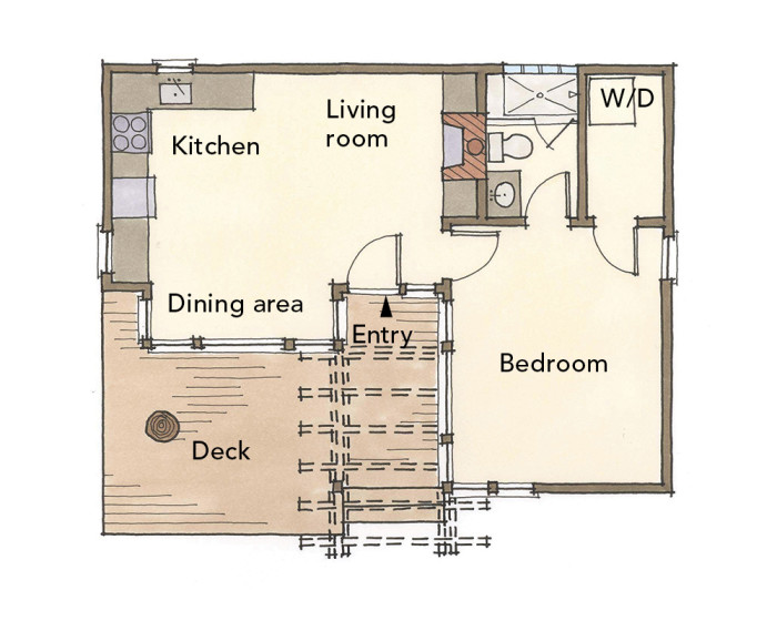
This Berkley, CA cottage serves as a granny flat for a homeowner wanting to live near her children and grandchildren while retaining her independence. Designed by bay area architect John Hopkins, the house makes the most of its 540 sq.ft. through a simple, well organized layout.
Floor Plan Highlights:
Two primary rooms arranged in an L-shaped plan eliminate space-hungry hallways and divide the house equally into public and private realms. Most of the windows are focused on the outdoor space, creating a sense of transparency and spaciousness. A generous deck nearly doubles the living area when the weather permits.
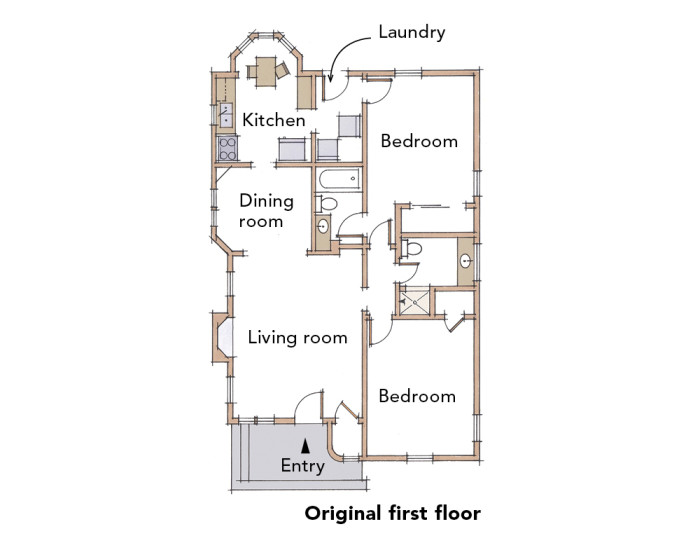
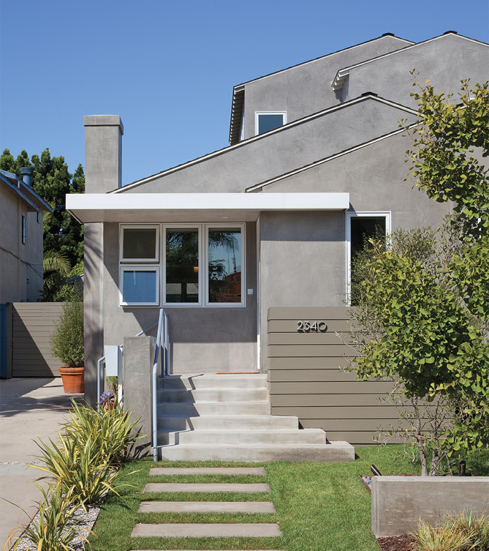
This remodel was redesigned by owner and architect Krista Becker. Organizing the new floor plan to create a contiguous living area made the small home feel expansive, while providing the practical benefit of easier child supervision.
First Floor Highlight:
The private spaces of the house-bedrooms and bathrooms-are placed along a central circulation loop around a set of new stairs, which provides access to the new master suite on the second floor. The feature stair buffers those private spaces from the public kitchen, dining and living areas nearby. Should accessibility ever become an issue in this home, the full bath and main-floor bedrooms can accommodate single-floor living.
Second Floor Highlights:
A comfortable bench at the top of the stair serves as a quiet place to read or work without the excess space of a dedicated study. A rooftop deck provides second floor outdoor access, which makes supervising outdoor play in the backyard easier. A four piece master bathroom, separated from the bedroom by generous walk in closets, completes the narrow suite.
 |
 |
Size: 1565 sq.ft.
Slideshow: Inspiring Ideas for Small Houses
Fine Homebuilding Recommended Products
Fine Homebuilding receives a commission for items purchased through links on this site, including Amazon Associates and other affiliate advertising programs.

Reliable Crimp Connectors

Affordable IR Camera

8067 All-Weather Flashing Tape







View Comments
My my my. Who reviewed these plans? The one named house of the year is chock full of the most egregious errors most would not even make as a freshman. We are talking about 1,600sf here, where a perfectly good 3-BR 2 1/2 house can be designed within. There is no coat closet, the only eating space is facing a wall, the powder room is off the kitchen, illegal in most jurisdictions and unappetizing in every jurisdiction, an unfurnishable front bedroom, only one bath, pocket doors that serve no purpose. Come on! At $150/sf or so, who would pay $240 big ones to put one of these on their small lot? No garage either and storage - HA. I could submit one to you with none of those issues. So could a lot of other architects.
Horsham_Architect wrote: "I could submit one to you with none of those issues."
Please do. We're always looking for new authors and well-designed projects to publish. You can send photos, plans and a project description to fh@taunton.com for review.
Thank you for your reply.
BP
Horsham, I was thinking the same thing. In fact I used to live in a 1600sf 4-BR 2 1/2 bath house with 2 car garage (and a coat closet!).
jglen:
At the risk of sounding dismissive, packing a lot in to any particular size does not mean you have a well-designed house. I'd like to see the floor plans of the house you described.
We choose this project to publish because of how well it met the owner's lifestyle. If you're interested, there's a lot more on the house here:
https://www.finehomebuilding.com/houseawards/2014/best-small-home
Be well,
BP
Horsham, I agree completely with your analysis. For starters, I use pocket doors frequently, but they are used for doors that default open, not for doors that open and shut several times daily. No entry closet? Seriously? Well, you could put a entry bench and coat hooks across from the entry but then you'd crowd that space - a lot - and lose access to the half-height under-stairs storage (great for seasonal holiday stuff, and the only available storage in the house.
The dining area is claustrophobic at best and the powder room off the kitchen is laughable. As for the MBR, you forgot to use the adjective 'totally' in front of unfurnishable. And finally, the dead-end kitchen where the sink is simply terrible design as is the laundry space/bedroom entry. Overall, almost a textbook case of how NOT to design a house - of any size.